Forest and agriculture occupy almost equal shares of Jefferson County in the supplied 2025 summary: 29.46% forest and 28.97% agriculture. Wetlands add another 19.94%, while developed land is much smaller and appears in a few concentrated clusters. This Jefferson County Georgia Land Cover Map set makes that rural mix easier to compare across four related views rather than reducing the county to a single dominant surface.
The page includes a countywide land-cover map, a forest-and-farmland view, an impervious-surface map, and a 1985–2025 endpoint comparison. The four original 2480 × 1754 JPG maps are available together in one download below. They can be used for county profiles, classroom work, presentations, broad environmental comparison, and selecting places that deserve closer study with local data.
Table of Contents
A near-even forest and farm split shapes the 2025 map
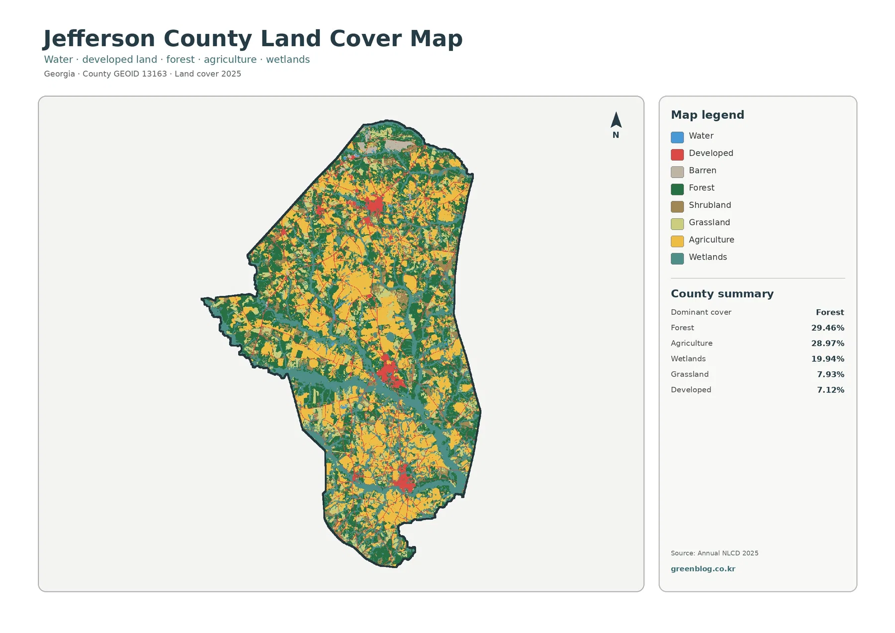
The first thing to notice is not one dominant color but the repeated alternation of green forest and yellow agricultural land. Large blocks of both occur from the northern end through the center and into the southern part of the county. The difference between their reported shares is only 0.49 percentage points, so Jefferson County is better described as a forest-and-farm mosaic than as a county controlled by either one alone.
Wetlands account for 19.94% and form a broad teal band across the middle, with narrower branches and patches elsewhere. An older county comprehensive plan identifies the Ogeechee River as a major natural resource crossing Jefferson County. That local context helps explain why wet surfaces matter here, but the supplied image does not label the river or draw a hydrography layer. The teal cells should therefore be read as mapped wetland cover, not as an exact river boundary.
Grassland contributes 7.93%, developed land 7.12%, and shrubland 5.39%. These smaller classes are distributed differently. Grass and shrub cells are scattered among forest, farms, and wet areas, while developed land gathers into several more recognizable red clusters and thin connecting traces. Open water is only 0.51%, a reminder that wetland cover and exposed water are not interchangeable categories.
Land cover describes what the ground surface is classified as from remotely sensed data. It does not show zoning, ownership, parcel lines, building rights, or legal wetland boundaries. A developed cell may still contain trees, lawns, bare soil, or other permeable surfaces. Likewise, a wetland-class cell should not be treated as a regulatory finding without the appropriate jurisdictional data and field review.
The county’s rural pattern is more mixed than a simple agriculture label suggests
Agriculture covers nearly three-tenths of Jefferson County, but forest and wetlands together cover 49.40%. That balance is visible throughout the map. Farm blocks often sit beside wooded areas, and wetland cells repeatedly interrupt or border both. The result is a landscape in which agricultural production, tree cover, and wet ground occupy large neighboring areas rather than separate halves of the county.
Jefferson County government identifies Louisville as the county seat and lists several incorporated communities, including Avera, Bartow, Stapleton, and Wadley; other county documents also include Wrens. The land-cover images supplied here do not label municipal boundaries or town names. Because of that, the red clusters are discussed as developed concentrations rather than being assigned to a specific municipality without an additional place layer.
Local agricultural context is supported by the University of Georgia Extension office in Jefferson County. Its agriculture and natural-resources program covers field crops, livestock, horticulture, weather, and farm management. The office has also reported that Burke and Jefferson counties are commonly among Georgia’s stronger corn-producing counties. That background is consistent with agriculture being a major mapped class, but the NLCD percentage cannot be converted into corn acreage or any other crop-specific total.
The forest-and-farmland view reveals how working land meets wet ground
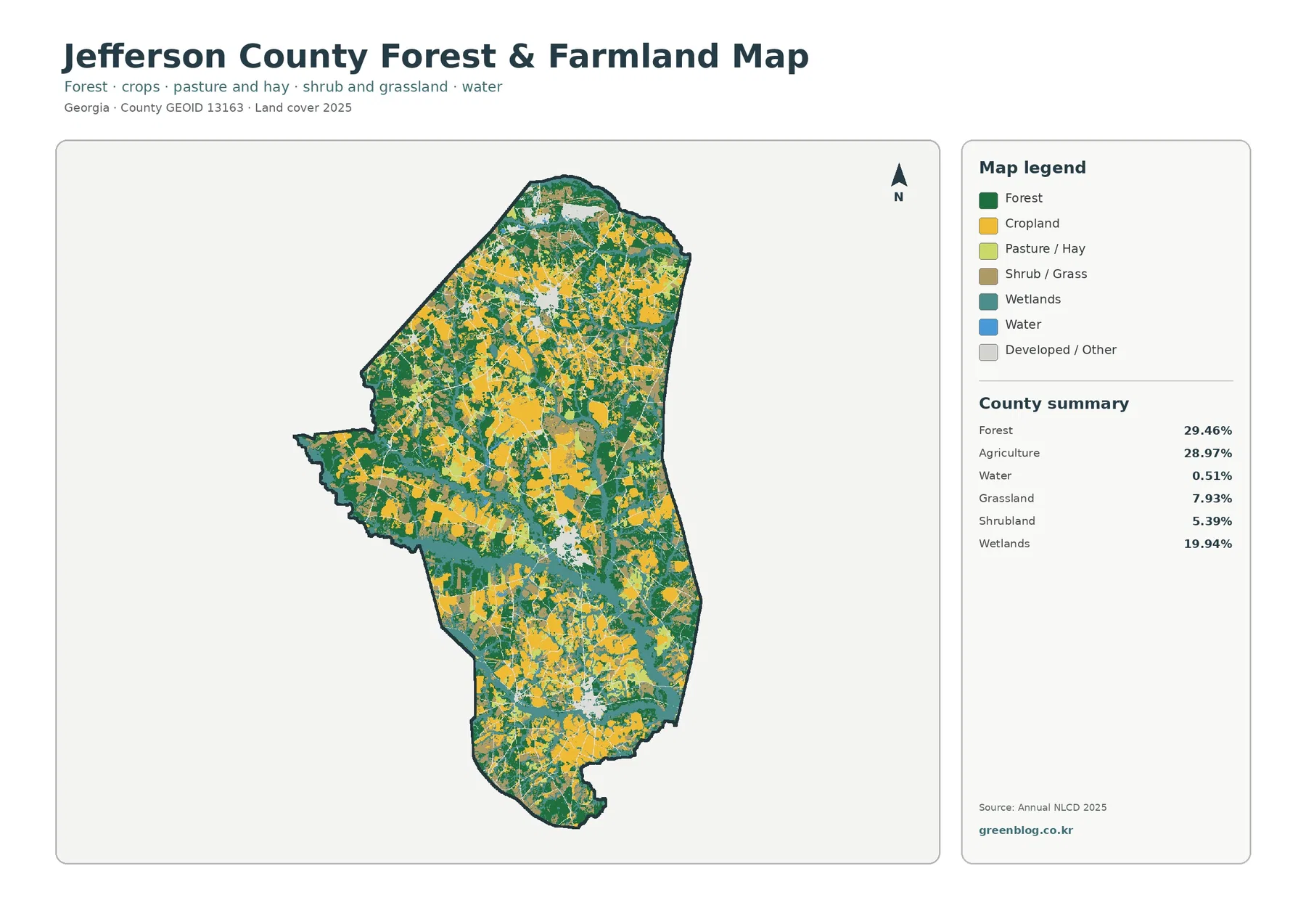
With developed and miscellaneous surfaces pushed into the background, the green-yellow-teal pattern becomes easier to follow. Forest is extensive in the north and through broad central sections, but yellow agricultural blocks appear beside it rather than being confined to one corner. Similar alternation continues southward, where farms, woods, and smaller wet areas form a patchwork across the county.
The 28.97% agriculture figure is a broad land-cover class, not a farm ownership map. It cannot identify field boundaries, crop species, yields, irrigation systems, or management practices. Yellow cells are useful for seeing where agricultural cover is concentrated at county scale, but anyone studying a particular farm should move from this overview to current aerial imagery, USDA data, county parcel information, and local agricultural records.
Forest works the same way. The 29.46% share combines many wooded cells into one countywide category, but the map shows those cells as blocks, narrow links, and edges interrupted by farms and wetlands. Annual NLCD uses 30-meter raster cells, meaning each square is assigned a predominant class. Narrow tree lines, drainage strips, tiny ponds, and mixed edges can therefore appear simplified at this scale.
The difference between 19.94% wetlands and 0.51% open water is especially useful for interpretation. Blue water represents exposed water surfaces, while wetland classes can include vegetation and seasonally or persistently wet ground. A county can therefore contain a large amount of teal wetland cover without having a comparable area of blue lakes or river surface. The map is showing different surface classes, not contradictory measurements.
Impervious cover stays low countywide but spikes in a few built centers
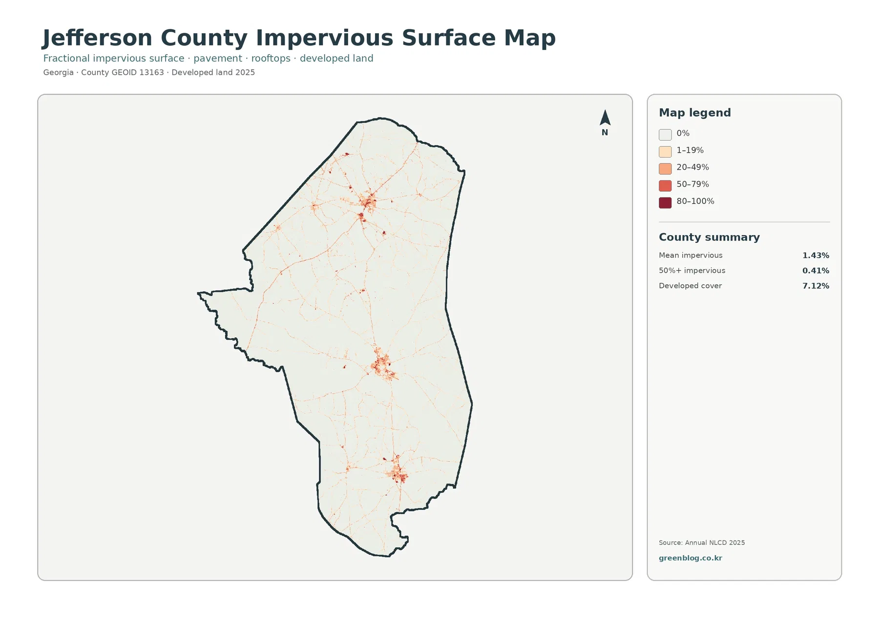
The supplied summary reports 7.12% developed land, but mean impervious cover is only 1.43%. Just 0.41% of the county is mapped at 50% or greater impervious surface. The gap is important: developed classes can include lawns, trees, open soil, and other permeable areas around buildings and roads, while the impervious layer isolates the harder surfaces that shed water more readily.
Most of the county is nearly white on this map. Stronger orange and red tones gather in roughly three larger clusters, and thin lines radiate outward through otherwise low-impervious areas. Those linear marks resemble a road network, but road names are not included. A specific line should be checked against a current transportation map before it is identified as a particular highway or corridor.
A county average of 1.43% can hide this contrast between concentrated built areas and extensive rural surroundings. Farms, forests, and wetlands occupy large spaces with very little hard-surface shading, while a small number of settlements carry much higher percentages. For a presentation, that makes the impervious map useful when the question is not simply “where is developed land?” but “where are roofs and pavement most concentrated?”
Impervious cover should not be used by itself as a flood-risk map. Runoff depends on rainfall, slope, soils, drainage infrastructure, stream position, wetland storage, and many other factors. The map can identify places with more hard surface, but flood insurance, drainage design, and engineering decisions require current authoritative hydrologic and local infrastructure data.
The 1985–2025 endpoint comparison is widespread, not mainly urban
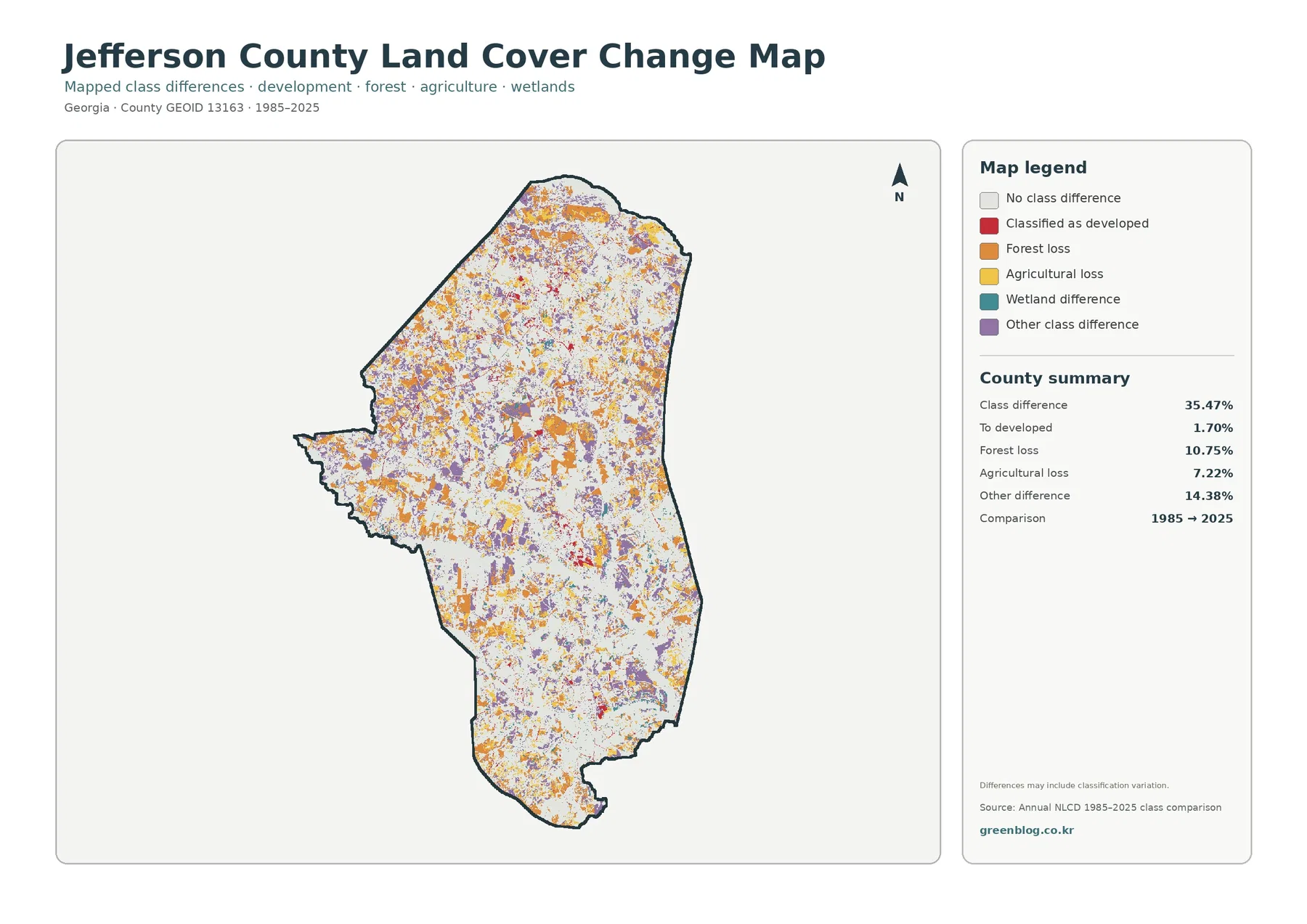
The map reports a total class difference of 35.47% between 1985 and 2025. That value is the share of cells carrying different endpoint labels, not the percentage of land that was damaged, cleared, or urbanized. The map itself notes that classification variation may be included. Differences in imagery date, seasonal conditions, mixed pixels, and classification methods can all influence an endpoint comparison.
Among the categories printed in the summary, 1.70% is classified as developed, 10.75% as forest loss, 7.22% as agricultural loss, and 14.38% as other difference. Orange forest-loss cells and purple other-difference cells are spread widely, while yellow agricultural-loss marks appear throughout many working-land areas. Red development-related differences are more localized around built clusters and some linear traces.
Wetland difference appears in the legend, but the supplied summary does not print a separate percentage for it. It would be misleading to estimate a rate from the colored pixels by eye or to treat a remainder calculation as an official statistic. The reliable approach is to report only the values supplied with the map and describe the visible distribution of unquantified categories without inventing precision.
“Forest loss” is also a classification statement, not a diagnosis of cause. A cell labeled forest in 1985 received another class in 2025, but that alone cannot distinguish timber harvest, conversion to farming, development, storm effects, regrowth cycles, or classification error. To establish what happened in a specific area, compare intermediate-year imagery and local records rather than relying on the two endpoints alone.
The Ogeechee River provides local context, but the wetland colors remain generalized
Georgia planning documents describe Jefferson County as part of the Coastal Plain and identify the Ogeechee River as a protected river corridor crossing the county. Regional planning material also notes a transition near the Georgia Fall Line southeast of Louisville. That background makes the county’s wetland pattern more meaningful, yet the supplied land-cover map does not contain elevation contours, river labels, or a legal corridor boundary.
For that reason, teal cells can be discussed as wetland cover associated with low and wet parts of the landscape, but they should not be traced as the exact Ogeechee channel or a regulatory buffer. A river study would be stronger if the land-cover map were paired with USGS hydrography, current aerial photography, elevation data, and the county or state river-corridor information used for planning.
The same principle applies to agriculture. UGA Extension provides useful local context about field crops and farm management, while the map shows where agricultural cover is broadly present. One source explains activity and production; the other describes surface classification. Keeping those roles separate prevents a reader from assuming that a yellow cell identifies a specific crop or that a county production statistic can be assigned to a particular field.
How to choose among the four maps
Use the 2025 countywide map first when the goal is to explain Jefferson County in one image. It shows the near-even forest and agriculture shares, the broad wetland presence, the smaller developed clusters, and the limited amount of open water together. For a county profile or introductory slide, this is the clearest starting point because it establishes the overall balance before the reader sees a more specialized layer.
Choose the forest-and-farmland map when the discussion centers on working land, wooded areas, wet ground, or habitat context. The reduced emphasis on developed and miscellaneous classes makes boundaries between major rural covers easier to follow. If the subject is settlement intensity, pavement, roofs, or the contrast between built centers and rural land, the impervious map answers that narrower question more directly.
The 1985–2025 map works best after a current-condition map. Its colors refer to endpoint differences, not today’s land-cover classes. Showing it second helps prevent red difference cells from being mistaken for all present-day development or orange cells from being read as current forest. It also encourages a more careful question: which areas changed classification, and what additional evidence is needed to understand why?
Each downloadable JPG is 2480 × 1754 pixels. That size works for screens, documents, classroom handouts, and many presentation layouts, but the package does not identify the files as meeting an A3 high-resolution reference. A large poster should be proof-printed first, and the original proportions should be preserved. Enlarging the image can make colors easier to see, but it cannot create parcel-level detail that the source raster never contained.
Reading limits that matter before using the files
Annual NLCD is designed for consistent regional land-cover comparison, not site surveying. Its 30-meter cells generalize mixed surfaces, so narrow roads, small ponds, tree lines, drainage ditches, and tiny clearings can be simplified or omitted. This is appropriate for county-scale patterns, but decisions about property boundaries, construction, permits, wetland jurisdiction, or exact acreage need finer and more current sources.
The current map represents the supplied 2025 observation year. Construction, timber activity, crop rotation, vegetation recovery, storm impacts, or water conditions after that date may not appear. If the question depends on what is on the ground now, compare the map with newer aerial imagery and local GIS records before drawing a conclusion about a specific site.
These limitations do not reduce the value of the maps for broad comparison. They simply define the scale at which the maps are most reliable. Used together, the four views show that Jefferson County combines substantial forest, agriculture, and wetlands; concentrates hard surfaces in relatively small centers; and contains widespread endpoint classification differences that deserve more detailed follow-up where a project requires it.
Frequently Asked Questions
Is forest or agriculture the larger land-cover class in Jefferson County?
Forest is slightly larger at 29.46%, compared with 28.97% agriculture. The difference is only 0.49 percentage points, and the map shows both classes repeatedly across the county. It is more accurate to describe Jefferson County as having a near-even forest-and-farm balance than to present one class as overwhelmingly dominant.
Why are wetlands 19.94% while open water is only 0.51%?
Open water represents exposed water surfaces, whereas wetland classes can include vegetated or seasonally wet ground. The two categories describe different surfaces, so a large wetland share does not require a similarly large lake or river area. The teal wetland cells should also not be treated as a legal wetland boundary.
Does the 35.47% class difference mean that much of the county was developed?
No. The 35.47% figure is the share of cells with different classifications at the 1985 and 2025 endpoints. The map lists only 1.70% as classified to developed, along with 10.75% forest loss, 7.22% agricultural loss, and 14.38% other difference. Causes and timing require intermediate imagery and local evidence.
Sources and Reference Data
- MRLC Annual NLCD Data – official access point for annual land-cover and comparison products
- USGS Annual NLCD Land Cover Classification – class definitions for forest, developed land, agriculture, wetlands, water, and related surfaces
- U.S. Census Bureau TIGER/Line Shapefiles – official county-boundary reference data
- Jefferson County Government – County Profile – county-seat and community information for Jefferson County
- UGA Extension Jefferson County – Agriculture & Natural Resources – local agriculture and natural-resource programs and guidance
- Georgia DCA – Jefferson County Comprehensive Plan – county natural-resource context, including the Ogeechee River corridor
Map File Information
The ZIP contains four original JPG maps for comparing Jefferson County's 2025 land cover, forest and farmland, impervious surfaces, and 1985–2025 endpoint class differences.
- Included Files: Use only the versions confirmed in the article and supplied images
- File Type: Use the confirmed download contents
- Intended Use: Printing, education, presentations, and map-based projects
Related Maps
- Appling County Georgia Land Cover Map
- Atkinson County Georgia Land Cover Map
- Bacon County Georgia Land Cover Map
Green Map creates custom-edited map images using open geographic data sources such as geoBoundaries, Natural Earth, OpenStreetMap, and government open data.
These maps are edited visual materials, not raw data files, and are provided for education, documents, presentations, and graphic reference.