The Greene County Georgia Land Cover Map is dominated by forest, but the county is not visually uniform. The supplied 2025 summary puts forest at 60.03%, agriculture at 12.14%, developed land at 9.00%, grassland at 5.61%, and shrubland at 4.65%. A large lake system cuts into the western and southwestern side, while built surfaces form distinct clusters near the water and at several inland locations.
This page compares four views: current land cover, forest and farmland, impervious surface and developed land, and the 1985–2025 class-difference map. The WebP images are placed beside the discussion, and the four original 2480 × 1754-pixel JPG maps are available together in one ZIP below. They work well for county profiles, lessons, presentations, and broad landscape comparison, but they are not parcel, zoning, survey, or permit maps.
Table of Contents
A forest majority surrounds smaller farm and developed openings
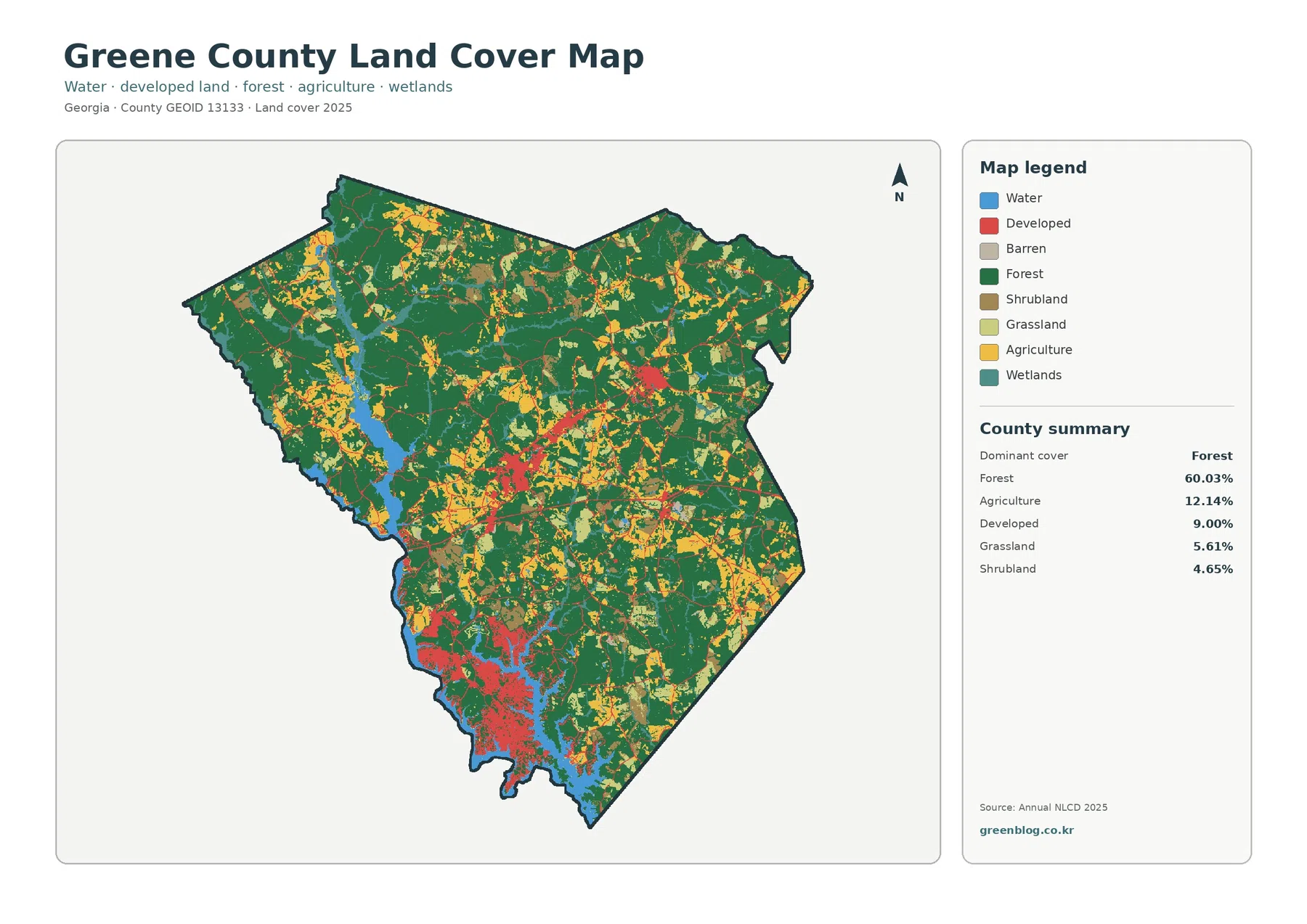
Dark green forest is the continuous element in the countywide view. It occupies broad areas in the north and east and keeps reappearing through the middle and south instead of being confined to one corner. At 60.03%, forest is large enough that most other classes read as openings or clusters within a wooded county rather than as equally extensive zones.
Agriculture is the next large class at 12.14%. Yellow areas appear in many separate blocks, especially through the northwest, interior, and southeastern parts of the county. The pattern is fragmented rather than a single farm belt. That matters when comparing Greene County with counties where agriculture forms broad uninterrupted plains, because here working land repeatedly meets forest along irregular edges.
Developed cover accounts for 9.00%. Red areas stand out most strongly in the southwest beside the large water body and in several smaller inland concentrations. Thin traces connect some of these clusters, but the map does not label roads, so they should not be assigned route names from appearance alone. The important point is concentration: built cover is visually strong in a few places even though it occupies less than one-tenth of the county.
The focused vegetation summary adds 4.54% open water and 3.83% wetlands. Most of the obvious blue water lies along the western and southwestern side, with long arms reaching inland. Wetland cells occur near some water edges and in scattered interior patches. These classes describe surface cover; they do not establish shoreline ownership, regulated wetland boundaries, flood zones, or public access.
Land cover is a classification of what is on the ground surface as represented in remotely sensed data. It is different from land use, zoning, ownership, and development rights. A developed cell can still contain grass and trees, and a forest cell does not automatically identify a national forest parcel or conservation easement. Keeping those distinctions clear is especially important in Greene County, where mapped forest, planned development, lakefront communities, and public forest lands overlap in the broader landscape but are governed by different datasets.
Hard surfaces are concentrated rather than countywide
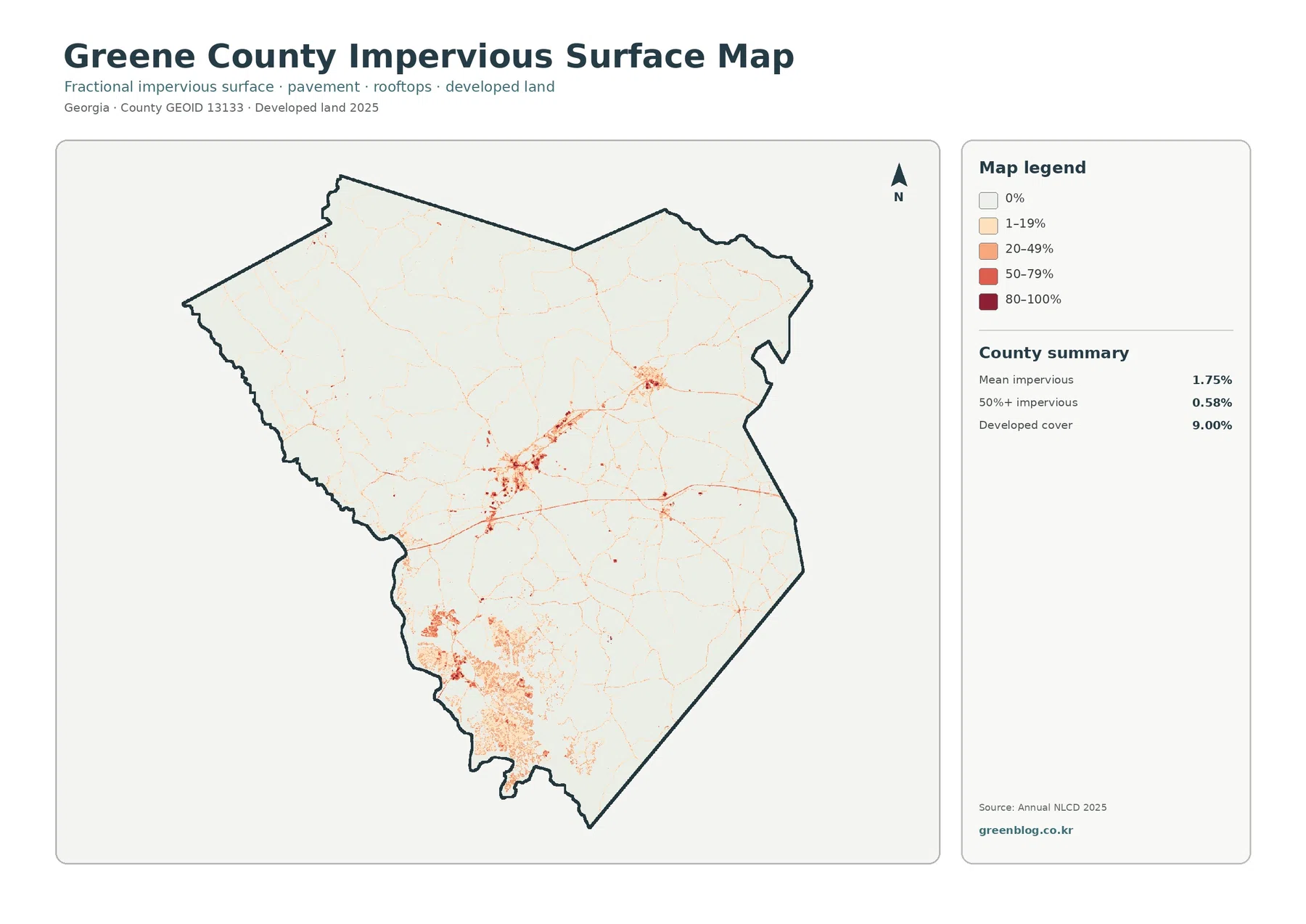
Mean impervious cover is only 1.75%, and 0.58% of the county is mapped at 50% impervious or greater. Those values are far below the 9.00% developed share. Developed land can include lawns, trees, bare ground, and other permeable surfaces around homes, businesses, and roads, while the impervious layer isolates the harder portions such as roofs and pavement.
The strongest impervious signal forms a broad southwestern concentration beside the lake system visible in the other maps. Smaller clusters appear inland, and fine lines extend away from them. Large portions of Greene County remain close to the palest category, which fits the countywide mean: a few built centers are being averaged together with a much larger rural and forested area.
Greene County’s comprehensive plan helps identify the southwest context without turning the land-cover image into a zoning map. The county describes Lake Oconee as a major growth and recreation area and notes the Reynolds Lake Oconee community along the lake. That official description is consistent with the strong hard-surface concentration near the water, but the preview cannot define the boundary of Reynolds, identify a specific subdivision, or show which parcel contains a building.
Impervious cover can be useful in runoff discussions because pavement and rooftops shed water differently from forest or soil. It should not be used by itself as a flood-risk map. Elevation, rainfall, drainage, soils, streams, lake levels, culverts, and engineered stormwater systems all matter. Here the layer is best treated as a map of surface hardness and development intensity, not a prediction of flooding.
Forest and farmland become easier to separate when built cover fades
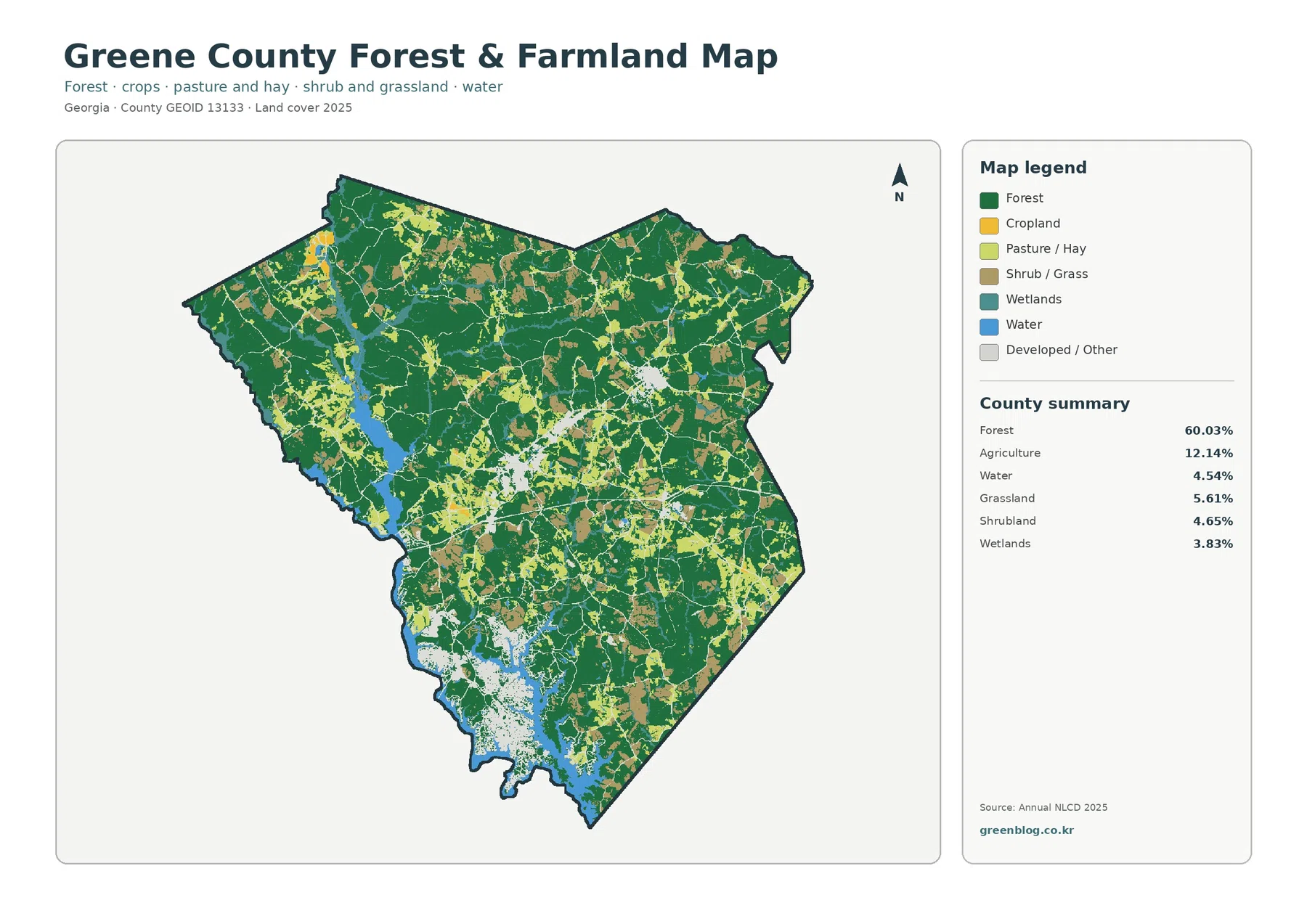
With developed areas faded, forest clearly connects across much of the county. Agricultural colors appear as irregular openings rather than a continuous band. This makes the 60.03% versus 12.14% contrast easier to understand: farming is meaningful and widespread, but it occupies islands and corridors within a much larger wooded setting.
The package reports agriculture as a combined 12.14% value. Cropland and pasture or hay have separate legend colors, yet their individual percentages are not supplied in the summary. It would therefore be misleading to estimate exact shares from the image. The useful comparison is geographic—where farm-related cover occurs, how large the patches are, and where they meet forest or water.
Grassland contributes 5.61% and shrubland 4.65%. Both are visible as smaller pieces among the dominant forest and farm classes. Some narrow strips may look like distinct field edges, but Annual NLCD is a raster product rather than a parcel layer. A fence line, tree row, ditch, small meadow, or narrow road may be represented by the predominant class of a 30-meter cell instead of appearing as a precise boundary.
Open water at 4.54% is especially important because it is not spread evenly. The large western and southwestern water body occupies a relatively modest countywide percentage but shapes a long shoreline and touches several developed areas. Wetlands at 3.83% are a separate class and can include vegetated or saturated surfaces that do not look like open blue water. Water and wetland percentages should therefore not be combined as though they describe the same surface condition.
Lake Oconee and Oconee National Forest give the map local meaning
The county’s 2025 comprehensive plan describes Lake Oconee in the southwest near the Putnam County line and gives its area as about 19,000 acres. It also identifies the lake as a major recreational and development influence. That context helps explain why the southwest is unusual on all four supplied maps: a large open-water system, shoreline development, hard-surface concentrations, and change signals appear close together there.
Northern Greene County has a different context. The same county plan says Oconee National Forest covers roughly 27,000 acres in the northern part of the county and notes the importance of forestry to the local economy. The land-cover map does not draw the national forest boundary, but its broad northern forest cover is compatible with a county that contains substantial public forest acreage.
The Oconee River is another named feature in the county plan and flows into Lake Oconee. The supplied land-cover previews, however, do not label individual rivers. Blue and teal cells can help locate major water and wet-ground patterns, but a named river corridor, protected-river buffer, or jurisdictional wetland should come from current hydrography and regulatory maps rather than from the color pattern alone.
This is also why the county’s Future Land Use Map should not be substituted for the land-cover image, or vice versa. Future land use is a planning framework for how areas may be guided over time. Annual NLCD describes classified surface conditions for an observation year. A wooded parcel can have a future planning designation, and a developed land-cover cell can sit inside a much larger planning district. The two products answer different questions.
The 34.80% endpoint difference needs cautious interpretation
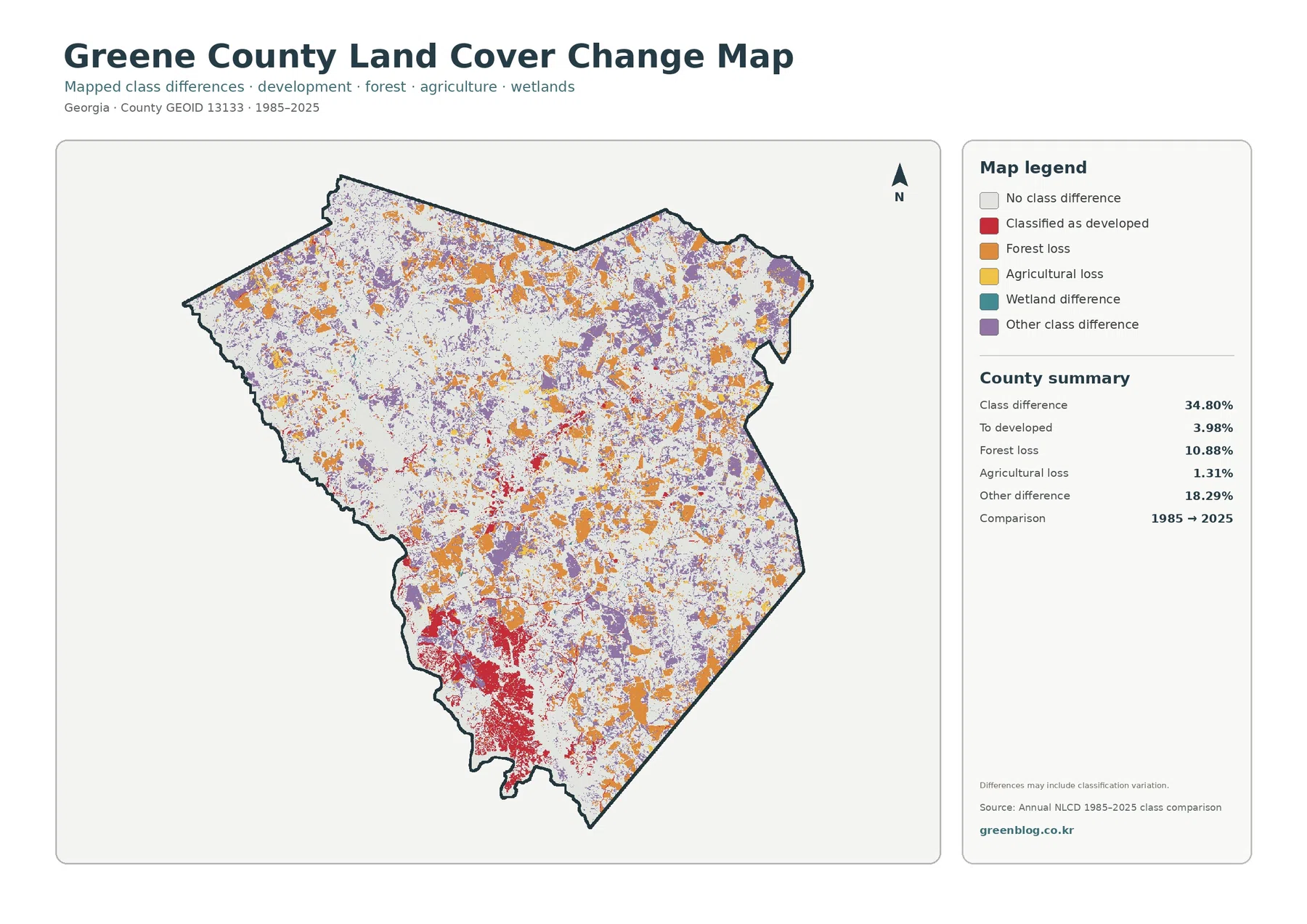
The change map reports a total class difference of 34.80% between 1985 and 2025. That number should not be described as the percentage of Greene County that was damaged, cleared, or urbanized. It is the share of cells whose endpoint classifications differ, and the map itself warns that classification variation can be part of the result.
The summary lists 10.88% forest loss, 3.98% classified as developed, 1.31% agricultural loss, and 18.29% other difference. Orange forest-loss cells are widely scattered, while purple other differences appear across many parts of the county. Red developed-conversion cells are more concentrated, including a strong southwestern group near the lake and smaller inland patches.
Neither “forest loss” nor “agricultural loss” identifies a cause. A cell may have changed because of timber harvest, regrowth, farming, construction, vegetation succession, disturbance, water conditions, or differences in classification. Determining what happened requires intermediate imagery and local records. The endpoint map is useful for screening where to look, not for assigning a project, date, or cause.
The legend includes wetland difference, but the supplied summary does not provide a separate wetland-difference percentage. It would be inappropriate to subtract the listed categories from 34.80% and label the remainder as an official wetland value. The safe approach is to discuss the visible wetland-difference locations without inventing a number.
Choose the map that matches the question
For a general county profile, start with the 2025 overview. It places forest, agriculture, development, grassland, shrubland, wetlands, and water in one frame, making the forest majority and the Lake Oconee side of the county immediately understandable. The focused vegetation map is better when the question is about farm openings, forest continuity, or the difference between open water and wetlands.
Use the impervious layer when the topic is concentration of hard surfaces. It distinguishes the intense cores from the broader 9.00% developed class and helps explain why a county can have visible residential and commercial clusters while still recording only 1.75% mean impervious cover. It is also more suitable than the general map for illustrating where pavement and rooftops are concentrated.
The 1985–2025 comparison belongs later in a presentation because its colors mean change categories rather than current land cover. Showing it first can cause viewers to mistake red for today’s developed area or orange for current forest. Pair it with the 2025 map and compare the same place in both views so current condition and endpoint difference stay separate.
For cross-county comparison, keep the year and class system consistent. Greene County’s useful reference values are 60.03% forest, 12.14% agriculture, 9.00% developed cover, 4.54% water, 3.83% wetlands, and 1.75% mean impervious cover. Percentages alone are not enough, however. A second county with the same developed share could have one compact town, several dispersed centers, or a shoreline pattern very different from Greene County.
Scale, mixed pixels, and observation dates limit detail
Annual NLCD is raster based and derived from Landsat imagery at 30-meter resolution. Each cell receives a predominant class even when the real ground contains a mixture of trees, grass, pavement, water, and buildings. Mixed cells are especially important along the intricate Lake Oconee shoreline and at boundaries where forest meets fields or development.
Zooming the JPG makes the symbols and small patches easier to see, but it cannot recover parcel detail that is absent from the source grid. Narrow roads, individual houses, small ponds, thin riparian strips, and property lines may be simplified or merged with neighboring cover. Site-level questions should move to current high-resolution imagery, county GIS, survey information, and field verification.
The current maps represent the supplied 2025 observation year. Construction, timber activity, vegetation recovery, water-level changes, or other events after that date may not be present. The change layer compares two endpoints, 1985 and 2025, rather than recording every event during the forty-year interval. A location that changed more than once can have a simple endpoint relationship that hides its intermediate history.
Those limitations do not reduce the value of the set for county-scale work. They define the proper scale of use. The maps are strong for explaining broad forest coverage, farm openings, shoreline development, hard-surface concentration, and places with endpoint class differences. They are weak for legal boundaries, parcel decisions, precise wetland delineation, engineering design, or determining why an individual cell changed.
Preparing the four original JPG maps for a report or lesson
The download contains one JPG for current land cover, forest and farmland, impervious surface and developed land, and 1985–2025 land-cover change. Each image measures 2480 × 1754 pixels. The supplied asset manifest does not mark these files as meeting an A3 high-resolution reference, so check legend text and line clarity with a test print before using them at a large physical size.
A simple presentation sequence is overview first, focused vegetation second, impervious surface third, and change last. For a shorter report, choose the overview plus the one specialized map that answers the main question. This keeps the graphics readable and prevents viewers from treating four different legends as though they measure the same thing.
Frequently Asked Questions
Is Greene County mostly forest?
Yes, in the supplied 2025 summary forest is the dominant class at 60.03%. Agriculture follows at 12.14% and developed land at 9.00%. The map also shows 4.54% open water and 3.83% wetlands in the focused vegetation summary, with the largest obvious water system on the western and southwestern side.
Why does the Lake Oconee side look developed when mean impervious cover is only 1.75%?
Development is concentrated rather than evenly spread. The southwest contains a strong built cluster, but large forested and rural areas elsewhere have very little hard surface. Also, the 9.00% developed class can include grass, trees, and open soil, while impervious cover isolates roofs, pavement, and similar materials. Only 0.58% of the county is mapped at 50% impervious or greater.
Does the 34.80% class difference mean one-third of the county was physically transformed?
No. It is the share of cells with different endpoint classifications in 1985 and 2025, and classification variation can contribute to the result. The listed components include 10.88% forest loss, 3.98% classified as developed, 1.31% agricultural loss, and 18.29% other difference. The map is a screening tool for locations that deserve closer historical review.
Sources and Reference Data
- MRLC Annual NLCD Data – official access point for annual land-cover and comparison products
- USGS Annual NLCD Land Cover Classification – class definitions and guidance for forest, agriculture, wetlands, developed land, and related surfaces
- USGS EROS – Annual NLCD Spatial Resolution – official explanation of the 30-meter raster resolution
- U.S. Census Bureau TIGER/Line Shapefiles – official county-boundary reference for Greene County
- Greene County Comprehensive Plan / Future Land Use Plan – official local context for Lake Oconee, Oconee National Forest, growth, and planning
- UGA Cooperative Extension – Greene County Agriculture & Natural Resources – local agriculture and natural-resource information and services
Map File Information
The ZIP contains four original JPG maps for comparing Greene County's forest majority, farm openings, Lake Oconee-area development, impervious surfaces, and 1985–2025 class differences.
- Included Files: Maps described in this article
- File Type: ZIP archive available from the download link below
- Intended Use: Printing, education, presentations, and map-based projects
Related Maps
- Appling County Georgia Land Cover Map
- Atkinson County Georgia Land Cover Map
- Bacon County Georgia Land Cover Map
Green Map creates custom-edited map images using open geographic data sources such as geoBoundaries, Natural Earth, OpenStreetMap, and government open data. These maps are edited visual materials, not raw data files, and are provided for education, documents, presentations, and graphic reference.