Fulton County is one of the clearest Georgia examples of why a countywide percentage needs a map beside it. Developed land accounts for 65.71% of the 2025 classification, yet the long county outline contains very different landscapes. Much of the central and northern portion is heavily built, while the broad southwestern end contains far more forest and a small but visible share of agricultural cover. These four maps separate current land cover, forest and farmland, impervious surface, and 1985–2025 class differences.
The WebP images below are intended for quick viewing in the article. A single ZIP download contains the four original JPG maps for reports, lessons, presentations, or countywide reference work. Land cover should be read as a satellite-based classification of what is on the ground, not as zoning, ownership, parcel boundaries, or permission to develop a site.
Table of Contents
A long county shape puts several very different urban and rural settings in one boundary
Fulton County stretches more than 70 miles from end to end, according to the county government, and its unusual outline matters when interpreting the maps. The northern block contains cities such as Alpharetta, Johns Creek, Milton, Roswell, and Sandy Springs. Atlanta sits in the long central portion, while communities including College Park, East Point, Fairburn, South Fulton, Palmetto, and Chattahoochee Hills extend through the southern half. A county average therefore combines dense metropolitan surfaces with much greener land farther southwest.
That contrast is visible before any percentage is read. The central section is dominated by developed colors with relatively small patches of forest. The northern block is also extensively developed, though woodland fragments remain distributed between built areas. Farther south, the balance begins to change, and the southwestern end contains large connected-looking forest areas with scattered agricultural cover. Treating Fulton as one uniform urban surface would miss one of the strongest patterns in the supplied maps.
The county government lists 15 incorporated cities, including Atlanta, but the land-cover images do not draw municipal boundaries. City names are useful geographic context rather than exact overlays for the colors. If a reader needs a land-cover percentage for Alpharetta, South Fulton, or another municipality, the city boundary would need to be combined with the underlying raster data in a separate analysis. The percentages on this page describe the entire county.
Developed cover leads at 65.71%, but its density is not uniform
The 2025 county summary reports 65.71% developed cover, 27.01% forest, 3.66% agriculture, 1.68% wetlands, 1.11% water, 0.62% grassland, and 0.13% shrubland. Developed land is clearly the largest category, yet the map shows that its share is concentrated differently from place to place. The middle and much of the north are dominated by red, while the lower southwestern portion contains a much stronger green forest presence.
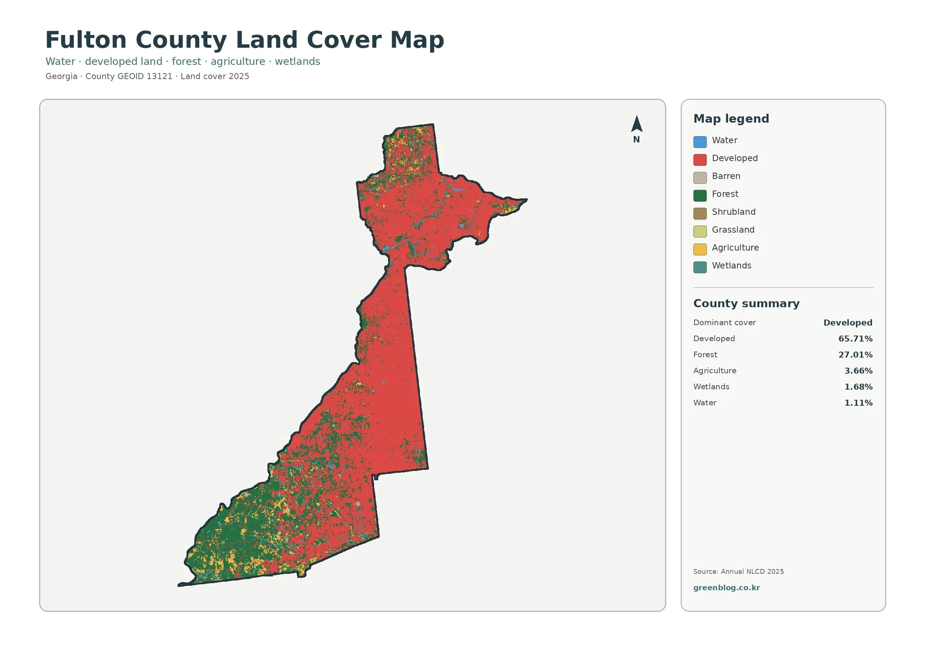
The 27.01% forest share deserves attention because it is not evenly scattered as tiny remnants. Large green areas occupy much of the southwestern end, and smaller wooded patches remain throughout parts of the north and south. Agriculture is only 3.66% countywide, but yellow agricultural classes are more noticeable in the greener southwest than in the dense central corridor. The spatial arrangement explains more than the county totals by themselves.
A developed land class is broader than pavement and rooftops. Lower-density residential areas may include houses, streets, lawns, gardens, and trees but still fall within a developed class. That distinction becomes especially important in Fulton County, where the general land-cover map can appear almost continuously urban through parts of the county. The impervious-surface view later in the page narrows the question to the amount of hard, water-resistant surface within those developed areas.
Impervious surface separates the built footprint from the broader developed category
Fulton County has a mean impervious value of 23.55%, and 19.12% of the county is mapped at 50% impervious or higher. Impervious surface refers to roofs, pavement, parking lots, and similar constructed surfaces that do not readily absorb rainfall. The difference between 23.55% mean imperviousness and 65.71% developed cover is not a contradiction. It reflects the fact that many developed cells also contain vegetation or other permeable ground.
The impervious map is darkest through the central metropolitan section and remains strong across much of the northern block. Higher-value patches form a dense network rather than a single isolated center. The southwest is much lighter overall, although narrow and localized developed features remain. This makes the map useful for distinguishing a heavily built core from lower-density developed land that may still contain substantial tree or grass cover.
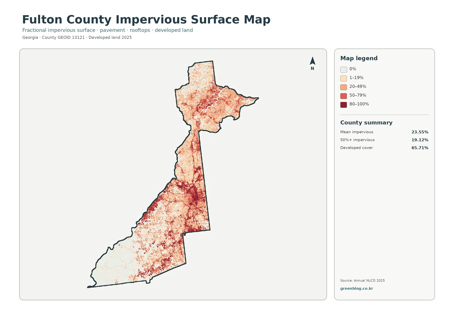
For presentations, pairing this image with the general land-cover map is more informative than using either one alone. The general map answers where land is classified as developed, forest, agriculture, wetland, water, and other broad classes. The impervious map asks how much of the surface is physically covered by hard constructed materials. A suburban neighborhood can therefore appear developed on one map but only moderate or light on the other.
Imperviousness should not be converted directly into a flood-risk conclusion. Hard surfaces can affect runoff, but flooding also depends on rainfall, topography, streams, drainage systems, soils, and site design. This map is appropriate for locating concentrations of built surface at a county scale. Flood hazard, stormwater engineering, or property-level drainage questions require additional datasets.
The forest and farmland view reveals a greener southwest that the urban colors can obscure
The forest-and-farmland map reduces the visual weight of developed and other classes so the remaining natural and working-land cover is easier to see. Fulton County’s southwestern end becomes the dominant feature in this version. Forest occupies broad areas, agricultural classes appear in scattered patches among the green, and the central urban corridor becomes comparatively pale. The northern section still contains woodland fragments, but they are more broken up by development.
Agriculture represents just 3.66% of the county total, so Fulton is not a farm-dominated county. Even so, the map shows that agricultural cover has a recognizable geographic concentration rather than being evenly spread. Much of it appears in the southwest alongside larger forest areas. This is a useful reminder that a small countywide percentage can still matter within a specific part of a long, irregular county.
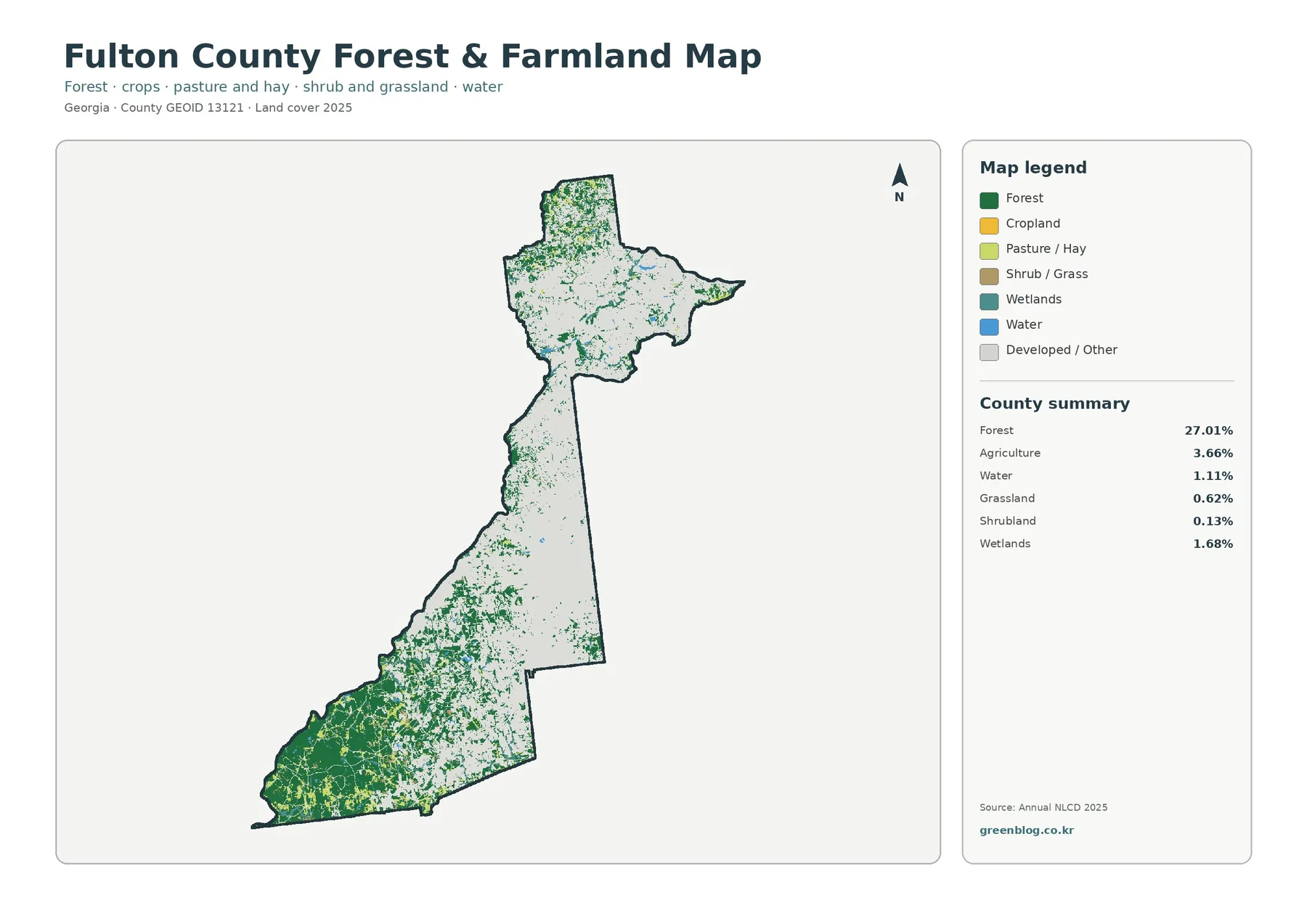
Forest should also be read as a land-cover class, not as a legal conservation designation. A green pixel does not tell the reader whether land is public or private, protected or unprotected, actively managed or unmanaged. Likewise, agricultural classes indicate the surface classification and do not identify a farm parcel, crop owner, or zoning category. Those questions need parcel, planning, or land-management records.
Wetlands account for 1.68% and water 1.11% in the 2025 summary. They are relatively small shares compared with developed land and forest, but the map includes narrow and scattered occurrences that can matter locally. Because this article’s maps are designed for countywide comparison, they should not be used to delineate a wetland edge or stream boundary. Detailed hydrology or wetland work requires specialized sources and finer local review.
The 1985–2025 comparison highlights widespread class differences, especially changes to developed
The change map compares the land-cover class at two endpoints, 1985 and 2025. It reports a class difference across 35.32% of the county. Of that countywide area, 21.32% is shown as changed to a developed class by 2025, while forest loss is listed at 1.35%, agricultural loss at 0.44%, and other class differences at 12.14%. These numbers describe differences between classified endpoints; they are not a direct measurement of construction acreage or a complete history of every change during the forty-year interval.
Red areas marking change to developed are especially prominent in the northern block and through portions of the central and southern urbanized sections. The current map already shows extensive development in these areas, but the change layer adds a time dimension by identifying cells whose endpoint class is different. In the southwestern forest-rich end, the change pattern is more mixed and the white “no class difference” background is more visible.
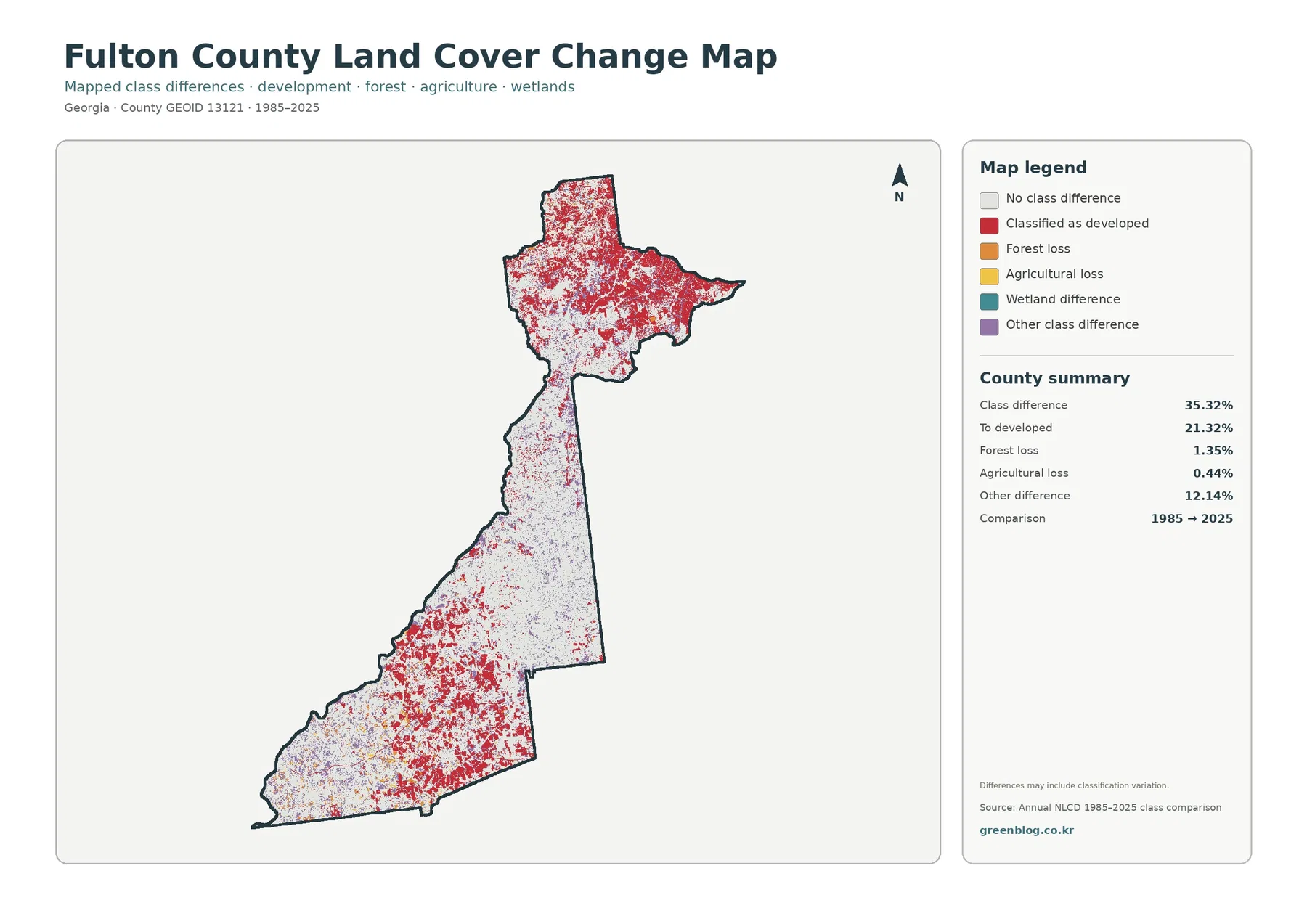
The map itself warns that differences can include classification variation. Annual NLCD is raster based at 30-meter spatial resolution, so each grid cell receives a representative class even when the ground contains a mix of roofs, trees, roads, lawn, bare soil, or water. Changes in imagery, classification methods, or mixed-pixel conditions can affect the endpoint labels. A small colored patch should therefore be treated as a place to investigate, not automatic proof of a specific development or clearing event.
A two-date comparison also cannot tell when a change occurred. A site may have changed more than once between 1985 and 2025, and two endpoints can hide those intermediate transitions. Anyone studying a particular neighborhood, construction period, or vegetation change should add intermediate Annual NLCD years, aerial imagery, and local planning or parcel records. The supplied change map is best used to locate broad patterns and candidate areas for closer review.
North, center, and southwest each answer a different land-cover question
In north Fulton, the useful comparison is between extensive development and the woodland fragments that remain inside a heavily urbanized setting. The general map shows red developed cover across most of the block, while the forest-and-farmland version makes remaining green patches easier to identify. The impervious layer then distinguishes areas with concentrated hard surfaces from developed neighborhoods that still include more vegetation.
The central part of the county is different because the outline narrows and the built pattern becomes especially continuous. This is where the distinction between developed cover and impervious density is visually strongest. For a reader discussing the Atlanta-area urban core, the general map gives the broad class pattern while the impervious map better communicates where constructed surface is most concentrated. Neither image should be interpreted as a street map or municipal boundary map.
The southwest reverses the emphasis. Forest is the major visual feature, agricultural classes are easier to notice, and impervious values are generally lower. This portion prevents the countywide 65.71% developed statistic from being read too literally across every location. It also illustrates why long counties can contain land-cover settings that would look like separate regional types if they were viewed without the county boundary.
Using these three broad zones is a reading aid rather than an official regional classification. The supplied maps do not draw a north/central/southwest boundary. The division simply helps a reader describe the strongest visible changes along the elongated county. When precise municipal or planning districts matter, an official boundary layer should be added instead of inferring them from the land-cover colors.
Choose the map by the question rather than using all four as interchangeable images
For a single-page overview, the general land-cover map is the strongest starting point. It combines developed land, forest, agriculture, wetlands, water, and smaller classes in one view. The reader can immediately see why Fulton is urban overall while still containing a large forested southwest. It also works well when comparing Fulton with another Georgia county using the same 2025 classification scheme.
The forest-and-farmland map is better when the subject is tree cover, rural land, or the contrast between built areas and greener open land. Because development is visually subdued, smaller woodland fragments in the north become easier to see. The impervious map should be selected when the topic is constructed surface intensity, since it separates broad developed classification from the percentage of pavement, roofs, and other hard cover.
Use the change map only when a time comparison is actually needed. Its red color does not mean all present-day development, and white does not mean undeveloped land. Red marks cells classified as change to developed between the two endpoints; white indicates no class difference between 1985 and 2025. Keeping the legend and years visible prevents the most common misreading.
The four maps can also be paired rather than shown as a full set. General land cover beside impervious surface is useful for explaining development category versus built-surface density. Forest and farmland beside the change layer can show the current greener areas while identifying where endpoint classes differ. A focused two-map comparison often communicates more clearly than placing four similar-looking images on one slide without explanation.
Download the original JPGs with the legend and image size in mind
The article uses WebP previews for efficient browser display, while the download archive contains the four original JPG files: general land cover, forest and farmland, impervious surface, and 1985–2025 land-cover change. Each JPG is 2480×1754 pixels. Using the original file instead of a browser screenshot preserves the complete layout, including the title, legend, county summary, and comparison year.
The asset manifest does not mark these files as meeting the package’s A3 high-resolution reference. They should not be described as guaranteed A3 300-dpi print maps. If a large physical print is required, test the intended output size and make sure the legend and smaller summary text remain legible. For ordinary reports, classroom handouts, and presentation slides, scaling the original JPG down is preferable to enlarging the WebP preview.
Avoid cropping the legend from the impervious and change maps. The impervious map uses percentage bands, while the change layer uses endpoint-difference categories. A red tone in one map does not carry the same meaning as red in another. Preserving the title, legend, and year keeps the file understandable after it is copied into a document where the surrounding article text is no longer visible.
Scale and classification limits matter most when the map is used for local decisions
Annual NLCD uses 30-meter raster cells. At that scale, one cell can contain several real-world surfaces but still receive one representative land-cover label. A residential block may contain a roof, driveway, lawn, mature trees, and a narrow street, while a small stream or wooded strip may occupy less than a full cell. Countywide patterns remain useful, but the map should not be treated as a survey of parcel edges or individual structures.
The current-cover and impervious maps use the 2025 classification year. Construction, demolition, tree growth, clearing, or agricultural changes after that observation period may not appear. The change map uses only the 1985 and 2025 endpoints. For current site conditions or a specific year, check newer imagery and the relevant intermediate datasets rather than assuming the map represents today’s exact ground conditions.
Fulton County is particularly well suited to a multi-map reading because the urban-rural contrast is so strong. Start with general land cover to understand the countywide composition, move to the impervious layer for built intensity, use the forest-and-farmland view to bring out the greener southwest and woodland fragments, and consult the change map last for endpoint differences. That sequence keeps four related datasets from being mistaken for four versions of the same information.
Frequently Asked Questions
Does 65.71% developed cover mean nearly all of Fulton County is densely urban?
No. Developed is the largest 2025 class, but density varies substantially. The central and northern sections contain extensive built cover, while the southwestern end has broad forest and some agricultural cover. Forest still accounts for 27.01% countywide. The impervious map is the better tool for judging where hard constructed surfaces are especially concentrated.
Why is mean impervious surface only 23.55% when developed cover is 65.71%?
Developed land can include lawns, trees, and other permeable surfaces around homes and lower-density development. Impervious surface measures hard cover such as pavement and roofs more directly. Fulton County’s mean is 23.55%, and 19.12% of the county is mapped at 50% impervious or higher, so the two statistics describe different aspects of urban land.
Can the 35.32% class difference be reported as the amount of land physically changed since 1985?
It should not be reported that way. The figure represents raster cells whose classified land-cover category differs between the 1985 and 2025 endpoints. The map notes that classification variation can be included. Confirming actual construction, forest clearing, or agricultural conversion requires intermediate imagery, additional Annual NLCD years, or local records.
Sources and reference material
- USGS Annual NLCD Collection 1.2 Land Cover – land-cover classification and 30-meter raster context
- MRLC Annual NLCD Data – access to Annual NLCD land-cover and related products
- Fulton County Government – About Fulton County – county shape, geographic extent, and north/south context
- Fulton County Government – Cities in Fulton County – official list of Fulton County municipalities
- U.S. Census Bureau TIGER/Line Shapefiles – county boundary data
Map File Information
The four original JPG land-cover maps for Fulton County are provided together in one ZIP file.
- Included Versions: General land cover, forest and farmland, impervious surface, and 1985–2025 land-cover change
- Printable Size: 2480×1754 pixels each
- File Type: ZIP containing four JPG files
Related Maps
- Appling County Georgia Land Cover Map
- Atkinson County Georgia Land Cover Map
- Bacon County Georgia Land Cover Map
Green Map creates custom-edited map images using open geographic data sources such as geoBoundaries, Natural Earth, OpenStreetMap, and government open data.
These maps are edited visual materials, not raw data files, and are provided for education, documents, presentations, and graphic reference.