Wetlands are the defining feature of the supplied 2025 maps for Clinch County. They cover 45.50% of the county, while forest accounts for 30.78% and developed land only 5.61%. The Clinch County Georgia Land Cover Map therefore begins with a very different picture from a suburban county: wet ground and wooded land dominate, and the strongest built surfaces are limited to a few compact concentrations.
This page compares four views of the same county: current land cover, forest and farmland, impervious surface, and mapped class differences between 1985 and 2025. The WebP images are placed with the explanations below, while the four original 2480 × 1754-pixel JPG maps are available together in one ZIP for county profiles, lessons, presentations, and broad regional comparison.
Table of Contents
A county where wetlands outweigh built land by a wide margin
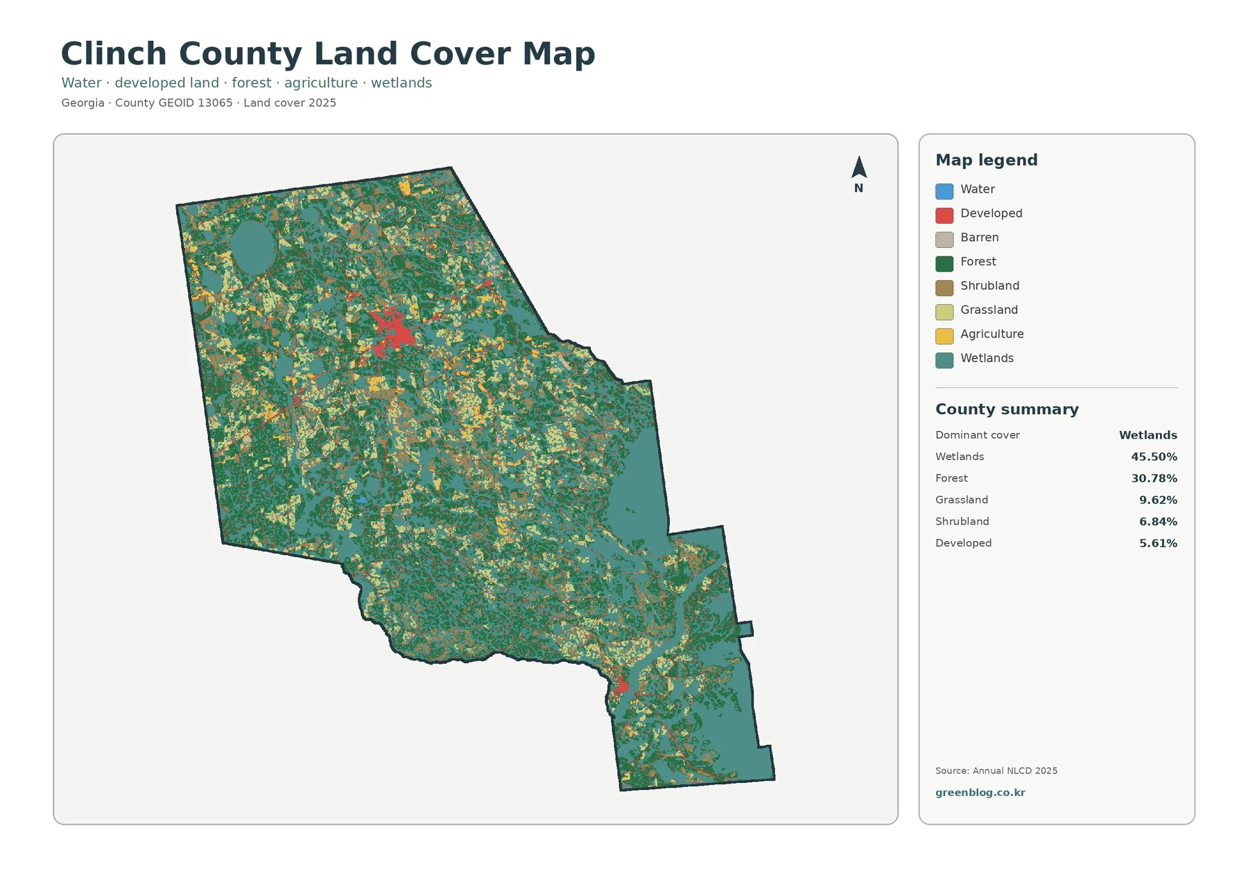
The summary beside the countywide map puts wetlands first at 45.50%. Forest follows at 30.78%, grassland at 9.62%, shrubland at 6.84%, and developed land at 5.61%. Those percentages explain why most of the map is green or teal rather than red. The landscape is not uniform, however. Open vegetation and smaller developed areas interrupt the larger wetland and forest pattern across many parts of the county.
Large teal areas are especially noticeable through the eastern and southeastern portions of the mapped county, but wetlands also appear as smaller blocks and bands elsewhere. Forest is broadly distributed rather than confined to one corner. The clearest developed concentration sits in the north-central interior, with a smaller cluster farther south. Thin developed traces extend away from those concentrations, but they remain minor compared with the county’s natural-cover classes.
Land cover should not be confused with zoning or legal land use. Annual NLCD classifies what the surface is predominantly covered by at the mapped resolution. A wetland-colored cell is not automatically a regulatory wetland boundary, and a developed cell is not a zoning district. Parcel ownership, building permission, flood regulation, and jurisdictional wetland decisions require current local or agency records that are designed for those purposes.
The countywide map is the best place to begin because it keeps all of the main classes together. It makes the scale of wetlands immediately clear while also showing that forest, grassland, and shrubland are important parts of the county. Once that overall pattern is established, the next map is more useful for separating wooded land, agriculture, open vegetation, and wet ground.
The forest-and-farmland view reveals how little land is mapped as agriculture
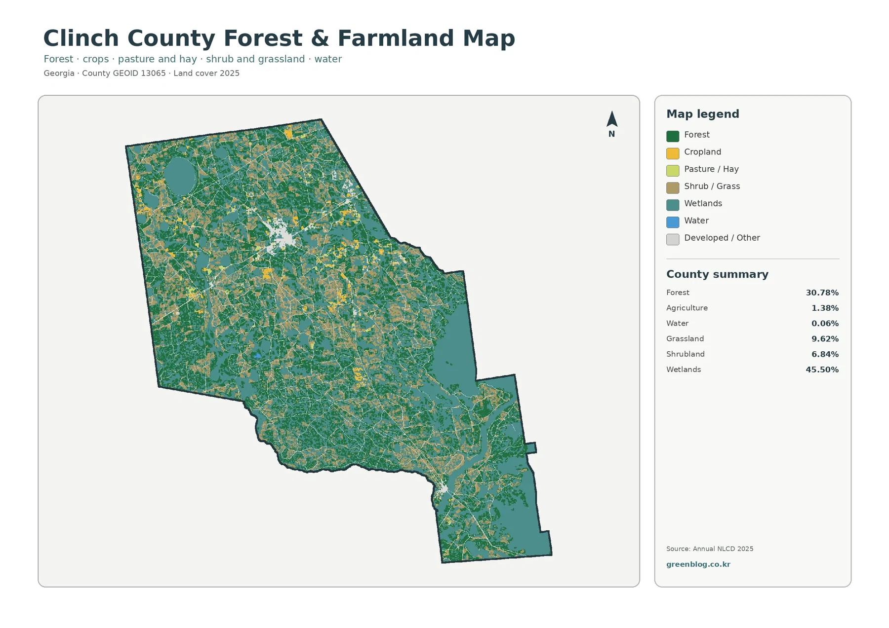
On this second view, forest remains 30.78% and wetlands remain 45.50%. Grassland contributes 9.62% and shrubland 6.84%, while agriculture is only 1.38%. Open water is listed at 0.06%. The small agricultural share matters because yellow patches can seem more prominent to the eye when they are scattered across a large county, even though they make up only a small fraction of the total area.
Agricultural cells do not form one broad continuous block. They occur as smaller pieces among forest, wetlands, grassland, and shrub-dominated areas. That arrangement gives the county a patchwork appearance in places, but the map still has a clear overall balance: natural and semi-natural cover occupies far more land than the agricultural class represented in this 2025 dataset.
The University of Georgia Cooperative Extension page for Clinch County provides useful local context. It lists blueberries, timber, honeybees, and row-crop production among the county’s agricultural activities. The land-cover map does not identify those commodities, and it should not be used to assign a crop type to an individual yellow cell. The Extension information describes what is produced locally; the NLCD map answers the separate question of which surfaces were classified as agriculture in the supplied observation year.
Grassland and shrubland deserve attention here because together they cover considerably more area than agriculture. They may represent a variety of open or transitional vegetation conditions, but the map does not state why a particular parcel is grassy or shrubby. A viewer should resist turning those classes into a detailed land-use story without higher-resolution imagery or local records. The value of this map is the broad distribution, not a parcel-by-parcel diagnosis.
Hard surfaces remain concentrated in only a few places
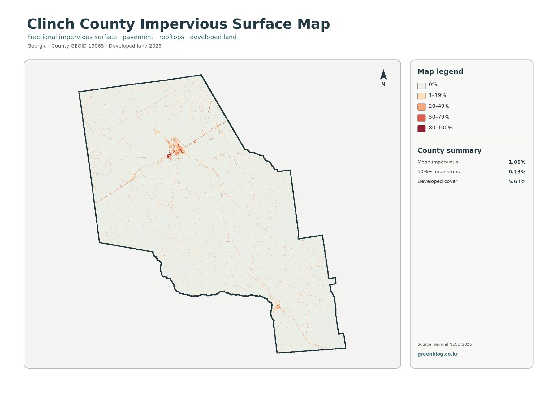
Impervious surface means hard cover such as pavement, rooftops, and parking areas that does not readily absorb water. The countywide mean is only 1.05%, and cells with at least 50% impervious cover account for 0.13% of the county. Developed land, by comparison, covers 5.61%. The difference is expected because a developed land-cover class can include lawns, trees, bare soil, and other permeable surfaces around buildings and roads.
The visual pattern is much simpler than the general land-cover map. A distinct orange-to-red concentration appears in the north-central part of the county, with narrower traces extending outward. A smaller developed concentration appears farther south. Outside those areas, most cells remain in the lightest categories. This makes the map especially useful when the question is not merely where development exists, but where hard surfaces are concentrated within that development.
Official Georgia Department of Community Affairs planning material covers Clinch County together with Argyle, Du Pont, Fargo, and Homerville. That planning source is the proper place to examine municipal context and local planning policy. The impervious map serves a different purpose. It provides a generalized view of hard-surface intensity, and its colored clusters should not be treated as exact municipal boundaries or as evidence of zoning status.
For watershed or environmental instruction, the low impervious mean can be compared directly with the very high wetland share. That contrast is one of the clearest features in this set of maps. It does not, by itself, prove anything about runoff quality, flood behavior, or water chemistry. Those topics depend on drainage, soil, rainfall, elevation, and other factors that are not measured by this map.
The 1985–2025 layer is mainly a forest-class story, not an urban-growth map
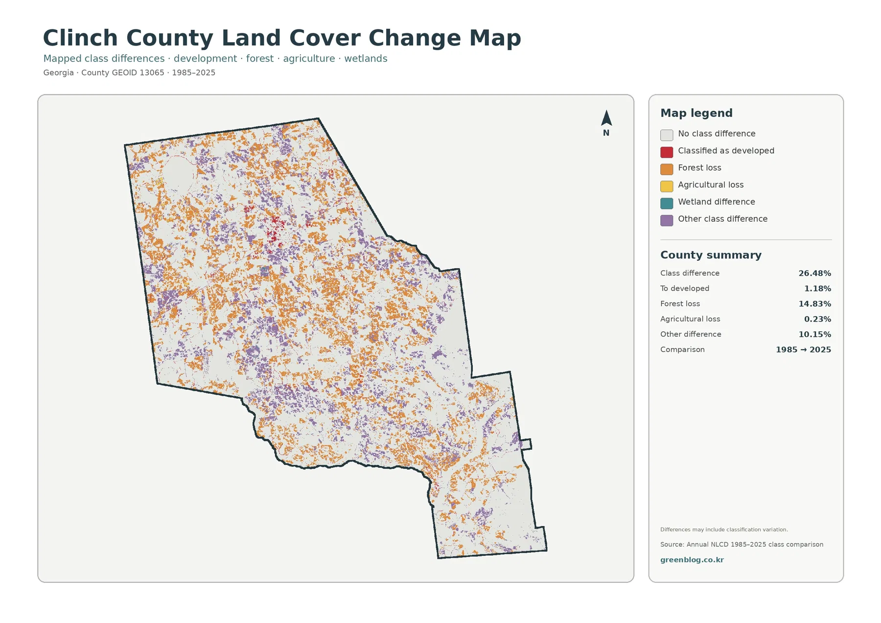
The change summary reports that 26.48% of the county has a different mapped class at the 2025 endpoint than at the 1985 endpoint. Forest loss is the largest named category at 14.83%, while other class difference accounts for 10.15%. Cells classified as developed account for 1.18% of the comparison, and agricultural loss is 0.23%. Those values make it clear that the colored change layer should not be summarized simply as development expansion.
Orange forest-loss cells are spread across many parts of the county rather than forming one continuous urban edge. Purple other-difference cells are also scattered widely. Red cells representing a change to developed land are much less extensive and occur more selectively near the places where current development is already visible. The map therefore describes a broad set of class differences, with forest-related changes contributing far more of the total than conversion to developed land.
“Forest loss” in this comparison does not give the date, cause, ownership, or permanence of the change. It indicates that a cell classified as forest at one endpoint received a different class at the other endpoint. Timber harvest, vegetation recovery, altered management, storms, mixed-pixel effects, or classification variation can require additional evidence to distinguish. The map itself includes a caution that differences may include classification variation, which is important when interpreting small or scattered patches.
Reading the change map beside the 2025 forest-and-farmland view prevents a common mistake. Clinch County can still have 30.78% forest in 2025 while also showing a substantial number of cells labeled as forest loss over the endpoint comparison. Current cover and historical class difference are two separate measurements. One describes what is mapped now; the other asks whether the 1985 and 2025 classes match.
What the four views can tell you—and what they cannot
The four maps work best as a sequence of questions. The countywide view answers which classes dominate now. The forest-and-farmland version makes open vegetation, agriculture, forest, wetlands, and water easier to compare. The impervious layer narrows attention to hard surfaces. The change layer shifts from current condition to a two-date comparison. Treating each image as a separate question produces a clearer interpretation than trying to make one map answer everything.
Annual NLCD is a raster dataset, meaning the landscape is divided into square cells. At a 30-meter cell size, one cell can contain trees, a ditch, grass, pavement, a small structure, and another surface at the same time. Classification reduces that mixture to a mapped category or value. Enlarging the JPG makes the cells easier to see, but it does not add parcel boundaries or recover detail that was not in the source data.
The observation year is also a limit. These maps describe the supplied 2025 condition and an endpoint comparison to 1985. Construction, harvest, vegetation recovery, standing water, or other changes after the observation date will not appear. For current property decisions, permit questions, wetland jurisdiction, or precise site review, use recent imagery and the responsible local, state, or federal records.
The source size of each downloadable JPG is 2480 × 1754 pixels. That is useful for digital reports, ordinary printing, presentations, and side-by-side comparisons. The package does not identify the images as meeting an A3 high-resolution reference, so a large poster should be test-printed before relying on fine labels or small class boundaries.
Using the set for county comparison and local context
Clinch County is a strong example for comparing wetlands and hard surfaces on the same page. Nearly half the county is mapped as wetlands, yet the mean impervious value is only 1.05%. A comparison with a more urban county can therefore show a dramatic shift in both color and statistics without needing a complex GIS analysis. The same legend and measurement ideas can be applied to each county map set.
The set is also useful for explaining why open water and wetlands are not interchangeable. Water is listed at only 0.06% on the forest-and-farmland summary, while wetlands account for 45.50%. Wetlands may contain water-influenced soils and vegetation without appearing as open blue water. This difference is easy to demonstrate visually and helps prevent a common legend-reading mistake.
For local planning context, pair the maps with the Georgia DCA comprehensive plan rather than using the land-cover colors as a substitute for policy. For agriculture context, the UGA Extension page adds information about local production that the map cannot provide. Using those sources together keeps the article grounded: the map describes surface classes, while the local documents explain community planning and agricultural activity.
Four original JPG maps in one file
The ZIP contains one original JPG for 2025 land cover, one for forest and farmland, one for impervious surface and developed land, and one for the 1985–2025 class comparison. Each image measures 2480 × 1754 pixels. Start with the countywide map for an overview, then choose the specialized map that matches the question you need to explain.
Frequently Asked Questions
Why can Clinch County be 45.50% wetland but only 0.06% open water?
Wetlands and open water are different classes. Open water represents exposed water surfaces, while wetlands can include water-influenced soils and vegetation. The county can therefore have a very large wetland share without a similarly large open-water percentage.
Does 5.61% developed cover mean 5.61% of the county is pavement or rooftops?
No. Developed land can contain lawns, trees, bare ground, and other permeable surfaces around buildings and roads. The separate impervious map estimates hard surfaces more directly, and its countywide mean is only 1.05%.
Is the 14.83% forest-loss value the same as a measured logging area?
No. It is an endpoint classification result for cells that changed from the forest class between 1985 and 2025. It does not identify the exact year, cause, ownership, or permanence of the change, and classification variation can be part of the comparison.
Sources and Reference Data
- MRLC Annual NLCD Data – official access point for annual land-cover and comparison products
- USGS Annual NLCD Land Cover Classification – class definitions and guidance for forest, wetlands, agriculture, developed land, and related surfaces
- U.S. Census Bureau TIGER/Line Shapefiles – official geographic reference for county boundaries
- Georgia DCA – Clinch County Comprehensive Plan – planning material for Clinch County, Argyle, Du Pont, Fargo, and Homerville
- UGA Cooperative Extension – Clinch County Agriculture and Natural Resources – local information on agriculture and natural-resource programs
Map File Information
The ZIP contains four original JPG maps for comparing Clinch County's broad wetlands and forest, limited agricultural cover, sparse impervious surface, and 1985–2025 mapped class differences.
- Included Files: Use only the versions confirmed in the article and supplied images
- File Type: Use the confirmed download contents
- Intended Use: Printing, education, presentations, and map-based projects
Related Maps
- Appling County Georgia Land Cover Map
- Atkinson County Georgia Land Cover Map
- Bacon County Georgia Land Cover Map
Green Map creates custom-edited map images using open geographic data sources such as geoBoundaries, Natural Earth, OpenStreetMap, and government open data.
These maps are edited visual materials, not raw data files, and are provided for education, documents, presentations, and graphic reference.