Developed land dominates Clayton County in the supplied 2025 classification. The Clayton County Georgia Land Cover Map reports 73.78% developed cover, while forest accounts for 15.76%, wetlands 4.43%, agriculture 3.23%, and water 1.27%. The broad northern part of the county is heavily developed on the map, but the long southern section contains more forest, farmland, wet areas, and open water.
This page compares four views rather than treating “developed” as a single condition. The WebP images show countywide land cover, forest and farmland, impervious surface, and the difference between the 1985 and 2025 classifications. The four original 2480 × 1754-pixel JPG maps are also available together in one ZIP for reports, classroom work, county profiles, and presentations.
Table of Contents
A 2025 countywide view dominated by developed cover
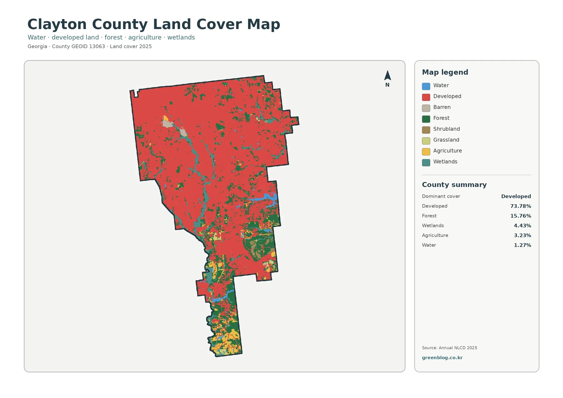
The most important number in the county summary is 73.78% developed cover. That does not mean nearly three quarters of Clayton County is solid pavement. The land-cover classification groups a range of developed settings, including areas where buildings and streets are mixed with lawns, trees, and other surfaces. Even with that qualification, the red developed class covers a remarkably large share of the county and is especially continuous across the wide northern section.
Forest is the second-largest class at 15.76%, but it is not distributed evenly. Large green patches become much easier to see in the lower half of the county, while the north contains smaller pieces interrupted by development. Wetlands make up 4.43% and appear in branching and elongated areas, often cutting through or bordering developed land. Agriculture is only 3.23% countywide and is concentrated more heavily in the south than the percentage alone might suggest. Water, at 1.27%, appears in a few distinct blue areas and narrower features.
The Georgia Department of Community Affairs plan page lists municipalities in and associated with Clayton County, including Forest Park, Jonesboro, Lake City, Lovejoy, Morrow, Riverdale, and College Park. The supplied land-cover map does not draw their municipal boundaries or label each city, so the developed color should not be used as a substitute for a city-limit map. Its strength is different: it shows how developed surfaces connect across a county that is part of the larger Atlanta metropolitan area.
Impervious surface separates hard urban cover from the broader developed class
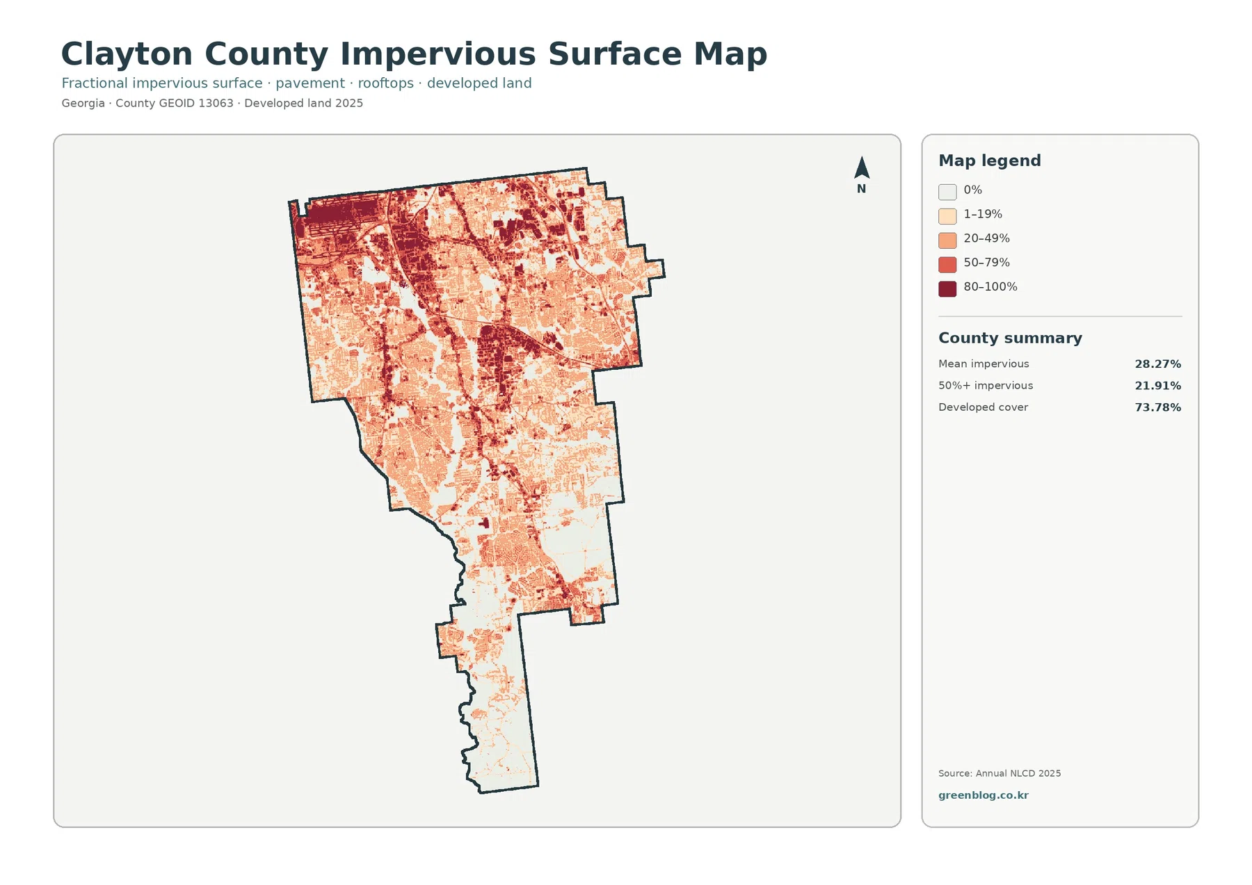
Clayton County’s mean impervious surface is 28.27%, and 21.91% of the county falls in cells that are at least 50% impervious. Those figures are much lower than the 73.78% developed-cover share because the two measurements answer different questions. A developed residential cell can still contain substantial grass, trees, and exposed soil. Impervious percentage narrows the view to hard surfaces such as rooftops, paved roads, parking lots, and similar materials that shed rather than absorb much of the rainfall that reaches them.
The darkest impervious values are concentrated across much of the north and northwest, with additional clusters extending through the central part of the county. Lower values become more common farther south. This makes the impervious map particularly useful when the question is not simply “Where is land developed?” but “Where are the hardest and most intensively covered developed surfaces?” It also helps prevent a common mistake: assuming that every red pixel on the general land-cover map represents the same degree of pavement or building coverage.
Clayton County’s 2024 comprehensive planning material describes a much denser roadway network in the north, including I-75, I-285, I-675, GA-85, U.S. 19, and Jonesboro Road, while noting that the southern portion has no direct interstate access and fewer arterial roads. That transportation context is useful beside the impervious map because both show a strong north-south contrast. The raster does not label those roads, however, so a dark band should not be assigned to a specific highway without checking an official transportation or street map.
Southern forest, farmland, wetlands, and water become clearer when development is muted
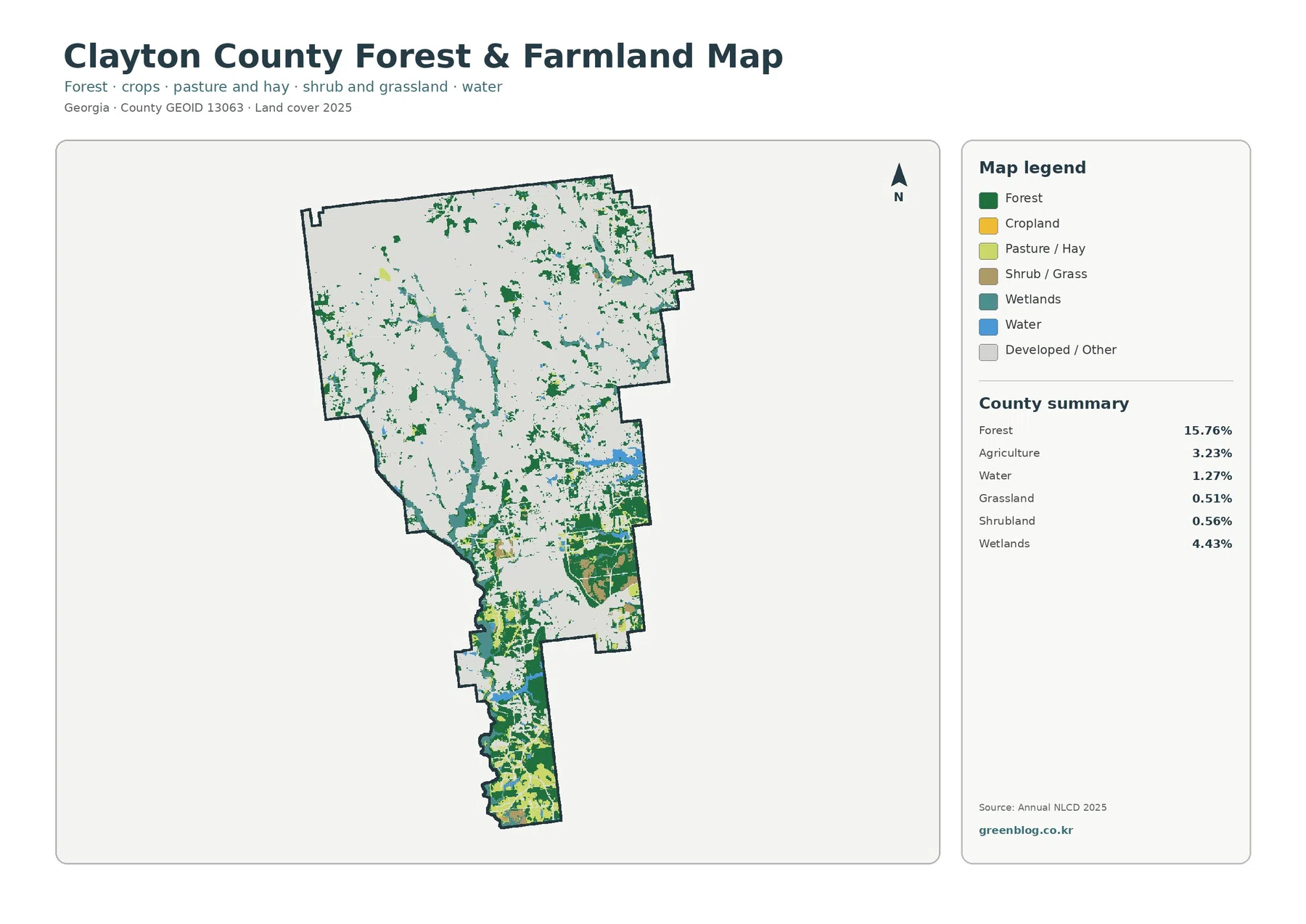
The forest-and-farmland view changes the visual balance of the county. Developed and other cover recede into a pale background, allowing 15.76% forest, 3.23% agriculture, 4.43% wetlands, and 1.27% water to stand out. Grassland accounts for 0.51% and shrubland for 0.56%. These smaller categories do not occupy much of the county, yet their placement helps show that the undeveloped portion of Clayton County is a mixture rather than one continuous forest block.
The southern extension contains the most obvious combination of green forest patches, yellow agricultural areas, light-green pasture or hay, and teal wetlands. Some forest also remains in central and northern parts of the county, but it is more fragmented by developed cover. The map therefore works well for explaining why a highly developed county can still contain meaningful natural and rural surfaces, especially toward its southern end. It is also a better choice than the general map when the audience needs to compare forest and farmland without the developed class overwhelming the page.
An official Clayton County existing-conditions report identifies the far southern panhandle as a Rural Preserve and highlights the Flint River and Flint River Basin as important natural features. It also states that the Flint River begins near Hartsfield-Jackson Atlanta International Airport and flows south through Clayton County. The supplied land-cover image does not label the river, so the wetland and water colors should not be treated as a named hydrography layer. The official river context is still useful when interpreting why the southern part of the county deserves separate attention from the heavily developed north.
The 1985–2025 comparison highlights development as the largest mapped change category
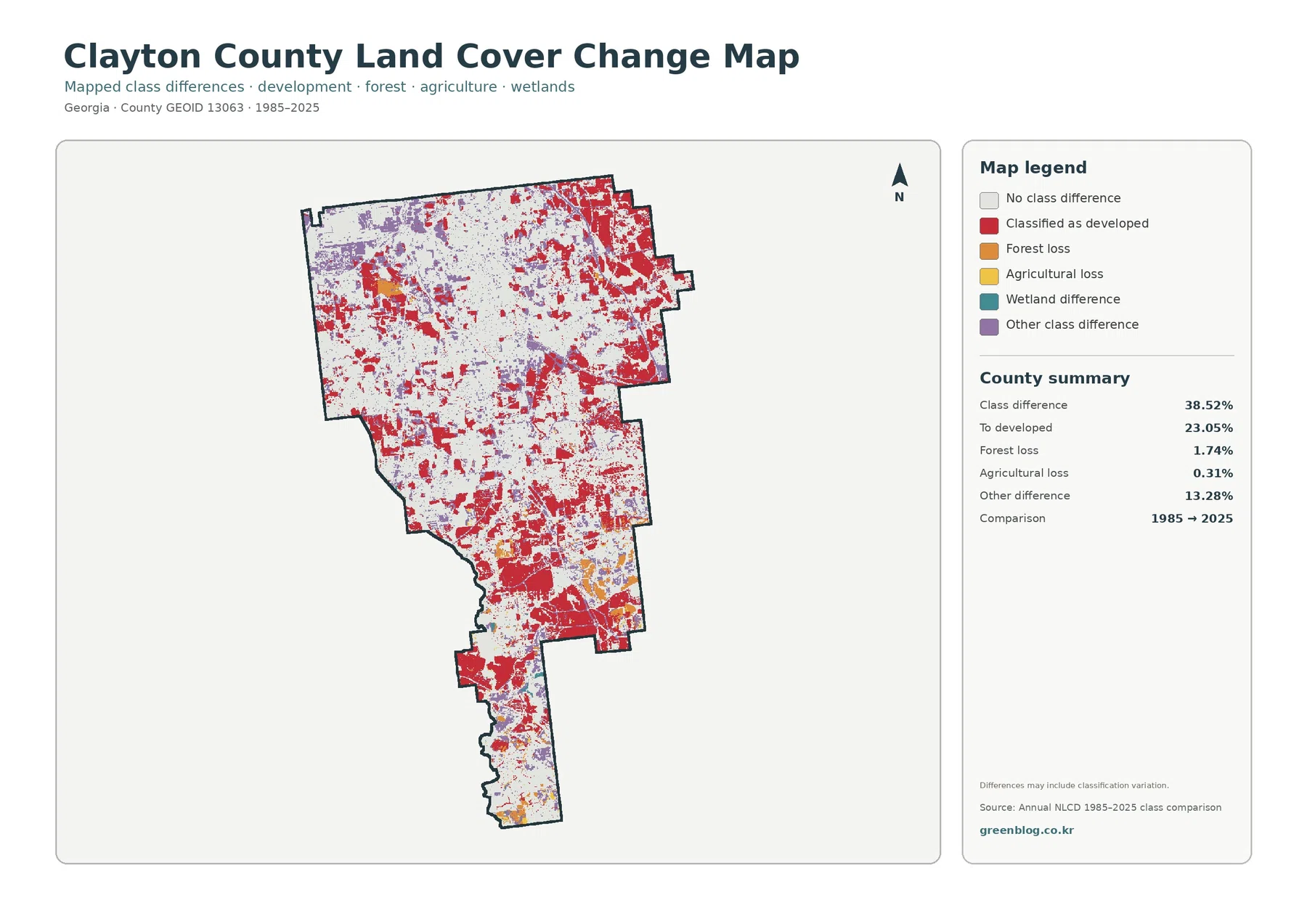
The comparison reports a class difference for 38.52% of the county. The largest named component is “to developed” at 23.05%, followed by other class differences at 13.28%, forest loss at 1.74%, and agricultural loss at 0.31%. Red change cells appear widely across the north and central county, but they are not limited to one compact center. There are also red patches and smaller clusters farther south, which shows why a countywide change map adds information that cannot be inferred from the current land-cover percentages alone.
The 23.05% figure should be read as an endpoint classification comparison, not as a construction permit record. A cell that belonged to another class in 1985 and is classified as developed in 2025 enters this category, but the map does not identify the year when that change occurred or the project that caused it. The map itself notes that class differences may include classification variation. Mixed pixels, imagery differences, vegetation condition, and other factors can affect how a 30-meter cell is assigned at each endpoint.
For that reason, the change map is best used to locate broad areas that deserve a closer look. If a project requires a timeline for development, clearing, wetland change, or agricultural conversion, intermediate-year imagery and local records are necessary. The map is valuable precisely because it provides a quick countywide screening view: white areas keep the same mapped class at both endpoints, while colored areas show where the two classifications differ and what broad type of difference was recorded.
How the north-south contrast changes the way each map should be used
Clayton County is a good example of why one percentage cannot describe an entire county. The north is strongly developed and contains many of the darkest impervious cells, while the southern extension retains more forest, agriculture, wetlands, and water. A county profile about urban development should therefore use the general land-cover and impervious maps together. A lesson about remaining natural cover or rural character should give the forest-and-farmland view more attention. A historical comparison should lead with the 1985–2025 map and then return to the current maps for context.
The four maps also help separate land cover from land use. Clayton County’s comprehensive plan includes future land-use and character-area information for planning decisions, but those policy maps are not the same as the Annual NLCD layers shown here. A residential parcel can contain tree canopy and grass, an industrial parcel can include undeveloped ground, and forest cover does not automatically mean a property is legally protected. When zoning, ownership, parcel boundaries, or future development rights matter, the county’s Planning & Zoning and GIS resources should be consulted directly.
For presentations, the general land-cover map works well as the first slide because it establishes the overall 73.78% developed share. The impervious map makes a strong second comparison because it immediately shows that developed land and hard surface are not identical. The forest-and-farmland map is useful when discussing the southern panhandle or remaining green areas. The change map belongs in a separate historical section, where its endpoint nature and classification limits can be explained without mixing it with the 2025 snapshot.
Scale, classification, and what the JPG files can and cannot show
Annual NLCD uses 30-meter raster cells. Each cell summarizes a square area that may contain more than one real-world surface, so small roads, narrow streams, individual houses, tree rows, and parcel edges can be generalized. Zooming a JPG enlarges the pixels but does not create parcel-level detail. When the question concerns a specific property, wetland boundary, easement, zoning district, or construction site, higher-resolution imagery and official local data are required.
The observation year matters as well. These maps represent the supplied 2025 classification, so construction, demolition, vegetation recovery, clearing, flooding, or other changes after that observation are not included. The 1985–2025 map is not a continuous forty-year animation; it compares two endpoints. That makes it suitable for broad change screening but not for identifying the exact sequence of events between those years.
Each downloadable JPG measures 2480 × 1754 pixels. The package does not identify the files as meeting an A3 high-resolution reference, so a large poster should be test-printed before final use. For normal documents, web reference, classroom handouts, and presentation slides, keeping the original aspect ratio avoids distortion and preserves the legend. The ZIP contains the four original JPG maps rather than upscaled replacements.
Four original JPG maps in one download
The download includes one 2025 countywide land-cover map, one forest-and-farmland map, one impervious-surface and developed-land map, and one 1985–2025 land-cover change map. Keeping all four together makes it easier to compare the same county from a broad cover view, a natural-and-agricultural view, a hard-surface view, and an endpoint-change view without mixing the categories.
Frequently Asked Questions
Does 73.78% developed cover mean 73.78% of Clayton County is pavement and rooftops?
No. Developed land-cover classes can include lawns, trees, bare ground, and other permeable surfaces around buildings and streets. The impervious map is the better measure of hard cover: mean impervious surface is 28.27%, and 21.91% of the county is mapped in cells that are at least 50% impervious.
Which map is most useful for comparing the developed north with the greener south?
Start with the countywide land-cover map to see the full contrast, then use the forest-and-farmland map to examine the southern forest, agriculture, wetlands, and water without the developed class dominating the display. The impervious map is useful if the comparison is specifically about hard urban surfaces rather than the broader developed category.
Does the 23.05% “to developed” value identify all new construction since 1985?
No. It identifies cells that were assigned another land-cover class in 1985 and a developed class in 2025. It does not provide the construction year, project type, permit history, or exact cause, and some endpoint differences may reflect classification variation. Detailed development history requires intermediate imagery and local planning or permit records.
Sources and Reference Data
- MRLC Annual NLCD Data – official access point for current land-cover and comparison products
- USGS Annual NLCD Land Cover Classification – definitions and guidance for developed land, forest, agriculture, wetlands, water, and related classes
- U.S. Census Bureau TIGER/Line Shapefiles – official county-boundary reference for Clayton County
- Georgia DCA – Clayton County Comprehensive Plan – official access to the county’s 2024 and earlier comprehensive planning documents
- Clayton County Comprehensive Transportation Plan – official county transportation planning and network context
- Clayton County Geographic Information System – official local GIS access for city limits, zoning, parcels, and other geographic data
Map File Information
The ZIP contains four original JPG maps for comparing Clayton County’s dominant developed cover, southern forest and farmland, impervious surfaces, and 1985–2025 class differences.
- Included Files: Use only the versions confirmed in the article and supplied images
- File Type: Use the confirmed download contents
- Intended Use: Printing, education, presentations, and map-based projects
Related Maps
- Appling County Georgia Land Cover Map
- Atkinson County Georgia Land Cover Map
- Bacon County Georgia Land Cover Map
Green Map creates custom-edited map images using open geographic data sources such as geoBoundaries, Natural Earth, OpenStreetMap, and government open data.
These maps are edited visual materials, not raw data files, and are provided for education, documents, presentations, and graphic reference.