The St. Johns County Florida Land Cover Map shows a county where no single surface type tells the whole story. Wetlands are the largest 2025 class at 32.13%, followed by forest at 22.49% and developed land at 21.70%. Water accounts for 10.56% and agriculture 7.75%, while grassland and shrubland make up smaller shares. The map is especially useful because those classes are not evenly mixed: development is strongest in the north and along the eastern settled corridor, large agricultural blocks stand out in the southwest, and wetlands, forest, and water occupy broad interior and coastal areas.
This page compares four views of the same county: 2025 land cover, forest and farmland, impervious surface and developed land, and 1985–2025 land-cover class differences. The WebP images are designed for quick comparison in the article, and the four original JPG maps are available together in one ZIP download below. The set works well for county profiles, classroom lessons, presentations, and broad comparisons of development, agriculture, wetland, forest, and water patterns.
Table of Contents
Wetlands lead the countywide totals, but forest and development are nearly tied behind them
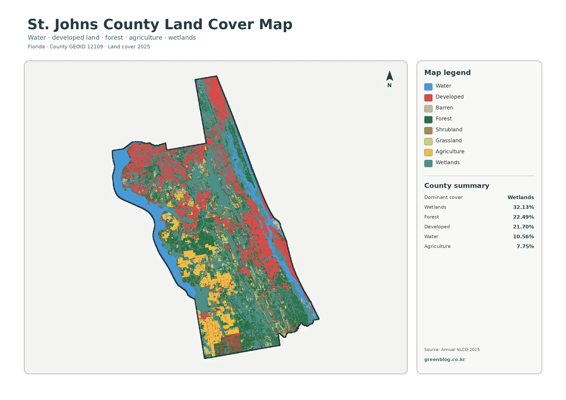
Teal wetland cover appears across much of St. Johns County rather than forming one isolated block. It is especially persistent along the eastern side and through parts of the central and southern county, where wetland cells mix with forest and open water. The 32.13% share makes wetlands the largest single category, yet the image shows why that number should be read as a countywide total rather than a description of one continuous wetland area.
Forest is the second-largest class at 22.49%. Dark green areas are widespread in the interior and south, with additional wooded areas in the north and northeast. In many places, forest meets wetlands directly. Those colors should remain separate in interpretation: forest identifies tree-dominated cover, while wetland classification reflects wetter ground and wetland vegetation. A wooded wetland and a drier upland forest can look related on a broad map but represent different land-cover classes.
Developed land covers 21.70%, only slightly less than forest, but its geography is different. Red areas are strongest in the northern and northeastern portions of the county and continue along much of the eastern settled corridor. Additional developed patches appear through the center. A developed land-cover cell can contain buildings, streets, lawns, trees, and other landscaped or open surfaces, so the red class should not be treated as a municipal boundary, zoning district, or statement that every part of the cell is paved.
Open water accounts for 10.56%, a substantial share for a county this size. Blue areas are prominent along the eastern coastal and estuarine side and along parts of the western edge. Water and wetland colors frequently sit next to each other, but they answer different questions. Open water represents the water surface itself, while wetland cover can include vegetated or seasonally saturated ground that does not appear as open blue water.
Southwestern farm blocks become much clearer when developed areas are muted
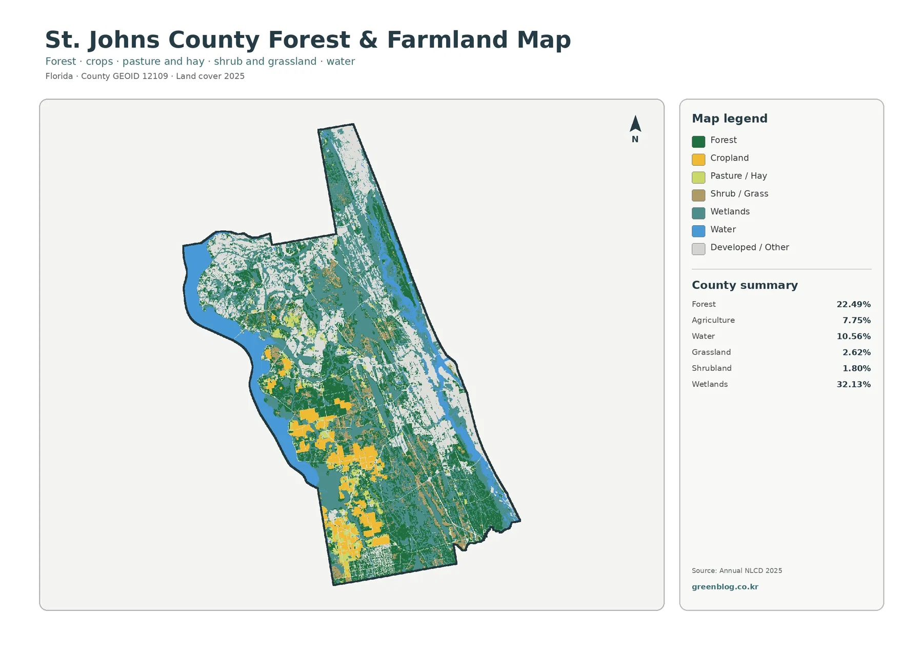
The forest-and-farmland map reduces the visual weight of developed land, making yellow and light-green agricultural areas easier to follow. The largest farm-oriented blocks occur in the southwest and south-central parts of the county. Agriculture is only 7.75% of the countywide summary, but it is concentrated enough to become one of the most distinctive local patterns on this focused map.
That geography has a real local context. UF/IFAS Extension identifies St. Johns County as part of the Tri-County Agricultural Area and notes the long importance of potato and cabbage production, with agricultural programs centered around the Hastings area. This official background helps explain why sizable agricultural blocks matter locally. It does not mean that every yellow cell on the map is a potato or cabbage field, because the land-cover image does not identify crop species or ownership.
The map legend separates cropland from pasture or hay, but the county summary combines them into one agriculture total. That distinction matters when reading the image. The colors can show where different agricultural cover types appear, yet the supplied statistics do not support a new percentage for each subclass. Estimating exact cropland and pasture shares by counting pixels would add numbers that were not provided or verified.
Grassland makes up 2.62% and shrubland 1.80%. Both appear in smaller pieces among forest, agriculture, wetlands, and developed areas. At county scale, these transitional covers can look sharply bounded, but the underlying landscape may contain mixtures of grasses, shrubs, scattered trees, field edges, roadsides, and disturbed ground. The map is designed for broad surface comparison, not parcel-level vegetation inventory.
A 21.70% developed share produces a countywide mean impervious value of only 7.40%
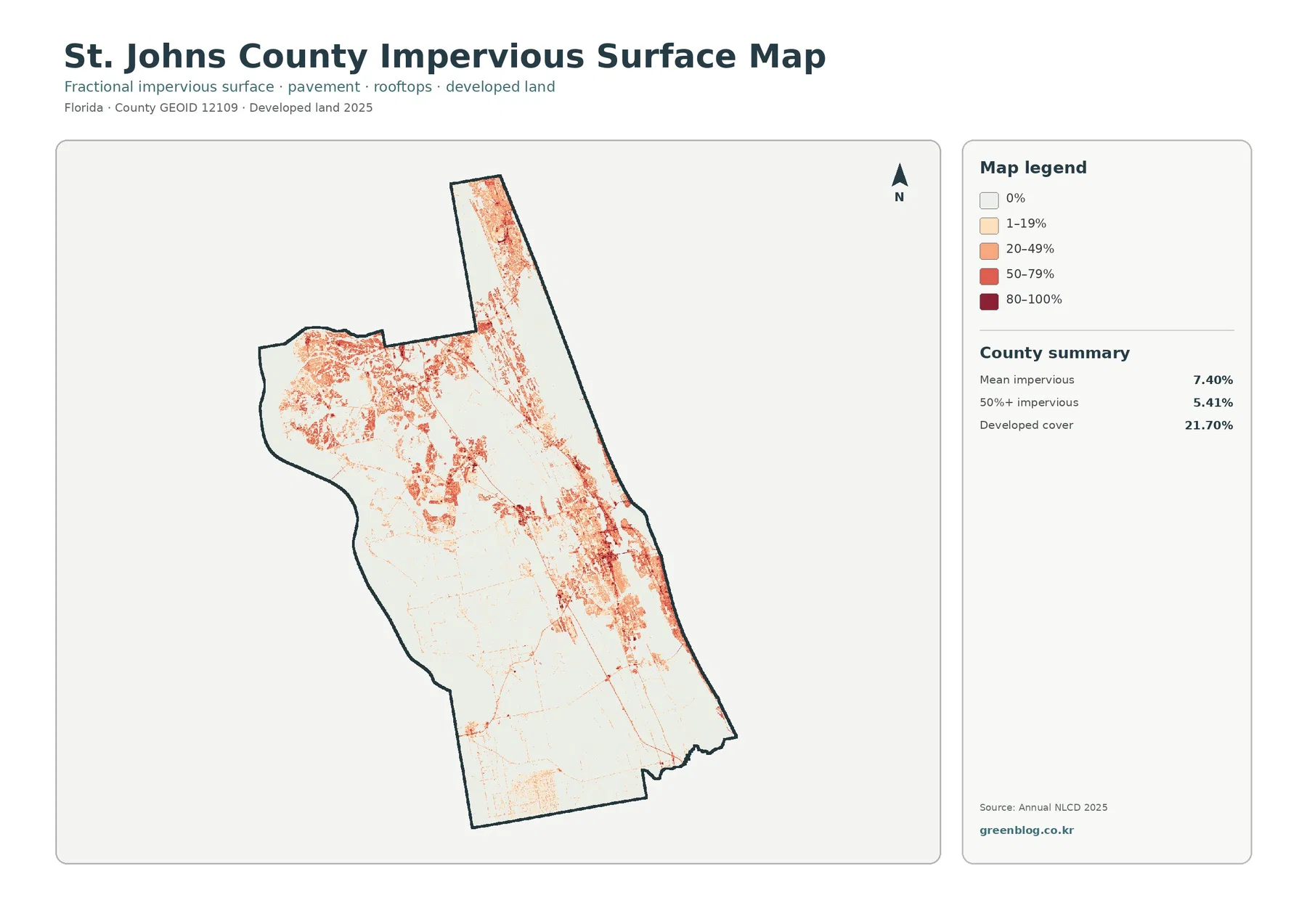
Developed cover and impervious surface are related, but they are not interchangeable. Developed land-cover classes can include homes, commercial sites, lawns, trees, landscaped open space, and streets within the same mapped area. Impervious surface isolates the fraction covered by hard materials such as rooftops, pavement, and parking areas. That is why St. Johns County can have 21.70% developed cover while its countywide mean impervious value is 7.40%.
The strongest impervious colors cluster in the north, northeast, and eastern developed corridor. Much of the southwest is pale, including the large agricultural areas visible on the previous map. The contrast provides a useful cross-check: a place that looks important on the agriculture map may contribute very little to hard-surface coverage, while a smaller developed district can produce a much stronger impervious signal.
Areas at 50% or greater impervious cover make up 5.41% of the county. That figure indicates that heavily sealed surfaces are concentrated rather than spread uniformly across St. Johns County. Thin orange or red lines may resemble roads, but this is not a transportation map. It does not identify route names, lane counts, traffic volume, ownership, or pavement condition. Impervious percentage measures surface hardness only.
Impervious cover also should not be used by itself as a flood-risk measure. A low value does not guarantee low flooding potential, especially in a county with extensive wetlands, estuarine environments, and low-lying coastal areas. Rainfall, soil, elevation, drainage, tide, groundwater, and the connection between wetlands and waterways all matter. The map can show where hard surfaces are concentrated, but specialized flood and drainage products are needed for site decisions.
Coastal and estuarine context helps explain the wet eastern side without defining every wetland cell
The eastern wetland and water pattern can be placed in a verified local context through the Guana Tolomato Matanzas National Estuarine Research Reserve. NOAA describes the reserve as stretching north and south of St. Augustine and protecting salt marsh, tidal wetlands, estuarine lagoons, upland habitat, and coastal waters. That setting helps explain why wetland and water cover are such important parts of the county’s eastern landscape.
The reserve should not be used as a shortcut for interpreting every teal cell, however. The supplied land-cover maps do not display the legal boundary of the GTM Reserve or any other protected area. A wetland-classified cell describes surface cover; it does not prove conservation ownership, jurisdictional wetland status, development restrictions, or a specific management designation. Those questions require separate official boundary and regulatory data.
The 1985–2025 comparison is led by cells classified as developed
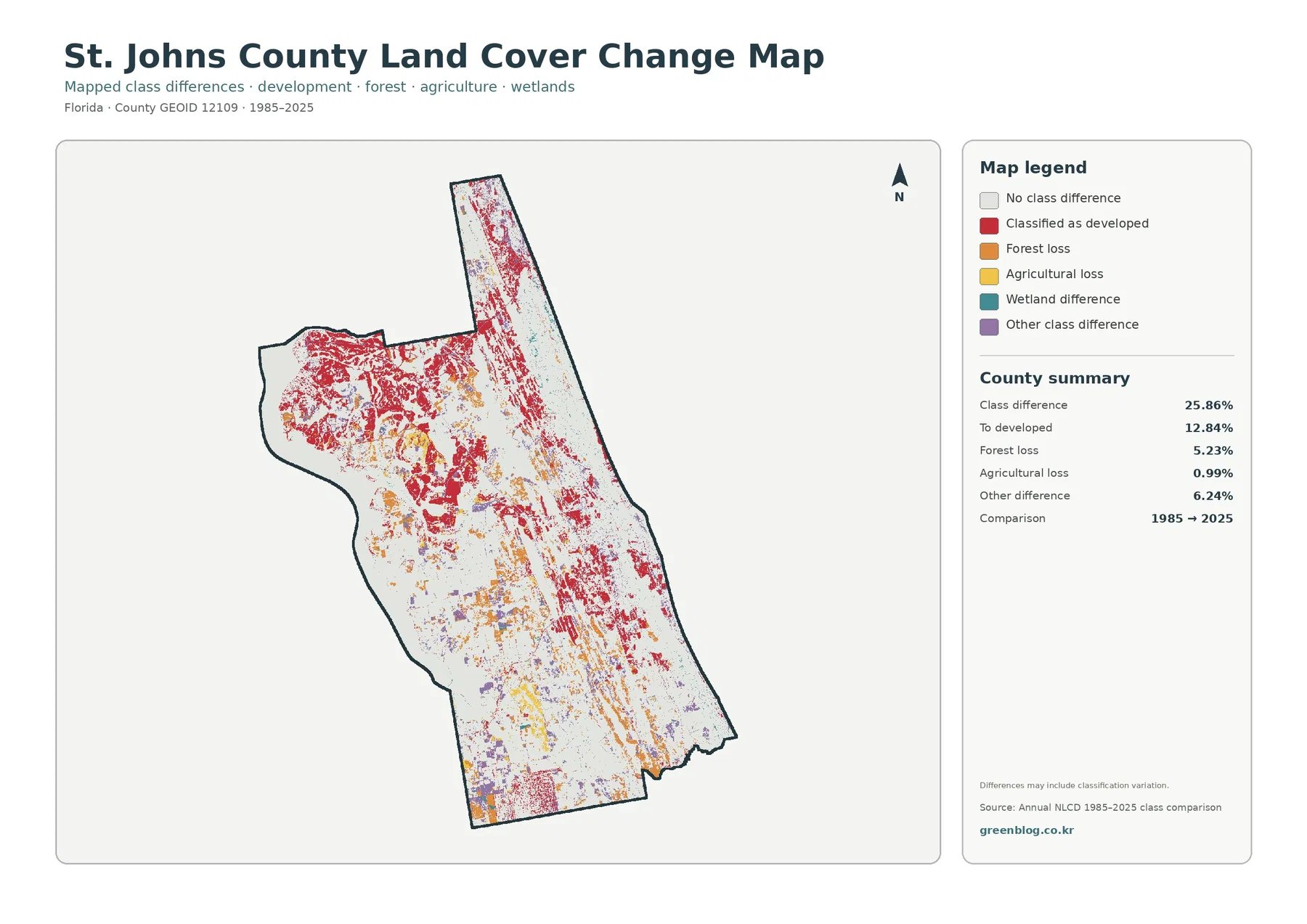
The change map reports a total class difference of 25.86%. The largest listed component is “to developed” at 12.84%, and red difference cells are widespread through the north, east, and parts of the center. This 12.84% figure is not a second estimate of current developed land. The 21.70% developed value describes the 2025 map, whereas 12.84% describes cells highlighted in the two-date comparison as a developed-category difference.
Forest loss is listed at 5.23%, agricultural loss at 0.99%, and other class difference at 6.24%. Forest-loss colors are scattered across several parts of the county, sometimes near developed-category differences and sometimes away from them. Proximity alone does not establish cause. Timber activity, vegetation recovery, hydrologic changes, storms, land conversion, imagery conditions, or classification rules can all affect how a cell is labeled at two different dates.
Wetland difference is included in the legend, but the supplied summary does not provide a separate wetland-difference percentage. It is reasonable to describe where that color appears, but not to calculate a precise rate from the image. The map also warns that class differences may include classification variation, so 25.86% should not be rewritten as “25.86% of St. Johns County was physically transformed.” It is a comparison of two classified snapshots.
Cross-map comparisons reveal three different kinds of county contrast
The first contrast is wetlands versus development. Wetlands occupy 32.13% and developed land 21.70%, but the map shows them concentrated in different ways. Wetland cover is broad and repeated through the eastern and interior landscape, while development is strongest in the north and along the eastern settled corridor. Looking only at countywide percentages would hide that geographic separation.
The second contrast is agriculture versus impervious surface. The southwest contains some of the largest agricultural blocks even though agriculture is only 7.75% countywide. On the impervious map, those same areas are mostly light. That comparison makes an important point: a visually large working-land district can occupy substantial local space without creating the hard-surface signature associated with dense development.
The third contrast is open water versus wetlands. Water covers 10.56% and wetlands 32.13%. Both are major parts of the county’s environmental setting, especially toward the coast and estuarine areas, but they are not interchangeable. A presentation that shows both colors can explain why a landscape may be strongly influenced by water even where large parts are vegetated wet ground rather than open water.
Choosing the right map for a lesson, county profile, or presentation
Use the 2025 countywide land-cover map when the audience needs the overall composition first. It places the 32.13% wetland share, 22.49% forest share, 21.70% developed share, open water, and southwestern agriculture in one frame. This is the strongest opening image for a county profile because it shows both totals and location before the discussion moves into one subject.
The forest-and-farmland view is better when the subject is working land or vegetation. It makes the southwest agricultural blocks easier to isolate and helps compare them with forest and wetlands. For development intensity, the impervious map is more informative than the general developed class because it shows where hard surfaces are concentrated. The two-date change map belongs later in a presentation, after the audience understands the current 2025 pattern.
For comparisons with another Florida county, keep the observation year and classification system consistent. A 2025 percentage should not be compared directly with a different year without noting the date difference. The 1985–2025 image also should not be treated as an annual history. A location could change more than once between the two dates and still end in a class similar to where it began, so intermediate imagery is needed for detailed change histories.
Raster scale and the 2480×1754 JPG size limit fine-detail interpretation
Annual NLCD is raster data, which means the landscape is divided into grid cells and each cell receives a representative classification. A real cell can contain trees, grass, pavement, buildings, water, and bare ground at the same time. The map simplifies that mixture, particularly around field edges, wetland boundaries, narrow roads, small channels, and scattered buildings. County-scale patterns are reliable for broad comparison, but small boundaries are not survey lines.
The original JPG files in this package are 2480×1754 pixels. Enlarging them makes colors and small patterns easier to see, but it cannot add source detail that was not present in the original image. The asset manifest does not mark these files as meeting the package’s A3 high-resolution reference. If a large print is required, check sharpness at the intended print size before final use. The files remain well suited to screen viewing, ordinary printed handouts, presentations, and county-level comparison.
Frequently Asked Questions
What is the largest 2025 land-cover class in St. Johns County?
Wetlands are the largest class at 32.13%. Forest follows at 22.49%, developed land at 21.70%, water at 10.56%, and agriculture at 7.75%. The wetlands are distributed across several parts of the county rather than forming one continuous block, so the map should be used together with the summary percentages.
Do the large agricultural areas in the southwest identify specific potato or cabbage fields?
No. The map identifies agricultural land cover, not crop ownership or species. UF/IFAS notes that potato and cabbage have historically been major crops in the Tri-County Agricultural Area around Hastings, but that local context cannot be assigned to every agricultural pixel. Field-level crop identification requires a different dataset.
Does the 25.86% class difference mean one quarter of the county was completely transformed?
No. The 25.86% value is the share of cells classified differently in the 1985 and 2025 comparison. The listed components include 12.84% to developed, 5.23% forest loss, 0.99% agricultural loss, and 6.24% other difference. The map warns that classification variation may be included, so specific causes require additional evidence.
Sources and Reference Data
- MRLC Annual NLCD Data – annual land-cover data used for the 2025 and two-date comparison views.
- USGS Annual NLCD Land Cover Classification – official descriptions of developed, forest, agricultural, wetland, water, and other land-cover classes.
- U.S. Census Bureau TIGER/Line Shapefiles – official geographic reference for the St. Johns County boundary.
- UF/IFAS Extension St. Johns County Agriculture – local agricultural context for the Hastings and Tri-County Agricultural Area.
- NOAA Guana Tolomato Matanzas National Estuarine Research Reserve – official coastal and estuarine context around St. Augustine and northeast Florida.
Map File Information
This ZIP contains the four original JPG maps used to compare 2025 land cover and related themes across St. Johns County.
- Included Files: Use only the versions confirmed in the article and supplied images
- File Type: Use the confirmed download contents
- Intended Use: Printing, education, presentations, and map-based projects
Related Maps
- Alachua County Florida Land Cover Map
- Baker County Florida Land Cover Map
- Bay County Florida Land Cover Map
Green Map creates custom-edited map images using open geographic data sources such as geoBoundaries, Natural Earth, OpenStreetMap, and government open data.
These maps are edited visual materials, not raw data files, and are provided for education, documents, presentations, and graphic reference.