The Greater Bridgeport Planning Region Connecticut Land Cover Map set covers one of Connecticut’s nine current county-equivalent planning regions. The four views make a strong coastal-to-inland contrast easy to see: developed land dominates much of the southern and central region, while larger forest blocks remain toward the west and north. Water and wetlands break up both patterns, especially around inland water bodies and the Long Island Sound edge.
This page includes a general land-cover map, a forest and farmland map, an impervious-surface map, and a 1985–2025 change map. The four original JPG maps are available together in one ZIP download. They can be used as a regional reference, for classroom comparison, in reports or presentations, or simply to examine how built and natural surfaces share a relatively small Connecticut planning region.
Table of Contents
A heavily developed coast with a greener inland edge
Greater Bridgeport is not the old Fairfield County boundary. It is a current Census county-equivalent identified as GEOID 09120, and MetroCOG lists six member municipalities: Bridgeport, Easton, Fairfield, Monroe, Stratford, and Trumbull. Bridgeport anchors the southern urban core near Long Island Sound. Easton and Monroe sit farther inland, while Trumbull occupies a middle position between the dense southern communities and the more wooded northern part of the region.
The 2025 summary printed on the supplied land-cover map identifies developed land as the dominant class at 61.07%. Forest follows at 27.89%, then wetlands at 6.24%, water at 3.03%, and agriculture at 1.03%. Those values matter because the region can look almost entirely urban at first glance. In reality, more than a quarter of the mapped area remains forested, and wetlands and water form a noticeable secondary layer around the developed footprint.
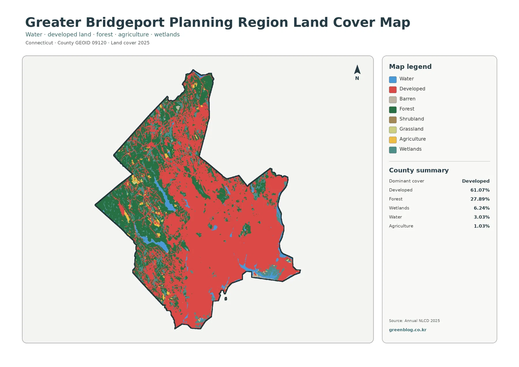
Red developed classes cover broad areas in the south, southeast, and much of the central portion of the map. The concentration is strongest around the Bridgeport-centered urban area and continues into neighboring developed communities. Rather than ending at a single sharp line, the built pattern becomes more fragmented toward the interior, where forest patches and smaller water or wetland areas interrupt the developed background.
Forest has a different shape. Larger green blocks are easier to find along the western side and through northern sections of the planning region. The northwest in particular contains a more continuous forest pattern than the coast. Smaller wooded patches remain inside the more developed half of the region as well, so the map is useful for seeing both large inland forest areas and the more fragmented urban greenery closer to Bridgeport, Fairfield, Stratford, and southern Trumbull.
Water and wetlands are worth reading as their own features instead of treating them as minor colors. A prominent inland water system in the west-central part of the map creates a visible break in the forest and developed pattern. Additional water and wetland cells appear near the coast and in smaller interior locations. Because the regional boundary reaches Long Island Sound, the southern edge also has a very different land-and-water relationship from the inland municipal areas.
Forest stands out when the developed background is muted
The forest and farmland view answers a narrower question than the general map. It reduces developed and other surfaces to a pale background so wooded land, agriculture, grass, shrub, wetlands, and water are easier to isolate. That change in emphasis makes the western and northern forest blocks much more obvious. It also shows how little of the region is occupied by broad agricultural cover compared with many rural U.S. counties.
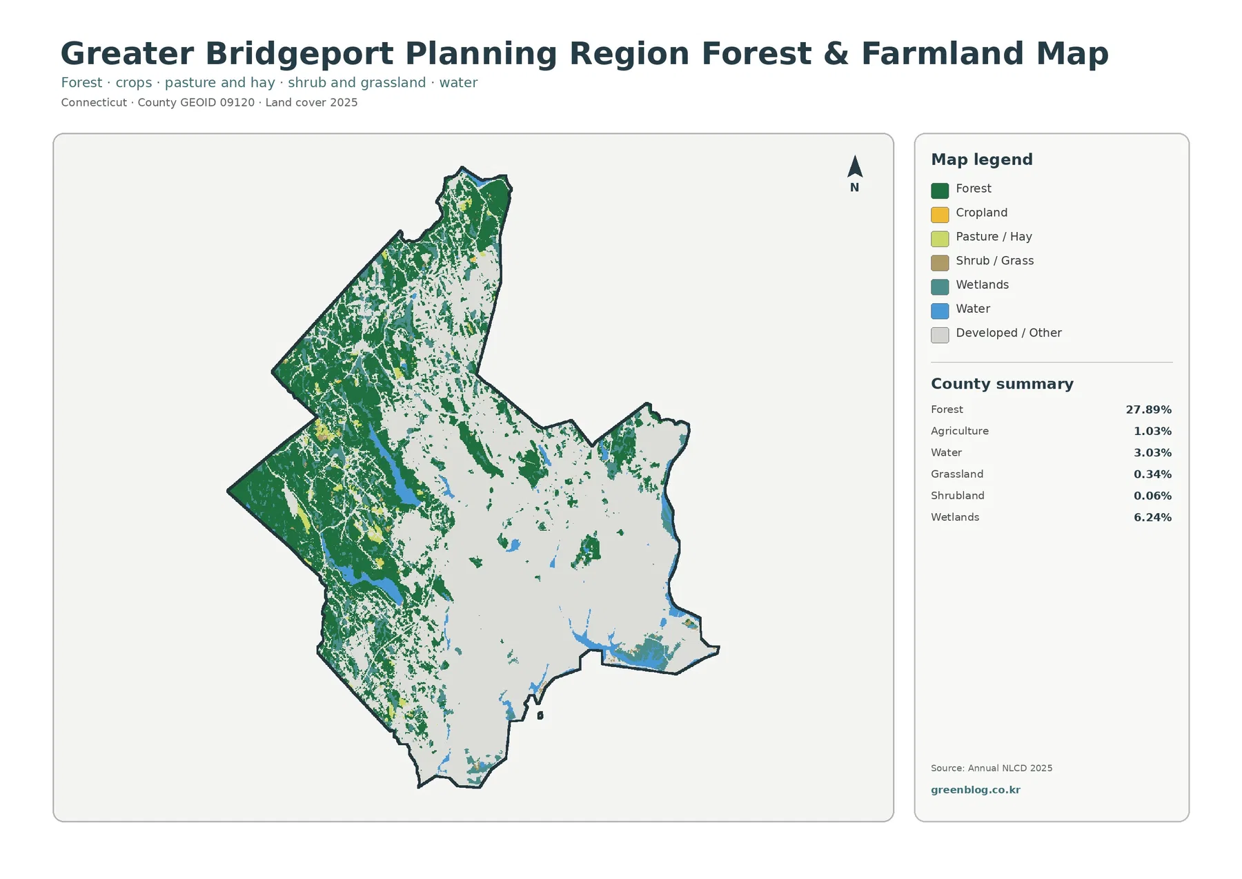
Forest accounts for 27.89% of the region and forms the main natural land-cover component on this map. The largest connected areas lie toward the west and north, with additional narrow or broken wooded strips extending into the central part of the region. In the developed south, green areas appear as smaller pieces surrounded by the light developed/other background. That fragmentation is as informative as the total percentage because it shows where forest is continuous and where it is embedded within settlement.
Agriculture is only 1.03%, while grassland is 0.34% and shrubland 0.06%. The small yellow and light-green patches therefore should not be interpreted as an agricultural belt. They are scattered features within a region shaped much more strongly by urban development and forest. This view is useful when someone needs to locate open or cultivated areas, but the map does not support describing Greater Bridgeport as an agricultural region.
Wetlands, at 6.24%, and water, at 3.03%, add another layer to the forest pattern. Some wetland areas sit near larger water features or within wooded sections, while other wetland cells appear near developed land. The classification describes surface cover, not legal wetland jurisdiction, ownership, zoning, or parcel-level restrictions. Any regulatory question requires the appropriate municipal, state, or federal wetland information rather than this regional land-cover map alone.
Impervious cover separates dense built areas from lower-intensity neighborhoods
A developed class does not mean that every square meter is pavement or roof. The impervious-surface map deals with that distinction by estimating how much of each mapped cell is covered by hard surfaces such as roads, parking areas, and rooftops. The supplied summary gives a mean impervious value of 18.48% for the region. Areas with at least 50% impervious cover account for 15.21%, while developed land as a land-cover category covers 61.07%.
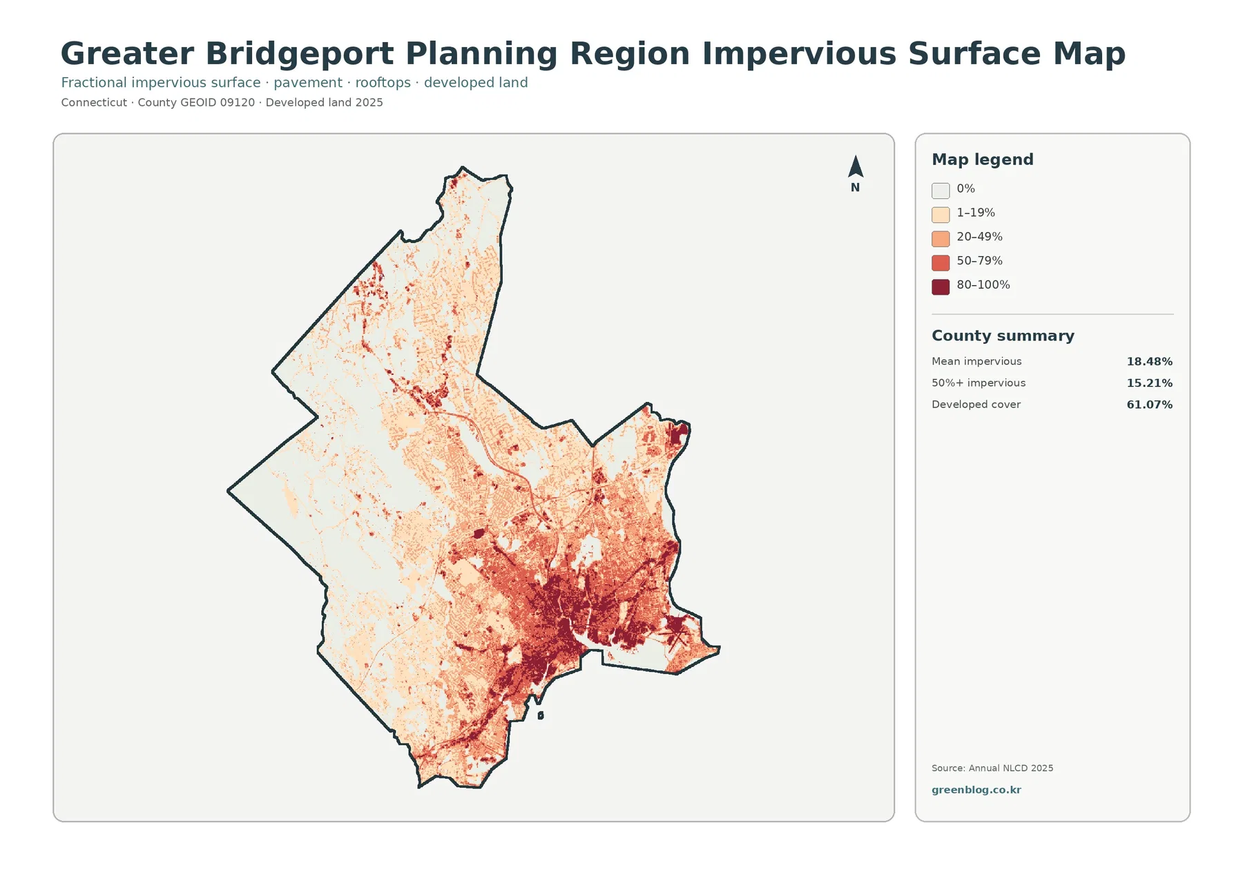
The darkest impervious values cluster heavily in the southern urban core. Bridgeport and nearby parts of Fairfield and Stratford form the broadest high-intensity area, with dense red tones around transportation and commercial or residential surfaces. Several linear and compact high-value features extend away from that core. The map shows association in location; it does not by itself establish why a particular area became more intensively developed.
Moving inland changes the texture quickly. Large portions of the west and north are pale, indicating little or no impervious surface within many cells. Roads and settled places still create thin lines and small clusters, but they do not merge into the same continuous dark surface seen near the coast. Central areas, including much of Trumbull, contain a mix of low and moderate impervious values that visually bridges the difference between the southern city and the greener inland municipalities.
This map can be useful in watershed lessons, stormwater context, or planning presentations because it highlights where hard surfaces are concentrated. It should not be treated as a flood map, drainage model, or parcel survey. A high impervious percentage can be one useful environmental indicator, but flood behavior also depends on topography, drainage systems, soils, rainfall, water levels, and other factors that are not represented here.
Most cells remain in the same broad class between 1985 and 2025
The change view compares mapped classes for 1985 and 2025. It marks class differences across 8.70% of the region. Of that total, 3.73% is labeled as change to developed, 0.31% as forest loss, 0.05% as agricultural loss, and 4.51% as other difference. The important visual message is not a region-wide sweep of change. Most of the map remains unmarked, while differences appear as many scattered patches and narrow features.
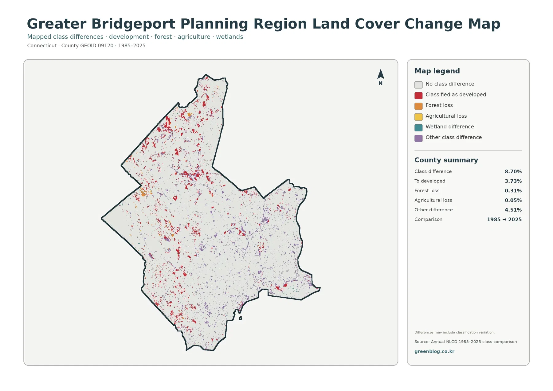
Change-to-developed cells appear in the south, but they are not confined to Bridgeport. Smaller red clusters also occur through central and northern portions of the planning region. That distribution is consistent with incremental change occurring in many places rather than one single development front. Forest-loss and agricultural-loss colors occupy much smaller shares of the map, so they should not be exaggerated in a written summary simply because they are visually distinct.
The map itself includes an important caution that differences may include classification variation. A changed cell can represent real land-cover conversion, but imagery conditions, classification methods, mixed pixels, or the way boundaries between classes are assigned can also affect a comparison. For a specific site, the change map is best used to identify an area worth checking. Historical aerial photography, local planning records, permits, or field information are better tools for determining exactly what happened and when.
The six municipalities help explain the regional pattern
MetroCOG’s current description of the region is useful context because it ties the map to recognizable places. Bridgeport is the state’s most populous city and forms the central urban anchor. Fairfield and Stratford lie along the southern side near Long Island Sound. Easton and Monroe are inland, and Trumbull sits between the coastal core and the more wooded north. The map does not draw municipal boundaries inside the planning-region outline, but the general south-to-north difference is easier to understand with that arrangement in mind.
The western side deserves separate attention because forest and inland water are prominent there. On the general map, wooded cover and water interrupt the developed pattern. On the forest map, those green areas become the dominant visual feature. On the impervious map, the same broad area is comparatively pale. Seeing the same place in three different thematic views prevents a common mistake: assuming that one color on one map fully describes the landscape.
The coast presents the opposite case. Developed classes are widespread and high impervious values cluster near Bridgeport and the southern corridor, but water and wetland cells remain part of the picture. A land-cover map cannot tell whether a specific shoreline parcel is public, private, protected, developable, or regulated. It only describes the mapped surface class. That distinction is especially important in a compact coastal region where many planning, environmental, and property questions overlap geographically.
Choosing one map depends on the question
For a quick regional overview, start with the general land-cover map. It puts developed land, forest, wetlands, water, and agriculture in the same frame and makes the 61.07% developed share easy to place in context. It is the most useful single image for a report introduction or a classroom explanation of what covers the ground across Greater Bridgeport.
Use the forest and farmland map when the subject is green space, wooded continuity, open land, or the limited agricultural footprint. Use the impervious map when the question is about the intensity of built surfaces rather than the broader developed class. The percentage scale from 0% through 80–100% makes it possible to distinguish a lightly developed cell from a heavily paved or roofed one, which the standard land-cover map cannot do as clearly.
The change map is appropriate when the question involves long-term comparison. It does not replace the current land-cover map because a cell marked as unchanged still needs the current map to identify its present class. A clear presentation often pairs those two views: one shows what is there in 2025, and the other highlights where the classified surface differs from 1985. This is more informative than using either image alone for a change discussion.
Scale and classification limits matter more in a compact urban region
Annual NLCD land-cover products use a raster grid, commonly at 30-meter resolution. A raster is a surface divided into cells, with each cell assigned a class or a percentage. That means a narrow stream, a small parking lot, a strip of roadside trees, or a single property boundary may be generalized into the surrounding cell. Zooming the image on screen does not create additional detail beyond the source resolution.
Mixed pixels are especially common where land covers meet. A cell near a neighborhood edge might contain pavement, lawn, trees, and a building. The land-cover product assigns a class according to its classification method, while the impervious product can separately express the hard-surface fraction. This is one reason the developed percentage and impervious percentage should never be treated as interchangeable measurements.
Time is another limitation. The supplied current maps are labeled 2025, and the comparison map spans 1985–2025. A construction project, vegetation change, or shoreline alteration that happened after the observation period may not appear. For current regulatory or engineering work, these maps should be combined with newer local data. For regional reference and broad comparison, however, the consistent classification makes the four-map set useful.
Using the JPG set in documents, classes, and presentations
The WebP images in the article are convenient for on-screen viewing, while the downloadable set provides the four original JPG maps in one archive. When printing, keep the map and legend at the same aspect ratio so category labels remain readable. The general land-cover, forest, and impervious maps depend heavily on color, so color printing is preferable when the distinction between classes or percentage ranges matters.
For a presentation, one large map is usually easier to read than four small maps crowded onto one slide. A discussion of urban intensity can lead with the impervious map and then use the general land-cover map for context. A discussion of natural cover can do the reverse with the forest map. The 1985–2025 change view works best beside the current map so an audience can connect a changed location with its present landscape.
Be careful when quoting the summary percentages. They describe the entire Greater Bridgeport Planning Region, not each municipality separately. The 61.07% developed value is not a Bridgeport city percentage, and the 27.89% forest value is not an Easton or Monroe percentage. Municipal statistics require a separate calculation using municipal boundaries. Keeping the regional scale clear makes the maps more useful and avoids assigning a planning-region number to one town.
Frequently Asked Questions
Is Greater Bridgeport Planning Region the same as Fairfield County?
No. Connecticut now uses nine planning regions as Census county-equivalents. Greater Bridgeport Planning Region is the county-equivalent made up of Bridgeport, Easton, Fairfield, Monroe, Stratford, and Trumbull, and the maps on this page follow that planning-region boundary.
Why is developed land 61.07% while mean impervious cover is only 18.48%?
They measure different things. The developed land-cover class can include lawns, trees, and other surfaces within developed settings. Impervious cover estimates the share occupied by hard surfaces such as pavement, parking areas, and rooftops, so its regional mean can be much lower.
Does every colored cell on the 1985–2025 change map represent confirmed construction or land clearing?
No. The map reports class differences, and the supplied note warns that some differences can include classification variation. Use it to locate areas for follow-up, then check historical imagery or local records when the exact cause and date of change matter.
Map File Information
The download contains the four original JPG maps discussed on this page in one ZIP archive. The set includes the general land-cover view, forest and farmland view, impervious/developed-land view, and the 1985–2025 land-cover change view.
- Included Files: four JPG maps
Related Maps
- Capitol Planning Region Connecticut Land Cover Map
- Connecticut Map
- A Craighead County Arkansas Land Cover Map
Sources and References
- MRLC Annual NLCD Data – land-cover and impervious-surface datasets
- USGS Annual NLCD Land Cover Classification – class definitions and interpretation
- U.S. Census Bureau TIGER/Line Shapefiles – county-equivalent boundary data
- Connecticut Metropolitan Council of Governments (MetroCOG) – official description of the six member municipalities in Greater Bridgeport Planning Region
Green Map creates custom-edited map images using open geographic data sources such as geoBoundaries, Natural Earth, OpenStreetMap, and government open data.
These maps are edited visual materials, not raw data files, and are provided for education, documents, presentations, and graphic reference.