A single countywide average does not describe St. Lawrence County very well because its west and southeast look strikingly different. Forest accounts for 53.50 percent of the 2025 mapped area, but that forest is not spread evenly: the southeast is dominated by broad green cover, while the west and northwest contain much more agriculture, wetlands, and scattered development. The map set moves from the full 2025 class mix to rural cover, hard surfaces, and finally a two-date comparison, so each image answers a different question.
The webpage uses lighter WebP previews for quick viewing. A single download provides the four original JPG maps for printing, classroom work, presentations, and county comparisons. Land cover describes what the surface is classified as—forest, agriculture, water, wetland, developed land, and related classes. It does not define property ownership, zoning, buildability, parcel lines, or legal wetland boundaries.
Table of Contents
Begin with the county’s river lowlands and forested southeast
The county’s own geographic description provides useful context before reading the colored pixels. St. Lawrence County lies along the Canadian border, with the St. Lawrence River to the northwest and the Adirondack Mountains to the east. County materials distinguish the St. Lawrence Valley, Adirondack foothills, and Adirondack Mountains, describing the valley as generally level to gently sloping with wetlands, shallow lakes, and slow streams. That regional framework helps explain why the 2025 map contains such different land-cover mixtures within one county.
On the western and northwestern side, agriculture and wetlands appear in a dense patchwork. Farther southeast, the map becomes much greener as forest takes over large continuous areas. The transition is gradual rather than a sharp dividing line: central portions of the county contain forest, farmland, wetland, small water bodies, and developed pixels in the same broad landscape. This makes St. Lawrence County especially useful for comparing how one countywide percentage can hide strong local variation.
County sources also state that the entire county drains within the St. Lawrence River watershed and identify the Raquette, Oswegatchie, St. Regis, and Grasse as major rivers. The land-cover map is not a hydrography map and does not label those river courses, so individual blue pixels should not be assigned a river name from this figure alone. Still, the official watershed context explains why water and wetland cover deserve close attention rather than being treated as minor background classes.
For orientation across all four images, use the large forested southeast and the northwestern river-side edge as fixed reference areas. Once a place is located on the general map, it is easy to find the same part of the county on the forest/farmland, impervious, and change maps. That method is more reliable than trying to match small isolated color patches by memory.
The 2025 map is dominated by forest, but wetlands are the second-largest class
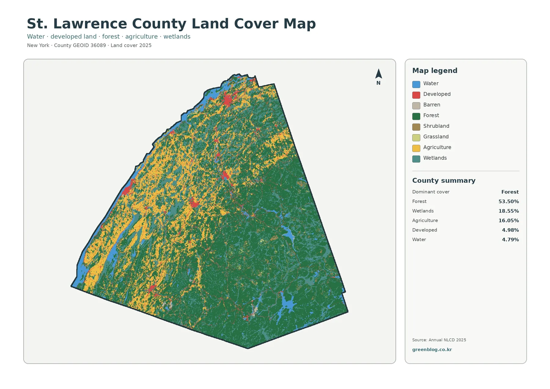
Forest covers 53.50 percent of the mapped county, making it the dominant 2025 class. The strongest concentration is in the southeast and east, where green cover forms broad connected areas. Moving toward the center and northwest, forest becomes more fragmented by agriculture, wetlands, water, and developed land. The percentage answers how much of the county is forest; the map answers where that forest is concentrated and where it breaks into a more mixed landscape.
Wetlands account for 18.55 percent, a remarkably large share relative to many county maps. Teal areas occur throughout the county, with especially visible concentrations in the north, west, and central zones. Wetlands also appear within the southeastern forest mosaic rather than stopping at the edge of the wooded region. Because wetland cover exceeds agriculture in the county summary, it should be treated as one of the main themes of the map rather than an occasional secondary class.
Agriculture represents 16.05 percent. Yellow agricultural cover is most prominent in the west and northwest, where large and small farmed areas are mixed with forest and wetland patches. It becomes less dominant toward the forested southeast. This distribution is more informative than the countywide percentage by itself because it shows a distinct agricultural side of the county rather than a uniform scattering of fields.
Developed land is 4.98 percent. Red pixels cluster around a limited number of settlement centers and thin connecting corridors instead of forming a large continuous urban area. Several concentrations can be seen toward the north and west, with smaller interior clusters. The pattern is important when interpreting the impervious-surface map later: developed land identifies a land-cover class, while impervious percentage estimates how much hard surface is present within each cell.
Water makes up 4.79 percent. Blue areas include the northwestern boundary and numerous internal lakes and water bodies, particularly in forested sections of the county. Smaller legend classes are also present. The forest/farmland summary lists grassland at 0.57 percent and shrubland at 1.27 percent; those categories can appear in scattered patches even though they are minor at county scale.
A practical way to read this figure is to start with the five large summary classes and then inspect smaller colors only where they matter. At a countywide viewing scale, tiny barren, grass, or shrub pixels can be easy to overinterpret. The broad forest–wetland–agriculture structure carries most of the useful regional information, while the smaller classes add local detail when the image is enlarged.
Hard surfaces occupy little of the county, yet their clusters are easy to locate
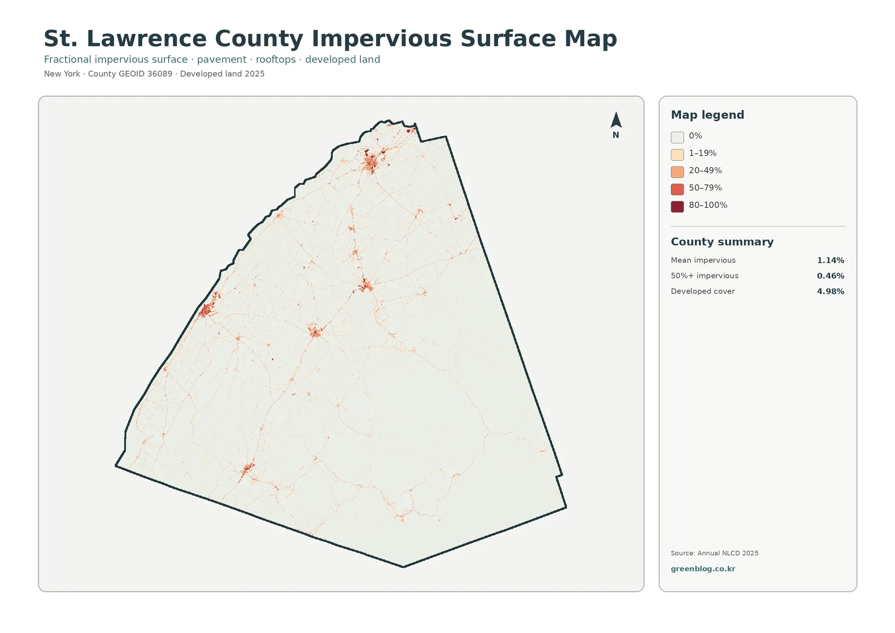
An impervious surface is pavement, a roof, a parking area, or another surface that does not readily absorb rainfall. The countywide mean impervious value is only 1.14 percent, and 0.46 percent of the mapped county falls in cells with at least 50 percent impervious cover. Those numbers are much lower than the 4.98 percent developed-land share because the two products measure different properties of the landscape.
Most of the map is nearly white, which is consistent with the county’s broad forest, wetland, and agricultural cover. Stronger orange and red values appear in compact clusters toward the north and northwest and at several smaller interior centers. Thin lines connect or extend away from some clusters. The pattern allows the viewer to find built surfaces quickly even though they occupy only a small fraction of such a large county.
The thin lines often resemble roads, but the map does not identify road names, functional classes, or traffic volumes. It shows hard-surface fraction in raster cells. A line that coincides with a road corridor should therefore be described as a concentration of impervious surface, not as evidence that a particular road caused nearby development. Cause-and-effect questions require transportation, building, and historical land-use records.
Comparing this image with the general land-cover map prevents a common mistake. A developed cell can contain lawns, tree cover, soil, and other permeable ground along with buildings and pavement. The impervious layer estimates the hard portion separately, so a developed area may contain a mix of light and dark impervious values. “Developed” does not mean “completely paved.”
The layer is useful for stormwater and watershed education, but it is not a runoff or flood-risk model. Slope, soil, vegetation, rainfall, ditches, culverts, stream connections, and local infrastructure all influence how water moves. At county scale, the map is best for finding broad concentrations that may deserve closer study rather than predicting what will happen at a specific property.
For presentations, pair the 1.14 percent mean with the 0.46 percent area above 50 percent impervious cover. The mean communicates how little hard surface exists across the whole county, while the higher-threshold statistic highlights the compact places where pavement and rooftops are much denser. Showing both avoids making the county look either more urban or more uniformly rural than the map indicates.
Forest and farmland separate the Adirondack side from the agricultural side
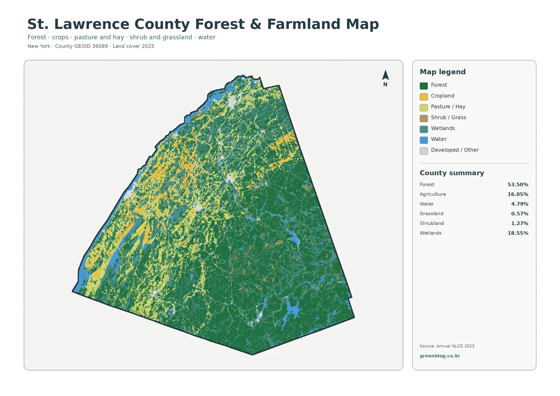
The forest-and-farmland figure simplifies the color scheme so the county’s rural contrast becomes easier to read. Forest remains 53.50 percent and agriculture 16.05 percent, while wetlands and water remain visible for context. Broad forest dominates the southeast. In the west and northwest, agricultural cover becomes much more frequent and is interwoven with wooded patches and wetlands rather than forming one uninterrupted block.
That western patchwork matters because the county’s official Agricultural Development Plan describes agriculture as a significant part of the local economy and farmland-protection effort. The map does not show farm ownership, crop type, production, or agricultural-district status, but it does show where agricultural surface cover is concentrated at county scale. The official plan can provide economic and policy context without turning the land-cover pixels into legal farm boundaries.
The southeastern forested area is visually more continuous than the western woods. Water and wetland patches remain present inside the forest, and small developed or other areas break the green locally. Forest classification does not identify tree species, stand age, harvest history, ownership, or public access. A continuous green area on this figure is therefore a surface-cover pattern, not a forest-management map.
Grassland is listed at 0.57 percent and shrubland at 1.27 percent in the summary. Those classes are small in percentage terms but can occur in many separate places. A small countywide share does not mean the class is confined to one location. For visual communication, it is better to explain the large forest and agriculture contrast first, then mention grass and shrub cover as smaller components of the mosaic.
This map works well for classroom comparison because it strips away some of the visual competition from developed classes. Students can select one western agricultural area and one southeastern forest area, then ask how much wetland or water appears around each. Returning to the general map afterward adds development and smaller classes back into the picture and shows why a simplified thematic view can be useful.
It also helps with county-to-county comparison, provided the metric and year are kept consistent. St. Lawrence County’s 53.50 percent forest share should be compared with another county’s 2025 forest share, not with that county’s impervious mean or developed percentage. Matching the legend category prevents an attractive chart from becoming a misleading one.
Wetland and water cover shape how the rural pattern should be interpreted
With wetlands at 18.55 percent and water at 4.79 percent, nearly a quarter of the mapped county falls into those two broad surface categories combined. They are not evenly distributed. Wetlands are especially visible in the northern, western, and central parts of the county, while water appears along the northwestern edge and as many internal lakes or ponds. In the southeast, water and wetlands occur within an otherwise strongly forested landscape.
The county’s official characteristics page describes the St. Lawrence Valley as a lowland region with wetlands, shallow lakes, and slow streams, while the Adirondack portions contain mountains, marshes, bogs, rivers, streams, lakes, and ponds. That description provides regional context for the mixture visible on the map. It should not be used to label an individual wetland pixel, but it supports the broader distinction between a wet lowland landscape and a forested, lake-rich southeastern area.
Water pixels indicate mapped water surface. They do not provide depth, water quality, navigability, shoreline ownership, or flood probability. Wetland pixels likewise do not establish a regulatory wetland. Jurisdictional boundaries are determined through separate agency datasets and, when necessary, site investigation. A land-cover map can identify broad places to ask a question; it cannot supply the legal answer.
For watershed instruction, the maps support careful observational questions. Where do developed or impervious clusters sit near mapped water? Where does agriculture approach wetland-rich areas? Which forested zones contain many water bodies? These questions can be answered visually. Whether those relationships create a water-quality, drainage, or habitat problem requires additional hydrologic, topographic, and field evidence.
The 1985–2025 difference map is mostly about class comparison, not a single trend
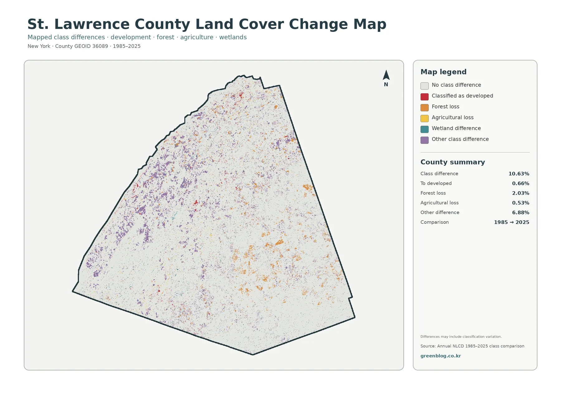
For the change layer, each grid cell is checked against its class in 1985 and again in 2025, and only mismatches receive a change color. Overall, 10.63 percent of the county is shown with a class difference. The summary breaks that total into 0.66 percent classified to developed, 2.03 percent forest loss, 0.53 percent agricultural loss, and 6.88 percent other class differences. Wetland difference is a separate legend category, but the summary panel does not provide a standalone percentage for it.
Purple “other difference” pixels are the largest reported component and are widely scattered, with noticeable concentrations in western parts of the county. That 6.88 percent share is why the 10.63 percent total cannot be described as development growth. Most of the total is not the red development category. The map also warns that class differences may include classification variation, which is especially important when comparing two widely separated dates.
Forest-loss pixels account for 2.03 percent and appear as orange patches in several parts of the county, including portions of the central-east and southeast. A pixel labeled forest loss tells the reader that the broad class differs between the two endpoints; it does not identify logging, development, agriculture, wind damage, or another cause. Intermediate land-cover years, historical imagery, and local records are needed when the actual transition matters.
The 0.66 percent “to developed” category is visible around some settlement clusters and linear features, but it remains a small part of the countywide difference. Likewise, agricultural loss at 0.53 percent appears in scattered patches rather than as one dominant zone. Proximity between two change colors should not be turned into a transition story unless the underlying data are checked.
A two-date comparison has another limitation: it cannot show every event between the endpoints. A cell might change more than once and return to its original broad class, or a mixed cell might be classified differently in the two years. The safest use is to treat the colored cells as places where the mapped classes differ, then investigate selected locations with intermediate data if a detailed history is required.
The difference map becomes much easier to use after the current maps have been read. Locate a colored cluster on the change layer, then return to the 2025 general map to identify the current class. The forest/farmland and impervious figures can add present-day context. This sequence turns a vague change color into a specific research question without claiming more than the data support.
Use the four files for different questions, not as interchangeable illustrations
The general 2025 map is the best starting point for a county overview because it includes all major classes and the full county summary. Use the forest/farmland map when the main question is the contrast between the agricultural west and the forested southeast. Move to the impervious layer when the topic becomes pavement, rooftops, and compact built surfaces. Use the 1985–2025 difference layer only when the question involves two-date class comparison.
A useful first test area is the southeastern forest block. It is strongly green on the general and forest/farmland maps, nearly blank on much of the impervious map, and contains scattered change pixels rather than one continuous change zone. A second test area in the west shows a much more mixed combination of agriculture, wetland, forest, small built clusters, and class differences. Comparing those two places makes the county’s internal diversity obvious.
A third comparison can focus on one of the northern or northwestern developed clusters. The general map identifies developed cover; the impervious map reveals that only portions of the same area have very high hard-surface percentages. The difference map may show some cells classified to developed, but current development and post-1985 development are not the same question. Keeping those concepts separate is essential for accurate captions and presentations.
For teaching, ask students to record four observations for the same location: current land-cover class, forest/farmland setting, impervious intensity, and whether a 1985–2025 difference is mapped. For presentation slides, use the same county outline at a similar size from one slide to the next. That makes the thematic change easier to follow than reducing all four maps to tiny panels with unreadable legends.
For comparative research, keep the year and statistic consistent. A 2025 forest percentage should be compared with 2025 forest in another county; a mean impervious value should be compared with the same impervious statistic. Developed cover, impervious percentage, and “to developed” change are three different measurements even though all relate to built landscapes.
JPG files for print, slides, and offline use
Opening the ZIP gives you one JPG for each theme: the full 2025 class map, the forest/farmland view, the impervious/developed view, and the 1985–2025 difference view. Each image carries its own title, legend, and county summary so it can be used away from the webpage in print layouts, slide decks, teaching handouts, and reference notes.
Choose the map that matches the question. The general map gives the full class mix; the forest/farmland view makes the west–southeast rural contrast clearer; the impervious figure isolates hard-surface intensity; and the change figure identifies cells whose broad class differs between the two comparison years. Using the right file is more informative than treating the four graphics as decorative variants of the same map.
When a map is cropped or reused, keep the title, year, and legend visible whenever possible. Keep the dates attached to the images: the current-cover and impervious products use 2025, whereas the difference layer uses 1985 and 2025 as its endpoints. Without that context, a red area could be mistaken for current developed land, high impervious cover, or a cell classified to developed in the two-date comparison. A short caption prevents that confusion.
Raster cells are for broad comparison, not parcel or regulatory decisions
Annual NLCD is a raster dataset, meaning the landscape is divided into grid cells. One grid cell may straddle several real surfaces—for example a field edge, a narrow road, shoreline vegetation, and nearby water. The assigned class or impervious percentage summarizes that cell. A colored edge should not be treated as a surveyed property line or an exact field boundary.
Countywide percentages compress a very large and varied landscape into a few summary numbers. The 53.50 percent forest value does not mean every town is half forest, and 18.55 percent wetland does not mean wetlands are equally dense everywhere. The maps show that the southeast is much more heavily forested while the west and northwest contain more agriculture and wetland mixing. The summary answers “how much”; the map answers “where.”
The current maps represent the 2025 mapped year. Conditions can change after the observation period, especially in active farm fields, harvested forest, construction areas, roadside vegetation, and wetland margins. For a current property question, pair the county-scale map with newer imagery, local records, and field information. These figures are best for orientation, education, broad comparison, and preliminary research.
The same caution applies to land-use law. Agricultural cover does not establish an agricultural district. Forest cover does not identify public or private ownership. Developed cover does not show zoning. Wetland cover does not define a jurisdictional wetland. County planning maps and the responsible state or federal datasets are the appropriate next step when a question becomes legal, parcel-specific, or regulatory.
Used within those limits, the four-map set is a strong screening resource. It can locate a farm-heavy area, a wetland-rich lowland, a forested Adirondack section, a compact impervious cluster, or a place with mapped class differences. Those observations help a reader decide what to investigate next without implying that a generalized land-cover product contains every answer about the site.
Frequently Asked Questions
Which surface class covers the largest share of St. Lawrence County in 2025?
Forest is the dominant class at 53.50 percent. Wetlands account for 18.55 percent, agriculture 16.05 percent, developed land 4.98 percent, and water 4.79 percent. The map shows the strongest forest concentration in the southeast, while agriculture and wetlands are much more prominent in the west and northwest.
Why is developed cover 4.98 percent while mean impervious cover is only 1.14 percent?
They are different measurements. A cell categorized as developed can still contain lawns, trees, exposed soil, and other ground that absorbs water alongside roofs or pavement. Impervious data instead estimate how much of each cell is occupied by hard, water-shedding surface. In St. Lawrence County, the highest values are concentrated in relatively small settlement and corridor clusters rather than across every developed pixel.
How should the 10.63 percent 1985–2025 class-difference value be interpreted?
No. Only 0.66 percent is summarized as “to developed.” Forest loss is 2.03 percent, agricultural loss 0.53 percent, and other class differences 6.88 percent, with wetland difference shown as another legend category. The map also notes that classification variation can contribute to differences, so the total is not a development-growth rate.
Are these maps suitable for parcel, zoning, or wetland-regulation decisions?
No. They are generalized images designed for county-scale land-cover comparison. They do not define property ownership, tax parcels, zoning districts, building rights, or jurisdictional wetland boundaries. Use current county, state, or federal records created for those specific purposes, and verify important site conditions with newer imagery or field information when needed.
Map File Information
The ZIP contains four original St. Lawrence County JPG maps covering 2025 land cover, forest and farmland, impervious surface, and 1985–2025 class differences.
- Included Files: Land cover, forest & farmland, impervious/developed land, and land cover change maps
- File Type: ZIP containing four original JPG maps
- Intended Use: Printing, teaching, presentations, county comparison, and map reference
Related Maps
- Albany County Land Cover Map
- Allegany County New York Land Cover Map
- Bronx County New York Land Cover Map
Sources and references
- MRLC Annual NLCD Data – official source for Annual NLCD land-cover and impervious-surface products
- USGS Annual NLCD Land Cover Classification – official explanation of the Annual NLCD land-cover classes
- U.S. Census Bureau TIGER/Line Shapefiles – official source for county boundaries and geographic identifiers
- St. Lawrence County Characteristics – official county description of the St. Lawrence Valley, Adirondack foothills, mountains, and major watershed context
- St. Lawrence County Planning Maps – official county planning map portal with land-use and agricultural-district resources
- St. Lawrence County Agricultural Development Plan – official county plan providing local agricultural and farmland-protection context
Green Map creates custom-edited map images using open geographic data sources such as geoBoundaries, Natural Earth, OpenStreetMap, and government open data.
These maps are edited visual materials, not raw data files, and are provided for education, documents, presentations, and graphic reference.