Personal remittances can be a modest line in one economy and a macroeconomic-scale inflow in another. The World Bank indicator Personal remittances, received (% of GDP) makes those differences easier to compare because it expresses incoming remittances relative to the size of each economy. The dataset used here contains 199 economies and takes the most recent non-empty observation available for each one. It is therefore a map of latest available observations, not a single-year 2025 ranking.
That distinction matters. Ninety-four economies have a 2025 value, 66 have a 2024 value, and 12 have a 2023 value. Another 27 economies are represented by an older observation because a newer non-empty value is not present in the verified extract. The map is useful for seeing the broad global pattern, but any close country-to-country comparison should keep the observation year beside the percentage.
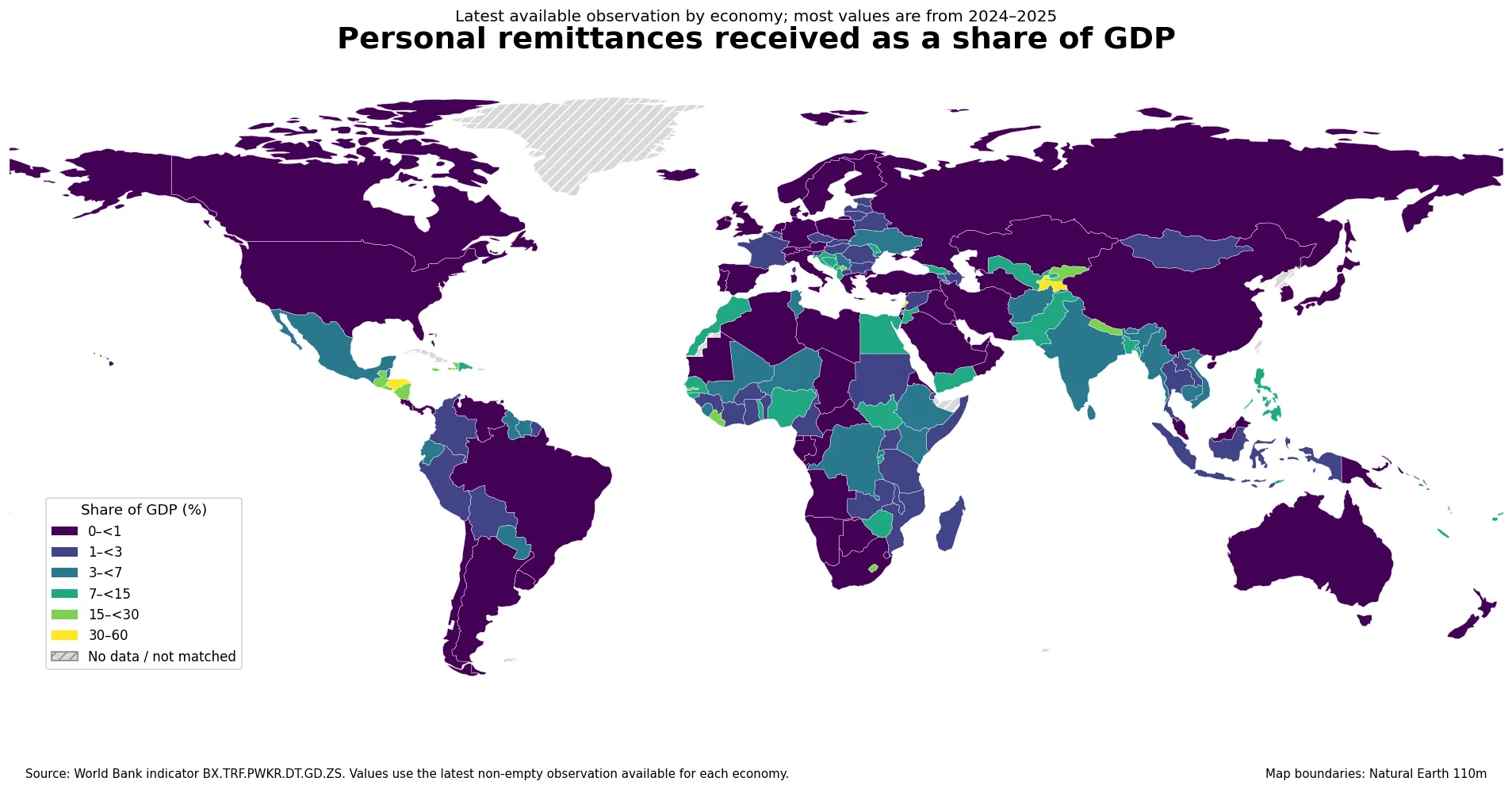
Table of Contents
What personal remittances received as a share of GDP measures
The indicator uses personal remittances received as the numerator and gross domestic product as the denominator. In the World Bank definition, personal remittances combine personal transfers with compensation of employees. Personal transfers cover current transfers in cash or in kind between resident and nonresident households, while compensation of employees captures income connected with border, seasonal, and other short-term workers and residents employed by nonresident entities. It is a balance-of-payments concept, so it is broader than the everyday idea of a person sending money to relatives.
Because GDP is the denominator, the percentage answers a relative-size question: how large are incoming personal remittances compared with the annual output of the economy? It does not tell us which country receives the largest dollar amount. A large economy can receive substantial remittance flows and still record a very small percentage of GDP, while a much smaller economy can show a high ratio with a lower absolute inflow.
The ratio is also affected by both sides of the calculation. A rise can reflect stronger remittance receipts, a smaller GDP denominator, or a combination of the two. A decline can occur even while remittances rise if GDP grows faster. For that reason, the percentage is excellent for cross-economy scale comparisons but should not be treated as a self-contained explanation of why a country moved up or down.
How fresh is the country coverage?
The verified file has one row for each of 199 economies. Of those rows, 160 are from 2024 or 2025. Adding 2023 raises the relatively recent group to 172. The remaining 27 observations come from 2022 or earlier. This mixed-year structure is common when a global indicator is assembled by taking the latest available value for every economy, but it creates an important comparability limit.
| Observation year | Economies | What it means |
|---|---|---|
| 2025 | 94 | Newest values in the extract |
| 2024 | 66 | Recent values that remain the latest available |
| 2023 | 12 | Latest value stops at 2023 |
| 2022 or earlier | 27 | Extra caution is needed for time-sensitive comparisons |
The age of the oldest observations is not trivial. The Central African Republic, for example, is represented by a 1993 value in this latest-observation extract, and Turkmenistan by 1996. Those numbers should not be lined up against 2025 observations and described as a current ranking. The safer approach is to use the map for distributional context, then filter to a common or near-common period when a strict ranking is needed.
The distribution is highly skewed
Across all 199 latest observations, the median is about 2.25% of GDP. The first quartile is roughly 0.52% and the third quartile is about 6.89%. The arithmetic mean is much higher, about 5.24%. That gap between the mean and median shows how strongly the upper tail matters: a limited number of economies have ratios far above the typical level and pull the average upward.
Restricting the calculation to the 160 economies with 2024 or 2025 observations changes the numbers only slightly. The median is about 2.11%, the mean about 5.19%, and the middle 50% runs from roughly 0.53% to 6.61%. In other words, the same broad pattern remains even when older observations are removed: most economies sit at relatively modest ratios, while a smaller group records very large shares of GDP.
This is why the map uses class intervals rather than a simple linear-looking legend. The categories—below 1%, 1% to under 3%, 3% to under 7%, 7% to under 15%, 15% to under 30%, and 30% to 60%—make it easier to see differences across the dense lower part of the distribution without hiding the extreme upper values.
Economies with the largest recent ratios
Among economies whose latest observation is from 2024 or 2025, Tajikistan stands far above the rest at 57.66% of GDP in 2025. Tonga follows at 39.20% in 2024. Honduras is at 30.12% in 2025, while El Salvador reaches 27.51% in 2025 and Nicaragua 26.63% in 2024. Nepal is close behind at 25.99% in 2024. These figures describe scale relative to GDP; they should not be read as shares of GDP production that are literally generated by remittances.
| Economy | Observation year | Personal remittances received (% of GDP) |
|---|---|---|
| Tajikistan | 2025 | 57.66% |
| Tonga | 2024 | 39.20% |
| Honduras | 2025 | 30.12% |
| El Salvador | 2025 | 27.51% |
| Nicaragua | 2024 | 26.63% |
| Nepal | 2024 | 25.99% |
| Marshall Islands | 2024 | 23.48% |
| Samoa | 2025 | 22.37% |
| The Gambia | 2024 | 22.00% |
| Liberia | 2024 | 21.28% |
| Lesotho | 2025 | 20.72% |
| Guatemala | 2024 | 19.12% |
The upper part of the list includes several different parts of the world rather than one continuous region. Central Asia contributes Tajikistan and the Kyrgyz Republic, Central America contains several high-ratio economies, Pacific island economies appear repeatedly, and parts of Sub-Saharan Africa are also visible in the upper bands. The map therefore shows multiple remittance-intensive clusters rather than a single global belt.
Regional clusters and sharp neighboring contrasts
Central Asia provides one of the clearest examples of both clustering and contrast. Tajikistan records 57.66% in 2025, the Kyrgyz Republic 17.60% in 2024, and Uzbekistan 14.28% in 2025. Kazakhstan, however, is only about 0.08% in 2025. Physical proximity alone clearly does not determine the ratio. Country-specific migration links, labor-market connections, domestic economic scale, and other factors may matter, but this single indicator cannot assign causal weights to them.
A similar pattern appears in Central America. Honduras, El Salvador, Nicaragua, and Guatemala all sit in high categories, with the latest values ranging from about 19% to 30% of GDP. Yet Costa Rica is around 0.83% in 2025, Belize 3.72%, and Mexico 3.51%. A regional label is therefore useful for finding a cluster, but not as a substitute for country-level data.
Pacific island economies are another visually distinct group. Tonga is at 39.20%, the Marshall Islands at 23.48%, Samoa at 22.37%, and Fiji at 7.11%. Ratios can become especially large in small economies because the GDP denominator is comparatively small. That does not make the percentage less meaningful, but it reinforces the need to separate relative dependence from absolute remittance volume.
The map also shows many economies in the lowest band. Kuwait is about 0.015% in 2025, Saudi Arabia 0.027%, Chile 0.028%, the United States 0.029%, Canada 0.036%, and Oman 0.036% in 2024. These very small shares mean that incoming personal remittances are tiny relative to GDP. They do not imply that cross-border transfers are absent, and they say nothing about how much money these economies send outward.
Why low and high percentages need careful interpretation
A high remittance-to-GDP ratio can be economically important because it signals that incoming remittances are large relative to domestic output. But the indicator alone does not establish whether that situation is beneficial or harmful overall. Remittances can support household consumption, education, housing, or foreign-exchange availability, while heavy dependence on external labor income can also expose households or an economy to shocks outside the country. Evaluating those channels requires other data.
Likewise, a low ratio does not mean migration or international transfers are unimportant to particular communities. National GDP is a very large denominator in many countries, so a small national percentage can coexist with strong local effects in specific regions or households. The World Bank series is designed for macroeconomic comparison, not household-level incidence.
It is also a receipts indicator, not a net-flow indicator. An economy may send large remittances abroad while receiving little, or it may both send and receive large amounts. To study net remittance flows, migrant labor relationships, or bilateral corridors, additional series are needed. The present map should be read as one side of the cross-border income picture.
Using the latest-observation map without turning it into a false ranking
The most practical way to use this map is in two stages. First, use the colors to identify economies and regions where remittances are large or small relative to GDP. Second, check the observation year before making a direct comparison. If two economies are both from 2025, the comparison is much cleaner than one between a 2025 value and a value from the 1990s.
For trend questions, this latest-value view is not enough. A change through time should be calculated from a consistent series for the same economy, ideally while also examining the absolute amount of personal remittances and the GDP denominator. That makes it possible to determine whether the ratio changed because remittances moved, GDP moved, or both changed in different directions.
The 2022-or-earlier observations are still useful because they indicate where newer data are not present in this extract. They should be treated as data-availability information as much as economic information. Keeping those rows visible avoids silently dropping economies, but the year field must remain part of the interpretation.
Source, map coverage, and reproducibility
The underlying series is the World Bank indicator BX.TRF.PWKR.DT.GD.ZS. The verified country-level file contains 199 rows and uses the latest non-empty observation per economy. No missing value was converted to zero. That matters because a missing observation and a true 0% value have completely different meanings.
For the map, the country codes were joined to Natural Earth 110m boundaries. Values matched 165 of the 177 boundary features after correcting the standard ISO placeholders for France, Norway, and Kosovo. Some territories or statistical economies in the World Bank table do not have a separate polygon in this small-scale boundary layer, and some mapped territories lack a value in the series. Hatched areas therefore mean no matched value, not zero remittances.
The result is best understood as a geographic overview of the latest available World Bank observations. It highlights the unusually high ratios found in parts of Central Asia, Central America, the Pacific, and several African economies, while also showing how widespread sub-1% ratios are. The map becomes more informative—not less—when the year differences and the GDP denominator are kept visible in the interpretation.
Frequently Asked Questions
What does personal remittances received as a share of GDP mean?
It is incoming personal remittances divided by GDP. The percentage shows the size of remittance receipts relative to the economy rather than the absolute amount of money received.
Are all values on the map from 2025?
No. The dataset uses the latest non-empty observation for each of 199 economies: 94 are from 2025, 66 from 2024, 12 from 2023, and 27 are older.
Does a high percentage mean a country receives the most remittances in dollar terms?
No. A smaller economy can have a high remittance-to-GDP ratio with a lower absolute inflow, while a large economy can receive more money but show a much smaller percentage of GDP.
Related Articles
Green Map creates custom-edited map images using open geographic data sources such as geoBoundaries, Natural Earth, OpenStreetMap, and government open data. These maps are edited visual materials, not raw data files, and are provided for education, documents, presentations, and graphic reference.