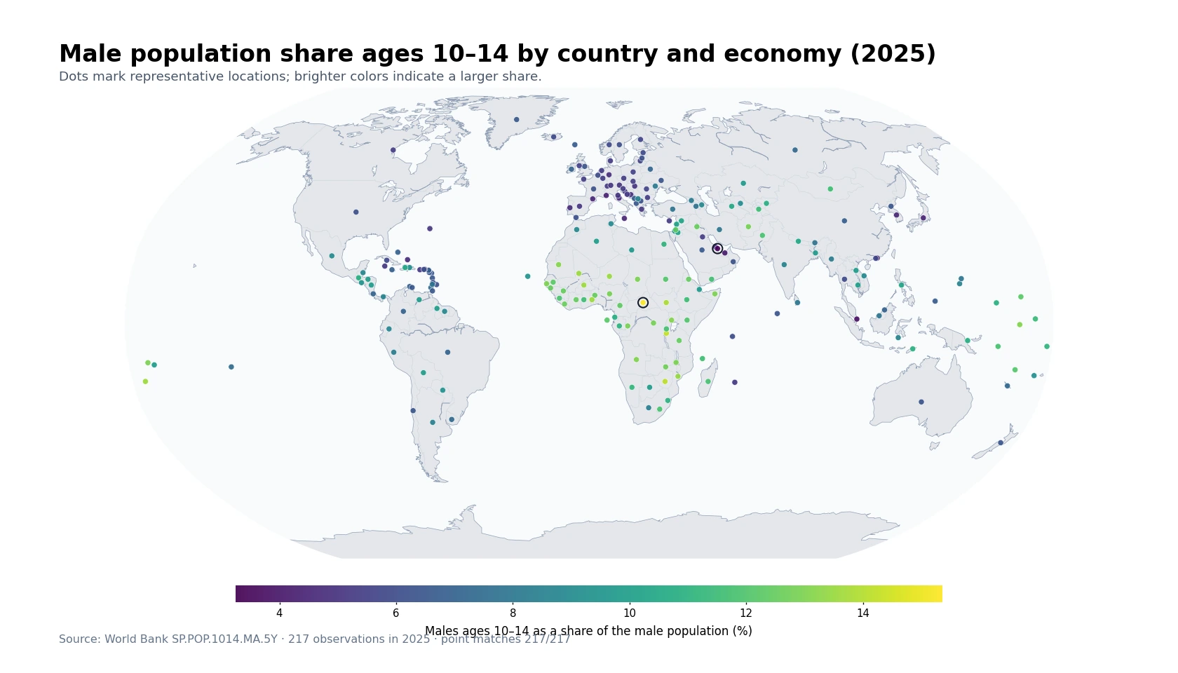
The World Bank indicator SI.DST.03RD.20 measures the share of total income or consumption accruing to the third population quintile. People are ordered from the lowest to the highest level of per-capita income or consumption and then divided into five equally sized population groups. The third quintile is the middle 20% — roughly the 41st through 60th percentiles of that distribution. It always contains one-fifth of the population, but it does not necessarily receive one-fifth of total income or consumption.
The latest-available file contains 171 economies, but its observation years range from 1992 to 2025. That wide spread matters. This map is therefore a picture of each economy’s most recent reported value, not a synchronized “2025 world ranking.” Economies whose latest observation is earlier than 2023 are marked with a black outline so older survey evidence is visible rather than silently mixed with newer observations.
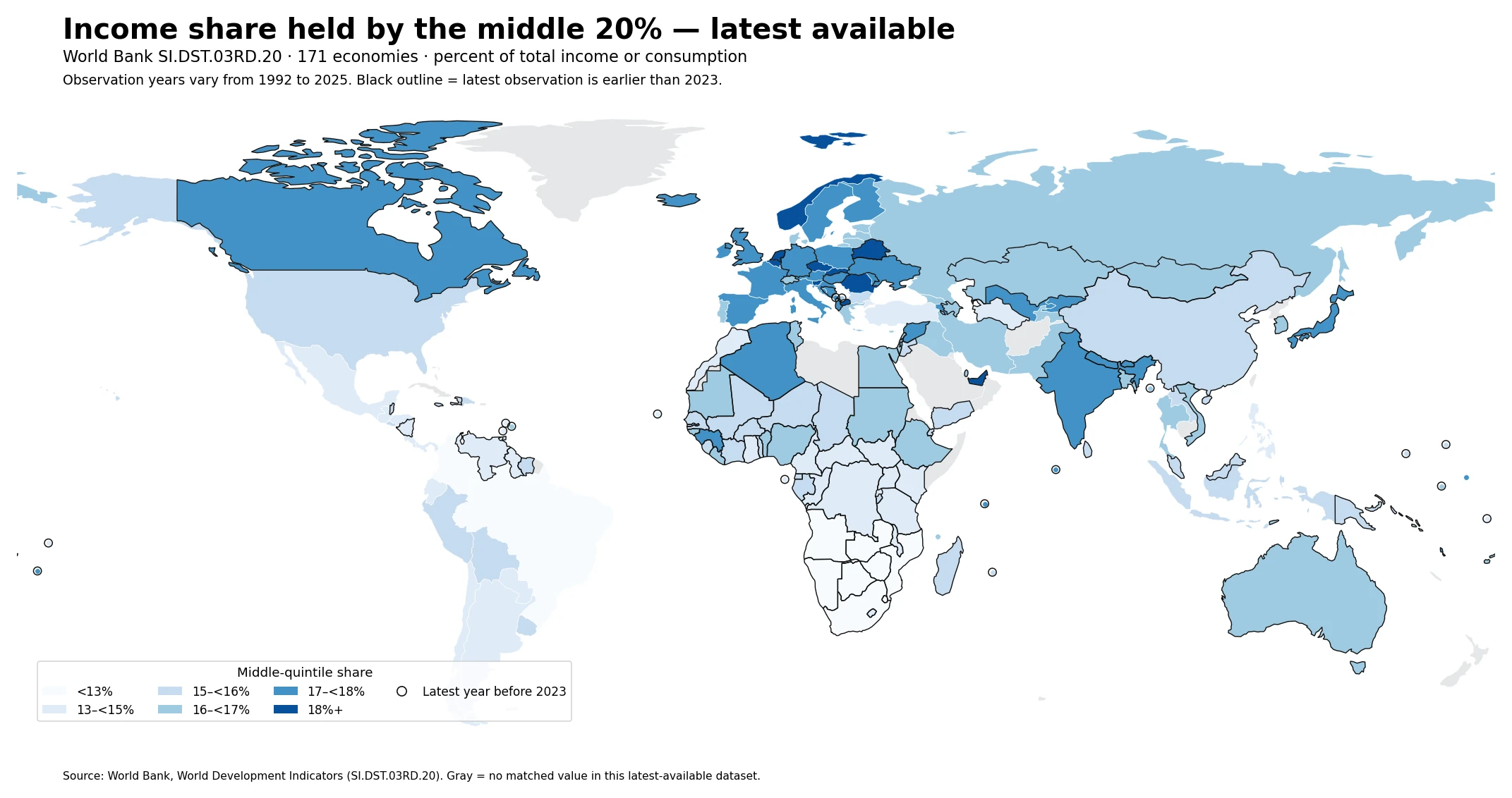
Across all 171 latest observations, the median is 16.0% and the mean is 15.8%. Values range from 9.8% to 19.3%. In a perfectly equal distribution, any 20% of the population would receive 20% of total income, yet none of the latest observations in this dataset reaches that benchmark. That makes the middle-quintile share informative, but it is still only one slice of the distribution and should not replace a full inequality measure.
Table of Contents
What the “third 20%” actually measures
The phrase “third 20%” can sound like a simple ordinal label, but it has a specific distributional meaning. Household survey observations are ranked from lower to higher welfare, usually using income or consumption per person, and split into five population quintiles of equal size. The first quintile is the lowest 20%, the fifth is the highest 20%, and the third is the group centered in the middle of the distribution. SI.DST.03RD.20 reports the percentage of total measured income or consumption that goes to that middle quintile.
A higher value means that the middle quintile receives a larger share of the total measured resources. It does not, by itself, prove that living standards are higher or that inequality is lower. Two economies can both report a 16% middle-quintile share while allocating very different shares to the bottom 40% and top 40%. The indicator is most useful when read alongside the lowest-20%, highest-20%, and Gini measures from comparable surveys.
Most latest values cluster around 15% to 18%
The distribution of latest observations is relatively concentrated. Ten economies are below 13%, 34 are between 13% and 15%, 38 are between 15% and 16%, 42 are between 16% and 17%, 37 are between 17% and 18%, and ten are at or above 18%. The median value of 16.0% is four percentage points below the 20% equal-share benchmark.
| Middle-quintile share | Economies |
|---|---|
| <13% | 10 |
| 13–<15% | 34 |
| 15–<16% | 38 |
| 16–<17% | 42 |
| 17–<18% | 37 |
| 18%+ | 10 |
That four-point gap should not be turned into a stand-alone inequality score. The same middle share can coexist with different patterns above and below the middle. The map is best used to identify broad geographic contrasts and then check the rest of the distribution before drawing conclusions about inequality.
Survey years vary sharply across economies
Freshness is the central limitation of this latest-available map. Only four economies have a 2025 observation. Twenty-one are from 2024 and 37 from 2023. Another 53 are from 2020–2022, 36 from 2015–2019, and 20 are from 2014 or earlier. Calling the complete map a 2025 cross-section would therefore misstate the evidence.
| Latest observation year | Economies |
|---|---|
| 2025 | 4 |
| 2024 | 21 |
| 2023 | 37 |
| 2020–2022 | 53 |
| 2015–2019 | 36 |
| 2014 or earlier | 20 |
Distributional indicators based on household surveys are not updated everywhere every year. Survey schedules, publication lags, redesigns, and data-quality review can all create gaps. Latest-available values are useful for coverage and spatial context, but strict country ranking should use a common survey year or a carefully harmonized period.
The 2023 cross-section is high across several Central and Eastern European economies
Among the 37 economies observed in 2023, the median middle-quintile share is 17.0% and the mean is 16.8%. The Slovak Republic records 19.3%, followed by Romania at 18.4% and Czechia at 18.1%. Belgium, Norway, and Slovenia each record 18.0%.
| Economy | 2023 middle-quintile share |
|---|---|
| Slovak Republic | 19.3% |
| Romania | 18.4% |
| Czechia | 18.1% |
| Belgium | 18.0% |
| Norway | 18.0% |
| Slovenia | 18.0% |
| Kiribati | 17.9% |
| Croatia | 17.8% |
The spatial concentration is visible on the map, but the dataset does not identify a causal mechanism. Tax-and-transfer systems, labor-market structure, household composition, survey design, and whether welfare is measured using income or consumption can all matter. The map supports a description of where shares are higher or lower; it does not by itself establish why.
Southern Africa and parts of Latin America show low latest-available shares
The lowest latest value is Namibia at 9.8% in 2015. Botswana and Eswatini are both at 10.7% in 2015 and 2016 respectively, and South Africa is at 10.8% in 2022. Those neighboring low values form a notable Southern African pattern. In Latin America, Colombia is at 11.5% in 2024, Brazil at 12.8%, and Panama at 13.0%.
| Economy | Latest year | Middle-quintile share |
|---|---|---|
| Namibia | 2015 | 9.8% |
| Botswana | 2015 | 10.7% |
| Eswatini | 2016 | 10.7% |
| South Africa | 2022 | 10.8% |
| Colombia | 2024 | 11.5% |
| Zambia | 2022 | 11.9% |
| Zimbabwe | 2019 | 12.0% |
| Mozambique | 2022 | 12.5% |
| Angola | 2018 | 12.6% |
| Brazil | 2024 | 12.8% |
The dates in that table are as important as the values. Namibia’s and Botswana’s observations are from 2015, while the Latin American examples are much newer. These are useful latest-available reference points, not a same-year leaderboard.
What the newest 2024–2025 observations show
There are only four 2025 observations: Uzbekistan at 17.1%, Indonesia at 15.5%, Costa Rica at 13.8%, and Ecuador at 13.7%. Among the 21 observations from 2024, Armenia is at 17.5% and the Kyrgyz Republic at 17.2% on the high end, while Colombia at 11.5%, Brazil at 12.8%, and Panama at 13.0% sit at the low end.
| Economy | Year | Middle-quintile share |
|---|---|---|
| Costa Rica | 2025 | 13.8% |
| Ecuador | 2025 | 13.7% |
| Indonesia | 2025 | 15.5% |
| Uzbekistan | 2025 | 17.1% |
| Armenia | 2024 | 17.5% |
| Kyrgyz Republic | 2024 | 17.2% |
| Comoros | 2024 | 16.7% |
| Georgia | 2024 | 16.5% |
| Colombia | 2024 | 11.5% |
| Brazil | 2024 | 12.8% |
| Panama | 2024 | 13.0% |
The 2023 mean is 16.84%, the 2024 mean 15.10%, and the 2025 mean 15.03%, but those figures should not be interpreted as a global time trend. The country composition changes dramatically from year to year, and the 2025 sample contains only four economies. A time-series conclusion would require repeated observations for the same countries using comparable survey concepts.
Read the middle quintile together with the top and bottom quintiles
The middle 20% is one part of a five-quintile distribution. A low middle share can occur when the top groups capture a large fraction of total resources, but the same middle share can also coexist with different outcomes for the bottom groups. Pairing SI.DST.03RD.20 with the highest-20% and lowest-20% shares from the same survey provides a much clearer picture of how resources are distributed.
Another comparability issue is the welfare concept itself. World Bank distributional series can be based on income or consumption depending on the survey and country. Small differences of a few tenths of a percentage point should therefore be treated cautiously across heterogeneous surveys. Larger gaps, common-year comparisons, and consistent survey concepts are more informative than a precise global ranking built from mixed years and methods.
Four checks before using the map
- The value is the percentage of total income or consumption received by the population between roughly the 41st and 60th percentiles.
- The map uses latest available values, and observation years vary from 1992 to 2025. Black outlines mark latest observations earlier than 2023.
- Missing values are not converted to zero. Gray areas indicate no matched value in the latest-available dataset and base map.
- The middle-quintile share is not a complete inequality metric; use top/bottom shares, the Gini index, and poverty measures for a fuller assessment.
Source: World Bank World Development Indicators, SI.DST.03RD.20. The World Bank describes quintile shares as the percentage of income or consumption accruing to the indicated population subgroup; quintile shares may not sum to exactly 100 because of rounding. This article uses the most recent non-empty observation supplied for each economy.
Frequently Asked Questions
Who is included in the middle 20%?
It is the third population quintile: people roughly between the 41st and 60th percentiles after the population is ranked by per-capita income or consumption.
Does a higher middle-quintile share always mean lower inequality?
No. It shows only one part of the distribution. The top and bottom quintile shares and a broader measure such as the Gini index are needed for a fuller inequality assessment.
Why do the observation years differ by country?
The indicator is derived from household surveys that are conducted and published on different schedules. Latest observations in this dataset range from 1992 to 2025.
Related Articles
Green Map creates custom-edited map images using open geographic data sources such as geoBoundaries, Natural Earth, OpenStreetMap, and government open data. These maps are edited visual materials, not raw data files, and are provided for education, documents, presentations, and graphic reference.