Electricity systems can look similar from a distance while relying on very different fuels. A useful way to expose that difference is to measure the share of electricity produced from oil, natural gas and coal. Using World Bank indicator EG.ELC.FOSL.ZS, the latest non-empty observation is available for 209 economies. The range runs from systems where fossil fuels provide essentially all recorded electricity generation to systems where their contribution is close to zero. That spread makes the indicator useful for comparing the broad shape of national power mixes, provided the observation year and the limits of the metric are kept visible.
The most important caveat is timing. This is not a perfectly synchronized 2023 cross-section. The dataset uses the most recent non-missing observation for each economy: 61 observations are from 2021, 79 from 2022 and 69 from 2023. A country with a 2021 value may have changed since then, especially if new renewable, nuclear or gas capacity came online. The figures below therefore describe the latest available structure in the source, not a league table measured on one identical date.
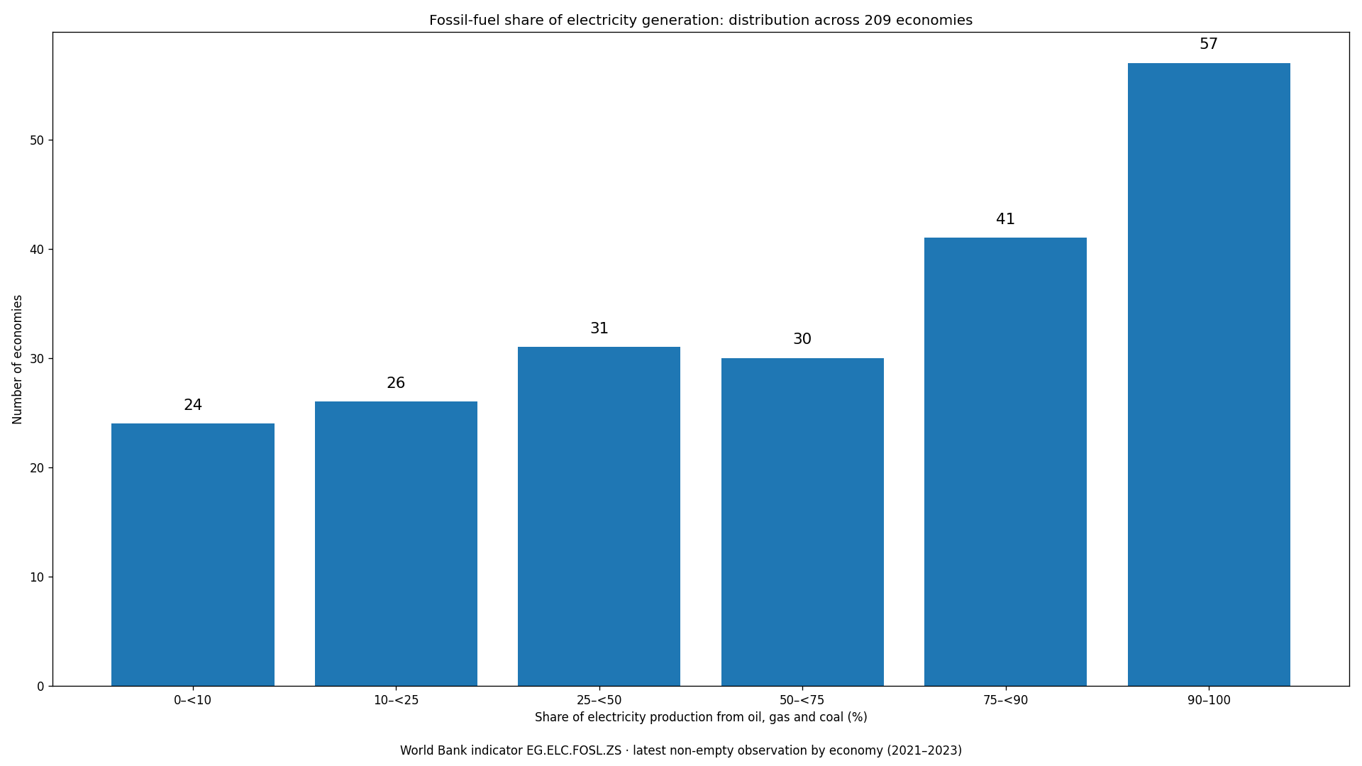
Table of Contents
What the global distribution looks like
Across the 209 observations, the simple arithmetic mean is 59.38% and the median is 65.52%. The median is especially informative because it shows that half of the economies in this dataset are above roughly two-thirds fossil-fuel generation. The mean sits lower than the median because a group of economies with very low fossil shares pulls the average down. The observed values span the full scale, from 0% to 100%, so the dataset is not clustered around a single global norm.
The six distribution bands make the contrast concrete. There are 57 economies at 90% or above and another 41 between 75% and 90%. At the other end, 24 are below 10%. In total, 128 of 209 economies, about 61%, are at or above 50%. This does not mean 61% of world electricity comes from fossil fuels, because every economy is counted equally here regardless of its generation volume. It means a majority of the economies in the comparison still obtain at least half of electricity production from oil, gas and coal combined.
Economies near the top of the range
Several observations are at, or extremely close to, 100%. Comoros, Gibraltar and Sint Maarten are recorded at 100% in their latest available rows. Turkmenistan is at 99.98%, Libya at 99.97% and Trinidad and Tobago at 99.93%. Brunei Darussalam, Bahrain and Kuwait are also above 99.8%. These values show very strong reliance on the combined fossil category for electricity production at the time of observation. They do not, however, reveal whether the system is mainly gas-fired, oil-fired or coal-fired. The indicator deliberately combines those sources, so a separate fuel-specific series is needed to distinguish their roles.
Saudi Arabia stands at 99.40% in 2022, while Algeria is 99.24% in 2023. Large electricity systems also occupy very different positions: India is 77.59% in 2023, Australia 66.08%, China 64.40% and Japan 64.28%. Treating all of these systems as simply “fossil dependent” would hide important differences. A system in the mid-60s already has roughly one-third of its production outside the combined fossil category, whereas a system above 99% has very little room for non-fossil generation in that observation.
What very low fossil shares mean—and what they do not
At the low end, Albania, Bhutan and Nepal are recorded at 0% in their latest observations. Paraguay is 0.0019% in 2023, Ethiopia 0.0115% in 2022 and Iceland 0.0198% in 2023. Norway is also low at 1.09% in 2023. In many such systems, hydropower, geothermal power, nuclear power or other renewables play a large role. But the combined fossil indicator by itself cannot identify the exact substitute. A value near zero should be read as “electricity production is overwhelmingly outside oil, gas and coal,” not as a complete description of the remaining generation mix.
Brazil is 8.73% in 2023, France 7.44% and Canada 19.67%, while Germany is 43.20% and the United Kingdom 37.06%. These examples underline why income level alone is not a sufficient explanation for the power mix. Domestic resources, legacy generating assets, nuclear policy, hydrological conditions, cross-border electricity trade, renewable build-out and fuel availability all matter. The indicator is therefore best used as a screening measure: it shows where systems differ, then points to the additional variables needed to explain why.
A side-by-side set of reference economies
The table below mixes high, middle and low observations so the distribution can be read against familiar reference points. The observation year is shown explicitly because it is part of the evidence. Korea, Rep. is at 61.17% in 2023, close to the United States at 59.30% and below China and Japan, both a little above 64%. That comparison is useful as a scale marker rather than as a special focus; the broader distribution remains the main subject.
| Economy | Observation year | Fossil-fuel share |
|---|---|---|
| Turkmenistan | 2022 | 99.98% |
| Libya | 2022 | 99.97% |
| Saudi Arabia | 2022 | 99.40% |
| India | 2023 | 77.59% |
| Australia | 2023 | 66.08% |
| China | 2023 | 64.40% |
| Japan | 2023 | 64.28% |
| Korea, Rep. | 2023 | 61.17% |
| United States | 2023 | 59.30% |
| Germany | 2023 | 43.20% |
| Canada | 2023 | 19.67% |
| Brazil | 2023 | 8.73% |
| France | 2023 | 7.44% |
| Norway | 2023 | 1.09% |
| Iceland | 2023 | 0.02% |
Five common interpretation mistakes
First, this is a share of electricity production, not a share of total national energy use. Petroleum used in transport, gas used directly in buildings and fuels consumed in industrial processes are outside the numerator unless they are used to generate electricity. Second, it is not an installed-capacity measure. A country can have a large fleet of fossil generators that runs infrequently, or a smaller fleet that operates at high capacity factors. Generation shares reflect actual output rather than nameplate capacity.
Third, the percentage is not a direct carbon-emissions metric. Coal and gas have different emissions characteristics, plant efficiencies vary, and upstream emissions are not represented by this share. Fourth, a low fossil percentage does not automatically imply a small electricity system, low demand or high grid reliability. Those are different questions. Fifth, the mixed observation years matter. A 2021 value and a 2023 value should not be described as if they were simultaneous measurements. The latest-value approach increases country coverage, but it trades away some time consistency.
What the pattern suggests about electricity transitions
The distribution shows that power-sector transitions are occurring from very different starting points. Systems above 90% have much more of their current generation tied to fossil fuels than systems already below 25%. That difference affects the scale of replacement generation, grid investment, storage, dispatchable capacity and fuel infrastructure that may be relevant to future change. Yet the indicator should not be turned into a policy scorecard. Countries differ in resource endowments, demand growth, interconnections, market design and the age of existing power plants.
For analysis over time, movement between bands can be more informative than a single rank. If a country shifts from the 80s to the 60s over several years, a follow-up analysis can test whether wind and solar expanded, hydro output recovered, nuclear generation increased or fossil generation declined for another reason. If the fossil share rises, the cause might be stronger electricity demand, weaker hydro conditions, outages at non-fossil plants or a change in fuel economics. The percentage flags the structural change; it does not identify the causal mechanism by itself.
Data source and calculation
The source is the World Bank indicator “Electricity production from oil, gas and coal sources (% of total),” code EG.ELC.FOSL.ZS. In the indicator definition, oil includes crude oil and petroleum products. Gas refers to natural gas and excludes natural gas liquids. Coal includes hard coal, lignite-brown coal and several derived coal fuels, and peat is included in this category. The analysis uses the most recent non-empty observation available for each of the 209 economies in the supplied data, with no interpolation or invented values.
The summary statistics are calculated directly from those 209 percentages. Each economy receives equal weight in the mean and distribution counts. As a result, the 59.38% average should not be confused with the fossil share of total world electricity generation. A generation-weighted global figure would require each country’s electricity output as an additional weight. The median of 65.52% is likewise a statement about the midpoint economy in this sample, not about the midpoint megawatt-hour produced globally.
What to compare next
The combined indicator is most informative when paired with fuel-specific generation shares. Coal-heavy and gas-heavy systems can produce similar combined fossil percentages while facing different fuel supply, operational and emissions profiles. Looking separately at coal, natural gas and oil generation can show what is driving the combined number. Adding hydropower, nuclear and renewable-generation shares then explains what fills the non-fossil portion of the mix.
A time-series comparison is the next step for measuring transition speed. That work should align years across countries instead of mixing latest observations. Using common start and end years makes percentage-point changes comparable and reduces the risk of attributing a difference to policy when it is partly a timing artifact. The latest-value view here is better suited to a broad structural scan: it identifies the systems with very high, middle and very low fossil shares and makes clear where deeper country-level analysis is worth doing.
Frequently Asked Questions
What is included in the fossil-fuel electricity share?
World Bank indicator EG.ELC.FOSL.ZS combines electricity production from oil, natural gas and coal-related fuels as a percentage of total electricity production.
Are all country values from 2023?
No. The comparison uses each economy’s latest non-missing observation: 61 are from 2021, 79 from 2022 and 69 from 2023.
Does a low fossil share mean a country uses little energy overall?
No. The indicator describes the fuel mix of electricity production only. It does not measure total energy consumption or direct fuel use in transport, buildings and industry.
Related Articles
Green Map creates custom-edited map images using open geographic data sources such as geoBoundaries, Natural Earth, OpenStreetMap, and government open data. These maps are edited visual materials, not raw data files, and are provided for education, documents, presentations, and graphic reference.