Manufacturing value added as a share of GDP shows how much of an economy’s total value added comes from manufacturing. This article compares the most recent non-empty World Bank NV.IND.MANF.ZS observation for 204 economies. It is therefore a latest-available map, not a perfectly synchronized 2025 cross-section, and the observation year should be read alongside every value.
A high percentage does not automatically mean an economy has one of the world’s largest manufacturing sectors in absolute terms. GDP is the denominator. A relatively small economy can post a high manufacturing share if manufacturing accounts for a large part of its domestic value added, while a much larger economy can have an enormous manufacturing sector but a lower percentage because services and other activities are also large.
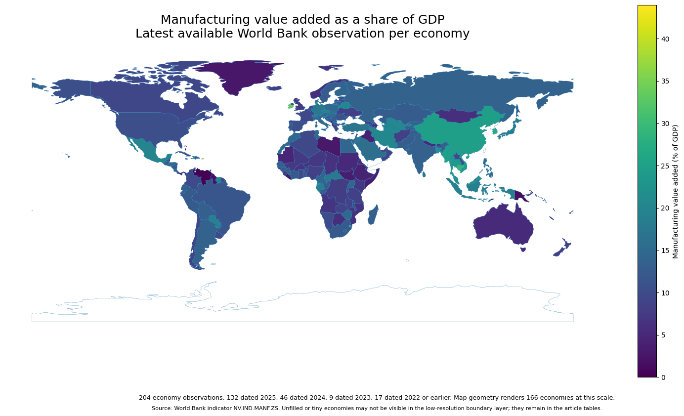
Table of Contents
What the indicator measures
The World Bank defines manufacturing around industries that transform materials or components into new products. Value added is the contribution made by a producer or industry after intermediate goods and services used in production are deducted from output. NV.IND.MANF.ZS expresses that manufacturing value added as a percentage of GDP, so the unit is percent rather than currency, employment, output volume, or export value.
That makes the indicator useful for describing economic structure. It answers the question “how large is manufacturing relative to the whole economy?” It does not directly measure factory employment, physical production, manufacturing exports, productivity, technological sophistication, or the size of the sector in dollars. Those are separate metrics and may produce a different country ordering.
The underlying observations come from the World Bank API for NV.IND.MANF.ZS. The extraction keeps the most recent non-empty observation for each economy. This design improves geographic coverage, but it also means the map should be interpreted as a latest-available structural comparison rather than a single-year league table.
Most observations are recent, but the years are not identical
Of the 204 observations, 132 are dated 2025, 46 are dated 2024, and 9 are dated 2023. Another 17 observations are from 2022 or earlier. In other words, roughly 87.3% of the dataset is from 2024–2025, which makes the overall map fairly current, but not all economies are being compared at exactly the same point in time.
The timing difference matters most when values are close. An economy whose latest observation is several years old may have changed since the reported year. The United States, for example, is represented by a 2021 observation in this supplied extract, while Canada is represented by 2022. Several other economies have even older latest values. Those entries are still useful as the latest available evidence, but they should not be treated as if they were measured in 2025.
For broad spatial patterns, this limitation is manageable because the year is carried through the table and the map is described as latest available. For precise year-on-year comparisons, a separate panel or time-series analysis would be required. Differences of only a few tenths of a percentage point should also not be over-interpreted because national accounts can be revised.
Economies with the highest latest shares
The highest latest observation is Puerto Rico (US) at 43.97%. Liechtenstein and Ireland are above 33%, while San Marino is above 31%. Cambodia and Eswatini are in the high twenties. The next group includes Korea, Rep., Myanmar, China, and Viet Nam. The mix of large and very small economies in the top ten is a reminder that this is a GDP share, not a ranking of global manufacturing output.
| Rank | Economy | Observation year | Manufacturing value added / GDP |
|---|---|---|---|
| 1 | Puerto Rico (US) | 2025 | 43.97% |
| 2 | Liechtenstein | 2023 | 34.17% |
| 3 | Ireland | 2025 | 33.93% |
| 4 | San Marino | 2023 | 31.77% |
| 5 | Cambodia | 2025 | 29.02% |
| 6 | Eswatini | 2025 | 28.06% |
| 7 | Korea, Rep. | 2025 | 27.43% |
| 8 | Myanmar | 2025 | 25.10% |
| 9 | China | 2025 | 24.73% |
| 10 | Viet Nam | 2025 | 24.53% |
The top group is geographically diverse. East and Southeast Asia contribute several high-share economies, but European microstates and Ireland also appear near the top. A single regional label is therefore not enough to explain the entire distribution. The same percentage can arise in economies with very different size, sector composition, trade patterns, and institutional structures.
The low end among 2024–2025 observations
To avoid letting very old observations dominate the bottom of the ranking, the table below looks only at economies whose latest value is from 2024 or 2025. Bermuda and the Turks and Caicos Islands are below 0.5%. Micronesia and São Tomé and Príncipe are also below 1%, while the Bahamas, Macao, the Cayman Islands, and Hong Kong have very small manufacturing shares of GDP.
| Economy | Observation year | Manufacturing value added / GDP |
|---|---|---|
| Bermuda | 2024 | 0.31% |
| Turks and Caicos Islands | 2024 | 0.45% |
| Micronesia, Fed. Sts. | 2025 | 0.48% |
| Sao Tome and Principe | 2025 | 0.59% |
| Bahamas, The | 2024 | 0.63% |
| Macao SAR, China | 2024 | 0.65% |
| Cayman Islands | 2024 | 0.87% |
| Hong Kong SAR, China | 2024 | 0.93% |
| Palau | 2024 | 1.21% |
| Gambia, The | 2024 | 1.45% |
A low manufacturing share is not, by itself, evidence of weak economic performance. The indicator is compositional. Economies with large financial, tourism, professional-service, public-service, or other non-manufacturing sectors can have low manufacturing percentages even when those other activities are highly productive. Small island and city economies are especially different from large land-based manufacturing economies.
A visible high-share cluster in East and Southeast Asia
One of the clearest spatial patterns is the concentration of relatively high shares across parts of East and Southeast Asia. In 2025, China is at 24.73%, Viet Nam at 24.53%, Thailand at 23.74%, Malaysia at 22.10%, and Cambodia at 29.02%. Bangladesh is also high at 22.44%. These values do not prove a common cause, but they show that manufacturing contributes a large fraction of GDP across several neighboring or nearby economies.
The pattern is useful precisely because the map turns a long country table into a geographic view. It allows the reader to see that high shares are not isolated to one economy. At the same time, nearby countries can differ substantially, and the indicator alone cannot determine whether trade integration, investment, labor costs, natural resources, industrial policy, or another factor explains those differences.
Central Europe also shows a band of mid-to-high shares
A second notable group appears in Central Europe. Czechia records 19.42% in 2025, Slovenia 18.60%, Germany 17.61%, the Slovak Republic 16.19%, and Austria 15.23%. These are clearly above the dataset median. Luxembourg, by contrast, is at 3.72% in 2025, illustrating how sharply economic structure can differ even within the same broad region.
Spatial proximity can help identify clusters worth investigating, but it should not be mistaken for causal evidence. A map of one ratio cannot establish why neighboring economies look similar or different. Answering that question would require additional variables such as manufacturing employment, sector-level production, trade, investment, productivity, and historical change.
The median is more informative than the mean for a typical economy
Across all 204 latest observations, the simple mean is 10.71% and the median is 9.97%. The first quartile is 5.31% and the third quartile is 14.34%, so the middle half of observations lies roughly between 5.3% and 14.3%. The maximum of 43.97% pulls the mean upward, which is why the median is a better single-number description of the center of the distribution.
If the sample is limited to the 178 economies with 2024 or 2025 observations, the median is 10.15%. That is close to the all-observation median, suggesting that the broad center of the distribution is not being driven entirely by the older rows. Still, restricting the years excludes economies without recent data, so the selection rule should always be stated.
A percentage of GDP is not an absolute manufacturing-size ranking
This distinction is fundamental. Manufacturing value added can be measured in currency units or as a percentage of GDP. The percentage used here normalizes manufacturing by the size of the entire economy. It is excellent for comparing structure, but it can make a small manufacturing-oriented economy look “larger” than a huge diversified economy when the question is actually absolute manufacturing output.
If the research question is “which economy produces the most manufacturing value added in total?”, an absolute-value series would be appropriate. If the question is “where is manufacturing most important relative to the rest of the domestic economy?”, the percentage series is the better choice. Mixing those two questions is one of the easiest ways to misread the map.
Small economies may be absent from the polygon map but not from the data
The supplied dataset contains 204 economy rows. The low-resolution world boundary layer matches and renders 166, or about 81.4%. Most unmatched rows are very small islands, microstates, or territories that are not represented as separate visible polygons at this scale. Their statistical observations are not treated as zero and are not removed from the ranking or distribution calculations.
That is why a small economy can appear in the top or bottom table even when it is hard to see on the world map. Enlarging tiny territories into oversized map symbols would create a different kind of distortion. The map is therefore used for broad spatial pattern recognition, while the tables preserve exact values for economies that are too small to display clearly.
What the map can and cannot tell you
The map is well suited to locating economies where manufacturing contributes a high or low share of GDP, spotting regional bands, and identifying outliers that deserve closer examination. It is also useful for distinguishing manufacturing-oriented economic structures from economies dominated by other sectors.
It cannot, on its own, explain productivity, wages, export competitiveness, supply-chain resilience, technological intensity, future growth, or the effect of a specific policy. Nor does a high share automatically imply better economic outcomes. The safest interpretation stays close to the metric: manufacturing value added as a percentage of GDP, using each economy’s latest available World Bank observation.
Frequently Asked Questions
What does manufacturing value added as a share of GDP measure?
It is manufacturing value added divided by total GDP. It describes the relative importance of manufacturing within an economy, not the absolute size of manufacturing output.
Are all values on the map from 2025?
No. 132 of the 204 observations are from 2025 and 46 are from 2024. The rest use each economy’s earlier latest available observation.
Does a high percentage mean an economy has a very large manufacturing sector?
Not necessarily. Because the measure is a percentage of GDP, a small manufacturing-oriented economy can have a high share. Absolute manufacturing value added is a different metric.
Why are some small economies missing from the visible map?
The low-resolution world boundary layer does not draw every microstate or tiny territory as a separate polygon. Their values are not zero-filled or discarded; they remain in the tables and statistics.
Related Articles
Green Map creates custom-edited map images using open geographic data sources such as geoBoundaries, Natural Earth, OpenStreetMap, and government open data. These maps are edited visual materials, not raw data files, and are provided for education, documents, presentations, and graphic reference.