Agriculture, forestry and fishing can be compared in many ways: output volume, employment, share of GDP, exports, or the value the sector adds to an economy. The World Bank indicator NV.AGR.TOTL.CD focuses on the last of these and expresses it in current U.S. dollars. It therefore gives a monetary measure of the contribution generated by activities in agriculture, forestry and fishing after intermediate inputs are deducted, rather than a count of tonnes produced or the gross sales value of farm products.
The dataset used here contains the latest non-missing observation for 206 economies. Coverage is complete at the row level, but the dates are not uniform. 158 economies have a 2025 observation, 28 have 2024, and 20 rely on an earlier latest value from 1990 through 2023. The map should therefore be read as a latest-available comparison, not as a synchronized 2025 league table.
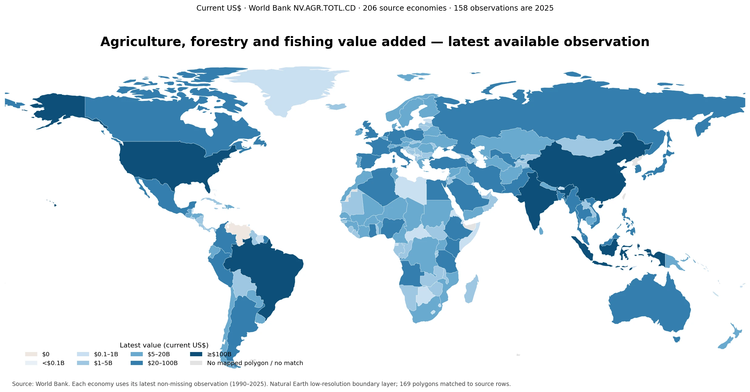
Table of Contents
What this value-added measure captures
Under the World Bank definition, agriculture, forestry and fishing corresponds to ISIC Rev. 4 divisions 01–03. The measure covers activities such as crop and animal production, forestry and logging, and fishing and aquaculture. Value added is calculated as the value of output less the value of goods and services consumed as intermediate inputs. This avoids counting the same purchased inputs repeatedly as they move through the production chain.
The “current US$” label matters just as much as the sector definition. Current-price figures are nominal: they are not adjusted to remove inflation over time. Converting domestic-currency value added into U.S. dollars also introduces exchange-rate effects. A country can therefore show a larger dollar value because of higher prices, currency movements, greater physical production, structural change, or a combination of these forces. The indicator is useful for comparing monetary scale, but it is not a direct measure of real output growth.
A highly concentrated global distribution
The median latest observation is about $3.3B, while the mean is much higher at $22.4B. The first quartile is $423.4M and the third quartile is $10.3B, so the middle half of the 206 economies falls within a range that is tiny compared with the largest values. 136 economies are at or above $1 billion, 56 are at or above $10 billion, and only 5 exceed $100 billion. At the other end, 24 economies are below $100 million.
That difference between the mean and median is a useful warning against describing a single “typical” country from the average alone. Large-population economies and major agricultural producers occupy the upper tail. Small island economies and economies where agriculture, forestry and fishing make up a small absolute sector can sit many orders of magnitude lower. Quartiles and the observation year provide more context than a single average.
Economies with the largest latest observations
China has the largest latest observation at roughly $1.30 trillion in 2025, followed by India at about $642.2 billion in 2025. The United States appears third at about $223.7 billion, but its latest observation in this dataset is from 2021. Indonesia is about $189.4 billion in 2025 and Brazil about $138.8 billion in 2025. These are the five economies whose latest available values exceed $100 billion.
| Economy | Latest value | Observation year |
|---|---|---|
| China | $1,298.3B | 2025 |
| India | $642.2B | 2025 |
| United States | $223.7B | 2021 |
| Indonesia | $189.4B | 2025 |
| Brazil | $138.8B | 2025 |
| Pakistan | $93.8B | 2025 |
| Turkiye | $83.2B | 2025 |
| Russian Federation | $78.3B | 2025 |
| Mexico | $71.2B | 2025 |
| Nigeria | $66.8B | 2025 |
Pakistan, Türkiye, the Russian Federation, Mexico and Nigeria complete the top ten. This ranking should not be treated as a pure ranking of farm output. The indicator includes forestry and fishing, measures value added rather than gross output, and is converted into current U.S. dollars. The mixed observation years also matter. If the analytical question requires a strict same-year ranking, the correct approach is to retrieve one common year for every economy rather than mix latest observations.
Absolute scale and economic dependence are different questions
A large value-added amount does not necessarily mean that an economy is highly dependent on agriculture. A very large economy can generate tens of billions of dollars in agriculture, forestry and fishing while the sector accounts for only a modest share of total GDP. A smaller economy can have a much lower absolute value but rely on the sector for a much larger share of income and employment.
For that reason, this current-dollar indicator works best when the question is “How large is the sector in monetary terms?” If the question is “How important is the sector inside the economy?”, a GDP-share indicator is more appropriate. Using both side by side separates scale from dependence and prevents a common mistake: assuming that the countries with the largest absolute amounts are automatically the most agriculture-oriented economies.
Why the observation year must stay visible
Most of the data are recent: 186 of the 206 economies have observations from 2024 or 2025. The remaining 20 do not. Some gaps are substantial. Somalia’s latest row is from 1990, Eritrea’s from 2009, Venezuela’s from 2011, Sint Maarten’s from 2013, and Tuvalu and South Sudan have 2015 observations. These values are still the latest non-missing entries returned for those economies, but they should not be presented as if they described conditions in 2025.
| Economy | Latest year | Value in that year |
|---|---|---|
| Somalia, Fed. Rep. | 1990 | $575.4M |
| Eritrea | 2009 | $262.2M |
| Venezuela, RB | 2011 | $0 |
| Sint Maarten (Dutch part) | 2013 | $0.8M |
| Tuvalu | 2015 | $5.9M |
| South Sudan | 2015 | $1.2B |
| Yemen, Rep. | 2018 | $6.2B |
| New Caledonia | 2019 | $169.2M |
| French Polynesia | 2020 | $123.5M |
| Cuba | 2020 | $3.0B |
Venezuela is a particularly clear example of why date context matters: the 2011 row reports a value of zero. That should not be interpreted as evidence that the country currently has no agriculture, forestry or fishing activity. It is an old database observation and must be handled as such. A latest-available dataset improves coverage, but it does not eliminate the need to distinguish recent rows from stale ones.
Geographic patterns in the map
The map highlights several broad clusters of large current-dollar value added. East and South Asia contain the two largest observations, and substantial values also appear in Southeast Asia. Major economies in North and South America occupy high-value classes, while Nigeria and Egypt stand out in Africa. In Europe, countries such as Italy, Spain, France and Germany have sizeable absolute values even though agriculture may represent a smaller share of their overall economies than it does in some lower-income countries.
The geometry layer is intentionally used only where a source economy can be matched to a world polygon. Of 206 source rows, 169 polygons are matched in the low-resolution Natural Earth layer. Many of the unmatched rows are small islands or territories that do not have a separate polygon at this scale. Their data have not been turned into zeros or guessed locations. When a small economy is not visibly colored on the map, the underlying source row remains the better reference.
How current prices and exchange rates affect the picture
Because values are expressed at current prices, inflation can lift the nominal dollar amount even if real production changes much less. Agricultural commodity price cycles can also move the monetary value of output and value added. In addition, a depreciation of a domestic currency against the U.S. dollar can make local-currency growth look weaker after conversion, while an appreciation can push the dollar figure higher.
This is why cross-sectional scale comparisons and time-series growth analysis should use different tools. Current U.S. dollars are intuitive for showing the approximate monetary size of sectors across economies. Constant-price series are usually more informative for real growth through time. Physical production indexes, yields, labor productivity and land productivity answer still different questions and should not be inferred from the current-dollar value-added series.
What the indicator can and cannot tell you
The series can show where agriculture, forestry and fishing generate the largest nominal amounts of value added, how concentrated the distribution is, and which economies fall into broad monetary size classes. Combined with observation years, it also reveals where country coverage is recent and where the latest available data are old. Those are useful facts for screening markets, comparing economic scale and identifying economies that warrant deeper analysis.
It cannot by itself measure food security, farm household income, employment, export competitiveness, production volume, climate exposure or resource efficiency. A country can have a large sector because it is populous and economically large, not because agriculture has an unusually high GDP share. Similarly, a small current-dollar value can reflect a small population, a small overall economy, exchange-rate conditions or an older observation. Additional indicators are needed before making causal or policy conclusions.
Useful follow-up comparisons
A strong next step is to pair the absolute value-added measure with the sector’s share of GDP. That separates “large in dollars” from “large relative to the domestic economy.” A second comparison is per-capita or per-worker value added, which adjusts for population or labor-force scale. A third is to align all economies to the same year when the purpose is a formal ranking rather than a latest-data snapshot.
Trade data can add another layer, but exports and value added should not be confused. A country may export large amounts of agricultural goods while using imported inputs, and a sector focused on domestic consumption can generate substantial value added without equally large exports. Production quantities, prices, employment and trade flows are complementary measures, not substitutes for the value-added concept.
Reading the map categories correctly
The color classes on the map are presentation bands, not World Bank ratings. A country just above a class boundary may have almost the same value as one just below it even though their colors differ. For close comparisons, use the numeric values rather than the shade alone. The top-ten table is also more suitable than the map for distinguishing economies whose values are relatively close.
The map uses a low-resolution global boundary layer so that a worldwide pattern remains readable on a normal web page. This improves rendering speed but reduces the visibility of microstates and small territories. The map therefore emphasizes spatial pattern rather than exhaustive cartographic representation of every one of the 206 source rows.
Source and calculation basis
The source is the World Bank indicator NV.AGR.TOTL.CD, Agriculture, forestry, and fishing, value added (current US$). One latest non-missing observation is used for each of the 206 economies in the supplied dataset. No missing values are filled with zero and no country values are estimated. The displayed monetary classes are visualization choices rather than official World Bank thresholds.
Frequently Asked Questions
Are all 206 economy observations from 2025?
No. 158 are from 2025, 28 from 2024, and 20 use an earlier latest non-missing observation from 1990–2023.
Does a large value-added amount mean agriculture has a large share of GDP?
Not necessarily. This indicator measures absolute current-dollar value added. A GDP-share indicator is needed to measure the sector’s relative importance within each economy.
Can current US$ value added be used as a real growth series?
Not directly. Current-price values are affected by inflation and exchange rates. Constant-price value added or physical production measures are more appropriate for real growth analysis.
Related Articles
Green Map creates custom-edited map images using open geographic data sources such as geoBoundaries, Natural Earth, OpenStreetMap, and government open data.
These maps are edited visual materials, not raw data files, and are provided for education, documents, presentations, and graphic reference.