Male preprimary gross enrollment varied widely across countries and economies in the World Bank’s 2020 data. Among the 140 reporting economies, the median was 78.68% and the mean was 72.40%. Australia recorded the highest value at 163.34%, followed by Grenada at 133.73% and the British Virgin Islands at 128.09%. At the other end, the Federated States of Micronesia was at 6.04%, Burkina Faso at 6.35%, and the Democratic Republic of the Congo at 6.61%. The spread is large enough that understanding the indicator is more important than simply treating it as an ordinary percentage bounded by 100.
The World Bank indicator is SE.PRE.ENRR.MA, School enrollment, preprimary, male (% gross). A gross enrollment ratio counts all male pupils enrolled at the preprimary level, regardless of age, and divides that enrollment by the male population of the age group officially corresponding to preprimary education. That definition is the key to reading the numbers. It is not the share of correctly aged boys who are enrolled, and it is not a probability. Because pupils outside the official age group remain in the numerator, the ratio can exceed 100% without being a data error.
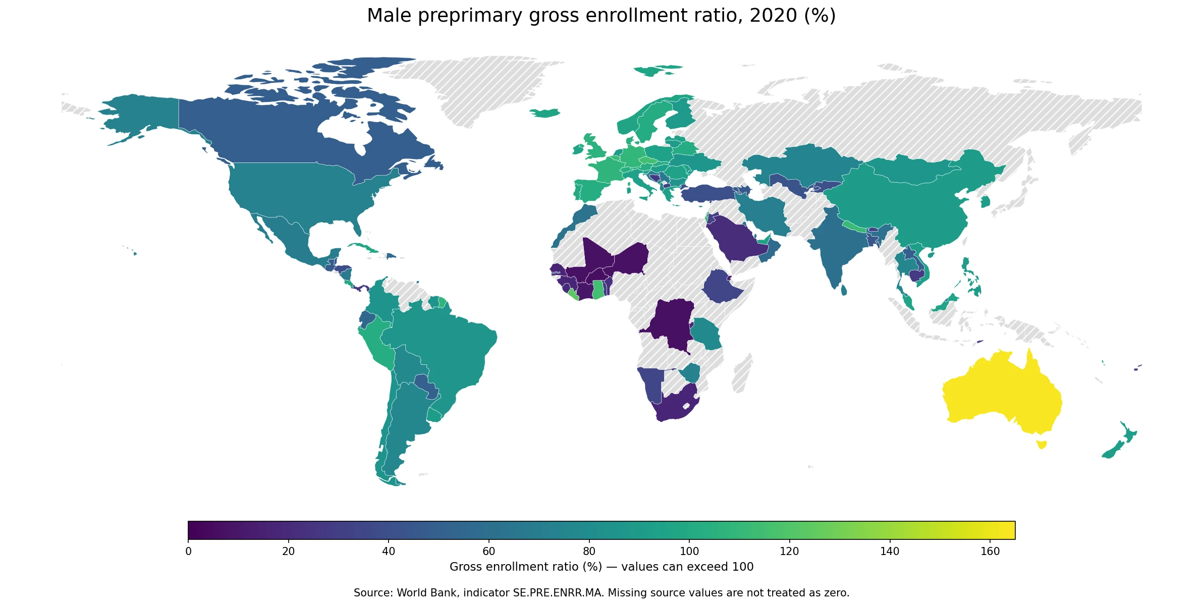
Table of Contents
A gross enrollment ratio above 100% is possible by definition
A value above 100% does not mean that more than 100% of boys are enrolled in the literal sense. It means that the total number of boys enrolled in preprimary programs, including boys younger or older than the official preprimary age group, is larger than the official-age male population used as the denominator. Early entry, late entry, repetition, differences in program duration, and the way administrative enrollment and population estimates align can all contribute to a ratio above 100%. The indicator therefore measures the scale of enrollment relative to the official age-group population rather than age-appropriate participation alone.
This distinction also means that higher is not automatically better in every interpretation. Gross enrollment is useful for showing how broadly an education level is used, but it cannot tell whether enrolled children are the expected age, whether they attend regularly, or whether learning conditions are strong. A country at 110% may have very broad participation, substantial out-of-age enrollment, or a mixture of both. To study age-appropriate coverage, a net enrollment measure would be more direct. To study quality, entirely different indicators are needed.
The median was 78.68%, while 26 economies were at or above 100%
The middle half of the 140 valid observations ran from 46.49% at the first quartile to 94.86% at the third quartile. The 10th percentile was 26.09% and the 90th percentile was 105.85%. Twenty-six economies had values of at least 100%, and 56 were at or above 90%. At the same time, 40 economies were below 50%, 14 were below 25%, and 12 were below 20%. These counts show why a single global average is not a sufficient description: the distribution includes a substantial high-enrollment group and a substantial low-enrollment group.
The mean of 72.40% was below the median of 78.68%, reflecting the weight of the lower observations. Values near 6% sit far below the center of the distribution, while the upper tail extends beyond 160%. In practical reading, it is more useful to ask which part of the distribution an economy occupies and whether nearby economies show similar values. The map highlights broad geographic patterns, but the full table of observations remains important because many small economies are not visible in a low-resolution world boundary file.
Australia led at 163.34%, but the highest values were geographically diverse
Australia had the highest 2020 value at 163.34%. Grenada was next at 133.73%, followed by the British Virgin Islands at 128.09%, Liberia at 123.23%, Ghana at 115.11%, and Czechia at 114.98%. St. Vincent and the Grenadines, Malta, Gibraltar, Israel, Belgium, and Nepal were also above 110% or very close to it. The leading group spans Oceania, the Caribbean, West Africa, Europe, the Middle East, and South Asia, so the ranking does not follow a simple high-income versus low-income pattern.
| Country or economy | Male preprimary gross enrollment ratio, 2020 |
|---|---|
| Australia | 163.34% |
| Grenada | 133.73% |
| British Virgin Islands | 128.09% |
| Liberia | 123.23% |
| Ghana | 115.11% |
| Czechia | 114.98% |
| St. Vincent and the Grenadines | 114.48% |
| Malta | 112.49% |
| Gibraltar | 112.44% |
| Israel | 111.98% |
The top values should be interpreted through the denominator. Australia’s 163.34% means that the number of male pupils enrolled in preprimary education across all ages was about 1.63 times the size of the official preprimary-age male population. It does not mean that 63% more than all boys attended school. The indicator cannot identify from this figure alone whether the excess comes mainly from early enrollment, late enrollment, repetition, program classification, or population-estimate differences. Those questions require age-specific enrollment or administrative detail.
At the lower end, several economies were below 20%
The lowest reported values were 6.04% in the Federated States of Micronesia, 6.35% in Burkina Faso, 6.61% in the Democratic Republic of the Congo, 7.23% in Niger, and 7.41% in Mali. Côte d’Ivoire was at 10.28%, Djibouti at 11.34%, Senegal at 15.93%, Burundi at 16.24%, and South Africa at 17.40%. A large share of the bottom group is in Africa, but the presence of Micronesia at the minimum shows that low reported ratios are not confined to one continent.
| Country or economy | Male preprimary gross enrollment ratio, 2020 |
|---|---|
| Micronesia, Fed. Sts. | 6.04% |
| Burkina Faso | 6.35% |
| Congo, Dem. Rep. | 6.61% |
| Niger | 7.23% |
| Mali | 7.41% |
| Cote d’Ivoire | 10.28% |
| Djibouti | 11.34% |
| Senegal | 15.93% |
| Burundi | 16.24% |
| South Africa | 17.40% |
A low ratio does not by itself establish why preprimary enrollment is limited. The indicator does not separate public and private provision, formal and other programs, cost barriers, distance, household preferences, or data-system differences. It also covers boys only. A complete assessment of participation would compare female and total enrollment measures and ideally use net enrollment or attendance indicators as well. The 2020 observation is a factual snapshot of reported gross enrollment, not a standalone score of the education system.
Neighboring countries can differ sharply
The map contains several examples of large differences across nearby countries. In West Africa, Ghana reported 115.11%, while Côte d’Ivoire was at 10.28% and Burkina Faso at 6.35%; Togo was 29.24% and Benin 22.04%. In South Asia, Nepal reached 111.60%, compared with 69.89% in Sri Lanka, 60.86% in India, and 44.42% in Bangladesh. These contrasts show that continental labels are too broad to explain the indicator. National education structures and reporting contexts matter at least as much as location.
There are also regional clusters of relatively high ratios. Belgium was at 111.71%, Germany 108.38%, France 107.28%, Switzerland 103.41%, and Austria 103.09%. In northern Europe, Denmark recorded 104.44%, Sweden 100.97%, Norway 96.45%, and Finland 88.41%. These values are closer together than the West African contrast, but they are still not identical. The geographic pattern is therefore a combination of clustering and country-specific deviations rather than a smooth regional gradient.
The comparison uses 2020 because it provides the common observation year in this dataset
The source request covers observations from 2017 through 2025, but the verified comparison dataset uses 2020 as the single common year with the required country coverage. There are 217 country and economy rows in the source master, of which 140 have a 2020 value and 77 are source-missing. The missing entries remain missing. Treating them as zero would incorrectly push non-reporting economies to the bottom of the ranking and would distort the average, median, and visual pattern.
The map has a second limitation that is separate from source missingness. The low-resolution Natural Earth boundary file used for the visualization matches 115 of the 140 valid observations. The remaining 25 valid observations are mostly small islands or separately reported economies that do not have a matching polygon in this boundary layer. Their values are still included in every distribution statistic and ranking in this article. The map should therefore be read as a geographic overview, while the numerical comparisons use all 140 reported observations.
What this indicator can and cannot tell you
Male preprimary gross enrollment is well suited to comparing the scale of enrollment relative to the official preprimary-age population. It can reveal where enrollment is low relative to that population, where enrollment is close to the size of the age group, and where out-of-age enrollment pushes the ratio above 100%. It is also useful for identifying countries that differ sharply from neighbors and for deciding where a deeper look at age-specific participation may be useful.
It does not measure learning quality, attendance intensity, teacher availability, classroom conditions, affordability, or the exact share of children enrolled at the official age. It also cannot tell whether a high ratio is driven by early entrants or older pupils. For policy comparisons, the safest approach is to combine this measure with female and total gross enrollment, net enrollment, demographic information, and details about how preprimary programs are defined. The 2020 map is a starting point for that broader comparison, not a complete verdict on preprimary education.
Frequently Asked Questions
Which economy had the highest male preprimary gross enrollment ratio in 2020?
Australia had the highest valid 2020 value in World Bank indicator SE.PRE.ENRR.MA at 163.34%, followed by Grenada at 133.73%.
Can a gross enrollment ratio be higher than 100%?
Yes. Gross enrollment includes pupils of all ages in the numerator, so enrollment can exceed the size of the official-age population used as the denominator.
Were economies with missing data treated as zero?
No. Of 217 source rows, 77 were source-missing and remained missing. Rankings and summary statistics use the 140 economies with reported values.
Related Articles
Green Map creates custom-edited map images using open geographic data sources such as geoBoundaries, Natural Earth, OpenStreetMap, and government open data. These maps are edited visual materials, not raw data files, and are provided for education, documents, presentations, and graphic reference.