The World Bank’s 2024 series SH.STA.OWGH.ME.ZS compares the modeled prevalence of overweight among children under age five, using weight-for-height as the indicator concept. The source file contains 217 countries and economies, but only 163 have a numeric value for 2024. The remaining 54 are explicitly preserved as source-missing observations rather than being converted to zero. Among the 163 reported values, the simple mean is 6.89% and the median is 5.50%.
Australia records the highest value at 26.4%, followed by Papua New Guinea at 18.5%, the Turks and Caicos Islands at 18.3%, Tunisia at 17.5%, and Albania at 16.7%. Myanmar is lowest at 0.6%, followed by Sri Lanka at 0.9%, Timor-Leste at 1.2%, Mali at 1.3%, and Bangladesh at 1.6%. The maximum-to-minimum spread is 25.8 percentage points, which is large relative to the median. These positions describe one official indicator in one year; they are not an overall ranking of child health systems.
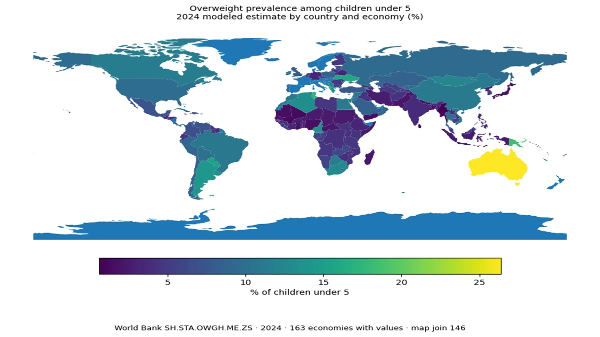
Table of Contents
What this indicator measures—and what it does not
The indicator is specific to children younger than five and to a weight-for-height definition of overweight. It should not be mixed with adult obesity rates, body-mass-index measures for older children, or whole-population obesity statistics. Different age groups and definitions can produce very different percentages. Every comparison here uses the same World Bank indicator code, the same percentage unit, and the same 2024 reference year so that the basic statistical object remains consistent across places.
The words ‘modeled estimate’ also matter. This is not simply a table of raw measurements copied from a single national survey. The official series is designed for comparable reporting, but the number alone does not reveal every detail of national survey timing, data availability, or estimation uncertainty. For that reason, the 54 missing economies remain missing in both the calculations and the map. A blank observation means that a comparable 2024 value is not supplied in this dataset; it does not mean zero prevalence.
The center of the distribution is lower than the mean
The first quartile is 3.85% and the third quartile is 9.50%, so the middle half of the 163 values lies between those two points. The mean of 6.89% is 1.39 percentage points above the 5.50% median. A relatively long upper tail explains much of that difference, with several economies above 15% and Australia above 25%. For a description of a typical observation, the median and interquartile range are therefore more informative than the mean alone.
Using simple descriptive bands, 26 observations are below 3%, 45 are from 3% to below 5%, 56 are from 5% to below 10%, and 36 are at 10% or higher. These are not official health categories; they are only visual aids for reading a continuous percentage distribution. An economy at 4.9% and one at 5.1% should not be treated as belonging to fundamentally different populations just because they fall on opposite sides of a display threshold.
The map shows broad geography, but the statistical and boundary lists are not identical
The choropleth joins the World Bank ISO3 codes to a Natural Earth country boundary layer. Of the 163 economies with a numeric value, 146 join to polygons in that boundary file. Some small islands and separately reported territories remain present in the statistical summaries but may appear as no data on the map because the boundary layer does not carry a matching polygon or code. Reporting the join rate is important: a map should not silently pretend that the geographic file covers every statistical economy.
Among the matched polygons, the simple mean is 8.26% in Europe, 9.10% in South America, 5.34% in Africa, and 5.98% in Asia. Oceania averages 12.78%, but only 5 matched observations are represented there and Australia’s 26.4% strongly affects that average. Continent averages can describe broad spatial context, but they should not substitute for country-level values.
High values appear in several different regions
The top group is geographically mixed. Australia and Papua New Guinea represent Oceania; Tunisia is in North Africa; Albania and Ukraine are in Europe; Paraguay and Argentina are in South America; Trinidad and Tobago and the Turks and Caicos Islands are in the Caribbean; and Cameroon is in Central Africa. This diversity argues against a simple story in which high prevalence is confined to one continent or one income group. The dataset itself does not identify a single causal mechanism behind the high values.
Percentages also need to be separated from absolute counts. A small territory and a large country can rank near each other even though the number of children represented is very different. The indicator tells us the share of children under five meeting the modeled overweight definition, not the number of affected children. Estimating absolute counts would require an additional age-specific population denominator, which is not part of this package and is therefore not calculated here.
Low prevalence does not automatically mean better overall nutrition
Myanmar, Sri Lanka, Timor-Leste, Mali, Bangladesh, Mauritania, Nigeria, Yemen, Ghana, and Nepal are among the lower observations. That ordering should not be read as a general nutrition league table. This indicator measures overweight only. It does not simultaneously measure stunting, wasting, underweight, dietary diversity, food insecurity, micronutrient deficiency, infectious disease burden, or access to health services. A place can have a low overweight prevalence and still face serious child-nutrition challenges on other dimensions.
The same caution applies to high values. Urbanization, diets, household income, food systems, health services, and many other variables may be associated with child overweight, but this cross-sectional file does not test those explanations. Establishing a relationship would require compatible explanatory data, a clear causal design, and statistical analysis beyond a country ranking. The responsible use of this dataset is to describe the 2024 geographic distribution, not to assign causes from the pattern alone.
Fifty-four missing economies are not zero-percent economies
The full table has 217 geographic rows because the World Bank country-and-economy master includes places with no numeric observation in the selected year. Exactly 54 rows carry the status NA_SOURCE_MISSING. They are excluded from the mean, median, quartiles, and ranking. They are also left as no data in the map rather than being painted with the lowest color. Zero-filling would manufacture artificial low-prevalence clusters and materially distort the distribution.
The geographic master also includes separately reported territories, so the 217 rows should not be described as a count of sovereign states. The most accurate wording is countries and economies. This distinction is especially important for maps, because a statistical provider and a boundary dataset can use different geographic universes. A table may contain a territory whose polygon is absent from a simplified world boundary layer.
How to read the map without overinterpreting it
A country map is useful for spotting regional concentration, neighboring contrasts, and distant places with similar values. It is less reliable as a visual measure of importance because large countries occupy more pixels than small countries. A small island with a high percentage can be almost invisible at world scale, while a large country with a moderate value dominates the viewer’s attention. The table and summary statistics are therefore necessary companions to the map.
Rank positions also compress information. A one-place difference in the middle of the table may reflect only a tenth of a percentage point, while the gap between Australia and the next-highest observation is several points. The source file does not include confidence intervals, so this article does not claim that small differences are statistically significant. Values that are close should be treated as close, even when their ordinal ranks are different.
This is a 2024 snapshot, not a trend analysis
The comparison uses one year. It cannot tell us whether prevalence is rising or falling in an individual economy or whether two countries are moving in opposite directions. Trend statements require multiple comparable years from the same indicator. A high 2024 value does not by itself demonstrate deterioration, and a low 2024 value does not demonstrate improvement. The map is best understood as a cross-sectional snapshot of the distribution at the selected reference year.
The most defensible takeaway is therefore descriptive: the official 2024 series spans from 0.6% to 26.4%, with a median of 5.5% and a pronounced upper tail. Those numbers show that the reported prevalence varies widely across countries and economies. Evaluating policy performance or the broader nutrition environment requires additional indicators on growth, undernutrition, food access, demographics, and health services rather than a single overweight measure.
Top 10 reported countries and economies
The table ranks the ten highest values among the 163 numeric observations using the same 2024 indicator. The order is a reading aid, not a composite assessment of child health.
| Rank | Country or economy | Prevalence |
|---|---|---|
| 1 | Australia | 26.4% |
| 2 | Papua New Guinea | 18.5% |
| 3 | Turks and Caicos Islands | 18.3% |
| 4 | Tunisia | 17.5% |
| 5 | Albania | 16.7% |
| 6 | Ukraine | 16.0% |
| 7 | Paraguay | 15.4% |
| 8 | Trinidad and Tobago | 15.0% |
| 9 | Argentina | 14.3% |
| 10 | Cameroon | 13.6% |
Bottom 10 reported countries and economies
The lower table uses the same percentage measure. A low overweight prevalence should not be interpreted as evidence that other forms of malnutrition are absent.
| Rank | Country or economy | Prevalence |
|---|---|---|
| 1 | Myanmar | 0.6% |
| 2 | Sri Lanka | 0.9% |
| 3 | Timor-Leste | 1.2% |
| 4 | Mali | 1.3% |
| 5 | Nigeria | 1.6% |
| 6 | Mauritania | 1.6% |
| 7 | Bangladesh | 1.6% |
| 8 | Yemen, Rep. | 1.7% |
| 9 | Ghana | 1.8% |
| 10 | Nepal | 1.8% |
Source and data coverage
The source is the World Bank indicator SH.STA.OWGH.ME.ZS for 2024. The file contains 217 geographic rows, 163 numeric observations, and 54 source-missing rows preserved as missing. World Bank API source
Frequently Asked Questions
Which country or economy has the highest reported 2024 value?
Australia is highest at 26.4% among the 163 countries and economies with numeric values, followed by Papua New Guinea at 18.5% and the Turks and Caicos Islands at 18.3%.
What is the median across the reported values?
The median of the 163 numeric 2024 observations is 5.5%, while the simple mean is about 6.89%.
Were missing economies counted as zero?
No. The 54 source-missing rows remain missing and are excluded from the mean, median, quartiles, and ranking.
Can this indicator be compared directly with adult obesity rates?
No. It measures overweight among children under five using a weight-for-height concept, so the age group and definition differ from adult BMI-based obesity measures.
Related Articles
Green Map creates custom-edited map images using open geographic data sources such as geoBoundaries, Natural Earth, OpenStreetMap, and government open data. These maps are edited visual materials, not raw data files, and are provided for education, documents, presentations, and graphic reference.