The youth employment-to-population ratio answers a broader question than the unemployment rate: what share of everyone aged 15–24 is currently employed? In the World Bank national-estimate series SL.EMP.1524.SP.NE.ZS, the denominator is the entire youth population in that age range. Students, young people outside the labor force, and jobseekers are all part of that denominator. That makes the measure useful for comparing how strongly employment is present in young people’s lives, but it also means that education systems and the timing of labor-market entry can move the number substantially.
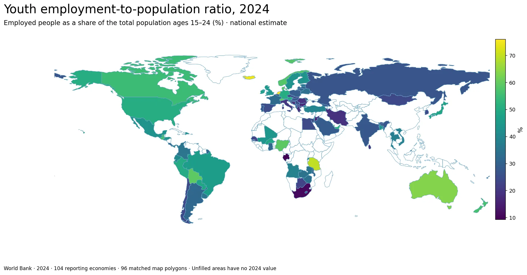
Table of Contents
The 2024 comparison contains values for 104 reporting economies
The cleaned country file contains 217 countries and separately reported economies. A 2024 value is present for 104 of them, while 113 are preserved as missing. Regional and income-group aggregates are excluded, so the unit is a country or economy rather than a World Bank aggregate. The count should therefore not be read as a count of sovereign states. The low-resolution map can match 96 of the reporting economies to visible country polygons; several small island and city economies remain in the statistics even when the base map does not draw them.
Across the 104 available observations, the simple mean is 36.36% and the median is 33.27%. The first quartile is 26.59% and the third quartile is 45.09%, so the middle half of reporting economies falls between roughly 26.6% and 45.1%. The 10th percentile is 19.73% and the 90th percentile is 56.15%. The full range stretches from 9.25% to 76.01%, a gap of about 66.8 percentage points.
This is not the share of the youth labor force that has a job
A youth employment-to-population ratio of 35% can be imagined as 35 employed people out of every 100 people aged 15–24. The other 65 are not all unemployed. Some may be studying full time, some may not be seeking work, and some may be unemployed under the labor-force definition. This distinction matters because an unemployment rate removes people outside the labor force from its denominator, while the employment-to-population ratio keeps the whole age group in view. A country can therefore have a low youth employment-to-population ratio without having an equally high youth unemployment rate.
The reverse caution is just as important. A high ratio is not a complete measure of labor-market quality. Young people may combine school with short-hours jobs, enter work earlier because fewer stay in education, or work in informal and low-paid activities. All of those situations can raise the percentage employed. The indicator does not directly describe wages, hours, contract security, informality or whether young workers would prefer more hours. It is best treated as a measure of employment participation within the youth population rather than a score for the overall quality of youth opportunities.
The Netherlands and Iceland exceed 70%, while Tanzania also ranks near the top
The highest 2024 value is the Netherlands at 76.013%, followed by Iceland at 74.646% and Tanzania at 69.649%. Australia records 63.654%, Switzerland 60.327%, Bolivia 59.463%, Nigeria 59.322%, Denmark 59.018%, Qatar 58.702% and Norway 58.072%. The top ten span Europe, Africa, Oceania, South America and the Middle East. That geographic mix is a warning against explaining high values with a single regional story. Similar percentages can emerge from very different combinations of education, working while studying, early labor-market entry and employment structure.
| Economy | Employment-to-population ratio, ages 15–24 (2024) |
|---|---|
| Netherlands | 76.0% |
| Iceland | 74.6% |
| Tanzania | 69.6% |
| Australia | 63.7% |
| Switzerland | 60.3% |
| Bolivia | 59.5% |
| Nigeria | 59.3% |
| Denmark | 59.0% |
| Qatar | 58.7% |
| Norway | 58.1% |
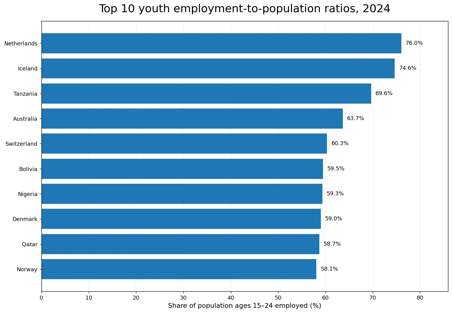
In northwestern Europe, high youth employment can coexist with substantial education participation because students may work at the same time. Tanzania and Nigeria show that a high ratio is not confined to that institutional pattern. In other settings, young people may enter paid work, family work or self-employment earlier. The cross-country map cannot identify which mechanism dominates in each case. It identifies where employment is common within the age group and where a closer look at schooling, labor-force participation, hours and job type would be most useful.
Europe shows one of the sharpest internal contrasts
European values range from more than 70% in the Netherlands and Iceland to less than 20% in Bulgaria, Greece and Italy. Switzerland is at 60.3%, Denmark 59.0%, Norway 58.1% and Germany 50.8%, while France is 32.6%, Spain 24.9%, the Slovak Republic 21.8%, Romania 19.2% and Bulgaria 17.3%. Sweden and Finland are around the low-40s. The pattern is not a clean north-versus-south split, but the broad contrast between parts of northwestern Europe and parts of southern and southeastern Europe is visually prominent.
A plausible next step is to compare these values with school enrollment, apprenticeships, part-time work and NEET rates, but the current dataset does not prove which factor causes the gap. A lower employment-to-population ratio may reflect prolonged education, weak demand for young workers, lower labor-force participation, or several forces at once. Likewise, a high figure may reflect widespread work-study combinations or earlier exit from education. National estimate series should be interpreted in the context of each statistical system rather than as if they were a controlled experiment.
Africa contains both one of the highest and the two lowest observations
The African reporting economies are especially heterogeneous. Tanzania reaches 69.6% and Nigeria 59.3%, while Gabon is only 9.3% and South Africa 10.7%. Angola records 38.3%, Zambia 34.7%, Zimbabwe 33.8%, Ghana 31.4% and Botswana 22.7%. A continental average would hide a spread of about 60 percentage points between Tanzania and Gabon. The map therefore works better as a guide to national differences and clusters than as evidence for one “African youth employment” level.
South Africa’s low value, for example, should not be read as meaning that nearly nine in ten young people are unemployed. The denominator includes students and all other 15–24-year-olds outside employment. To distinguish unemployment from non-participation, one would need youth unemployment and labor-force participation rates. To distinguish education from disengagement, one would also want enrollment and NEET indicators. The employment-to-population ratio is powerful precisely because it shows the final share employed, but it is intentionally silent about the reasons everyone else is not employed.
The Americas and Oceania also show wide differences in youth work participation
Australia records 63.7% and New Zealand 56.2%. In North America, Canada is 54.8%, the United States 50.9% and Mexico 42.9%, while Guatemala reaches 56.0%. South America ranges from Bolivia at 59.5% and Brazil at 46.1% to Argentina at 31.3% and Chile at 23.9%. These are large differences among neighboring or economically connected countries, reinforcing the point that the age at which young people move between school and work is not uniform even within the same broad region.
The ratio also treats all forms of employment as employment. A student working a few paid hours, a full-time employee, a self-employed worker and some forms of contributing family work can all affect the numerator according to national labor statistics. Consequently, two economies with a 50% ratio may offer very different employment experiences. Hours worked, earnings, occupation, informality and job security are separate dimensions. When the question is whether young people have “good jobs,” this map needs to be paired with indicators that measure those dimensions directly.
The lowest ten observations fall between about 9% and 19%
At the bottom of the 2024 distribution are Gabon at 9.252% and South Africa at 10.673%. Jordan follows at 15.167%, Bulgaria at 17.297%, Bosnia and Herzegovina at 17.489%, Greece at 18.487%, Iran at 18.495%, Sri Lanka at 18.550%, West Bank and Gaza at 19.209%, and Romania at 19.230%. The group spans several regions and economic structures. A low value is therefore a description of employment prevalence among young people, not a diagnosis with one universal explanation.
| Economy | Employment-to-population ratio, ages 15–24 (2024) |
|---|---|
| Gabon | 9.3% |
| South Africa | 10.7% |
| Jordan | 15.2% |
| Bulgaria | 17.3% |
| Bosnia and Herzegovina | 17.5% |
| Greece | 18.5% |
| Iran, Islamic Rep. | 18.5% |
| Sri Lanka | 18.6% |
| West Bank and Gaza | 19.2% |
| Romania | 19.2% |
Small differences within this lower group should not be overinterpreted. The difference between 18.5% and 19.2% is much less informative than the contrast between economies near 10% and those above 70%. Sampling, national definitions and the timing of surveys can also matter. For cross-country reading, broad bands, the median, the interquartile range and persistent regional contrasts are usually more informative than treating the table as a precise league ranking.
Youth unemployment, NEET and school participation answer different questions
Three common indicators are often confused. The employment-to-population ratio asks what share of all young people are employed. The youth unemployment rate asks what share of the youth labor force is unemployed, excluding those outside the labor force from the denominator. The NEET rate asks what share of young people are neither in employment nor in education or training. These measures overlap conceptually, but they are not interchangeable. A country with many full-time students can have a relatively low employment-to-population ratio without those students counting as unemployed or NEET.
For that reason, policy interpretation improves when the indicators are read together. A low employment-to-population ratio combined with high enrollment may describe a long education pathway. The same low ratio combined with a high NEET rate points to a very different challenge. A high employment ratio paired with low wages or high informality raises yet another issue. The 2024 map is best used to establish the first fact—how much employment is present among 15–24-year-olds—before adding the other dimensions needed to understand why.
Six checks make the map easier to interpret
- The denominator is the entire population ages 15–24, not only jobseekers or labor-force participants.
- Employment status does not measure wages, hours, security, formality or whether work is voluntary.
- 113 economies with no 2024 observation remain missing; none were converted to zero.
- The median is 33.3%, and the middle half of reporting economies lies between about 26.6% and 45.1%.
- Large structural differences are more informative than tiny changes in rank between economies with similar percentages.
- National-estimate values should not be mixed casually with modelled ILO series or different years without checking the methodology.
These checks prevent two common mistakes: equating low employment with high unemployment, and equating high employment with strong job quality. The map is a compact picture of how common employment is across the youth population in 2024. Explaining the causes requires additional evidence on education, labor-force participation, unemployment, work hours and job characteristics, preferably using consistent years and definitions.
Source and calculation method
The data come from the World Bank indicator Employment to population ratio, ages 15-24, total (%) (national estimate), code SL.EMP.1524.SP.NE.ZS. The comparison uses the 2024 observation for each country or separately reported economy, excludes World Bank aggregate groups, and retains missing observations as missing. The mean, median, quartiles and ranking tables are calculated directly from the 104 non-missing values.
The map joins ISO3 codes to a low-resolution world boundary dataset. 96 reporting economies match visible polygons. Small islands and some separately reported economies can therefore contribute to the statistics without appearing as filled polygons on this simplified map. White areas should not be read as zero employment. This is a one-year cross-section: it describes the 2024 distribution and does not by itself establish trends or causal relationships.
Frequently Asked Questions
Is the youth employment-to-population ratio the same as the youth unemployment rate?
No. The employment-to-population ratio uses the entire population ages 15–24 as its denominator, while the unemployment rate uses the youth labor force. Students and others outside the labor force therefore affect the two measures differently.
Does a higher youth employment-to-population ratio always mean a better labor market?
No. High values can reflect work-study combinations, earlier entry into work, or different employment structures. Wages, hours, informality and job security require separate indicators.
Do white areas on the map mean 0% youth employment?
No. Economies without a 2024 observation remain missing, and some small economies with values are not drawn as polygons on the low-resolution map.
Related Articles
Green Map creates custom-edited map images using open geographic data sources such as geoBoundaries, Natural Earth, OpenStreetMap, and government open data. These maps are edited visual materials, not raw data files, and are provided for education, documents, presentations, and graphic reference.