The World Bank indicator DT.TDS.DPPF.XP.ZS measures debt service on long-term public and publicly guaranteed debt, plus relevant IMF repayments and charges, relative to exports of goods and services and primary income. The dataset used here contains the latest non-empty observation for 120 economies. Across those observations, the median is 7.7% and the mean is 9.7%. This is not a perfectly synchronized 2024 cross-section: 99 of the 120 observations are from 2024, while the rest are the latest available values from earlier years.
That timing detail changes how the map should be read. It is best understood as a view of the most recent reported debt-service burden available through 2024, not as a claim that every economy had a 2024 observation. The indicator is also narrower than a general measure of external debt. It focuses on actual debt-service payments within the PPG and IMF scope, using a denominator tied to external earnings. It therefore answers a specific question: how large were these payments relative to exports of goods and services and primary income?
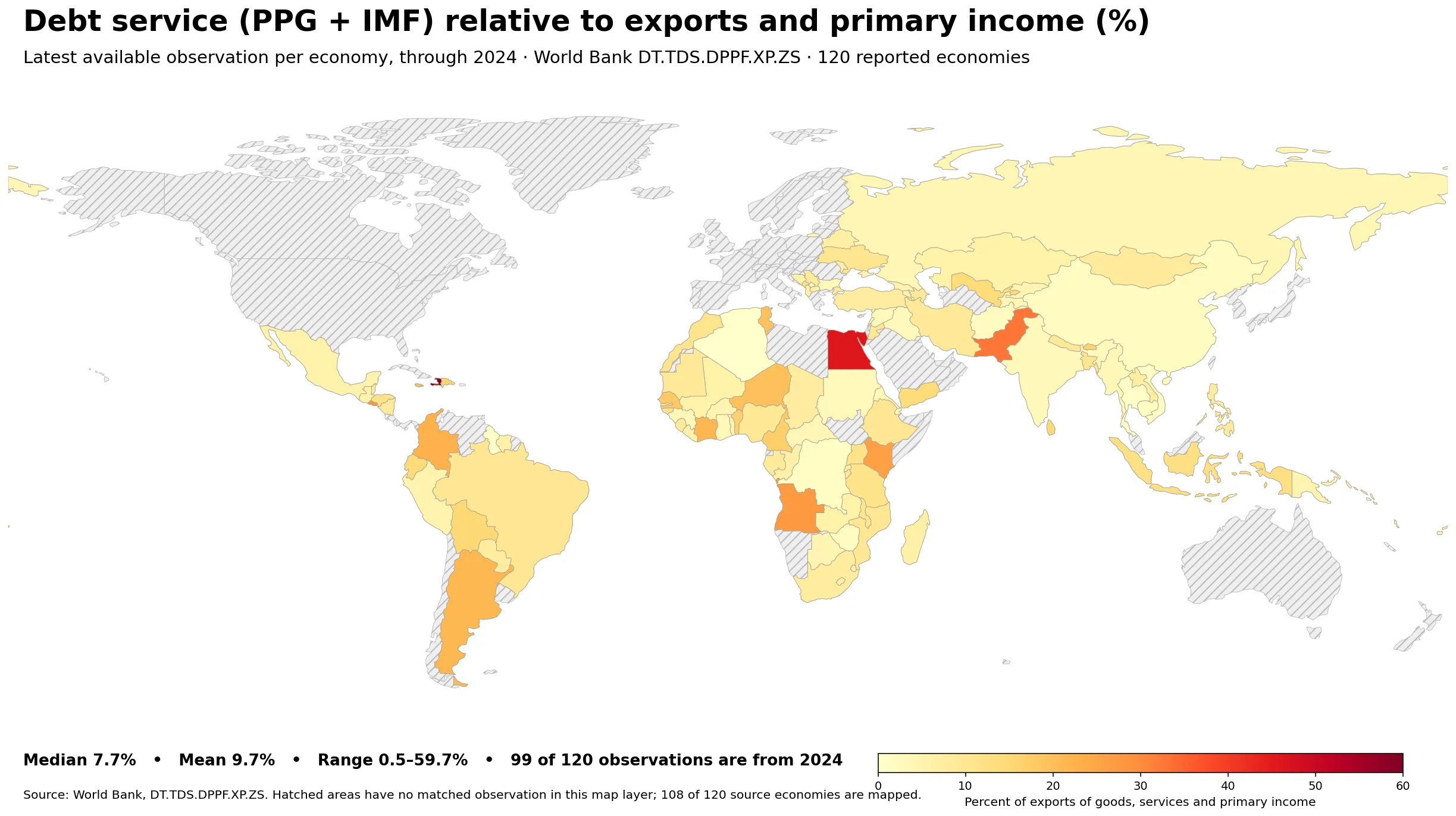
Table of Contents
What the debt-service ratio actually measures
PPG stands for public and publicly guaranteed debt. In the World Bank definition, debt service is the sum of principal repayments and interest actually paid in currency, goods, or services. This series differs from broader debt-service-to-exports measures because it covers long-term PPG debt and IMF repurchases and charges. The denominator includes exports of goods, exports of services, and primary income. It is therefore neither a debt-to-GDP ratio nor a measure of total government debt.
A reading of 20% means that the debt-service payments captured by this indicator were roughly equivalent to 20% of the economy’s exports of goods and services plus primary income for that observation year. A higher ratio can indicate a heavier current payment claim on external earnings, but the ratio does not tell us by itself whether the economy is solvent, whether foreign-exchange reserves are adequate, or whether future maturities are manageable. Those questions require additional balance-sheet, liquidity, and fiscal information.
The distribution across 120 latest observations
Across all 120 latest observations, the median is 7.7% and the mean is 9.7%. The first quartile is 4.6% and the third quartile is 11.0%, so the middle half of the distribution lies in a fairly compact band of roughly 4.6% to 11.0%. The full range is much wider, from 0.5% to 59.7%. The fact that the mean sits above the median reflects a right-skewed distribution with a small number of much higher observations.
The band counts make that shape clearer. There are 34 economies below 5%, 46 from 5% to 9.9%, 29 from 10% to 19.9%, 8 from 20% to 29.9%, and only 3 at 30% or more. In total, 80 of 120 are below 10%, while 11 are at 20% or above. This is why a single global average can overstate what a typical observation looks like.
| Latest-observation band | Economies |
|---|---|
| Below 5% | 34 |
| 5–9.9% | 46 |
| 10–19.9% | 29 |
| 20–29.9% | 8 |
| 30% or more | 3 |
Economies with the highest reported ratios
Haiti has the highest latest observation at 59.7%, followed by Egypt at 46.0% and Pakistan at 32.8%. Those are the only three observations above 30%. El Salvador is next at 27.7%, followed closely by Angola at 27.6%, Kenya at 26.0%, Tonga at 25.2%, Dominica at 23.7%, Colombia at 22.5%, and Côte d’Ivoire at 21.7%. All ten of these highest observations are from 2024, which makes their timing more directly comparable than rankings that mix older and newer observations.
| Economy | Observation year | Ratio |
|---|---|---|
| Haiti | 2024 | 59.7% |
| Egypt, Arab Rep. | 2024 | 46.0% |
| Pakistan | 2024 | 32.8% |
| El Salvador | 2024 | 27.7% |
| Angola | 2024 | 27.6% |
| Kenya | 2024 | 26.0% |
| Tonga | 2024 | 25.2% |
| Dominica | 2024 | 23.7% |
| Colombia | 2024 | 22.5% |
| Cote d’Ivoire | 2024 | 21.7% |
A high ratio should not be translated directly into “highest debt.” The numerator is actual debt service during a particular period, not the outstanding stock of debt. An economy with a large maturity falling due in one year can record a high ratio even if its total debt stock is not the largest. The denominator matters just as much: weaker exports or primary income can push the ratio up even when debt-service payments are unchanged. Restructuring, IMF repayment schedules, exchange-rate movements, and commodity cycles can also affect the observed level.
What the lowest observations show
At the other end of the distribution, Algeria is at 0.5%, Guyana at 0.8%, Thailand at 1.0%, the Democratic Republic of the Congo at 1.3%, Viet Nam at 1.4%, Kosovo at 1.7%, Zimbabwe at 1.7%, Cambodia at 1.7%, Lebanon at 1.9%, and China at 1.9%. Most of these observations are from 2024, but Guyana and Lebanon are from 2023. The year column therefore matters when interpreting the lower end of the ranking.
| Economy | Observation year | Ratio |
|---|---|---|
| Algeria | 2024 | 0.5% |
| Guyana | 2023 | 0.8% |
| Thailand | 2024 | 1.0% |
| Congo, Dem. Rep. | 2024 | 1.3% |
| Viet Nam | 2024 | 1.4% |
| Kosovo | 2024 | 1.7% |
| Zimbabwe | 2024 | 1.7% |
| Cambodia | 2024 | 1.7% |
| Lebanon | 2023 | 1.9% |
| China | 2024 | 1.9% |
A low ratio is also not a complete measure of financial strength. It can result from relatively small scheduled payments, strong exports and primary income, a maturity profile that pushes payments into later years, or other features of the debt structure. Because the indicator is limited to long-term PPG debt and IMF-related payments, an economy may still have significant private nonguaranteed external debt or short-term obligations outside this series. The correct direct reading is simply that the payments captured by this indicator were small relative to the denominator in that observation year.
Why the observation years are mixed
The source is constructed from the most recent non-empty value available for each economy. Of the 120 observations, 99 are from 2024, 6 from 2023, 3 from 2022, 3 from 2020–2021, and 9 from years before 2020. The oldest observation reaches back to 1993. That variation reflects gaps in recent reporting or availability and is essential context for any country comparison.
| Observation-year group | Economies |
|---|---|
| 2024 | 99 |
| 2023 | 6 |
| 2022 | 3 |
| 2020–2021 | 3 |
| Before 2020 | 9 |
If the comparison is restricted to the 99 economies with 2024 observations, the median rises slightly to 8.0% and the mean to 10.3%. Those figures are close to the full latest-observation median of 7.7% and mean of 9.7%, so the broad distribution is not radically different. Even so, an older observation should not be described as a current 2024 condition. The mixed-year map is useful for coverage, while a strict 2024-only analysis is better when synchronized timing is more important than the number of economies included.
What stands out on the world map
The map shows a highly uneven pattern rather than a smooth geographic gradient. Haiti and Egypt occupy the darkest end of the scale because their ratios are far above the median, while Pakistan also stands out above 30%. Many reported economies across Africa, Asia, and Latin America fall below 10%. The map is therefore most useful for identifying the few large outliers and the broad concentration of lower ratios, rather than for implying that neighboring economies necessarily share the same debt dynamics.
Map coverage also needs a technical caveat. The source contains 120 economies, but the low-resolution world boundary layer used for the visual has matched polygons for 108 of them after an ISO-code join. Several small island economies—such as Comoros, Cabo Verde, Dominica, Grenada, Saint Kitts and Nevis, Saint Lucia, Maldives, Mauritius, São Tomé and Príncipe, Tonga, Saint Vincent and the Grenadines, and Samoa—do not have a separate polygon in this layer or are too small for the boundary file. Their values remain in all statistical calculations; they are not converted to zero.
Why a high or low ratio is not a verdict on debt sustainability
Debt sustainability depends on more than one annual payment ratio. A high value can be a warning that current debt-service payments are large relative to external earnings, but it does not show the full reserve position, tax capacity, market access, currency composition, maturity structure, or contingent liabilities. An economy may be able to manage a temporarily high ratio if it has strong liquidity or if payments decline in subsequent years. Conversely, a low current ratio can coexist with large future maturities or weak financing conditions.
The denominator can move sharply as well. Export-oriented economies exposed to commodity prices may see the ratio rise when export receipts fall, even if scheduled debt service changes little. Service-exporting economies can experience a similar effect during tourism or transport disruptions. Primary income flows add another component. Because both numerator and denominator can change for different reasons, a movement in the ratio should ideally be decomposed before attributing it to worsening debt, improving exports, or policy decisions.
The indicator’s coverage matters just as much as its level. It is designed around long-term public and publicly guaranteed debt plus IMF repayments and charges. It does not represent all external liabilities. For a fuller picture, analysts commonly pair debt-service ratios with external debt stocks, short-term debt, reserves, current-account data, government revenue, interest payments, and projections of future amortization. The map is therefore a starting point for identifying where the current payment burden looks unusually large relative to external earnings, not a standalone risk score.
A practical way to compare economies
- Check the observation year first. A 2024 value and a 1990s value may both be the latest available for their economies, but they do not describe the same global moment.
- Compare the level with the distribution. The 7.7% median, 10% threshold, and 20% or 30% upper bands help separate typical observations from outliers.
- Think about both sides of the ratio. A higher value can come from larger payments, lower exports and primary income, or both.
- Remember the indicator scope. It focuses on long-term PPG debt and IMF-related payments, not every form of external debt.
- Use other liquidity and solvency indicators before drawing conclusions about debt distress, policy quality, or future repayment capacity.
Data source and calculation notes
The source is the World Bank DT.TDS.DPPF.XP.ZS indicator. The analysis uses the latest non-empty observation for 120 economies. Mean, median, quartiles, band counts, and rankings are calculated directly from those observations. The map does not replace missing or unmatched values with zero, and the year shown for each economy is the actual observation year stored in the source data.
For that reason, this dataset should not be described as “120 countries in 2024.” A strict 2024 comparison contains 99 observations. The broader 120-economy view trades synchronized timing for greater geographic coverage. Both perspectives are useful as long as the timing rule is stated clearly: this article uses the latest available value through 2024 and reports the observation year whenever rankings could otherwise be misleading.
Frequently Asked Questions
What is the median PPG and IMF debt-service ratio?
Across the 120 latest observations, the median is about 7.7% and the mean is 9.7%. The middle half of observations runs from roughly 4.6% to 11.0%.
Are all 120 observations from 2024?
No. Ninety-nine observations are from 2024. The remaining economies use their latest available value from an earlier year, so the observation year should be checked alongside the ratio.
Which economy has the highest latest ratio?
Haiti has the highest latest observation at 59.7%, followed by Egypt at 46.0% and Pakistan at 32.8%. All three observations are from 2024.
Does a low ratio mean external debt risk is low?
Not necessarily. This indicator covers long-term PPG debt and IMF-related payments relative to exports and primary income. Other liabilities, reserves, future maturities, and financing conditions require separate indicators.
Related Articles
Green Map creates custom-edited map images using open geographic data sources such as geoBoundaries, Natural Earth, OpenStreetMap, and government open data.
These maps are edited visual materials, not raw data files, and are provided for education, documents, presentations, and graphic reference.