How strongly are people with advanced education connected to the labor market? That is a different question from asking how many people have tertiary or other advanced qualifications. This article uses World Bank indicator SL.TLF.ADVN.ZS to compare the share of the working-age population with advanced education that is in the labor force. The denominator is the working-age population with advanced education, not the entire working-age population and not the total labor force.
The dataset contains 183 economies using the most recent non-missing observation available for each economy. Those observations are not synchronized to one year: 17 are from 2025 and 78 from 2024, giving 95 observations from 2024–2025, while the complete set spans 2000–2025. The figures therefore work best as a latest-available comparison rather than as a strict same-year global ranking.
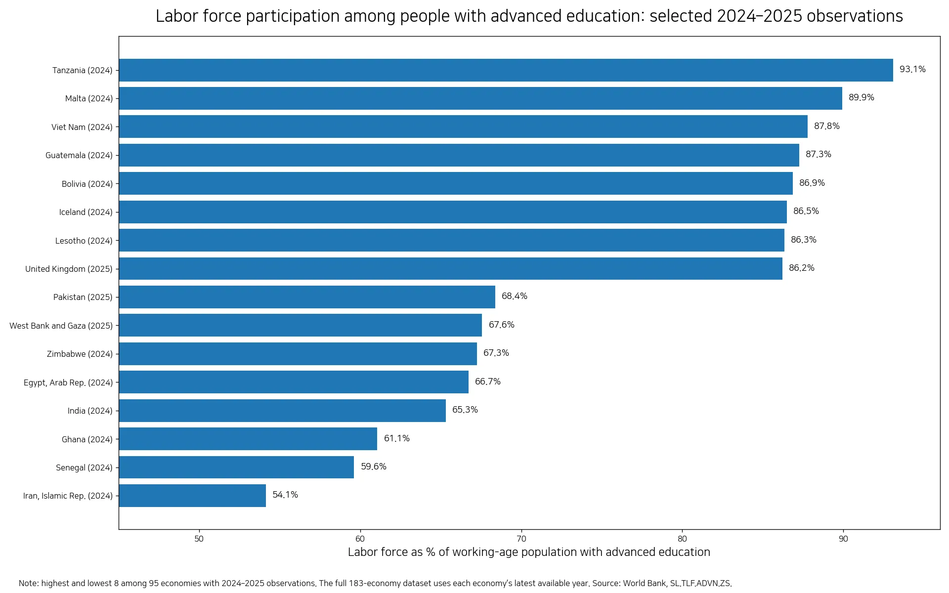
Table of Contents
What this indicator measures
The World Bank label is “Labor force with advanced education (% of total working-age population with advanced education).” In practical terms, it shows the percentage of working-age people who have advanced education and are part of the labor force. A value of 80% can be read as roughly 80 out of every 100 people in the relevant advanced-education working-age group being economically active under the indicator definition.
It does not measure the educational attainment of the whole population, and it does not show what share of all workers have advanced education. It also does not directly measure wages, job quality, productivity, or whether people are working in jobs that match their qualifications. A high participation figure can coexist with unemployment or underemployment, so other labor-market indicators are needed for a fuller assessment.
World Bank Data identifies ILOSTAT’s Education and Mismatch Indicators as the underlying source family for this series. The calculations here use the supplied World Bank latest non-missing country observations. The official indicator page is available at World Bank Data: SL.TLF.ADVN.ZS.
The distribution across 183 latest observations
Across all 183 latest observations, the median is 78.3% and the simple mean is 76.2%. The middle half of the observations lies between about 72.8% and 82.0%. Sixty-six economies are at or above 80%, 119 are at or above 75%, and 29 are at or above 85%. Only 12 observations are below 60%. This shows that many economies cluster in the 70s and low 80s, while the overall range remains wide.
The highest latest value in the full file is The Bahamas at 98.8% in 2023, followed by Solomon Islands at 94.8% in 2013, Tanzania at 93.1% in 2024, and Maldives at 92.3% in 2019. At the other end, Cameroon records 32.5% in 2021, Sudan 36.3% in 2022, and Republic of the Congo 36.5% in 2009. These are useful signals, but several of the most extreme latest observations are old enough that they should not be presented as a current 2025 league table.
A cleaner comparison: observations from 2024 and 2025
Restricting the view to the 95 economies with observations from 2024 or 2025 reduces the timing mismatch. In this subset, the median is 78.5% and the mean is 77.9%. Tanzania has the highest value at 93.1% in 2024, followed by Malta at 89.9%, Viet Nam at 87.8%, Guatemala at 87.3%, and Bolivia at 86.9%, all observed in 2024.
| Economy | Observation year | Share |
|---|---|---|
| Tanzania | 2024 | 93.1% |
| Malta | 2024 | 89.9% |
| Viet Nam | 2024 | 87.8% |
| Guatemala | 2024 | 87.3% |
| Bolivia | 2024 | 86.9% |
| Iceland | 2024 | 86.5% |
Within the same 2024–2025 subset, the lower values include Iran at 54.1% in 2024, Senegal at 59.6%, Ghana at 61.1%, India at 65.3%, Egypt at 66.7%, and Zimbabwe at 67.3%. The spread is large even after narrowing the years. However, the indicator alone cannot tell us why participation differs. Labor-market conditions, demographic structure, caregiving responsibilities, institutions, and many other factors may matter, but this dataset does not establish the causal contribution of any one factor.
| Economy | Observation year | Share |
|---|---|---|
| Iran, Islamic Rep. | 2024 | 54.1% |
| Senegal | 2024 | 59.6% |
| Ghana | 2024 | 61.1% |
| India | 2024 | 65.3% |
| Egypt, Arab Rep. | 2024 | 66.7% |
| Zimbabwe | 2024 | 67.3% |
How to interpret high and low values
A high value indicates that a large share of working-age people with advanced education are economically active. That can be consistent with strong labor-market attachment, but it does not automatically mean that jobs are plentiful or well matched to qualifications. The labor force includes both employed people and unemployed people who are actively seeking work. For that reason, an advanced-education unemployment rate, employment rate, and sex-disaggregated participation measures can materially change the interpretation.
A lower value means a larger share of the relevant advanced-education working-age group is outside the labor force. That status can reflect many circumstances, including further study, caregiving, household work, retirement, discouragement, or other forms of non-participation. Survey definitions and labor-market institutions can also differ across economies. It would therefore be misleading to treat a low number as a single, direct measure of labor-market quality.
Observation year is the key caveat in country comparisons
The most important limitation in this latest-available dataset is that each economy can have a different reference year. Ninety-five of 183 observations are from 2024 or 2025, while the remainder are from 2023 or earlier and the oldest latest observation is from 2000. Where data are old, the figure may no longer describe current labor-market conditions well. A shaded map or ranked table should therefore keep the year visible instead of encouraging readers to assume that every color represents the same period.
A practical reading strategy is to compare economies with the same or nearby observation years first. If the question is about one economy’s direction of travel, use a time series rather than a single latest point. If the question is about how advanced-educated people are doing in the labor market, combine this participation measure with unemployment among people with advanced education, employment indicators, and male/female participation measures. Those additional views help separate educational attainment from labor-market engagement.
What the data can and cannot answer
- It can show: the latest available share of advanced-educated working-age people who are in the labor force for each economy in the dataset.
- It can support: comparisons among economies observed in similar years and a view of where an economy sits within the broader distribution.
- It cannot directly show: wages, job quality, qualification mismatch, the prevalence of advanced education, or the causal effect of a particular policy.
- Always check: the observation year. “Latest available” does not mean that all economies were measured in the same year.
The most useful takeaway is therefore not a single global ranking. The series is best used as a measure of labor-market participation within the advanced-educated working-age group. The overall median of about 78% provides a benchmark, while the 2024–2025 subset offers a more time-consistent comparison. Individual economy conclusions should still be paired with the observation year and complementary labor-market indicators.
Frequently Asked Questions
Does this indicator show the share of the entire labor force that has advanced education?
No. The denominator is the working-age population with advanced education. The indicator shows what share of that group is in the labor force.
Can all 183 economy values be treated as a same-year ranking?
No. The dataset uses each economy’s latest non-missing observation, with years ranging from 2000 to 2025. Comparisons are cleaner when observation years are the same or close.
Does a high value automatically mean strong employment outcomes?
No. The labor force includes employed people and unemployed people who are actively seeking work. Employment, unemployment, wages, and job quality need separate indicators.
Related Articles
Green Map creates custom-edited map images using open geographic data sources such as geoBoundaries, Natural Earth, OpenStreetMap, and government open data.
These maps are edited visual materials, not raw data files, and are provided for education, documents, presentations, and graphic reference.