The share of people living below the $3.00-a-day international poverty line differs enormously across countries. Using the World Bank SI.POV.DDAY series and taking the most recent non-empty observation for each economy, the 171-country dataset has a median of 2.5%, while the highest reported value reaches 85.3%. The mean is 13.6%, far above the median, because a smaller group of very high-poverty observations pulls the distribution upward.
The $3.00 threshold is not a simple conversion of three U.S. dollars into local currency. It is an international poverty line expressed in 2021 purchasing power parity (PPP), which is designed to make the purchasing power of the threshold more comparable across economies. The indicator is useful for showing broad cross-country differences, but it does not by itself describe housing costs, inequality, public services, social protection, or the full range of material deprivation.
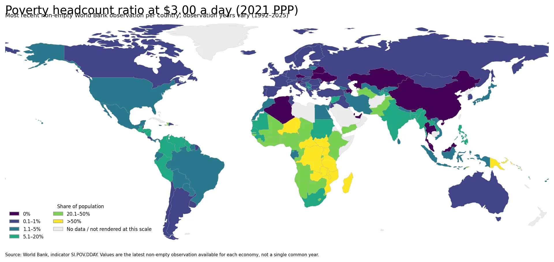
The map uses six ranges—0%, 0.1–1%, 1.1–5%, 5.1–20%, 20.1–50%, and above 50%—so the highly skewed distribution remains readable. All 171 observations are used in the statistics. The generalized world boundary layer renders 154 of those country geometries; several very small island states are not visible at this global map scale but remain included in the numerical summaries.
Table of Contents
What the $3.00-a-day poverty rate measures
The indicator measures the percentage of a country’s population living below the international poverty line of $3.00 per person per day at 2021 PPP. A value of 30% means that about three in ten people in that country were below the threshold in the observation year. The unit is percent of population, so the figure can be compared across countries more directly than a raw count, although population size still matters for understanding how many people are affected.
PPP revisions matter. A poverty line defined with a newer PPP benchmark is not automatically comparable with values published under an older PPP framework. For long-run trend analysis, the safest approach is to use a World Bank series that has been consistently recalculated on the same PPP basis rather than stitching together values from different editions.
The source is the World Bank SI.POV.DDAY indicator. The country set here takes the latest non-empty observation available for each economy. That makes the map good for answering “where are the latest reported levels highest or lowest?” It is not a same-year league table of 171 countries.
Where the highest latest observations occur
The highest values are concentrated in Sub-Saharan Africa. Nine of the ten largest observations are African countries, with Papua New Guinea the only non-African country in that top group. This concentration is visible on the map as a broad cluster of the darkest ranges across parts of central, eastern, and southeastern Africa.
| Country | Observation year | Population below $3.00/day |
|---|---|---|
| Congo, Dem. Rep. | 2020 | 85.3% |
| Mozambique | 2022 | 81.4% |
| South Sudan | 2016 | 76.5% |
| Malawi | 2019 | 75.4% |
| Burundi | 2020 | 74.2% |
| Zambia | 2022 | 71.7% |
| Central African Republic | 2021 | 71.6% |
| Madagascar | 2021 | 69.2% |
| Niger | 2021 | 60.5% |
| Uganda | 2019 | 59.8% |
The Democratic Republic of the Congo has the largest observation at 85.3% in 2020, followed by Mozambique at 81.4% in 2022. South Sudan was 76.5% in 2016, Malawi 75.4% in 2019, and Burundi 74.2% in 2020. Zambia and the Central African Republic were both above 71%, while Madagascar was 69.2% in 2021. These values show the scale of the differences, but the year column is essential: they should not be read as a synchronized ranking for one calendar year.
A distribution split between very low and very high values
Out of 171 observations, 68 are at or below 1%, including 15 values reported as 0.0%. At the other end, 12 countries have observations above 50%. That combination produces a very uneven distribution: the median is 2.5%, while the mean rises to 13.6%.
A reported value of 0.0% should not be interpreted as proof that literally no one in the country is below the line. Published international statistics can reflect rounding, sampling error, and the design of the underlying household survey. Differences such as 0.0% versus 0.1% are therefore less informative than the broader separation between the low, middle, and very high ranges.
Values above 50% are qualitatively different in scale because they indicate that more than half of the population was below the threshold in the reported observation. On the map, these countries stand apart clearly from the many economies with rates around 1% or lower.
Geographic patterns and nearby contrasts
The strongest geographic cluster is in Africa, but the continent is far from uniform. High observations extend across countries such as the Democratic Republic of the Congo, Burundi, Uganda, Malawi, Zambia, and Mozambique, while other countries in the region fall into much lower ranges. This means a continental average would hide substantial differences between neighboring or nearby economies.
For example, Zambia was 71.7% in 2022 while South Africa was 17.4% in 2022. Mozambique was 81.4% in 2022, whereas Botswana was 21.4% in 2015 and Namibia 22.9% in 2015. Those gaps are large enough to be visible even with broad map classes, but the older Botswana and Namibia observations also illustrate why geographic proximity should not be confused with a clean same-year comparison.
Outside Africa, Papua New Guinea stands out at 52.2%, although its observation is from 2009. Much of Europe, parts of North America, and several economies in East Asia have latest observations around 1% or below. The global map is therefore most useful for seeing the broad concentration of high values, while the year and exact percentage remain necessary for careful country-to-country comparison.
The observation years are not synchronized
The 171 country observations span 1992 to 2025. Of the full set, 107 are from 2021 or later, 62 are from 2023 or later, and only 25 are from 2024 or 2025. The dataset is therefore reasonably recent for many countries but contains a long tail of older observations.
| Freshness group | Number of countries/economies |
|---|---|
| 2024–2025 | 25 |
| 2023 or later | 62 |
| 2021 or later | 107 |
| All observations | 171 |
Only four countries have 2025 observations in this set: Indonesia at 4.0%, Ecuador at 3.4%, Uzbekistan at 2.3%, and Costa Rica at 0.8%. That is why a title suggesting that all 171 values are “2025 poverty rates” would be misleading. The endpoint was current through 2025, but the value shown for each country is its latest available non-empty observation.
Older data deserve extra caution. Papua New Guinea’s 52.2% value is from 2009, and some small economies also have observations from the early 2010s. The map remains useful as a coverage-rich view of the latest values available country by country, but it should not substitute for a common-year dataset when the goal is policy evaluation or a precise contemporaneous ranking.
Five cautions for reading the map correctly
- The threshold is PPP-based: $3.00 a day is expressed at 2021 purchasing power parity, not converted at today’s market exchange rate.
- Years differ: each country contributes its latest non-empty observation, so the comparison is not synchronized.
- Survey systems differ: household surveys, coverage, and statistical methods can affect the precision of reported poverty rates.
- 0.0% is a reported value: rounding and sampling mean it should not automatically be read as literally zero people.
- Geography is not causation: a cluster of high values does not mean location itself causes poverty. Institutions, conflict, labor markets, education, health, infrastructure, and many other factors may be relevant.
What the map is best used for
The clearest finding is the size of the cross-country gap. A global median of 2.5% coexists with a group of countries above 50% and a maximum above 85%. That makes a map more informative than a single global average because it reveals where extreme values are geographically concentrated.
A second finding is that the high-poverty cluster is broad enough to involve many countries rather than one isolated outlier. At the same time, large within-region differences show why regional labels should not replace country-level evidence. Nearby countries can fall into very different poverty-rate bands.
The third finding is methodological: freshness varies substantially. This visualization is best described as a map of the latest available country observations. For a direct comparison between two countries, check the observation year first and use a common-year series when the decision depends on timing.
Frequently Asked Questions
What does the $3.00-a-day poverty headcount ratio mean?
It is the share of the population living below an international poverty line of $3.00 per person per day at 2021 purchasing power parity. It is not a simple market-exchange-rate conversion of three U.S. dollars.
Does the map compare every country in the same year?
No. It uses the most recent non-empty observation for each country, so observation years vary from 1992 to 2025. Check the year before making a direct country-to-country comparison.
Does a reported 0.0% mean no one is below the poverty line?
Not necessarily. Published values can reflect rounding, sampling error, and survey design, so 0.0% is best interpreted as the reported estimate rather than proof of a literal zero population.
Related Articles
Green Map creates custom-edited map images using open geographic data sources such as geoBoundaries, Natural Earth, OpenStreetMap, and government open data.
These maps are edited visual materials, not raw data files, and are provided for education, documents, presentations, and graphic reference.