Sangamon County has one of the clearest urban-to-rural contrasts in central Illinois. Springfield forms a broad developed core near the middle of the county, while extensive agricultural land surrounds it in nearly every direction. Water, wetlands, and narrow wooded corridors break up that farm landscape, especially around Lake Springfield and along drainage and river corridors. The four maps on this page separate those features so the county can be read as more than a single percentage.
The 2025 summary classifies 76.51% of the county as agriculture and 14.75% as developed land. Forest accounts for 5.68%, wetlands for 1.82%, and water for 1.14%. Grassland and shrubland occupy only 0.03% and 0.01%. Original JPG versions of the general land-cover map, forest-and-farmland map, impervious-surface map, and 1985–2025 class-difference map are available together in the download package below.
Table of Contents
A large city core inside a predominantly agricultural county
The first thing that separates Sangamon County from many neighboring farm counties is the size of the Springfield developed area. On the county-wide map, the urban core appears as a large red mass rather than a small town-sized patch. Development continues outward in smaller clusters and narrow road-linked bands, but the surrounding landscape quickly returns to agriculture. That sharp transition makes it easy to compare built land with the county’s dominant farm cover.
Agriculture at 76.51% remains the defining land-cover class. Broad yellow areas fill the northern, eastern, western, and southern parts of the county. Forest is much less extensive in total area, yet it is not randomly scattered. Green cover often follows branching drainage corridors and low areas, creating narrow connections through otherwise open fields. Wetlands and water occupy small percentages but become locally important where they cluster around streams and the lake south of Springfield.
Lake Springfield is especially useful as a reference point because it brings several land-cover classes together in a compact area. The City of Springfield describes the lake as a municipal water-supply and recreation resource. Around its shoreline, the maps show water next to developed land, wetlands, forest, and agriculture. That combination creates a more complex pattern than the broad field blocks farther from the metropolitan area.
Reading the 2025 land-cover map from the center outward
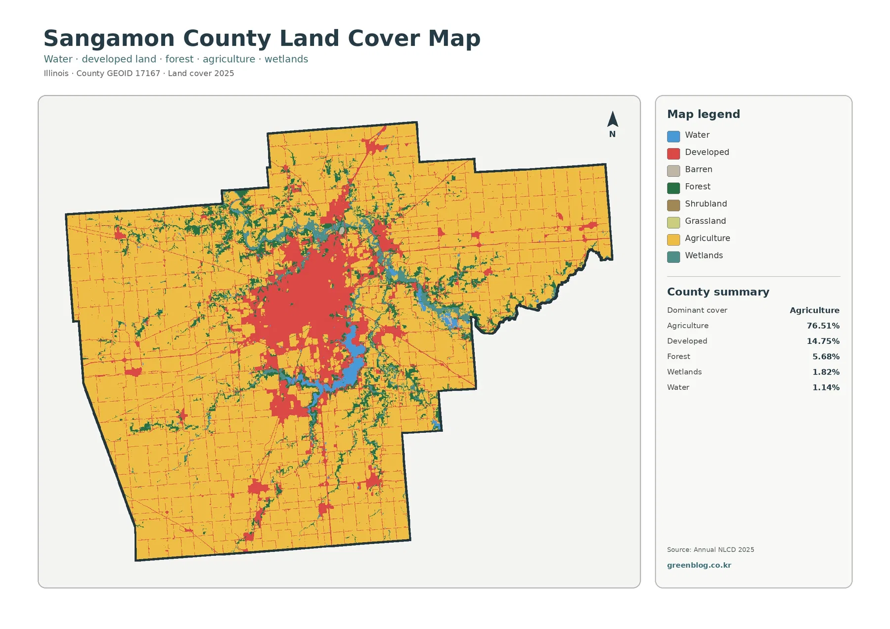
Starting at Springfield makes the overall pattern easy to follow. Developed land dominates the center, with a few satellite clusters and transportation lines extending into the countryside. Moving outward, agriculture quickly becomes the main color and remains continuous across large parts of the county. This relationship is more informative than the percentages alone because it shows that the developed share is geographically concentrated rather than evenly mixed through the farm landscape.
Forest cover is only 5.68%, but its shape gives it a strong visual presence. Instead of forming one large block, it often appears as branching green bands. These corridors are especially visible north and east of Springfield and along low-lying routes through the agricultural interior. The map does not label every stream, so the safest reading is to describe these as wooded drainage or river corridors unless a separate hydrography source identifies a specific waterway.
Wetlands at 1.82% and water at 1.14% are also concentrated rather than evenly distributed. The lake south of Springfield is the most obvious water feature, while smaller blue and teal areas occur along other drainage corridors. In a classroom or presentation, it is useful to point out that a small county-wide percentage can still be important when the class is concentrated in a particular environmental setting.
Land cover should not be confused with zoning or legal land use. A red developed pixel does not tell you whether a parcel is residential, commercial, or industrial, and a yellow agricultural pixel does not establish ownership or farm status. The map classifies what is covering the ground at the observation scale. Parcel boundaries, permits, zoning districts, and property rights require separate local records.
Where woods interrupt the farm grid
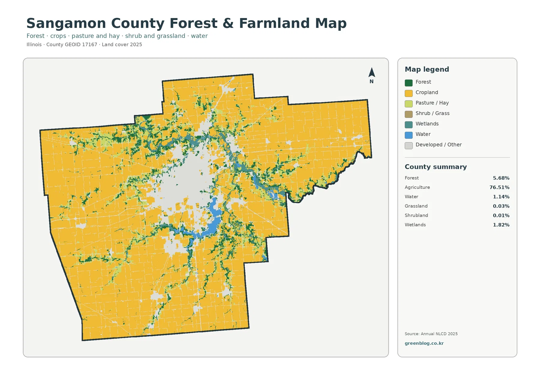
The forest-and-farmland view removes much of the visual competition from developed classes and makes the agricultural structure easier to examine. Cropland covers most of the county outside Springfield and other settlements. The most useful details are the green and teal interruptions: wooded corridors, wet areas, and water bodies that cut across or border the farm blocks.
Those interruptions matter because they show where the landscape is not simply continuous cropland. In several parts of the county, forest follows sinuous paths rather than rectangular field boundaries. Around Lake Springfield, water and adjacent natural cover create a distinctive break in the agricultural pattern. Elsewhere, smaller wooded lines connect patches that would be easy to miss on the general land-cover map.
The University of Illinois Extension unit serving Logan, Menard, and Sangamon counties provides local programming in commercial agriculture and links residents with resources on crops, soil, water, natural resources, and related topics. That local context fits the map well: agriculture is the dominant physical cover, but land and water management remain closely connected to the narrower natural corridors within the county.
Grassland and shrubland are only 0.03% and 0.01%, so they should not drive the interpretation of this map. Small isolated patches may be visible, but the main comparison is between cropland, forest, wetlands, water, and developed or other surfaces. At this scale, very narrow tree rows, roadside vegetation, small ponds, and individual farmsteads may be generalized or absorbed into a neighboring class.
Impervious cover reveals the shape of Springfield and the road network
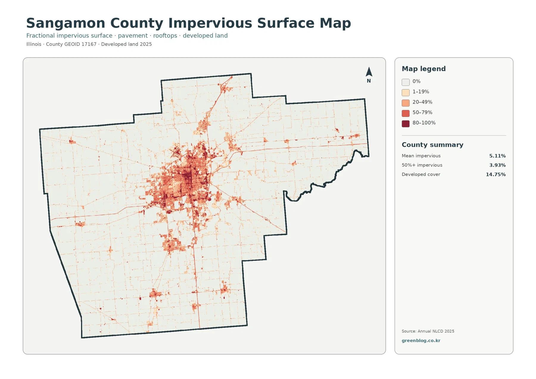
Impervious surface means pavement, rooftops, parking areas, and other hard surfaces that do not readily absorb water. The county-wide mean is 5.11%. Cells with at least 50% impervious cover account for 3.93% of the county, while the broader developed-land class covers 14.75%. Those measures describe related but different things: developed land includes a range of built settings, while imperviousness estimates how much of each cell is covered by hard surface.
Springfield dominates this map more strongly than any other feature. The center contains a dense patchwork of high impervious values, with lower values around the urban edge. Roads radiate outward as narrow linear marks. Smaller settlement clusters appear elsewhere in the county, but they are far more limited in size. The contrast with the surrounding agricultural plain makes the metropolitan footprint easy to identify without needing municipal boundary lines.
Lake Springfield adds another useful comparison. Built surfaces occur near parts of the shoreline, while other sections remain adjacent to water, vegetation, and agricultural land. Springfield has also worked with the Sangamon County Soil and Water Conservation District on source-water protection in the Lake Springfield watershed. City records describe wetland projects intended to reduce nutrients and sediment moving from agricultural drainage toward the lake.
High impervious values should not be treated as a flood-risk map. Runoff depends on topography, drainage systems, soil, rainfall, and receiving streams as well as pavement and rooftops. The impervious map is best used to locate concentrations of hard surface and to compare urban, suburban, and rural settings. A flood study or development decision requires dedicated hazard, engineering, and parcel data.
What the 1985–2025 class-difference map actually measures
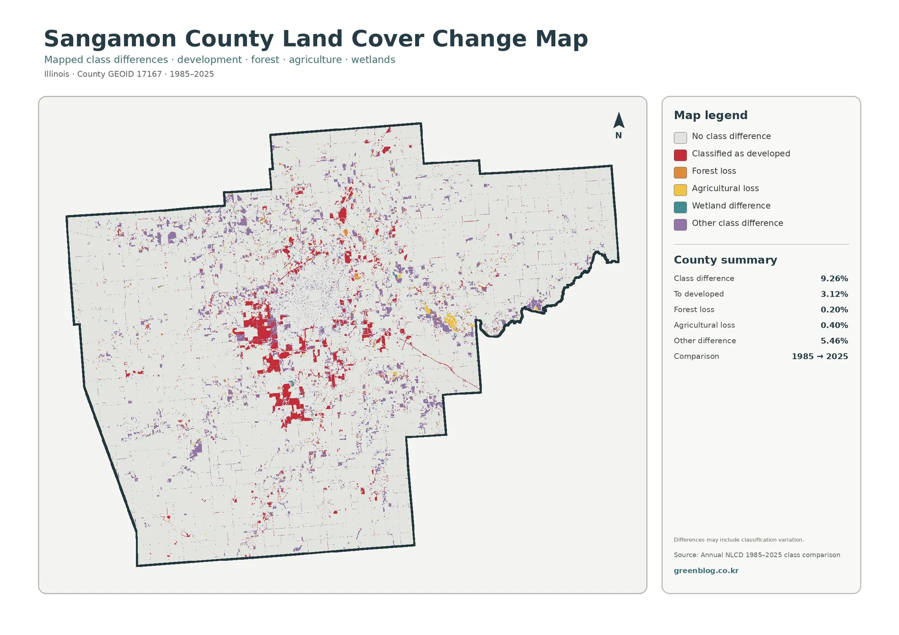
The change summary reports class differences across 9.26% of the county. Areas classified as developed account for 3.12%, forest loss for 0.20%, agricultural loss for 0.40%, and other class differences for 5.46%. The key phrase is class difference. The 9.26% total is not a statement that development grew by 9.26%, nor does it mean every colored cell represents a permanent land-use conversion.
Red developed-change cells are most noticeable around Springfield and its outer developed areas, with additional small clusters along transportation and settlement locations. Some of those areas overlap places that have high impervious values today. Even so, the two maps answer different questions. The impervious map describes the 2025 surface, while the change map marks cells whose broad land-cover classification differs between the comparison years.
Other class difference is the largest single category at 5.46%. That is an important caution. Satellite classification can assign similar vegetation or mixed pixels differently between dates, and edge cells around water, forest, agriculture, and development are especially sensitive to generalization. The map itself notes that differences may include classification variation, so it should be used as a screening layer rather than proof of a specific event.
Forest loss at 0.20% and agricultural loss at 0.40% are much smaller than the total difference. It would therefore be misleading to describe the map as evidence of broad county-wide forest clearing or wholesale farmland disappearance. A more defensible use is to identify areas worth checking with intermediate-year imagery, local planning records, or more detailed land-cover histories.
A practical way to compare the four maps
Begin with Springfield on the general land-cover map. Note the size of the developed core and where agriculture begins around it. Then switch to the impervious map and compare the same area. The developed class becomes more detailed because roads, dense built blocks, and lower-density outer areas separate into different impervious ranges. This two-map comparison is useful for explaining the difference between a land-cover category and the actual fraction of hard surface.
Next move south to Lake Springfield. The general map shows water, nearby development, wetlands, forest, and agriculture together. The forest-and-farmland map simplifies that setting so the relationship between cropland and natural cover is easier to follow. The change map adds a time comparison, but it should be read last because its colored cells require the most careful interpretation.
For a rural comparison, choose an agricultural area farther from Springfield. The general map may look almost uniformly yellow, yet the forest-and-farmland view often reveals narrow green or teal corridors. The impervious map adds the road grid, and the change map shows whether any cells were classified differently between 1985 and 2025. Matching the same location across all four views produces a much clearer explanation than reading four separate legends in isolation.
Good uses for the maps—and questions they cannot answer
For a county overview, the 2025 general map is the most balanced choice because it shows the agricultural majority, the Springfield urban core, Lake Springfield, and the smaller forest and wetland corridors at once. The forest-and-farmland map works better for environmental education or agriculture-focused presentations. The impervious map is useful when the topic is built surface, runoff context, or the contrast between city and countryside.
The maps can also support watershed lessons. A reader can follow water and wetland areas, identify nearby forest, and then compare those places with agriculture and developed cover. Around Lake Springfield, this is especially relevant because the city and local conservation partners manage source-water issues that involve both agricultural land and wetlands. The map does not measure water quality, but it provides a geographic background for understanding why land-cover context matters.
Annual NLCD-style land cover is a raster classification derived from remotely sensed data. Raster cells generalize the ground into a regular grid, so a cell that contains trees, pavement, grass, and a building may still receive one dominant class. Narrow streams, small ponds, hedgerows, parking-lot edges, and individual structures can be simplified. Mixed pixels are most common where several cover types meet within a small area.
The maps also represent specific observation years. The 2025 map may not include development or land-cover changes that occurred afterward. The 1985–2025 comparison does not show every intermediate step during those forty years. For parcel research, current zoning, legal wetlands, ownership, permits, flood hazards, or engineering decisions, use the appropriate local and state records in addition to these county-scale maps.
Used within those limits, the collection is a strong visual reference. It places agriculture, built land, water, forest, wetlands, hard surfaces, and long-term classification differences inside one consistent county boundary. That makes it useful for presentations, school projects, local research, environmental comparisons, and deciding which parts of Sangamon County deserve a closer look with more detailed data.
Choosing the right JPG for your project
Use the 2025 land-cover map when you need the broadest county picture. Choose the forest-and-farmland map when the relationship between cropland, woods, wetlands, and water is the main subject. The impervious map is the clearest option for Springfield and other built surfaces. The 1985–2025 map is best for locating classification differences that may deserve further research. The ZIP contains one original JPG for each of these four views.
Frequently Asked Questions
What is the dominant land cover in Sangamon County?
Agriculture is the dominant 2025 class at 76.51%. Developed land follows at 14.75%, then forest at 5.68%, wetlands at 1.82%, and water at 1.14%. The county is therefore strongly agricultural overall, but Springfield creates a large and visually distinct developed core.
What does the 5.11% mean impervious value represent?
It is the county-wide average fraction of hard surface such as pavement and rooftops within the mapped cells. Cells with at least 50% impervious cover account for 3.93% of the county. High values cluster mainly in Springfield and along other built-up areas and roads. Imperviousness is not the same as zoning or flood risk.
Does the 9.26% change figure mean development increased by 9.26%?
No. The 9.26% figure is the share of cells with a different broad land-cover classification in the 1985 and 2025 comparison. Areas classified as developed account for 3.12%, forest loss for 0.20%, agricultural loss for 0.40%, and other class differences for 5.46%. Classification variation can also contribute to mapped differences.
Map File Information
Download four original JPG maps for Sangamon County, Illinois: 2025 land cover, forest and farmland, impervious surface and developed land, and 1985–2025 land-cover class differences.
- Included Files: Four JPG maps shown on this page
- File Type: JPG files bundled in a ZIP archive
- Intended Use: Printing, education, presentations, and map-based projects
Related Maps
- Adams County Illinois Land Cover Map
- Alexander County Illinois Land Cover Map
- Bond County Illinois Land Cover Map
Sources and References
- MRLC Annual NLCD Data — annual land-cover and related datasets
- USGS Annual NLCD Land Cover Classification — land-cover classes and classification background
- U.S. Census Bureau TIGER/Line Shapefiles — county boundary data
- University of Illinois Extension — Logan, Menard and Sangamon Counties — local agriculture and natural-resource programs
- City of Springfield Lake Springfield Source Water Protection — wetland and agricultural-drainage work in the Lake Springfield watershed
- Sangamon County GIS — county boundary GIS service
Green Map creates custom-edited map images using open geographic data sources such as geoBoundaries, Natural Earth, OpenStreetMap, and government open data. These maps are edited visual materials, not raw data files, and are provided for education, documents, presentations, and graphic reference.