Effingham County in southeastern Illinois is mostly agricultural in the 2025 land-cover data, yet the county does not read as an uninterrupted field landscape. Agriculture accounts for 69.18% of the area, forest for 19.07%, and developed land for 11.04%. A large built-up cluster around Effingham stands out near the center, while smaller developed areas, forest patches, and the water around Lake Sara break up the surrounding farm pattern. The four maps on this page separate those features so they can be compared without relying on a single crowded view.
The web maps can be viewed directly in the article, and the four original JPG maps are available together in one ZIP download. Use the general map for a countywide profile, the forest-and-farmland version for a cleaner comparison of natural cover and cropland, the impervious map for pavement and rooftops, and the 1985–2025 change map for places where the two endpoint classifications differ. Reading them together is especially useful in Effingham County because the central transportation and development hub looks very different from the broad agricultural areas around it.
Table of Contents
A 69.18% agricultural landscape is interrupted by one strong central development cluster
The 2025 land-cover map is dominated by yellow agricultural cover across nearly every part of the county. The pattern changes sharply around the center, where developed land forms a large red cluster around Effingham. Smaller built-up patches appear to the west and east, while green forest occurs in many separate pieces through the north, south, and central portions of the county. Water and wetlands occupy much smaller shares, but the northwestern water body near Lake Sara is large enough to remain easy to find even at a countywide scale.
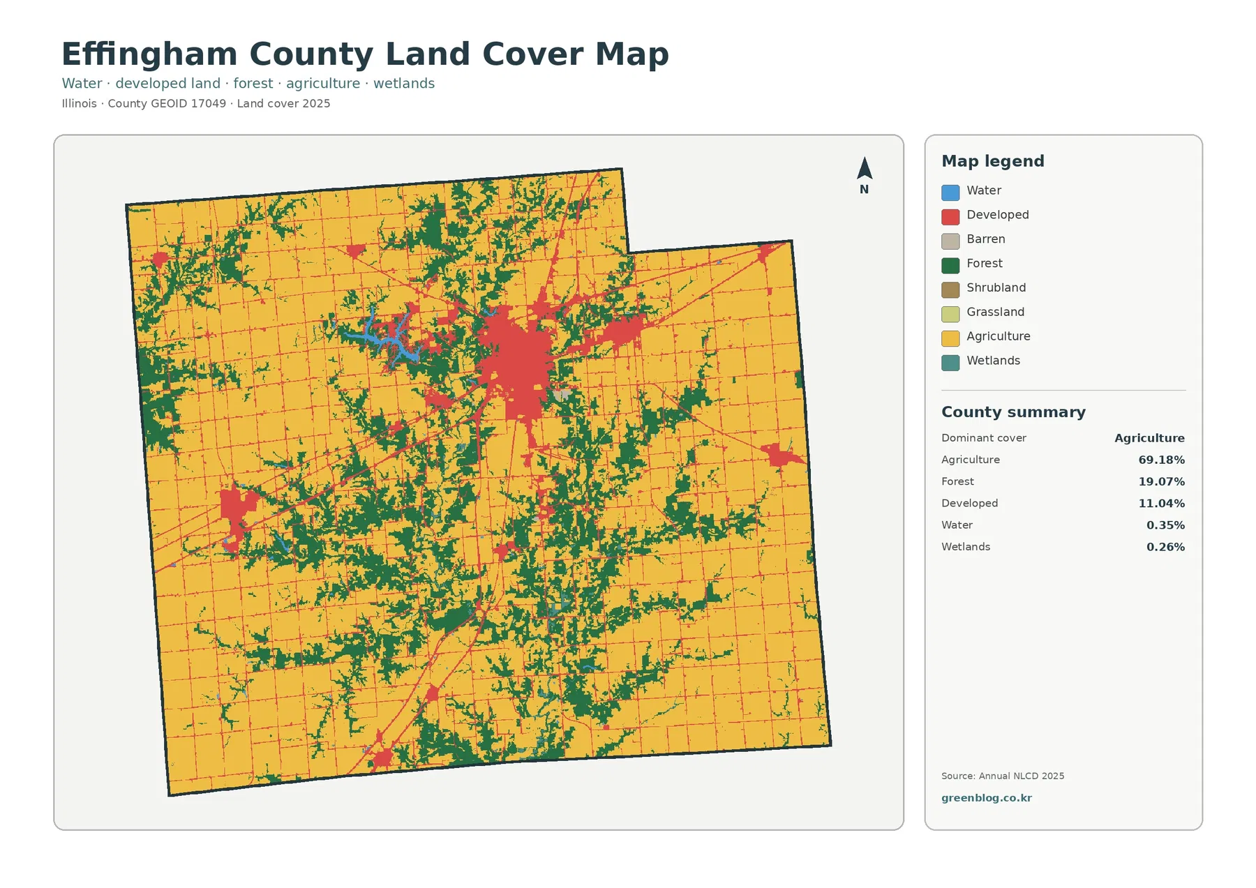
The percentage summary helps put the visual contrast in perspective. Agriculture covers 69.18%, forest 19.07%, developed land 11.04%, water 0.35%, and wetlands 0.26%. Developed land therefore occupies far less area than agriculture, even though its central concentration makes it visually prominent. Forest is the second-largest category and appears in many separated patches rather than one continuous block. Small water and wetland percentages also remind the reader that a feature can be locally noticeable without representing a large share of the entire county.
Land cover should not be confused with zoning, ownership, parcel use, or development rights. The map classifies what the surface looks like in the satellite-based dataset: cropland, forest, water, developed cover, and related categories. A developed cell may include lawns, trees, or open ground as well as buildings and pavement, while an agricultural cell does not identify a crop or property owner. The map is best used to compare broad surface patterns across the county rather than to answer legal or parcel-level questions.
Lake Sara and scattered forest belts provide the clearest natural contrast to the farm grid
The forest-and-farmland map removes much of the visual competition from developed and miscellaneous classes, making the green forest patches easier to follow. Forest is not restricted to a single corner of Effingham County. Substantial patches appear north of the central urban area, across the southern half, and in several western sections. Around Lake Sara in the northwest-central part of the map, blue water and adjacent green cover form one of the county’s clearest non-agricultural clusters. Official county information also identifies the Lake Sara area as one of the county’s notable population areas.
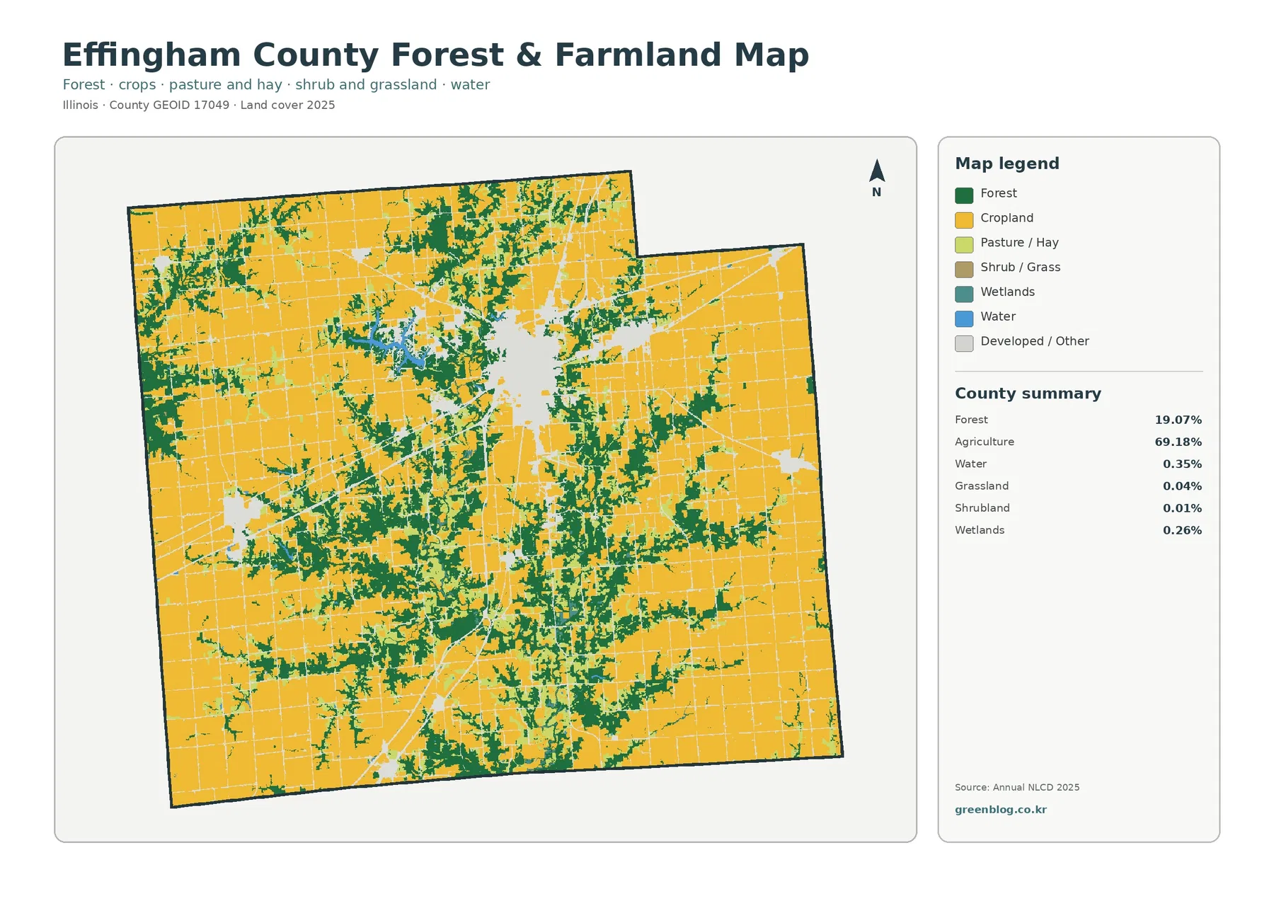
Across the southern part of the county, forest frequently appears as branching or irregular pieces between larger farm blocks. Northern forest is also substantial in places but tends to be broken into numerous separate patches. That distribution matters because the 19.07% forest figure is not produced by one large forest reserve; it is the combined result of many wooded areas distributed across the county. Cropland remains the continuous visual background, while forest changes the texture of that background wherever the green patches become denser.
Water accounts for only 0.35% and wetlands for 0.26%, so those categories should not be described as dominant countywide features. Their value is geographic rather than proportional. Lake Sara remains visible because the water is concentrated in one recognizable area, while smaller wetland and water cells occur as scattered pieces near other cover types. When the map is printed, the percentage summary is useful for preventing a bright blue or teal patch from being mistaken for a large share of the county.
Effingham’s highway crossroads are much clearer on the impervious-surface map
Effingham County’s official overview lists Interstate 57 running north–south and Interstate 70 running east–west, along with U.S. and state highways that connect the county’s communities. The impervious map turns that transportation pattern into one of its strongest visual features. The darkest concentrations occur around Effingham, and thinner orange or red lines extend away from the central cluster. Smaller concentrations appear around Altamont to the west and Teutopolis to the east, but they are less extensive than the central built-up area.
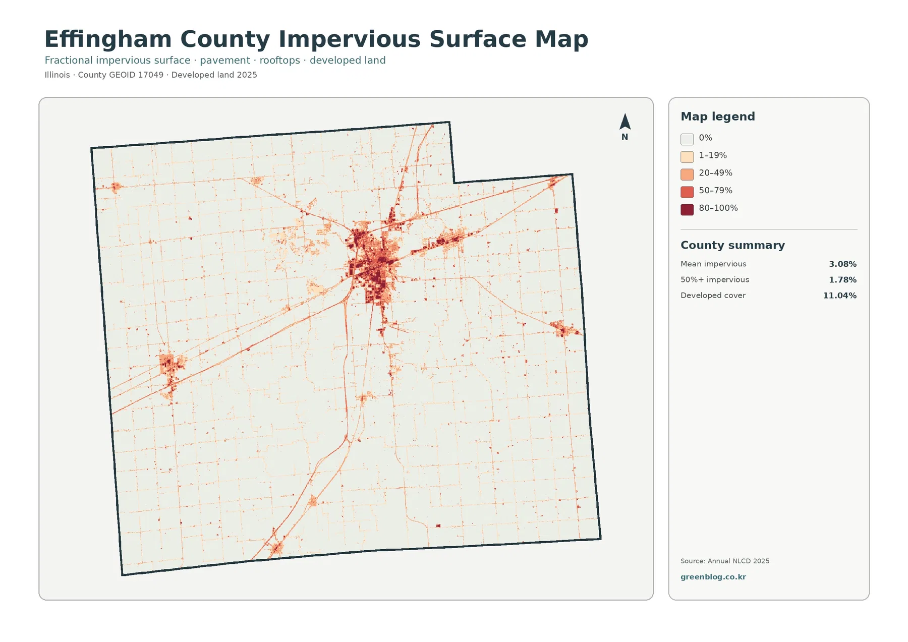
Impervious surface means pavement, rooftops, parking areas, and similar surfaces that do not readily absorb rainfall. The countywide mean is 3.08%, while 1.78% of the county falls in cells that are at least 50% impervious. Those values are low because most of the county is farmland or forest, but the county average should not be mistaken for conditions inside Effingham itself. The central urban area contains many much darker cells, showing a local concentration that is far above the countywide average.
The 11.04% developed-land figure and the 3.08% mean impervious value describe different things. Developed land is a land-cover class and can include lower-intensity areas where buildings, pavement, lawns, trees, and open ground are mixed together. Impervious cover estimates the fraction of hard surface within a cell. Comparing the two maps therefore separates the broad footprint of development from its densest paved or built portions. In Effingham County, that distinction is particularly useful around the central hub and along the thin transportation corridors radiating away from it.
The 1985–2025 comparison marks 9.42% of the county as a different class
The endpoint change map compares the land-cover classification in 1985 with the classification in 2025. It reports a total class difference of 9.42%. Of that area, 2.08% is classified as developed at the later endpoint, 0.57% is mapped as forest loss, 0.81% as agricultural loss, and 5.89% as other class difference. The “other” category is the largest component, so the total 9.42% should not be read as a single development or deforestation statistic.
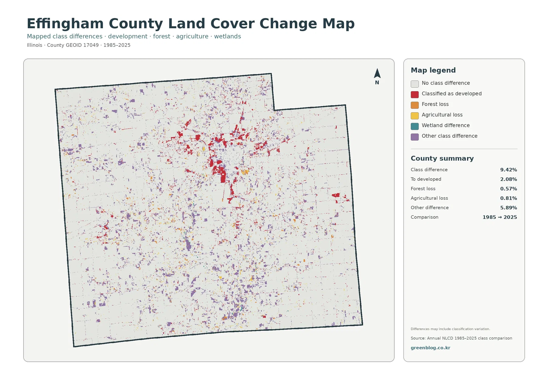
Red cells classified as developed are most noticeable around Effingham and in several linear or clustered areas extending outward from the central city. Smaller red concentrations also appear near other communities. Purple other-difference cells are much more widely scattered through the agricultural landscape, while forest-loss and agricultural-loss colors occur as smaller fragments. The pattern is therefore not one expanding front. It is a mixture of localized developed-class changes and many dispersed differences across the county.
A mapped class difference is not automatically proof of a specific physical event. Two dates can disagree because land cover truly changed, but classification boundaries, mixed pixels, and differences in the underlying data can also affect the result. The map itself notes that classification variation may be included. To determine exactly when a field became developed, whether a forest patch was cleared, or what happened at one property, dated aerial imagery and local records would be needed in addition to this county-scale comparison.
Each map answers a different part of the county story
Start with the general land-cover map when the goal is to explain the county as a whole. It places the 69.18% agricultural background, the 19.07% forest share, the 11.04% developed area, and the small water and wetland classes in one frame. The central Effingham cluster is easy to spot, but the map also shows that most land beyond the built-up areas remains agricultural or wooded. This is the most useful first map for readers who need orientation before they focus on one category.
Switch to the forest-and-farmland map when natural cover is the main question. Lake Sara, the scattered forest belts, and the broad cropland blocks are easier to separate without the red developed class dominating the view. For transportation and urban intensity, the impervious map is stronger because it highlights the dense center and the narrow corridors. The change map belongs last in the sequence because its colored cells make more sense after the 2025 pattern is already understood.
This map-by-map approach also reduces a common interpretation problem. A single red developed class cannot show whether a place is lightly developed or heavily paved, and a change cell cannot explain the full history of a site. Looking at the same location across the four views lets the reader distinguish current cover, simplified forest-versus-farm context, hard-surface intensity, and endpoint difference without forcing one map to answer all four questions.
The maps work well for county comparisons, classroom use, and printed reference
Effingham County is a useful example for explaining how a strong transportation and urban center can sit inside a predominantly rural county. A classroom or presentation can begin with the 69.18% agriculture and 19.07% forest shares, then use the impervious map to show how the Effingham hub differs from the surrounding farm landscape. The official county overview identifies Effingham, Teutopolis, Altamont, and the Lake Sara area among the county’s larger population concentrations, which gives a practical local context for several of the clusters visible on the maps.
For county-to-county comparisons, use the same map type and reference year on both sides. Effingham County’s 11.04% developed share may look visually dominant because it is concentrated, while another county with a similar percentage could have development spread more evenly. The same caution applies to forest. A 19.07% share divided among many patches does not look the same as 19% contained in one block. The numeric summaries and the geographic pattern should therefore be read together rather than treated as interchangeable measures.
A 30-meter land-cover grid is not a substitute for parcel or local GIS records
Annual NLCD is a raster product, which means the landscape is divided into grid cells and each cell receives a representative class. The land-cover data use 30-meter cells. Features smaller than a cell—such as a narrow local road, a small pond, a line of trees, or a property containing both a building and lawn—can be generalized. A sharp boundary between agriculture and forest on the map should therefore be read as a county-scale classification boundary rather than a surveyed property line.
Effingham County’s GIS department maintains a different set of geographic information, including tax parcels, land use, soils, flood areas, addresses, road lines, voting districts, and aerial photography. Those resources are appropriate when a question concerns a particular property or official local layer. The NLCD-based maps on this page are better suited to broad comparisons of agriculture, forest, developed cover, wetlands, water, and impervious surfaces across the whole county. Keeping those purposes separate prevents a regional land-cover map from being used for a task it was not designed to perform.
Time is another limitation. The current maps summarize the supplied 2025 classification, while the change map compares only the 1985 and 2025 endpoints. It does not show the sequence of events during the forty years between them. Recent construction, new farm conversions, small forest management changes, or conditions after the observation period will not appear. When a current site-specific decision matters, recent aerial imagery and the appropriate local or regulatory source should be checked alongside the county-scale map.
Frequently Asked Questions
What is the dominant 2025 land-cover class in Effingham County?
Agriculture is the dominant class at 69.18%. Forest accounts for 19.07%, developed land 11.04%, water 0.35%, and wetlands 0.26%. The countywide map shows broad farm cover around a large central development cluster and many separate forest patches.
Why does the impervious map look darkest around Effingham?
The map shows the highest concentration of pavement, rooftops, and other hard surfaces around the Effingham urban center. County information also lists I-57 and I-70 among the major highways crossing the county. The countywide mean impervious cover is 3.08%, but the central urban cells are much higher than that average.
Does the 9.42% class difference from 1985 to 2025 mean all of that area physically changed?
No. The summary includes 2.08% classified to developed, 0.57% forest loss, 0.81% agricultural loss, and 5.89% other class difference. Classification variation may also be included, so site-specific physical change should be checked with dated imagery or local records.
Sources and reference material
- MRLC Annual NLCD Data – official access to Annual NLCD land-cover products.
- USGS Annual NLCD Land Cover Classification – official documentation for Annual NLCD classes.
- U.S. Census Bureau TIGER/Line Shapefiles – official geographic boundary data for counties and other U.S. areas.
- Effingham County GIS & Maps – county information about parcels, roads, aerial photography, soils, flood areas, and other local GIS layers.
- Effingham County Sheriff – County Overview – official overview listing major communities and the I-57, I-70, U.S., and state highway network.
Map File Information
The download contains four original JPG maps for Effingham County: 2025 land cover, forest and farmland, fractional impervious surface, and mapped class differences from 1985 to 2025.
- Included Versions: land cover, forest and farmland, impervious/developed land, and 1985–2025 land-cover change
- File Type: one ZIP containing four JPG files
- Intended Use: printing, classroom or presentation work, county comparisons, reviewing the Effingham development hub, and comparing agriculture with forest cover
Related Maps
- Adams County Illinois Land Cover Map
- Alexander County Illinois Land Cover Map
- Bond County Illinois Land Cover Map
Green Map creates custom-edited map images using open geographic data sources such as geoBoundaries, Natural Earth, OpenStreetMap, and government open data. These maps are edited visual materials, not raw data files, and are provided for education, documents, presentations, and graphic reference.