Agriculture covers 71.90% of Clay County in the supplied 2025 classification, but the county is not a featureless sheet of cropland. Wooded strips and wetland cells repeatedly cut through the farm blocks, while developed land forms a few distinct town-sized clusters. This Clay County Illinois Land Cover Map set lets readers compare that present-day pattern with vegetation, hard surfaces, and mapped class differences since 1985.
Four WebP previews are shown on the page, and the four original 2480 × 1754-pixel JPG maps are available together in one ZIP. They work well for county profiles, classroom comparisons, presentations, and reference graphics where the goal is to show broad land-cover patterns rather than parcel details. The package does not identify the JPGs as meeting an A3 high-resolution standard, so a test print is sensible before using them at large sizes.
Table of Contents
A farm-dominated county with natural cover threaded through the grid
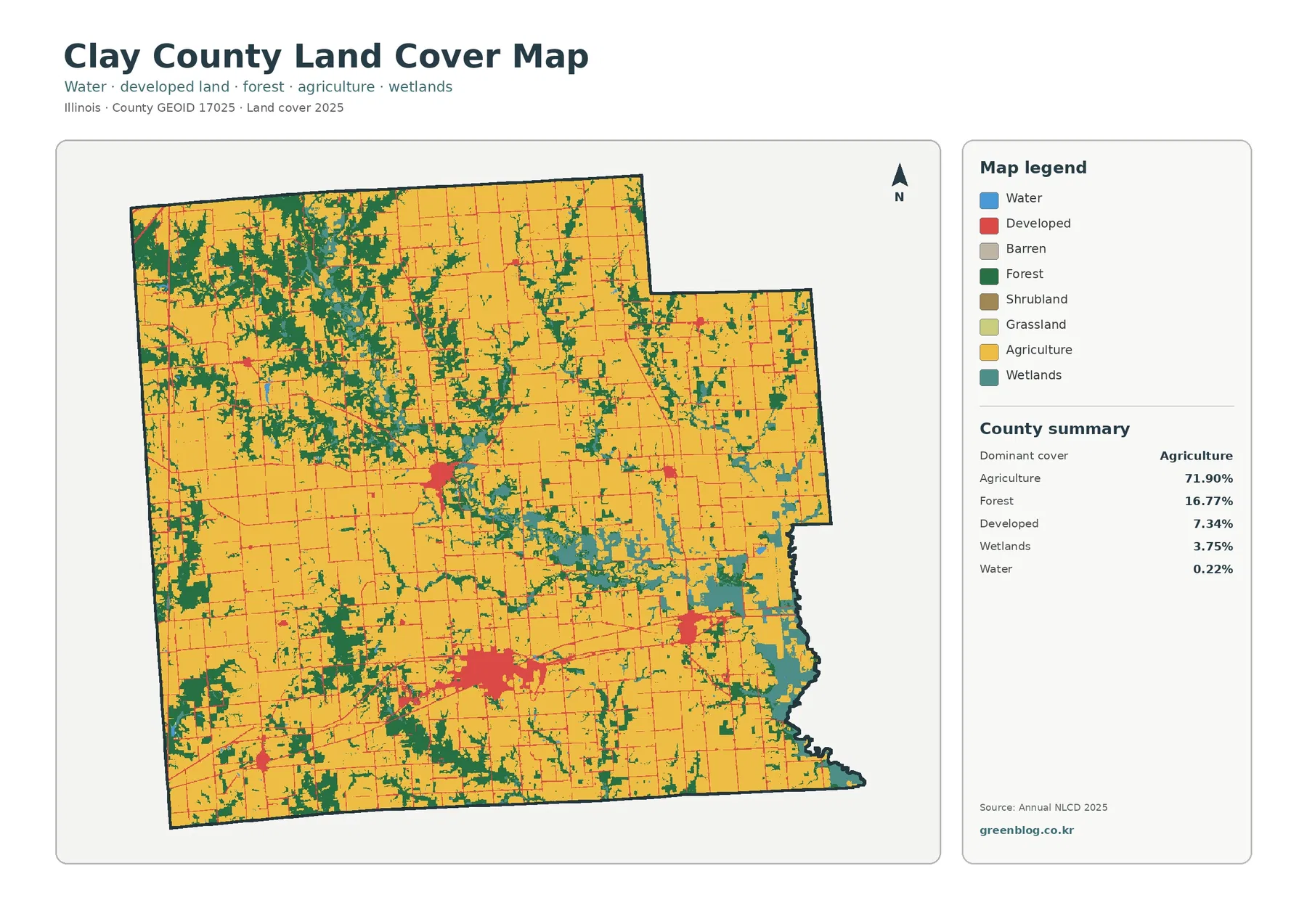
The county summary is led by agriculture at 71.90%. Forest accounts for 16.77%, developed cover for 7.34%, wetlands for 3.75%, and open water for 0.22%. Those percentages explain the dominant colors, yet the arrangement is just as important as the totals. Yellow agricultural areas form the broad background, while dark green forest and teal wetlands create irregular breaks that keep the landscape from appearing as one continuous rectangular farm surface.
The northwest contains some of the largest connected forest patches on the map. From there, narrower green strips extend into the interior, often bending or branching instead of following the straight edges typical of farm fields. Additional wooded pieces appear along the west and south. This pattern makes the 16.77% forest share visually prominent even though it is far smaller than the agricultural share. The forest is distributed in corridors and patches rather than confined to one corner.
Wetlands are especially noticeable toward the eastern side of the county, where teal areas form a broad irregular band. Smaller wet strips continue westward through the interior and appear along several narrow corridors. Open water is only 0.22%, so the map contains much more wetland color than blue water. That difference matters: wetland classifications can include saturated ground and wetland vegetation, not just the exposed water surface of a pond, lake, or stream.
Developed land does not spread evenly across this rural background. The largest red concentration lies in the southern central part of the county, with smaller concentrations near the center, farther east, and toward the southwest. Official county sources identify communities such as Louisville, Clay City, Xenia, and areas represented by Harter Township, while other public geographic references place Flora in the south-central part of the county. The preview itself has no municipal boundary layer, so the colored clusters should be treated as land-cover footprints rather than exact city limits.
Land cover is a classification of what is on the surface, not a statement about zoning, ownership, legal use, or development rights. A developed cell can still contain trees, grass, or open soil. An agricultural cell does not identify a specific crop or prove that every square meter was cultivated at the time of observation. Anyone working at parcel scale should use current county GIS records, property information, higher-resolution imagery, and field evidence instead of turning the countywide raster into a property map.
Removing the strong town colors reveals the shape of the farm–forest boundary
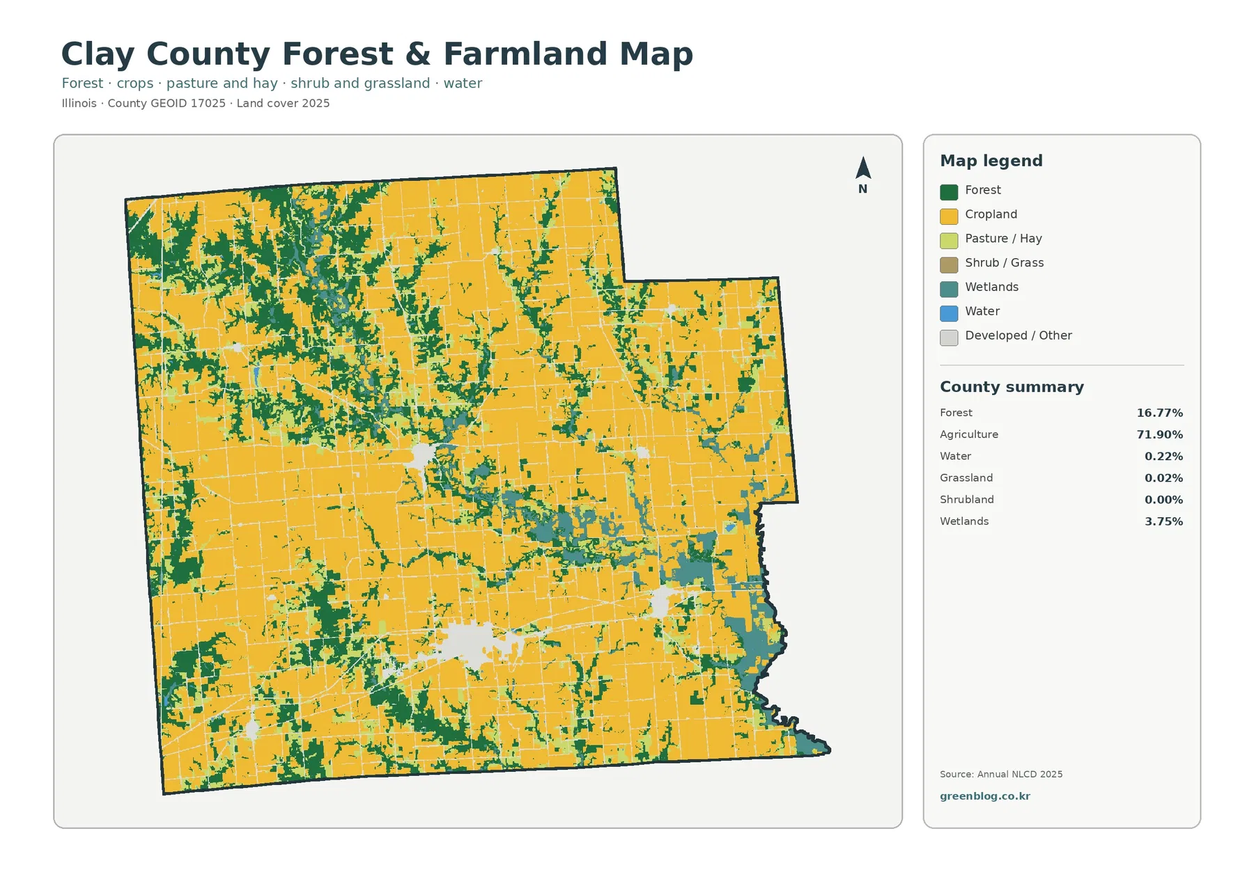
The forest-and-farmland view makes the field pattern easier to follow because developed and miscellaneous surfaces fade into the background. Large yellow blocks dominate the north, center, and south, but dark green areas repeatedly interrupt them. Some forest pieces are broad and compact, especially in the northwest, while others are narrow enough to look like ribbons between fields. The contrast helps readers see that the county’s agricultural dominance is built around a persistent network of natural cover.
This map is useful when a presentation needs more than the single statistic of 71.90% agriculture. A countywide percentage cannot show whether forest is concentrated, fragmented, or interwoven with working land. Here, the 16.77% forest share appears both as larger blocks and as thinner connectors. In several places, wetland color sits next to or within the wooded pattern, especially toward the east and through the middle of the county. The resulting farm–forest–wetland edges are a defining visual feature of Clay County’s map.
Grassland is listed at only 0.02%, and shrubland is 0.00% in the supplied summary. Those categories therefore deserve less emphasis than agriculture, forest, and wetlands. Small pixels may still appear on the map, but they do not support a claim that Clay County contains extensive mapped grassland or shrubland. Keeping the discussion proportional to the supplied statistics prevents a visually tiny class from being expanded into a major county characteristic.
The pale spaces where developed or other surfaces are muted also help separate settlement footprints from the surrounding farm matrix. The large southern cluster and several smaller centers stand out by absence rather than by a strong red color. That change in visual emphasis is useful in agriculture-focused material because it shows where field continuity is interrupted without making towns the central subject. It also allows the irregular forest and wetland corridors to remain visible next to the rectangular agricultural grid.
University of Illinois Extension serves Clay County together with Effingham, Fayette, and Jasper Counties and maintains a Clay County office in Louisville. Its programs include commercial agriculture, crops, soils, forestry, and natural resources. That local service context fits the strongly agricultural landscape shown here, but it should not be used to alter the map statistics. The 71.90% agricultural share and the other percentages on this page come from the supplied Annual NLCD 2025 classification.
Wetland corridors are much larger than the open-water share suggests
Only 0.22% of the county is mapped as open water, yet wetlands cover 3.75%. That distinction is easy to see along the eastern side, where teal areas cover substantially more ground than the small blue water cells. Wetland strips also cross the interior. Louisville is documented near the Little Wabash River, and Clay City lies close to the same river farther southeast, providing useful geographic context for the wet areas, but the land-cover preview does not label individual channels or regulatory wetland boundaries.
For drainage or environmental discussions, location matters more than the countywide wetland percentage alone. A narrow wet corridor can influence how a local landscape looks even when its total area is small compared with agriculture. The map can help identify broad places where wetlands and forest occur beside fields, but it cannot determine flood elevation, stream jurisdiction, wetland permitting status, or drainage capacity. Those questions require hydrography, elevation, soil, rainfall, regulatory, and often site-specific information.
It is also important not to turn adjacency into a causal claim. Forest and wetlands appear close together in several corridors, but the map only shows their spatial association. It does not prove that one caused the other or that a nearby agricultural practice created a wetland condition. A careful workflow uses this county map to identify a pattern, then consults higher-resolution imagery and appropriate natural-resource records before explaining why the pattern exists.
Hard surfaces form compact centers inside a countywide low average
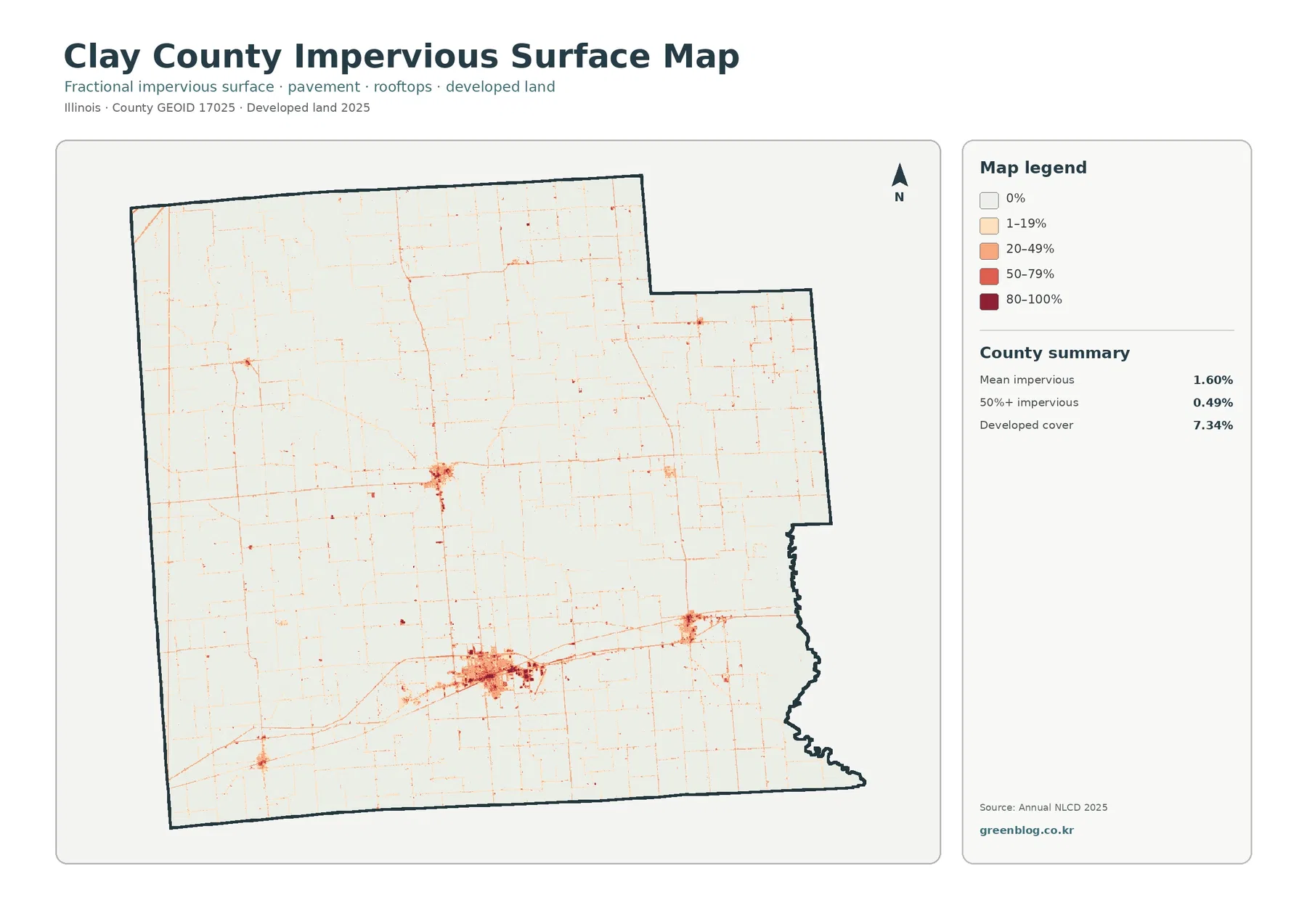
Clay County’s mean impervious cover is 1.60%, and only 0.49% of the county is mapped at 50% impervious or greater. Both numbers are much lower than the 7.34% developed-land share. The difference is expected because developed land-cover classes may include lawns, trees, bare ground, and other permeable surfaces around buildings and roads. The impervious layer isolates the harder fraction of those developed places rather than treating every developed cell as solid pavement.
The strongest impervious concentration appears in the south-central portion of the county. A smaller center is visible near the middle, another lies to the southeast, and smaller dots or short lines appear elsewhere. Fine linear traces connect much of the county in a loose grid. They can coincide with roads and other constructed surfaces, but the preview contains no road names or transportation attributes. A labeled road network should be consulted before assigning a specific route number to any line.
This is a good example of why a county average can hide local intensity. Thousands of agricultural and forest cells with little or no impervious surface pull the mean down, while a small town center can contain much higher percentages. For a county profile, the most informative presentation combines the 1.60% mean with the map itself. The number describes the whole county; the dark clusters show where hard surfaces actually concentrate.
Clay County Government places the courthouse and county offices in Louisville and provides a GIS Property Search among its online resources. That administrative information can help readers orient themselves to local places, but the county GIS and this NLCD-based map answer different questions. The GIS is appropriate for property and administrative reference. The land-cover map is appropriate for broad surface patterns. A developed cluster should never be copied from this raster and treated as a parcel or municipal boundary.
Impervious cover can be one ingredient in discussions about runoff because roofs and pavement reduce direct infiltration. It is not, by itself, a flood-risk map. Rainfall, slope, soils, drainage infrastructure, streams, wetlands, and downstream conditions all matter. In Clay County, the contrast between compact hard-surface centers and extensive farm and wetland areas makes it especially important to separate an urban-surface question from a countywide hydrology question.
The 1985–2025 comparison is dominated by scattered “other” class differences
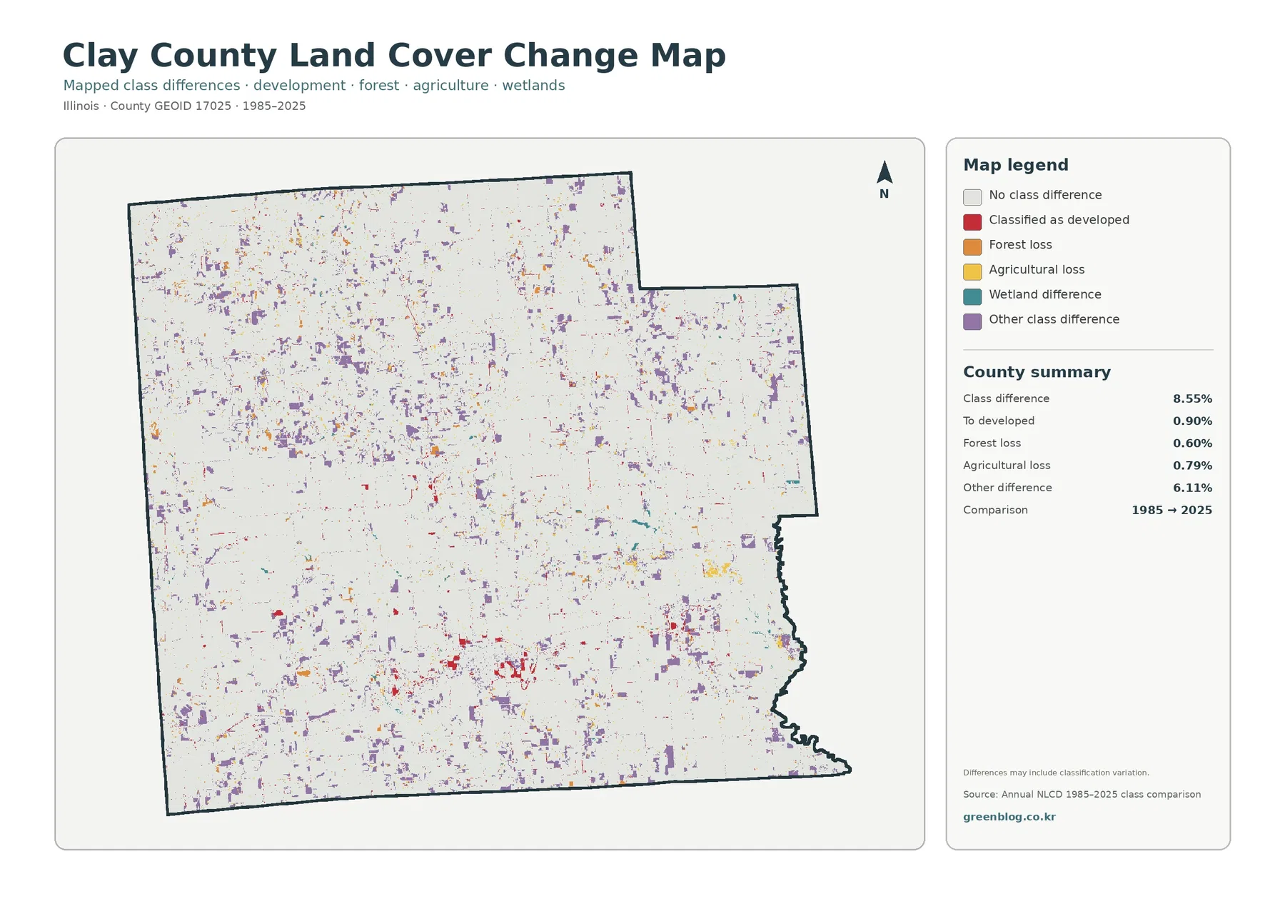
The endpoint comparison reports 8.55% total class difference. Of that, 0.90% is listed as classified to developed, 0.60% as forest loss, 0.79% as agricultural loss, and 6.11% as other class difference. Wetland difference has a legend category but no separate percentage in the summary. A residual calculation or visual estimate should therefore not be presented as an official wetland-change figure.
Purple “other class difference” cells are the most widespread colored marks. They appear across the northwest forest area, through the central farm-and-wetland mosaic, and in many small patches farther south. Red developed-conversion marks are more localized and are easiest to notice around current settlement footprints. Orange forest-loss and yellow agricultural-loss cells are scattered rather than forming one continuous countywide band. The map therefore describes a dispersed pattern of endpoint differences, not one single front of change.
The words “forest loss” and “agricultural loss” are classification labels, not a diagnosis of cause. A cell that was forest in 1985 and another class in 2025 can be marked as forest loss, but the image does not say whether timber harvest, construction, storm effects, vegetation succession, flooding, or classification variation caused the difference. The same caution applies to agricultural loss. Intermediate imagery and local records are needed to establish timing and explanation.
Annual NLCD works with 30-meter square cells and assigns a predominant class to each one. A single cell can contain crops, trees, a ditch, a driveway, grass, and a small structure while still receiving one label. Differences in mixed pixels, seasonal appearance, or classification can therefore show up in an endpoint comparison. The change-map note explicitly warns that the mapped differences may include classification variation, which is why the 8.55% total should not be equated with verified physical disturbance.
For a time-comparison graphic, show the 2025 land-cover map first and the 1985–2025 difference map second. The current map establishes what agriculture, forest, wetlands, and developed land look like now. The difference layer can then be read as a separate analytical view. Reversing that order can make red, orange, yellow, teal, and purple change colors look like current land-cover classes, especially to readers who have not studied the legend.
Choosing the right image without asking the map to do too much
Use the countywide 2025 map when the question is broad: what dominates Clay County, where do the main forest patches occur, and where do wetlands interrupt the farm matrix? Add the forest-and-farmland view when the emphasis is agriculture or natural cover. It reduces the visual weight of developed land and makes the contrast between rectangular fields and irregular green or teal corridors easier to explain.
The impervious map is the better choice for a development discussion because it separates hard surfaces from the wider developed category. It can illustrate why 7.34% developed cover does not mean that 7.34% of the county is pavement or rooftop. The strongest settlement centers become clear without overstating their countywide footprint. If the question concerns change over decades, use the endpoint-difference map and clearly state that it is a classification comparison rather than a complete development history.
For classroom use, the four views can demonstrate several useful distinctions. Students can compare a dominant percentage with the actual distribution of a class, distinguish wetlands from open water, separate developed land from impervious surface, and learn that a change layer has a different legend from a current-condition map. Clay County is particularly useful for this because the agricultural background is strong while forest, wetlands, and settlement clusters remain easy to see.
Keep the original JPG dimensions of 2480 × 1754 pixels when preparing reports or handouts. Enlarging the image far beyond its native size can soften labels and boundaries. The package does not mark these files as satisfying an A3 high-resolution reference, so large-format printing should be tested with the actual printer and paper. The WebP images on the page are previews; the ZIP contains the original JPG versions of all four maps.
At parcel scale, use another source. Thirty-meter land-cover cells are not designed to show property lines, narrow drainage ditches, small farm structures, or exact municipal limits. Clay County’s official site provides access to GIS Property Search and land-record resources for administrative and property questions. Those tools complement the land-cover maps rather than validating every raster edge. When precision matters, match the tool to the question instead of zooming the county map until it appears more detailed than it really is.
The 2025 classification is also a snapshot. Construction, crop rotation, timber activity, flooding, vegetation recovery, or other events after the observation period may not appear. For a current site-specific question, pair the county map with recent aerial imagery and local information. Its strongest use is consistent countywide comparison: showing the agricultural majority, the branching forest and wetland network, compact hard-surface centers, and the places where endpoint classifications differ.
Frequently Asked Questions
If agriculture is 71.90%, why does forest look so noticeable across Clay County?
Forest still covers 16.77% of the county, and it is distributed in many visible pieces rather than hidden in one compact area. Large northwest patches are joined by narrower wooded strips through the center and south. Those irregular green corridors repeatedly break the yellow agricultural background, making forest visually important even though agriculture remains the dominant class by a wide margin.
Why is developed cover 7.34% while mean impervious cover is only 1.60%?
Developed land-cover classes can include lawns, trees, bare ground, and other permeable surfaces around buildings and roads. The impervious layer focuses on roofs, pavement, parking areas, and similar hard surfaces. Because most of Clay County is rural, large low-impervious areas pull the countywide mean down even though several settlement centers contain much stronger local values.
Does the 8.55% class difference mean that 8.55% of the county was physically transformed between 1985 and 2025?
No. It is the share of cells with different endpoint classifications, and 6.11% is specifically labeled as other class difference. The map also warns that classification variation may be included. Determining actual land transformation, timing, and cause requires intermediate imagery, local records, and other supporting evidence rather than the endpoint layer alone.
Sources and Reference Data
- MRLC Annual NLCD Data – official access point for annual land-cover and comparison products
- USGS Annual NLCD Land Cover Classification – definitions and 30-meter guidance for agriculture, forest, wetlands, developed land, and related classes
- U.S. Census Bureau TIGER/Line Shapefiles – official county-boundary reference for Clay County
- Clay County Government – official Louisville courthouse, county services, GIS Property Search, and local administrative information
- University of Illinois Extension – Clay, Effingham, Fayette and Jasper Counties – local agriculture, crops, soils, forestry, and natural-resource programs serving Clay County
Map File Information
The ZIP contains the four original Clay County JPG maps for 2025 land cover, forest and farmland, impervious surface and developed land, and the 1985–2025 class-difference comparison.
- Included Files: Map files described in this article
- File Type: JPG maps packaged in a ZIP archive
- Intended Use: Printing, education, presentations, and map-based projects
Related Maps
- Adams County Illinois Land Cover Map
- Alexander County Illinois Land Cover Map
- Bond County Illinois Land Cover Map
Green Map creates custom-edited map images using open geographic data sources such as geoBoundaries, Natural Earth, OpenStreetMap, and government open data. These maps are edited visual materials, not raw data files, and are provided for education, documents, presentations, and graphic reference.