Agriculture covers most of Clinton County in the supplied 2025 data, but the county does not look like an uninterrupted sheet of farmland. Carlyle Lake occupies a large part of the northeast, wetlands follow water courses and low areas, and developed clusters appear at several separate locations across the county. This Clinton County Illinois Land Cover Map brings those contrasts together without treating land cover as zoning or parcel ownership.
Four views are used on the page: current land cover, forest and farmland, impervious surface and developed land, and a 1985–2025 class-difference comparison. The original 2480 × 1754-pixel JPG maps are available together in one ZIP. They work well for county profiles, classroom comparisons, presentations, and discussions of how farm country meets a large reservoir, wet ground, and several built-up centers.
Table of Contents
A farm-dominated county interrupted by water, wetlands, and separate built clusters
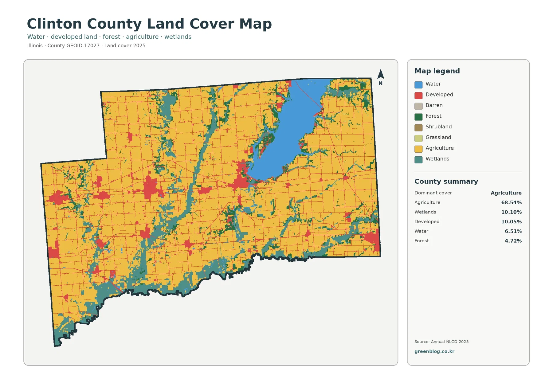
Agriculture accounts for 68.54% of the mapped county, making it the clear dominant class. Large yellow blocks spread across the west, center, and east, with only the biggest water and wetland features breaking that pattern. The next largest categories are wetlands at 10.10% and developed land at 10.05%. Open water adds another 6.51%, while forest covers 4.72%. Grassland is only 0.05% in the summary and shrubland rounds to 0.00%, so neither forms a major countywide component in this 2025 view.
The proportions are useful, but the map shape explains more. A large blue reservoir dominates the northeastern portion of the county, and teal wetland cells form branching strips away from it and across other low-lying areas. The southern edge also contains a broad concentration of wetlands, while narrow forest patches often sit beside those wetter corridors. Farm blocks remain extensive between them, producing a repeated pattern of fields separated by water-influenced strips rather than by large continuous forests.
Developed land appears as multiple red clusters instead of one metropolitan mass. A chain of built areas crosses the western and central portions of the county, another sizable concentration sits southwest of Carlyle Lake, and smaller clusters are scattered farther south and east. Fine red traces link many of these places. The preview does not label roads or municipal boundaries, so those lines should be read as developed patterns rather than as verified route names.
Land cover is a classification of what is on the surface. It does not tell a reader who owns a parcel, whether a property is zoned for development, where a farm boundary legally ends, or whether a wet area is a regulated wetland. Annual NLCD also uses 30-meter cells. A cell may contain crops, a ditch, trees, pavement, grass, and a building but still receive one predominant class. That scale is appropriate for countywide comparison, not for surveying individual sites.
Carlyle Lake gives the water share unusual visual weight
Clinton County’s 6.51% water share is easy to understand once Carlyle Lake is visible. The U.S. Army Corps of Engineers describes the reservoir as Illinois’s largest man-made lake and notes that it was created on the Kaskaskia River. The county’s official website also presents the lake as one of its defining features. Those sources help identify the large blue body on the map, but the land-cover image itself should still be used only for broad surface patterns rather than navigation, shoreline ownership, flood boundaries, or recreation-area limits.
Wetlands matter almost as much as the open water when reading the county. At 10.10%, they exceed the forest share by more than two to one. Teal cells ring parts of the reservoir, follow drainage lines into farm country, and become especially extensive near the southern boundary. In some places the wetland bands are narrow and branching; in others they widen into larger patches. That variation makes the county’s farm landscape look less uniform than the 68.54% agriculture figure might suggest on its own.
Illinois Department of Natural Resources material for the Carlyle Lake area describes managed bottomland, levees, moist-soil vegetation, and water-level management around portions of the lake. That local context is useful because it shows why a simple “water versus dry land” interpretation would be inadequate. The map’s wetland class can represent vegetated and seasonally wet surfaces that are different from open blue water. It still does not substitute for a jurisdictional wetland delineation or site inspection.
Removing the built colors reveals how farms meet wooded and wet drainage strips
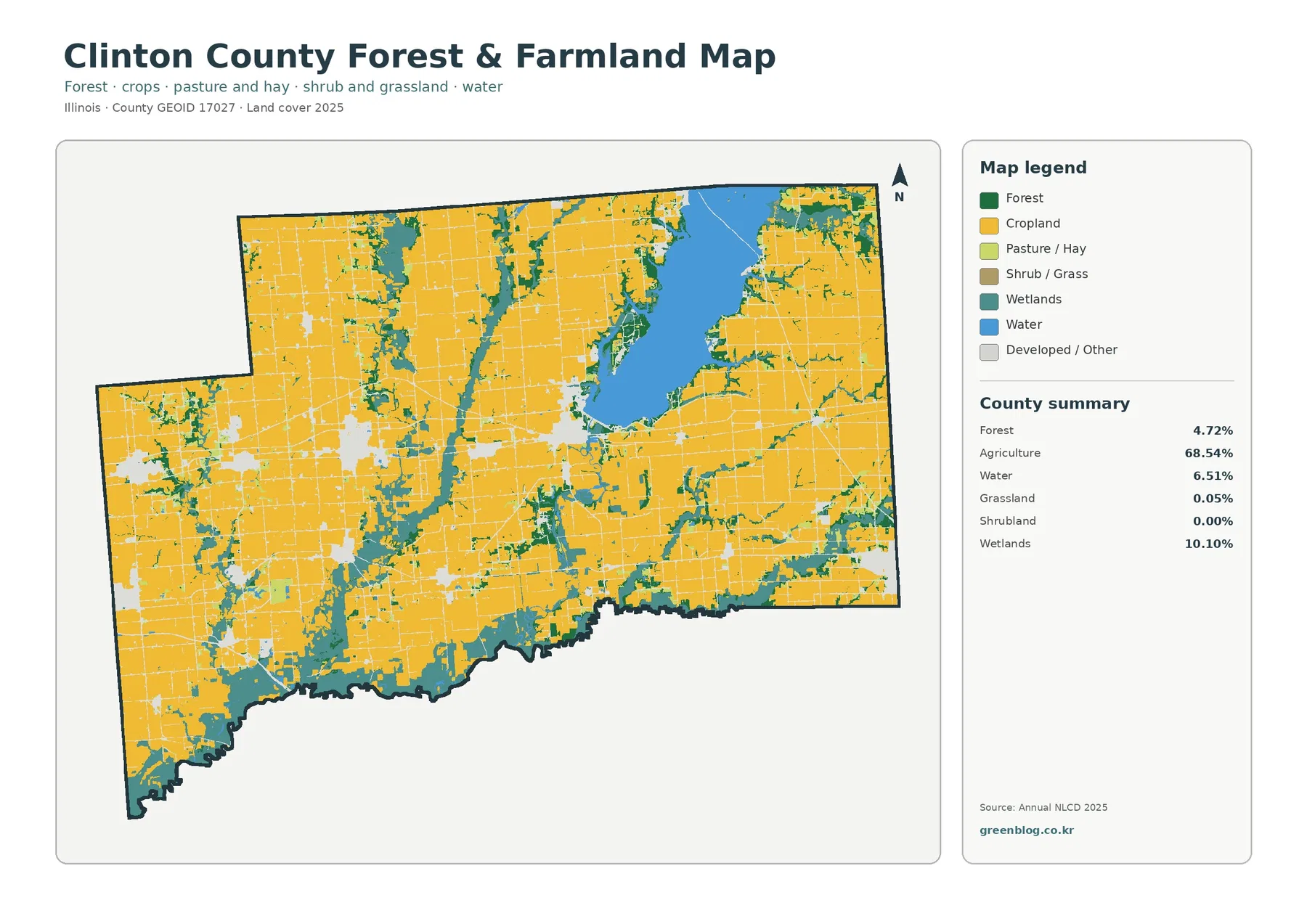
With developed and miscellaneous surfaces faded, agricultural blocks become easier to compare with natural cover. Cropland dominates nearly every broad upland area. The main interruptions are Carlyle Lake, wetland bands, and small green forest patches. In the central part of the county, several wet corridors run roughly north to south and divide the farm matrix into separate blocks. Similar wetland and forest traces appear in the west and southeast, while the large reservoir creates a very different edge in the northeast.
Forest is only 4.72% of the county, yet it is strategically placed in the landscape. Dark green strips often hug wetland edges, small channels, and the reservoir shore rather than forming enormous interior blocks. That shape matters when using the map for habitat or watershed discussions. A small countywide percentage can still create long connected-looking features on a map, although the 30-meter classification is too coarse to prove actual ecological connectivity between individual patches.
The agriculture statistic also requires care. Yellow cells identify land classified as agricultural cover, not a legal farm parcel or a specific crop. Straight edges may resemble property lines because field patterns are often geometric, but the raster does not reproduce survey boundaries. Farm roads, tree rows, drainage ditches, barns, and small grass areas may disappear into the dominant class at this scale. For acreage or ownership questions, parcel records and higher-resolution imagery are needed.
For presentations, this focused view is often a better choice than the full land-cover image when the main topic is the relationship between farming and water. It reduces the visual competition from developed classes and makes the reservoir, wetland bands, forest strips, and broad cropland blocks easier to compare. The countywide map can then be shown first for context, followed by this image for a closer look at the rural surface pattern.
Hard surfaces identify settlement centers without turning the county into an urban map
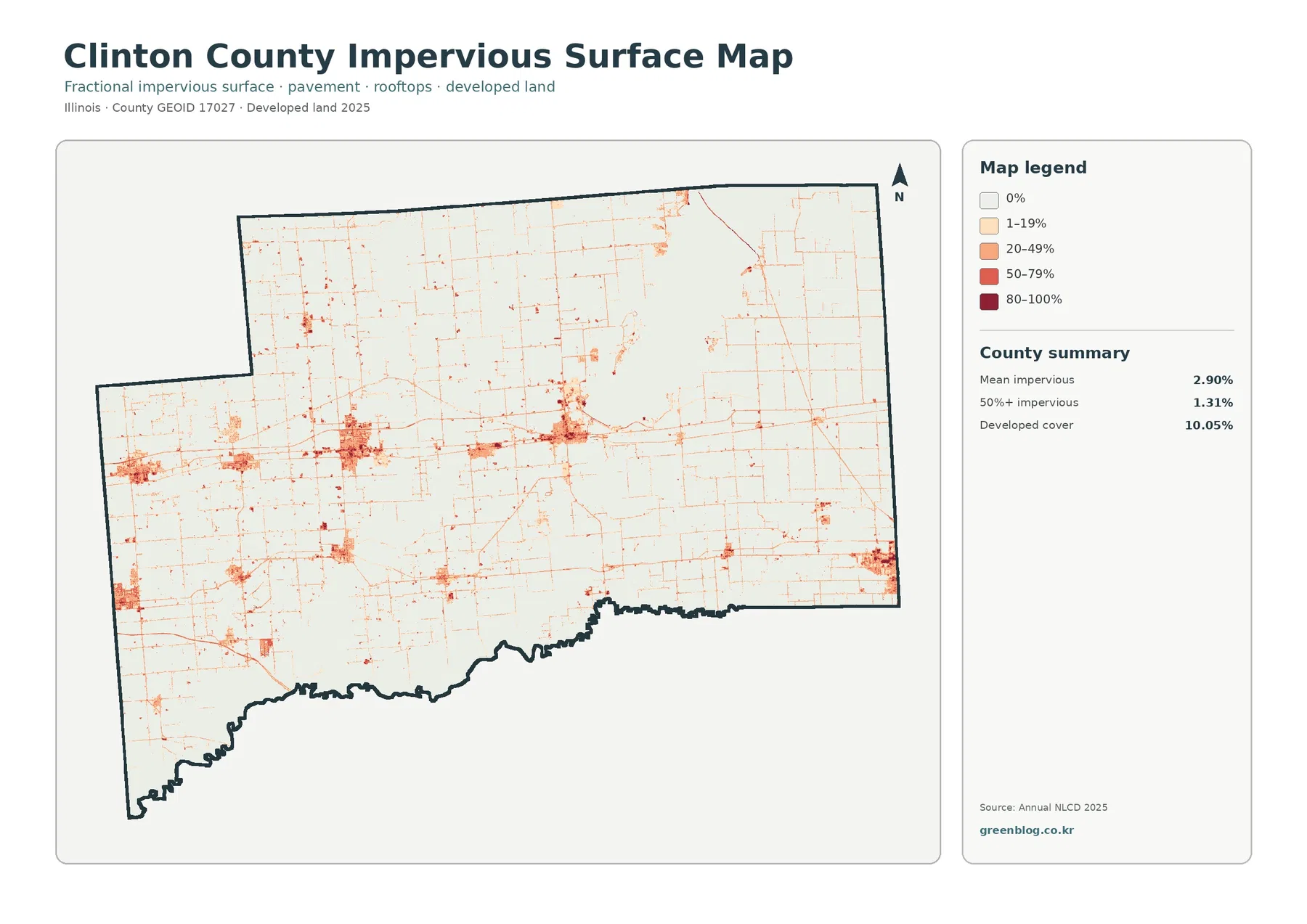
Mean impervious cover is 2.90% across Clinton County, and 1.31% of the county is mapped at 50% impervious or greater. Both values are much lower than the 10.05% developed share. That difference is expected because developed land-cover classes can include lawns, trees, bare soil, and other permeable surfaces around buildings. The impervious layer narrows the question to hard materials such as roofs, pavement, and parking areas.
The darkest tones occur within several separate built clusters. A west-to-central chain is especially clear, and another concentration lies just southwest of the large lake. Smaller nodes appear in the south and east. Between them, thin orange and red lines trace a dispersed network through mostly pale rural areas. This pattern makes the county’s settlement geography easier to see than on the general land-cover map, even though the layer does not provide street names or municipal limits.
Impervious cover is useful for discussing runoff or development intensity, but it should not be converted directly into a flood-risk statement. A paved surface sheds water differently from a crop field, yet flooding depends on rainfall, soil, slope, drainage infrastructure, river stages, reservoir operations, and other conditions. Carlyle Lake and the Kaskaskia River system make that distinction especially important in Clinton County. The map supplies one piece of environmental context rather than a hazard determination.
The low countywide mean is also a reminder that averages can hide strong local concentrations. Most agricultural cells have little or no impervious surface, while town centers and road intersections can contain much higher values. A reader interested in settlement form should therefore look at where the darker clusters occur and how they connect, not just at the 2.90% mean.
The 1985–2025 layer records class differences, not a single development story
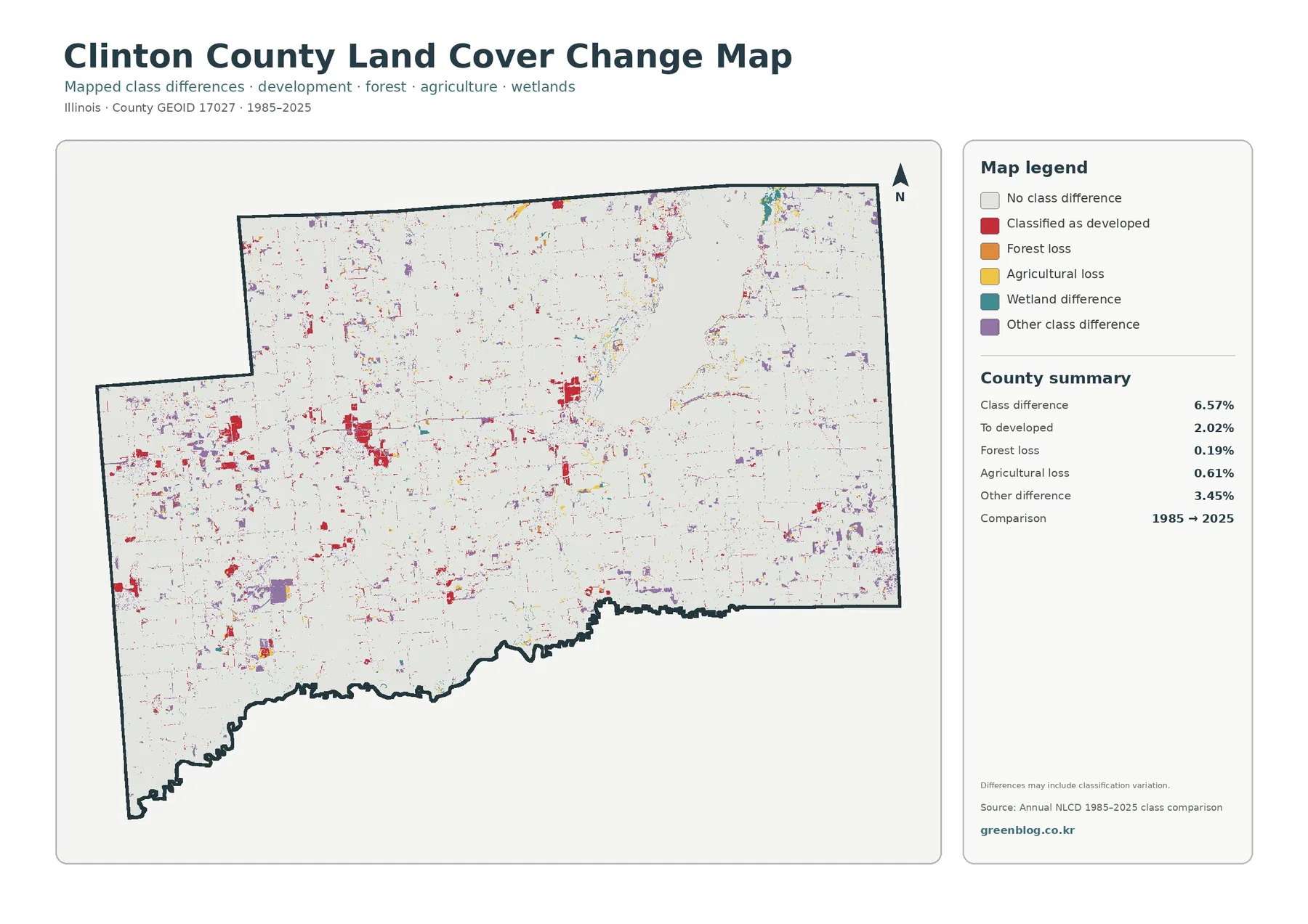
The endpoint comparison reports 6.57% total class difference between 1985 and 2025. The supplied summary identifies 2.02% as classified to developed, 0.19% as forest loss, 0.61% as agricultural loss, and 3.45% as other difference. Wetland difference appears in the legend but does not receive a separate percentage in the summary box. That missing number should not be estimated from the image or calculated as a simple residual without the underlying classification table.
Red developed-conversion cells cluster around several of the same settlement centers that stand out on the impervious map. They are visible in the western and central corridor, near the developed area southwest of Carlyle Lake, and at smaller nodes elsewhere. Purple other-difference cells are more widely scattered, particularly in western and southern areas. Agricultural-loss and forest-loss colors occur in smaller patches, while some wetland differences appear near water-influenced parts of the county.
A “loss” label means that a cell was placed in a forest or agricultural class in 1985 and in a different class in 2025. It does not tell the reader whether logging, construction, farm abandonment, flooding, shoreline change, or a classification issue caused the difference. The map also cannot identify the exact year when a transition occurred. Intermediate imagery and local records are necessary when timing and cause matter.
The 6.57% total should therefore be presented as a two-date class comparison. It is useful for screening where the surface label changed and for deciding where more detailed research may be worthwhile. It is not a complete forty-year land-use history. Showing the 2025 map before the change layer helps prevent viewers from mistaking red, purple, or yellow change colors for current land-cover classes.
How to use the four views without asking them to do more than they can
Start with the 2025 countywide map when the goal is a general profile. It puts the 68.54% agricultural majority beside the 10.10% wetlands, 10.05% developed land, 6.51% water, and 4.72% forest. Carlyle Lake immediately provides an orientation point, while the remaining colors show how rural land, wet corridors, and settlement clusters are arranged around it.
Use the forest-and-farmland image when the question is mainly rural land and water. It makes the farm blocks easier to separate from wetland corridors and wooded strips. Choose the impervious map when a presentation needs to emphasize settlement centers, road-linked hard surfaces, or the contrast between built areas and the agricultural background. Add the change map only when the topic requires a 1985–2025 endpoint comparison.
Each original JPG measures 2480 × 1754 pixels. The package does not mark the files as meeting an A3 high-resolution reference, so large-format printing should be tested before producing a final display. For web pages, classroom screens, reports, and slide presentations, keeping the original aspect ratio will preserve the map layout and legend proportions.
The current maps represent the supplied 2025 observation year. Construction, road work, crop conversion, vegetation recovery, shoreline conditions, or other changes after that date may not appear. Enlarging the image cannot create parcel detail that the 30-meter cells do not contain. Property decisions, engineering work, wetland jurisdiction, and flood analysis require newer and more specialized sources.
Frequently Asked Questions
Why does water occupy 6.51% of Clinton County on this map?
Carlyle Lake occupies a large part of the northeastern county and is the main reason the open-water share is visually prominent. The U.S. Army Corps of Engineers identifies it as Illinois’s largest man-made lake. Smaller water features add to the total, while wetlands are counted separately at 10.10%.
Why is developed cover 10.05% when mean impervious cover is only 2.90%?
Developed land-cover classes can include lawns, trees, bare ground, and other permeable surfaces around homes, businesses, and roads. Impervious cover focuses on hard surfaces such as roofs, pavement, and parking areas, so the countywide average is much lower.
Does the 6.57% class difference equal all land that physically changed from 1985 to 2025?
No. It is the share of cells assigned different classes at the two endpoints. Real land change can be part of that result, but seasonal conditions, mixed pixels, and classification variation can also contribute. The map does not provide the exact year or cause of each difference.
Sources and Reference Data
- MRLC Annual NLCD Data – official access point for annual land-cover and comparison products
- USGS Annual NLCD Land Cover Classification – official definitions for agriculture, forest, wetlands, developed land, and related classes
- U.S. Census Bureau TIGER/Line Shapefiles – official county-boundary reference for Clinton County
- Clinton County, Illinois – official county page describing local agriculture and Carlyle Lake
- U.S. Army Corps of Engineers – Carlyle Lake – official reservoir information, recreation resources, and local context
- Illinois DNR – Carlyle Lake SFWA – state information on wetland and wildlife-management areas around the lake
Map File Information
The ZIP contains four original JPG maps for comparing Clinton County’s 2025 farm-dominated land cover, Carlyle Lake and wetland corridors, impervious surfaces, and 1985–2025 class differences.
- Included Files: Map images described in this article
- File Type: ZIP archive
- Intended Use: Printing, education, presentations, and map-based projects
Related Maps
- Adams County Illinois Land Cover Map
- Alexander County Illinois Land Cover Map
- Bond County Illinois Land Cover Map
Green Map creates custom-edited map images using open geographic data sources such as geoBoundaries, Natural Earth, OpenStreetMap, and government open data. These maps are edited visual materials, not raw data files, and are provided for education, documents, presentations, and graphic reference.