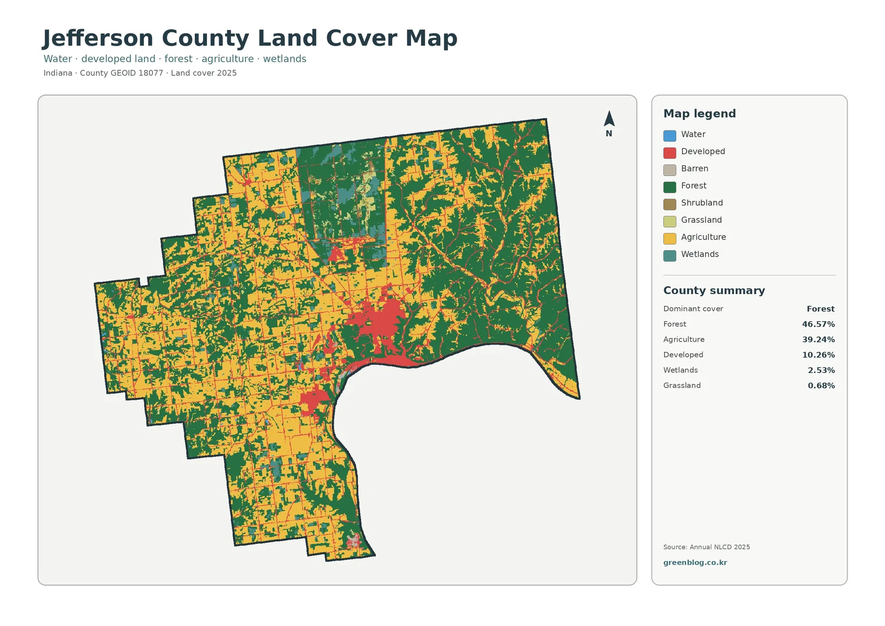
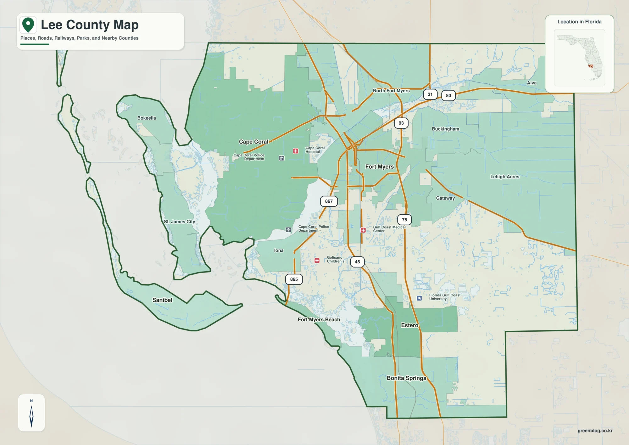
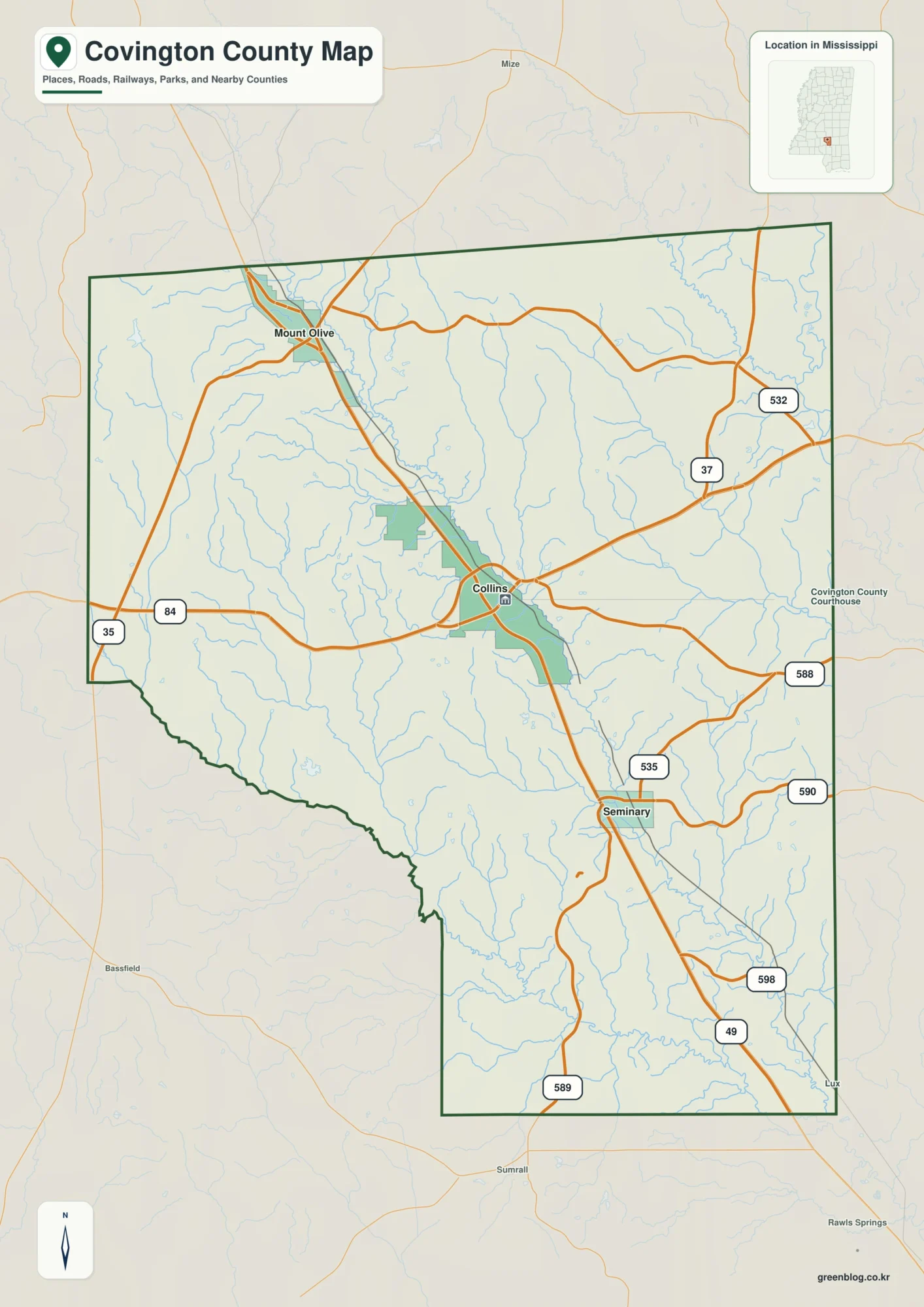
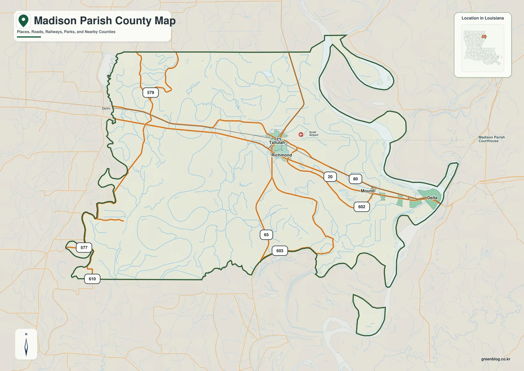
Sumter County’s 2025 land-cover picture is led by agriculture at 40.03%, but the county is not a continuous block of cropland. Forest accounts for 28.75%, wetlands for 12.90%, and a much denser developed area sits around Americus near the center of the county. The four maps on this page separate those patterns into current cover, forest and farmland, impervious surface, and mapped class differences from 1985 to 2025.
The web page uses WebP previews, while the four original JPG maps are available together in one ZIP. They work best as a set: the general map gives the county-wide balance, the impervious map narrows attention to pavement and rooftops, the farm-focused view separates working and natural cover, and the change map shows where classifications differ between two years. Reading them together prevents a single color or percentage from carrying more meaning than it should.
Table of Contents
Agriculture leads the 2025 classification, yet forest and wetland corridors repeatedly break up the farm blocks
The main land-cover summary lists agriculture at 40.03%, forest at 28.75%, wetlands at 12.90%, developed cover at 8.11%, and grassland at 5.08%. The forest-and-farmland view also reports shrubland at 3.34% and water at 1.46%. Those percentages establish the county-wide balance, but the map adds an important detail: agricultural cover is spread through many separate blocks rather than one uninterrupted area.
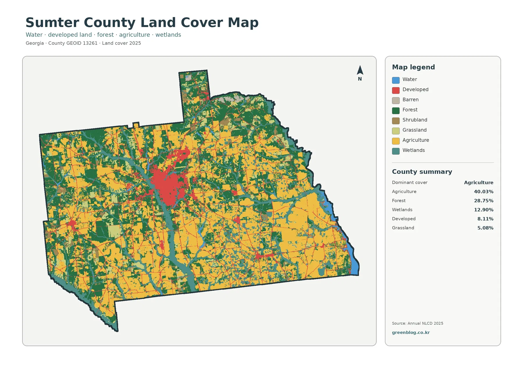
Yellow agricultural areas are prominent west, south, and east of the central built-up cluster. Green forest patches cut between them at many scales, and teal wetlands form both broader areas and narrow branching shapes. The northward projection of the county also contains a mix of farm and forest cover instead of a single dominant color. That mixture matters because a county-wide percentage can hide the way fields, woods, and wet ground meet along many local edges.
Americus forms the most obvious developed concentration in the center of the map. Sumter County’s official government site lists its county offices in Americus, and the University of Georgia’s Sumter County Extension office is also based there. The map does not label streets, so the thin red lines extending outward should be treated as developed or transportation-related surface patterns rather than identified roads. What is clear is the contrast between the large central cluster and the much less developed rural background.
Wetlands deserve separate attention because their 12.90% share is larger than developed cover. Teal cells run through agricultural and forest areas rather than appearing only beside obvious open water. Water itself is reported at 1.46%. Open water and wetlands are different mapped classes, so adding them mentally into one “water area” can be misleading. Wetlands may include vegetated, seasonally wet, or saturated surfaces that do not look like a lake or wide river on a satellite image.
| 2025 map summary | Share |
|---|---|
| Agriculture | 40.03% |
| Forest | 28.75% |
| Wetlands | 12.90% |
| Developed | 8.11% |
| Grassland | 5.08% |
| Shrubland | 3.34% |
| Water | 1.46% |
These are land-cover classes, not zoning or ownership categories. A cell classified as agriculture does not establish a farm parcel boundary, and a forest cell does not tell you whether the land is public, private, protected, or developable. Annual land-cover mapping generalizes the surface into raster cells, so property research still requires parcel, zoning, and legal records from the appropriate agencies.
Impervious cover makes the Americus core stand out more sharply than the developed class alone
Impervious surface means pavement, rooftops, parking areas, and other hard surfaces that do not readily absorb rainfall. The supplied map groups cells by the fraction of impervious cover, from 0% through 80–100%. Sumter County’s mean impervious value is 1.66%, and only 0.72% of the county is summarized as more than 50% impervious. That is much lower than the 8.11% developed land-cover share because low-density development can include substantial grass, trees, and open ground.
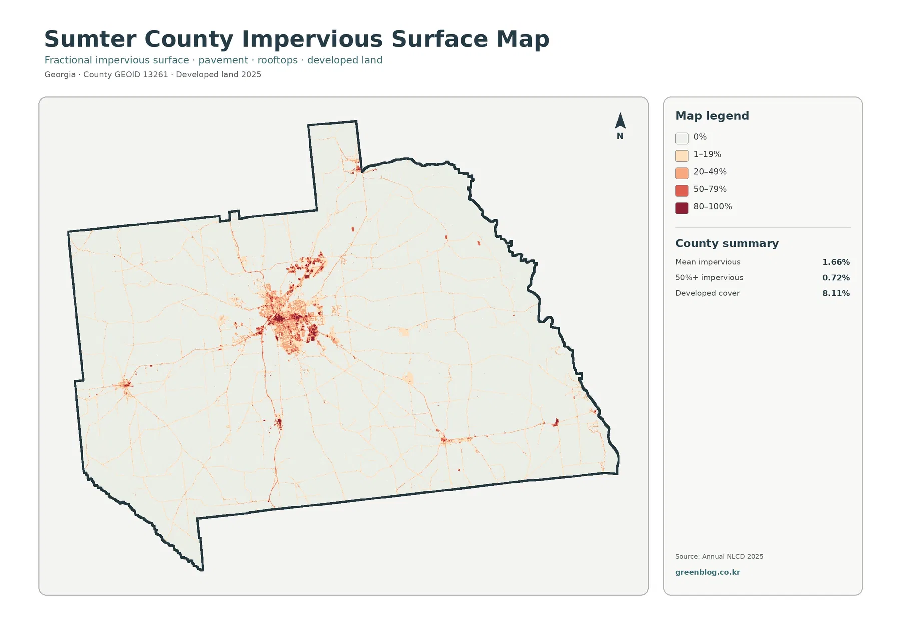
The central cluster is the strongest feature on this map. Darker reds and oranges form a compact area around Americus, then fade into thinner lines extending through the surrounding county. Smaller clusters appear away from the center, but none approaches the same footprint. This makes the impervious map useful when the question is not simply “where is developed land?” but “where are hard built surfaces most concentrated?”
A developed cell and a highly impervious cell are not interchangeable. A neighborhood with houses, lawns, tree cover, and local streets may be mapped as developed even though most of each 30-meter cell remains pervious. A commercial block with buildings and parking can have a much higher impervious percentage in a smaller area. Comparing the two maps therefore helps separate low-density settlement from the hard-surface core of a town.
The pale linear traces outside Americus can help reveal transportation corridors, but they should not be used to name or measure roads. The image does not include road labels, and narrow pavement can be diluted inside a 30-meter raster cell. For a presentation, it is reasonable to say that hard surfaces follow several routes out of the central built area; it is not reasonable to identify a specific highway from color alone without a separate road map.
Plains provides a useful local comparison point. The National Park Service describes Plains as a small rural community west of Americus and gives travel directions from Americus along the local road network. That context helps explain why a small developed cluster away from the county’s main center would not necessarily resemble the Americus footprint. Because the supplied map is unlabeled, however, individual small clusters should be matched to named towns only after checking a reference map.
The forest-and-farmland view reveals how fields, woods, grass, shrub cover, and wetlands share the rural landscape
Removing the strong developed colors changes the way Sumter County reads visually. Cropland becomes the most obvious broad cover, while forest appears as large patches and narrow connections around it. Pasture or hay, shrub and grass cover, wetlands, and water add smaller but important transitions. The map is especially helpful for seeing that an “agricultural county” still contains substantial natural and semi-natural cover between working fields.
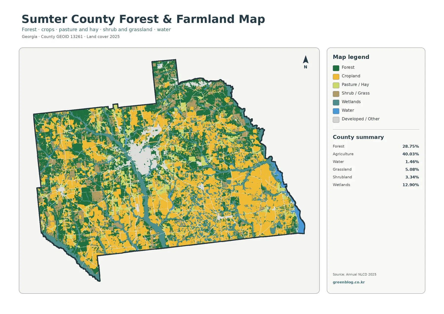
Agriculture at 40.03% is the largest single class, but green forest at 28.75% remains widespread on every side of the central area. In some places the forest patches are broad; in others they narrow between agricultural blocks. This is a more useful picture for habitat or watershed discussions than treating the county as either “farm” or “forest.” The two covers meet repeatedly, and wetlands often follow the same boundaries where the land-cover mosaic becomes more complex.
Grassland at 5.08% and shrubland at 3.34% should not be folded into the agriculture number. Pasture, hay, grass-dominated openings, and shrub-dominated areas are distinct mapped surfaces. They may occur near fields, but their vegetation structure and management can differ. Keeping those classes separate is useful in environmental education because it shows why a yellow field, light-green pasture, and darker green forest are not merely different shades of the same rural land use.
Wetlands at 12.90% are particularly visible as branching teal features that cross or border both agricultural and forested areas. Their shape is different from the larger rectangular or irregular farm blocks. That contrast can help a reader recognize where water-related cover is woven into the county’s rural surface. It still does not establish a regulated wetland boundary, floodplain, or stream jurisdiction; those questions require dedicated hydrology and regulatory data.
The University of Georgia maintains a Sumter County Agriculture and Natural Resources program in Americus. That official local resource is useful when a reader needs farm, soil, plant, or natural-resource guidance beyond what a land-cover map can provide. Its existence should not be treated as an explanation for the 40.03% agriculture share. The map measures surface classification, while extension services address management and education.
A 29.09% class difference from 1985 to 2025 is not the same as 29.09% urban growth
The long-term map compares land-cover classifications in 1985 and 2025. The county summary reports a total class difference of 29.09%. Within that total, 1.63% is summarized as changing to developed, 8.07% as forest loss, 6.06% as agricultural loss, and 12.36% as other class difference. Wetland difference is also shown in the legend, but the map summary does not print a separate percentage for that category, so it should not be assigned an invented value.
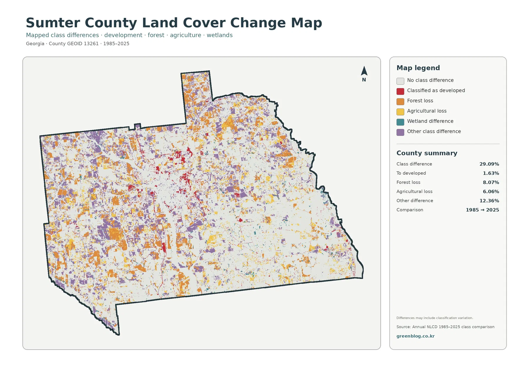
Orange, yellow, purple, teal, and red change classes appear in many separate patches. Red cells classified as developed are more noticeable around the present Americus area and along some routes, but the 1.63% summary makes clear that urban conversion is only one piece of the overall 29.09%. Forest loss and agricultural loss cover larger shares, and the “other difference” category is larger still. The map therefore supports a varied change story rather than a single development narrative.
Forest loss at 8.07% should be described carefully. A two-date classification can capture real clearing, harvest, conversion, or vegetation change, but it can also reflect regrowth stage, seasonal conditions, mixed pixels, or differences in classification between years. The map itself warns that class differences may include classification variation. A site-specific conclusion would need intermediate imagery or multiple annual land-cover products, not just the two endpoints.
The same caution applies to the 6.06% agricultural-loss category. It indicates cells that were classified as agricultural at the earlier date and differently at the later date. It does not directly measure farm income, crop production, acreage reported by farmers, or the number of farms. Those are separate statistical questions. The change map is strongest as a screening tool for where surface classes differ, after which other records can be used to investigate why.
Timing is another limitation. A cell that changed in the late 1980s and one that changed in the early 2020s can end up with the same category in a 1985–2025 endpoint comparison. If the goal is to reconstruct a sequence of development, forest harvest, or agricultural transition, annual or multi-year imagery is necessary. In a report, always keep the comparison dates visible so readers do not mistake the change layer for a current-condition map.
Plains and Andersonville add county-specific reference points without turning land cover into a location or parcel map
Two nationally recognized places help anchor Sumter County geographically. The National Park Service describes Plains as the rural hometown associated with Jimmy Carter National Historical Park. Andersonville National Historic Site, also in Sumter County, preserves the former Camp Sumter prison site, Andersonville National Cemetery, and the National Prisoner of War Museum. These references are useful for orientation, but the supplied land-cover maps do not draw park boundaries or label the towns.
That distinction keeps map interpretation disciplined. A reader can use a separate NPS or road map to locate Plains or Andersonville, then compare the surrounding land-cover pattern on this county map. What the land-cover layer can tell you is whether the surrounding surface is mostly agriculture, forest, wetland, developed cover, or another class at the mapped date. It cannot tell you the legal extent of a national park unit, historic property, city limit, or private parcel.
The same principle applies to Americus. The central built cluster aligns with the county’s main administrative and service location, but the color boundary is not a municipal boundary. Developed cells fade gradually into mixed rural cover, and the impervious map emphasizes hard surfaces rather than jurisdiction. Using both a reference map and the land-cover map gives a better picture than trying to make one layer answer both location and surface questions.
Choose the map by question, then compare a second view before drawing a conclusion
For a first look, start with the general land-cover map. It establishes the balance among agriculture, forest, wetlands, developed land, grassland, shrubland, and water. The central Americus cluster is easy to locate there, and the broad rural pattern provides a reference for all later comparisons. This is usually the best single image for an overview slide or county profile.
If the question concerns urban surfaces, switch next to the impervious map. It separates the 8.11% developed-cover concept from the 1.66% mean hard-surface value and highlights the places where roofs and pavement are concentrated. For stormwater education or settlement-pattern discussion, pairing those two maps is more informative than using either alone.
For agriculture, habitat, or watershed context, the forest-and-farmland map is the more useful companion. It keeps cropland, forest, pasture or hay, shrub and grass cover, wetlands, and water visually distinct. That makes it easier to discuss field-to-forest edges or wetland corridors without the central developed color dominating the page.
Use the 1985–2025 map after the current pattern is understood. Its colors describe class differences rather than present-day cover, and the red developed-change class is not the same layer as red developed cover on the general map. A presentation should keep the legend and year range visible. Cropping away those elements can make a correct map misleading.
The four views can also be combined in pairs. General cover plus impervious surface works well for explaining settlement density. Forest and farmland plus long-term change can support a discussion of where rural cover has been stable or different between endpoints. Whichever pair is chosen, avoid treating color proximity as proof of cause; adjacent development and forest loss may occur together without the map identifying the reason.
The download contains four 2480×1754 JPG maps, with practical limits for large printing
The WebP images in the article are web-friendly previews. The downloadable ZIP contains four original JPG files: general land cover, forest and farmland, impervious/developed land, and the 1985–2025 land-cover change map. The asset manifest records each JPG at 2480×1754 pixels. Because the layout, county boundary, legend area, and summary panel are consistent, the files are convenient for side-by-side comparison in documents and presentations.
The manifest does not mark these files as meeting an A3 high-resolution reference. They are well suited to on-screen work, ordinary documents, and many presentation layouts, but very large prints should be tested first. Fine wetland branches, narrow impervious traces, and small legend text can soften when enlarged. Keeping the entire map rather than cropping the legend will also preserve the context needed to interpret the colors correctly.
For a report, two larger maps often communicate more than four tiny ones. General land cover beside impervious surface gives a clear urban-rural comparison, while the forest-and-farmland view beside the change map supports a discussion of rural cover and long-term classification differences. If all four are used, keep captions explicit about 2025 current conditions versus the 1985–2025 comparison.
Raster generalization, observation dates, and legal boundaries set clear limits on what the maps can answer
Annual NLCD products generalize the ground surface into raster cells at roughly 30-meter scale. A single cell can contain a house, yard, trees, and a road, or a mix of field and wet ground. The classification assigns a representative class or percentage at that scale, so fine property lines and narrow features are simplified. This is appropriate for county-level pattern analysis but not for surveying an individual parcel.
The observation year is equally important. The current maps use 2025 data, while the change view compares 1985 with 2025. Construction, clearing, regrowth, farming changes, or wetland conditions after 2025 are not represented. Any project that depends on present-day site conditions should add recent aerial imagery, local records, and field verification.
Mapped wetlands and open water are not legal wetland determinations, flood zones, or navigable-water boundaries. Water level, vegetation, season, and cell size can all influence how a surface is classified. The teal and blue areas are useful for seeing where water-related cover is concentrated, but regulatory or engineering decisions require the datasets created for those purposes.
The change layer also does not identify causes. Developed-change cells near present roads or settlements show a spatial association, not proof that a particular road project caused the change. Forest or agricultural loss can have multiple explanations, and classification variation can contribute to the mapped difference. If cause matters, use historical imagery, planning records, forestry or agricultural records, and a timeline of local projects.
Finally, land cover is not land use. Agriculture-colored surface does not confirm an agricultural zoning designation, and developed cover does not confirm building rights or municipal jurisdiction. The safest use of these maps is to describe what the surface classification looks like at county scale, then move to legal, parcel, hydrologic, or planning sources when the question changes.
Frequently Asked Questions
What is the largest 2025 land-cover class in Sumter County?
Agriculture is the largest supplied class at 40.03%. Forest follows at 28.75% and wetlands at 12.90%. Developed cover is 8.11%, with the strongest concentration around the central Americus area.
Why is developed cover 8.11% while mean impervious surface is only 1.66%?
Developed land can include houses, lawns, trees, and open ground inside the same raster cells, while impervious surface measures the fraction occupied by hard surfaces such as pavement and rooftops. The two values answer different questions and should not be substituted for one another.
Does the 29.09% 1985–2025 class difference mean that 29.09% of the county became urban?
No. The supplied summary lists only 1.63% as changing to developed, alongside 8.07% forest loss, 6.06% agricultural loss, 12.36% other class difference, and a mapped wetland-difference category. The total also may include classification variation between years.
Map File Information
Download the four original Sumter County land-cover JPG maps in one ZIP: general land cover, forest and farmland, impervious/developed land, and 1985–2025 land-cover change.
- Printable Size: 2480×1754 pixels each
Related Maps
- Appling County Georgia Land Cover Map
- Atkinson County Georgia Land Cover Map
- Bacon County Georgia Land Cover Map
Sources and references
- MRLC Annual NLCD Data – Official access point for Annual NLCD land-cover and related products used to interpret the 2025 mapping.
- USGS Annual NLCD Land Cover Classification – Official explanation of land-cover classes including developed land, forest, agriculture, and wetlands.
- Sumter County, Georgia Official Website – County government information and official contact location in Americus.
- UGA Extension Sumter County Agriculture & Natural Resources – Official University of Georgia county resource for local agriculture and natural-resources education.
- Jimmy Carter National Historical Park – National Park Service information about Plains and its rural community context.
- Andersonville National Historic Site – National Park Service information about Andersonville National Historic Site in Sumter County.
- U.S. Census Bureau TIGER/Line Shapefiles – Official source for county and other geographic boundary data.
Green Map creates custom-edited map images using open geographic data sources such as geoBoundaries, Natural Earth, OpenStreetMap, and government open data. These maps are edited visual materials, not raw data files, and are provided for education, documents, presentations, and graphic reference.