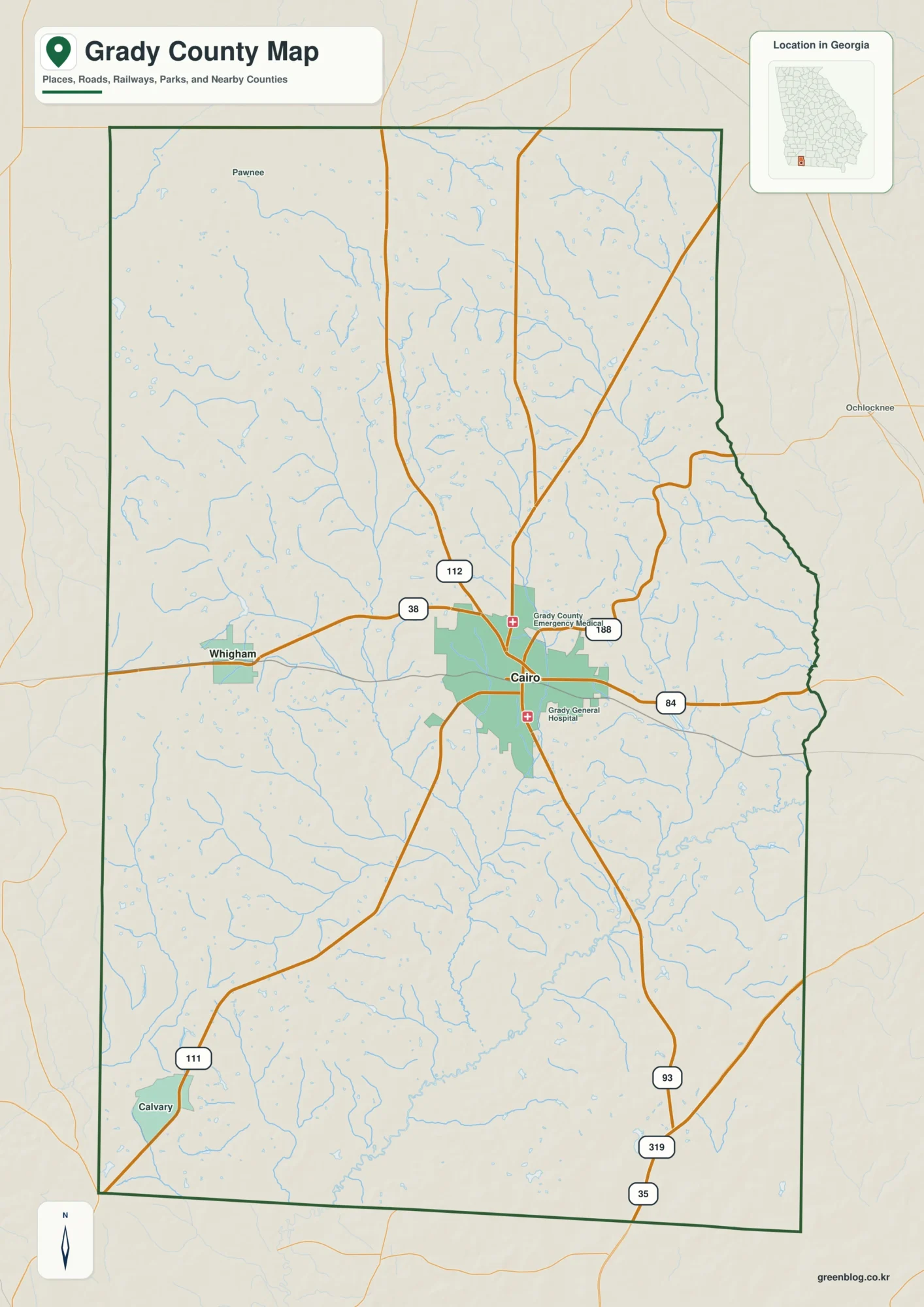
Agriculture is the largest class in Grady County’s supplied 2025 land-cover summary, but it does not dominate the county by itself. Farm cover accounts for 33.57%, forest for 28.33%, and wetlands for 26.21%, while the strongest developed cluster sits near Cairo in the middle of the county. This Grady County Georgia Land Cover Map set is designed to make those contrasts easy to see without treating surface classes as property or zoning boundaries.
The page includes four views: current land cover, forest and farmland, impervious surface and developed land, and a 1985–2025 class-difference map. The WebP images are useful for reading the article on screen, and the four original 2480 × 1754 JPG files are available together in one ZIP for county profiles, lessons, presentations, and side-by-side comparison.
Table of Contents
A three-way balance of farms, woods, and wet ground shapes the county
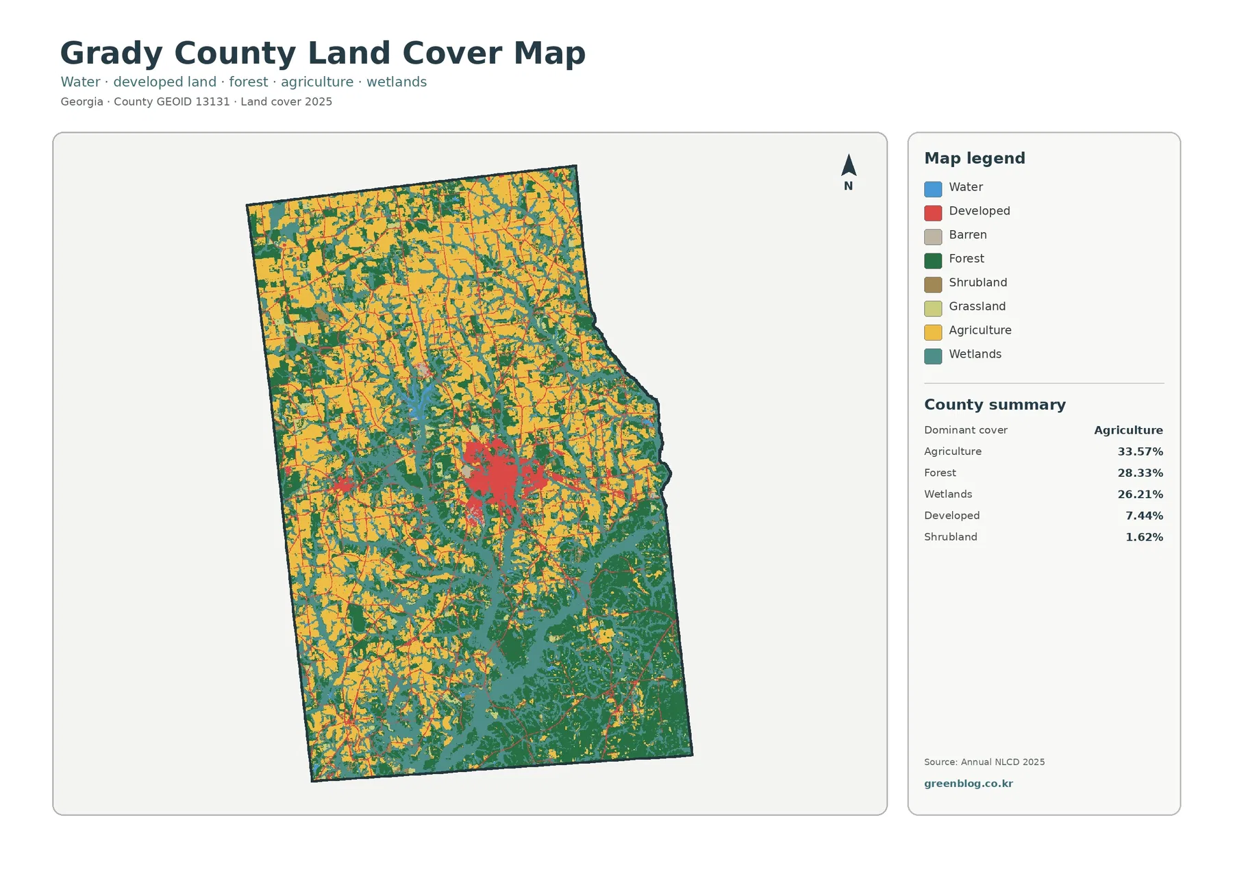
The general map immediately shows why a single label such as “farm county” would be incomplete. Agriculture leads at 33.57%, yet forest at 28.33% and wetlands at 26.21% are close enough to occupy much of the same visual space. Large yellow farm blocks are especially noticeable across the north and west, but they continue through the interior rather than stopping at one clean line. Dark green forest and teal wetlands become more prominent through the southern half and along branching low areas that reach back toward the center.
Developed cover is 7.44%, a much smaller share than the three leading classes, but its location makes it easy to recognize. A dense red group appears near the center where Cairo is located, with thinner marks and small patches extending outward. The image does not label roads or municipal limits, so those lines should not be assigned route numbers from appearance alone. Likewise, a small red patch outside the center should not be named as a particular town unless a verified place or boundary layer is consulted.
The north-to-south contrast is useful for orientation. Northern areas contain many broad agricultural shapes mixed with forest, while the south and southeast contain larger stretches where forest and wetland colors meet. The eastern county edge bends inward through the middle before continuing south, and the cover along that side remains mixed rather than following the boundary as one uniform class. This variation is more informative than simply listing percentages because it shows where the major classes actually touch one another.
Land cover describes what the surface was classified as from remotely sensed data. It is not a parcel map, ownership record, zoning layer, or statement that a property can be developed. A developed class can contain lawns, trees, exposed soil, and other permeable surfaces around structures. An agricultural class can indicate a working-land surface without identifying the owner, crop, farm operation, or legal land-use designation. Keeping those distinctions clear prevents the map from being used for questions it was never designed to answer.
Removing the built colors reveals how farm blocks meet wetland branches
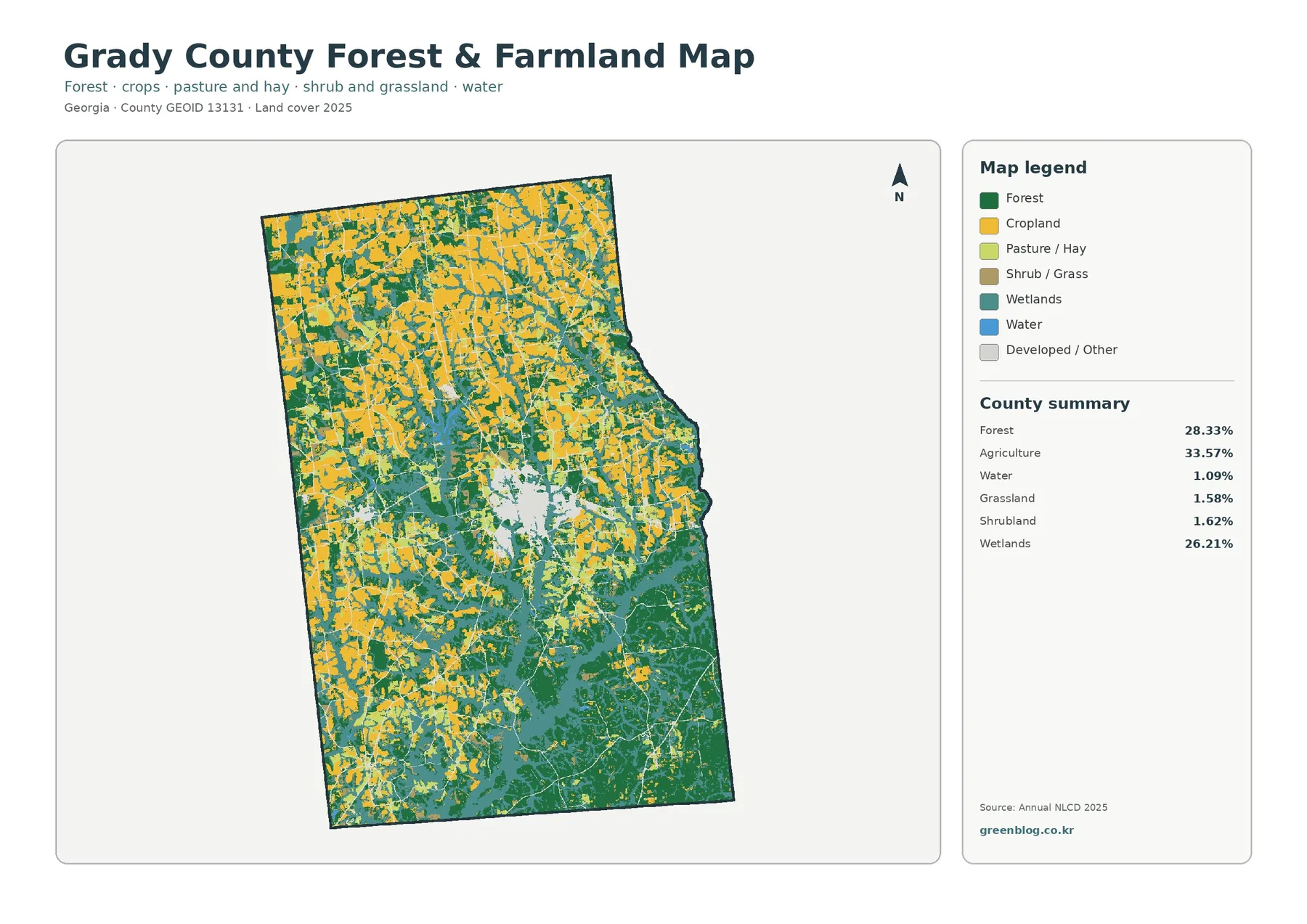
The forest-and-farmland view makes the county’s working-land pattern easier to follow because developed and miscellaneous surfaces fade into the background. Yellow agricultural blocks are broad in the northwestern portion and remain common across the west and interior. Forest occupies larger connected areas toward the southeast and also appears as strips or patches between fields. Wetlands form broad teal areas in the south and east, then narrow into branching shapes that divide or border both farm and forest cover.
The supplied summary for this map lists water at 1.09%, grassland at 1.58%, and shrubland at 1.62%. Those classes are small compared with agriculture, forest, and wetlands, but they help explain why some edges look mottled rather than clean. Open water is particularly different from wetland cover. Blue cells represent exposed water surfaces, while teal wetland classes can include vegetation and saturated ground. Grady County can therefore have extensive wetland cover even though open water occupies only a little more than one percent.
Some agricultural shapes have straight edges that resemble field or property boundaries. That resemblance should not be taken literally. Annual NLCD is a raster product: each grid cell receives a predominant class even when a ditch, tree line, farm road, grass strip, building, and cultivated ground share the same area. Thin features can disappear into a neighboring class, and a color boundary may be simpler than the real landscape. Enlarging the JPG helps with viewing, but it cannot recover parcel detail that was not present in the source data.
Local agricultural information is best used as a companion source rather than as a substitute for the map. The University of Georgia Cooperative Extension maintains a Grady County Agriculture & Natural Resources page with farm-related programs and soil and water services. That confirms the importance of local agricultural support, but it does not mean the 33.57% mapped agricultural share belongs to a particular crop or farm sector. The percentage is a countywide land-cover classification and should remain separate from production statistics.
Cairo stands out on the impervious map even though the countywide average is low
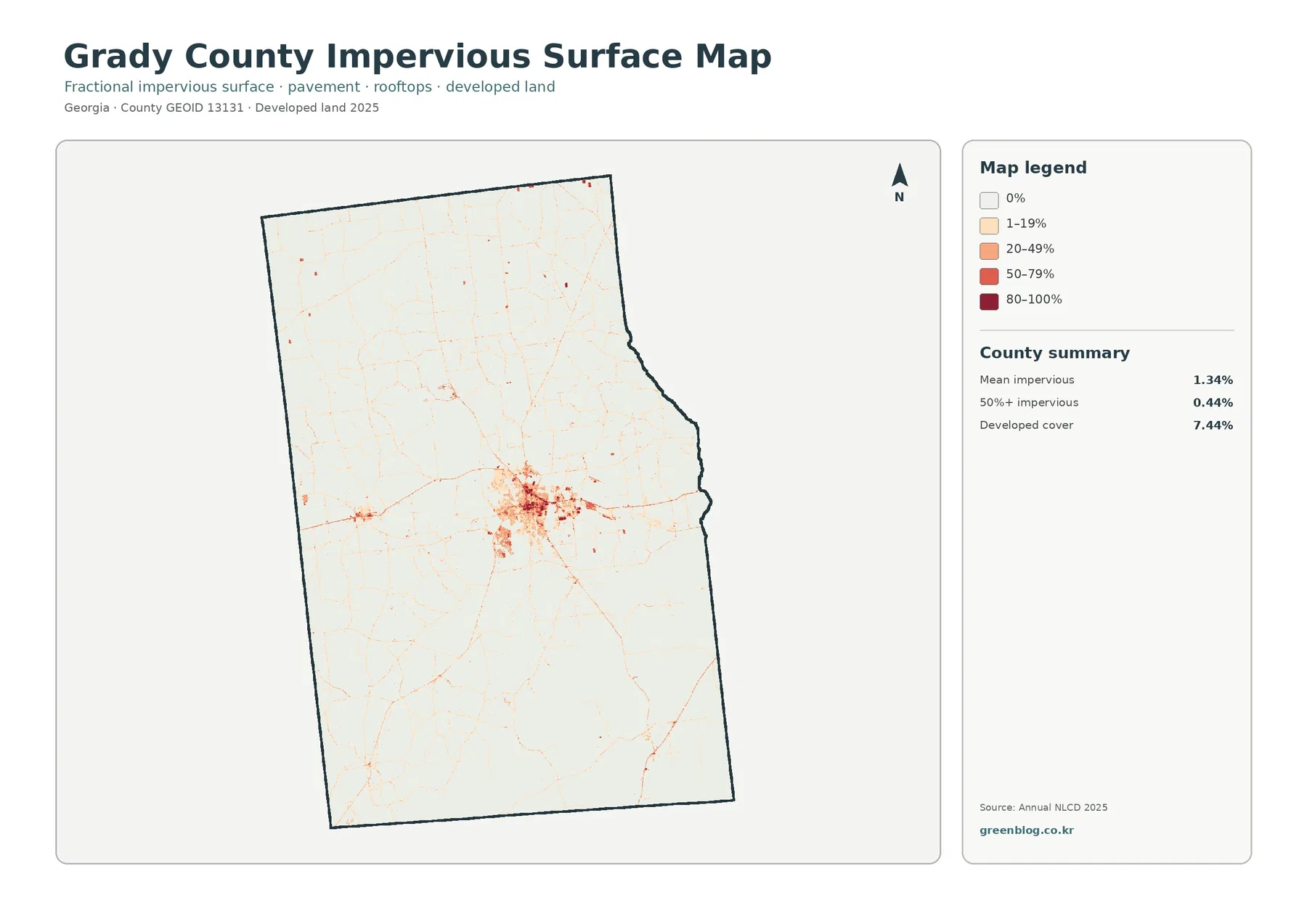
Mean impervious cover is only 1.34%, and 0.44% of the county is mapped at 50% impervious or higher. Those values are far below the 7.44% developed-land share because the two measures answer different questions. Developed classes may include yards, trees, open soil, and other permeable cover around buildings. The impervious layer isolates the harder surfaces—such as rooftops, pavement, and parking areas—that shed water rather than allowing it to soak directly into the ground.
The countywide average is low because large rural areas have little hard surface, but that average hides a strong local concentration. The darkest tones cluster around central Cairo, where the map forms a compact built core with several thinner extensions. Smaller dots and lines appear elsewhere, including toward the south and west, yet they are less continuous than the center. For a reader trying to understand development intensity, the location of these concentrations is more useful than treating 1.34% as if every part of the county had the same surface condition.
Linear marks can look like roads, but this is not a transportation map. No route labels, traffic counts, road classes, or ownership information are included. The map can show where hard surfaces form a line, but naming that line requires an official road layer. It also cannot tell whether a dark cluster is residential, commercial, industrial, institutional, or another land use. Land-cover classification and local planning categories overlap in places, but they are not interchangeable.
Impervious information can be useful when discussing runoff because hard surfaces affect how quickly rainfall reaches drains and nearby low areas. Still, the map does not measure flood risk by itself. Rainfall, soil, elevation, drainage networks, stream channels, wetland connections, and mapped flood zones all matter. The broad wetlands in the south and east provide environmental context, while Cairo’s hard-surface cluster shows a different type of surface condition, but the map alone cannot prove a direct cause-and-effect relationship between the two.
The 1985–2025 comparison spreads well beyond the central development cluster
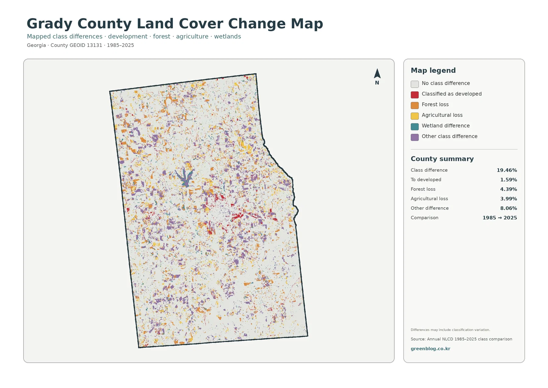
The endpoint comparison reports 19.46% total class difference. The supplied breakdown lists 1.59% classified as developed, 4.39% forest loss, 3.99% agricultural loss, and 8.06% other class difference. Wetland difference is shown in the legend but does not have a separate percentage printed in the summary. It would therefore be misleading to subtract the listed values from the total and present the remainder as an official wetland-change percentage.
Red developed-conversion cells are most visible around Cairo and along several outward traces, which is consistent with the compact hard-surface pattern on the current impervious map. The rest of the county contains a much more scattered mixture. Orange forest-loss cells, yellow agricultural-loss cells, and purple other differences appear in the north, west, interior, and southern areas. The map therefore describes more than urban expansion: changes between two classification dates are distributed through both working land and natural cover.
The word “loss” in this legend has a specific classification meaning. A forest-loss cell was forest at the 1985 endpoint and received another class in 2025; an agricultural-loss cell followed the same logic for agriculture. The map does not identify logging, abandonment, construction, storm damage, flooding, or classification error as the cause. A cell classified as developed also does not reveal the exact year a project occurred. Intermediate aerial imagery, permits, planning documents, and field evidence are needed to establish timing and cause.
The 19.46% total should not be described as the share of Grady County that was damaged or physically transformed. It is the share of cells with different endpoint classifications, and the map notes that classification variation may be included. A location could also change more than once between 1985 and 2025 and finish in the same class it started with, leaving that intermediate history invisible in a two-date comparison. The safest use is to screen for areas that deserve a closer look, not to treat every colored cell as a documented event.
Frequently Asked Questions
What is the largest land-cover class in Grady County?
The supplied 2025 summary places agriculture first at 33.57%. Forest follows at 28.33% and wetlands at 26.21%, so the county is better described as a farm-forest-wetland mix than as a landscape dominated by one cover type.
Why is developed cover 7.44% when mean impervious cover is only 1.34%?
Developed classes can include lawns, trees, bare soil, and other permeable surfaces around buildings and roads. Impervious cover isolates hard surfaces such as rooftops, pavement, and parking areas. Because the measures describe different parts of the developed landscape, the countywide impervious average is much lower.
Does the 19.46% 1985–2025 class difference mean that much land was developed?
No. Only 1.59% is listed as classified to developed in the supplied comparison. The 19.46% total also includes forest loss, agricultural loss, wetland difference, other class changes, and possible classification variation. Intermediate imagery and local records are needed to determine the timing and cause of change at a specific location.
Choose the first map by the question, then add only the comparison you need
For a general county profile, begin with the 2025 land-cover overview. It captures the main story in one image: agriculture is the largest class, forest and wetlands are also extensive, and Cairo forms the strongest developed center. If the topic is the boundary between working land and natural cover, the forest-and-farmland view is clearer because built and miscellaneous classes are subdued. If roofs and pavement are the focus, the impervious map removes much of the distraction caused by broader developed classes.
Use the 1985–2025 comparison after the current map rather than before it. That order keeps change colors from being mistaken for present-day classes. A presentation can show the current composition first, then place the change view beside it to ask where endpoint differences cluster. The same approach works for lessons: establish what yellow, green, teal, and red mean in 2025, then introduce the separate change legend with its own meanings.
The original JPG files are larger than the on-page previews and make small color boundaries easier to inspect. Each file measures 2480 × 1754 pixels. The package does not identify these files as meeting an A3 high-resolution standard, so anyone planning a large poster should make a proof print first. Keep the original proportions when resizing so the county outline is not stretched, and remember that greater display size does not create new spatial detail in the underlying classification.
Side-by-side county comparison is another practical use. Grady County is distinctive in this set because agriculture, forest, and wetlands all occupy large shares while the developed footprint remains comparatively small and centralized. When comparing it with another county, use maps from the same classification system and observation year whenever possible. Mixing years or unrelated land-cover products can make percentage differences look meaningful even when they partly reflect different methods.
What the raster cells can show—and what they cannot
Annual NLCD is built from raster cells rather than surveyed parcels. Each cell is assigned a predominant class, so narrow tree lines, ditches, small ponds, field roads, lawns, buildings, and strips of pavement can be simplified when several surfaces occur close together. This matters in Grady County because agricultural blocks, wooded patches, and wetland branches repeatedly meet at short distances. A crisp color edge on the map should be read as a generalized classification boundary rather than a legal line on the ground.
The current maps represent the supplied 2025 observation year. Construction, harvest, vegetation recovery, timber activity, storm effects, standing water, or road work after that observation may not appear. Current property, permit, zoning, wetland-jurisdiction, flood-insurance, or engineering decisions require newer and more specialized sources. These maps are strongest for county-scale explanation, regional comparison, education, and identifying areas where a more detailed source should be consulted.
Map File Information
The ZIP contains four original JPG maps for comparing Grady County’s 2025 agriculture, forest and wetlands, Cairo-area development, impervious surfaces, and 1985–2025 class differences.
- Included Files: General land cover, forest and farmland, impervious/developed surface, and land-cover change maps
- File Type: Four original JPG map files bundled in one ZIP archive
- Intended Use: Printing, education, presentations, and map-based projects
Related Maps
- Appling County Georgia Land Cover Map
- Atkinson County Georgia Land Cover Map
- Bacon County Georgia Land Cover Map
Sources and Reference Data
- MRLC Annual NLCD Data – official access point for current land-cover and annual comparison products
- USGS Annual NLCD Land Cover Classification – class definitions and guidance for forest, agriculture, wetlands, developed land, and related cover
- U.S. Census Bureau TIGER/Line Shapefiles – official county-boundary reference for Grady County
- Georgia DCA – Grady County with Cairo & Whigham Comprehensive Plan – official planning material for the county and its two cities
- UGA Cooperative Extension – Grady County Agriculture & Natural Resources – local agriculture and natural-resource programs and services
Green Map creates custom-edited map images using open geographic data sources such as geoBoundaries, Natural Earth, OpenStreetMap, and government open data. These maps are edited visual materials, not raw data files, and are provided for education, documents, presentations, and graphic reference.