The Early County Georgia Land Cover Map shows a rural county where agriculture is the largest mapped class without covering the landscape by itself. Agriculture accounts for 41.50% in the supplied 2025 summary, while forest covers 24.95% and wetlands 19.85%. Those three classes weave through one another across the county, with the strongest developed concentration appearing around the Blakely area rather than across the full map.
This page pairs four WebP previews with the original 2480 × 1754-pixel JPG files: countywide land cover, forest and farmland, impervious surface and developed land, and a 1985–2025 class comparison. The four original JPG maps are available in one download, making it easier to use the overview alone or combine it with a more focused map for county profiles, lessons, and landscape comparisons.
Table of Contents
A farm-dominated county broken up by forest and wet ground
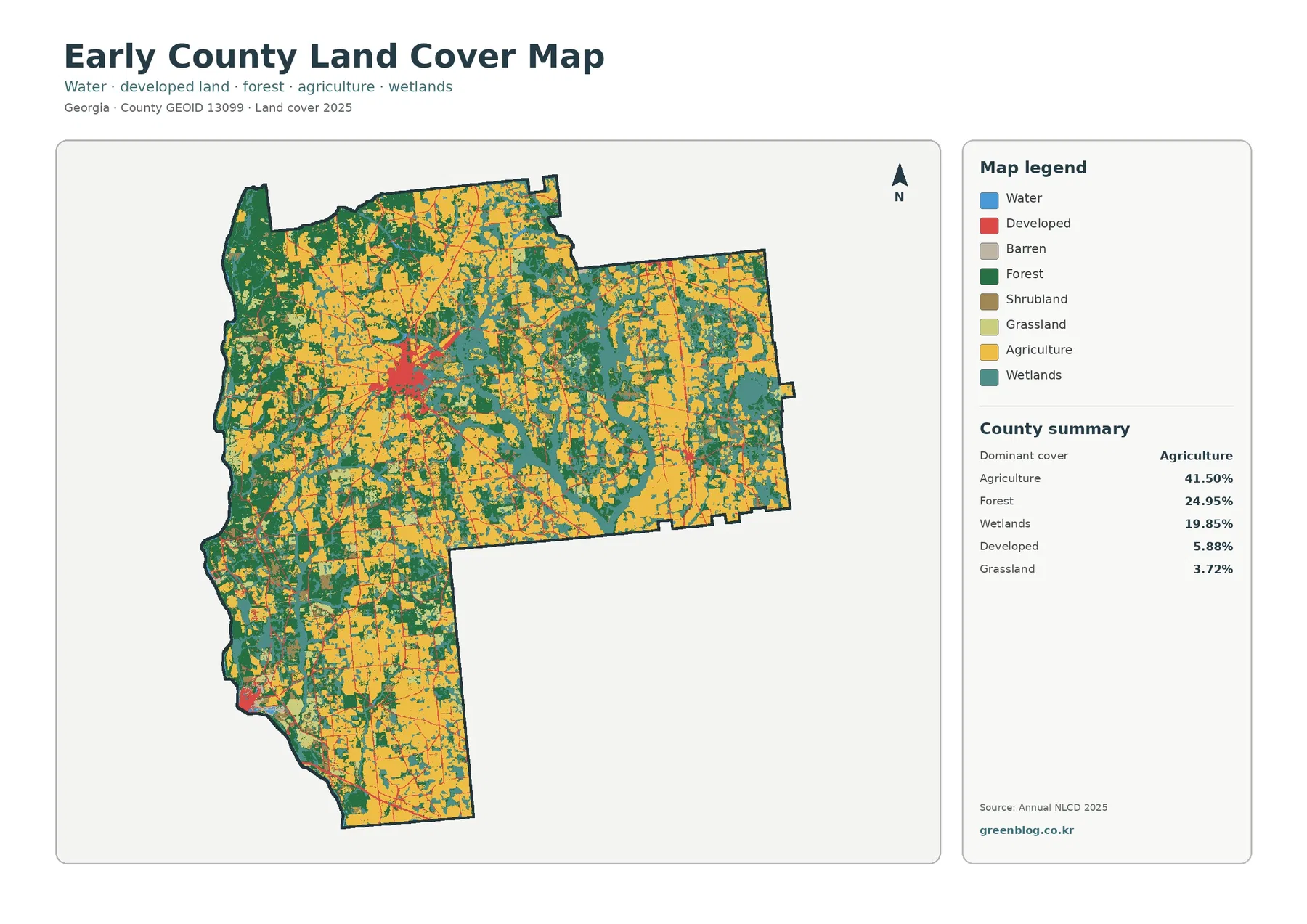
Agriculture leads the county summary at 41.50%, but the map never becomes one uninterrupted field color. Forest is the second-largest class at 24.95%, wetlands account for 19.85%, developed land covers 5.88%, and grassland is 3.72%. The forest-and-farmland summary also lists shrubland at 3.18% and open water at 0.81%. Together, the values describe a county in which working land is extensive but frequently interrupted by wooded and wet areas.
Large agricultural blocks occur in several parts of the county, especially through broad interior and eastern sections. Dark forest becomes more continuous along portions of the western side and in scattered belts elsewhere. Wetland colors form irregular bands and branching shapes between fields, particularly through the central and eastern half. The result is a patchwork rather than a simple divide between farms and woods, which is important when using the map for environmental or agricultural context.
The main developed cluster is small compared with the farm and forest classes, but it stands out because most of the county is lightly built. Blakely is the county seat, and Georgia planning records also identify Damascus, Jakin, and Arlington in the county’s municipal context. These places help explain why developed cells appear as one larger concentration plus smaller points and road-linked traces instead of a continuous suburban belt.
Why the forest-and-farmland view adds more than a second color scheme
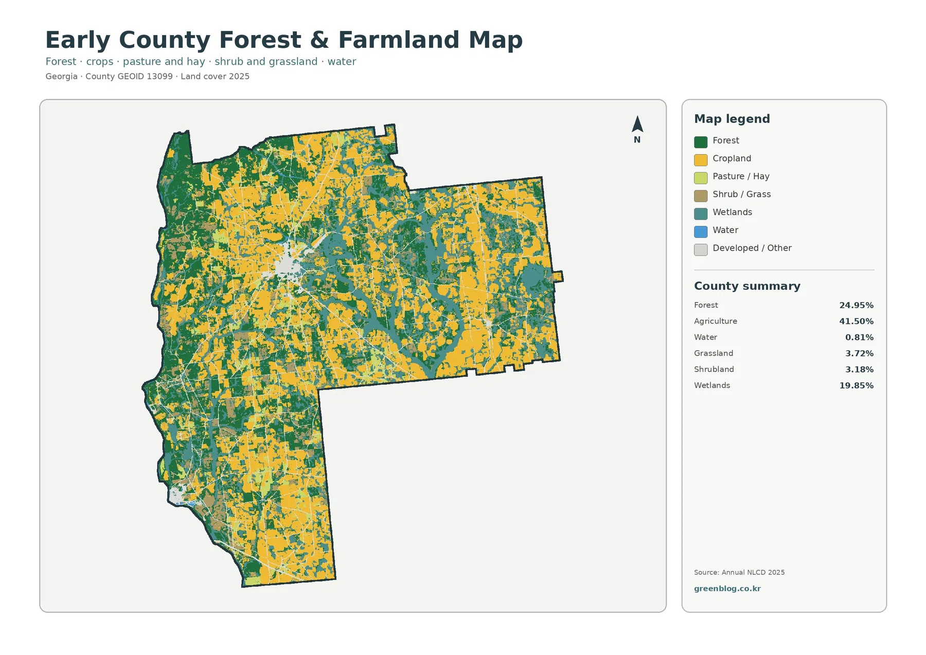
Removing most of the developed-color emphasis makes the rural pattern easier to compare. Agricultural areas remain broad, yet they are repeatedly divided by forest strips and wetland corridors. The western and southwestern portions contain larger connected wooded areas, while wetland cells cut through field country in long, irregular shapes. A presentation about Early County agriculture can therefore show both the scale of farmland and the natural cover that sits between individual farming blocks.
Local agricultural context supports the importance of the yellow farm class. The University of Georgia Extension office for Early County identifies cotton, peanuts, corn, and beef cattle among major locally produced commodities, and its county impact information describes on-farm variety and pest-management work. That information should not be read back into individual pixels, however. The map identifies a broad agricultural land-cover class; it does not tell which crop is planted in a particular field or where one farm property ends.
The distinction between wetlands and open water matters here as well. Open water is only 0.81% in the supplied summary, while wetlands reach 19.85%. A wetland class can include vegetated or seasonally wet ground, so a large wetland share does not require a large blue lake area. This helps explain why teal wetland shapes are common even though the blue water class remains visually limited.
Hard surfaces stay concentrated around towns and roads
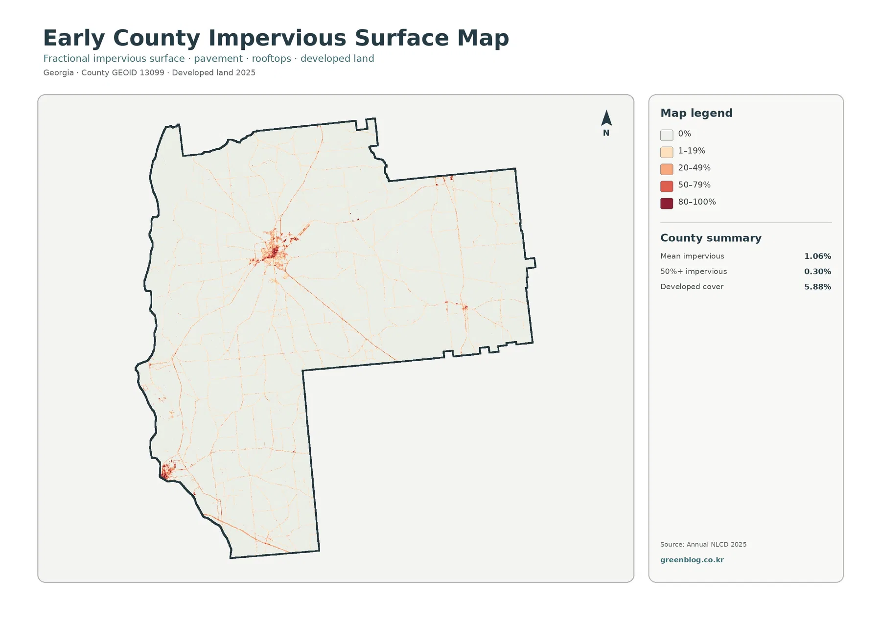
Impervious surface means pavement, roofs, and similar materials that do not readily absorb water. Early County’s mean impervious share is 1.06%, and only 0.30% of the county falls in cells with at least 50% impervious cover. Those values are much smaller than the 5.88% developed-land figure because a developed land-cover class can still include lawns, trees, bare soil, and other permeable surfaces around buildings and streets.
The map makes this difference visible. One dense cluster of orange and red shades marks the principal built area, while fine lines extend outward along roads. Smaller concentrations appear near other settlements and junctions, but most of the county remains near the lowest impervious category. That pattern is useful for distinguishing a compact town center from agricultural land that may contain scattered houses or farm structures without becoming heavily paved.
Because the image is a land-cover product, it should not be treated as a street map or a legal development map. It does not show parcel lines, zoning districts, building permits, or municipal boundaries. A user checking a specific property should move from this county-scale reference to current local records and higher-resolution imagery rather than enlarging the raster and assuming that the enlarged cells become more precise.
The 1985–2025 comparison shows turnover, not a year-by-year history
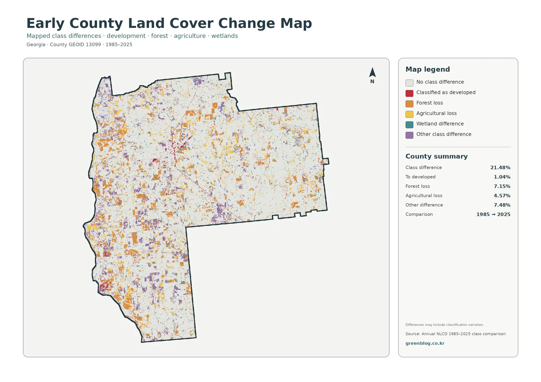
The supplied comparison reports a class difference across 21.48% of Early County. Forest loss accounts for 7.15%, agricultural loss for 4.57%, cells classified as developed for 1.04%, and other class differences for 7.48%. Colored cells occur throughout the map rather than forming one single growth front. The small red developed category is visible around the main built areas, but orange forest-loss and purple other-difference cells are more widespread.
These categories need cautious wording. A cell marked as forest loss simply had a forest class at the 1985 endpoint and a different class at the 2025 endpoint. The map by itself cannot tell whether that change came from permanent clearing, timber harvest and regrowth, agricultural conversion, storm effects, or classification variation. The same caution applies to agricultural loss. It is an endpoint comparison, not a record of every event that occurred during the forty-year interval.
The gray majority is equally informative because it identifies cells with no class difference between the two selected endpoints. For a county where farmland, forest, and wetlands are all substantial, viewing changed and unchanged areas together provides a better picture than focusing only on the colored cells. A detailed change study would add intermediate Annual NLCD years, aerial photography, and local land records before assigning a cause.
Local context helps explain the map without turning it into a land-use plan
Early County lies in southwest Georgia. Georgia Department of Community Affairs planning pages cover the county together with Blakely, Damascus, and Jakin, and list Arlington in the county’s city context. A state planning document describes Jakin in the southernmost part of Early County and notes the Chattahoochee River to its west. Those references are useful for orientation, especially when comparing the county’s western edge with the interior agricultural and wetland mosaic.
They also show why land cover and legal land use must remain separate concepts. The map classifies what the surface appears to be—cropland, forest, wetland, developed cover, water, and related categories. It does not say whether a parcel is zoned for agriculture, protected from development, owned by a public agency, or available for construction. Planning documents answer different questions and should be used alongside, not replaced by, the land-cover image.
Annual NLCD uses 30-meter raster cells, meaning the county is divided into square grid cells and each cell receives a predominant class. A single cell can contain a field edge, trees, a ditch, a road, and a building while still being assigned one category. This generalization is appropriate for county-scale comparison but not for parcel surveys, wetland jurisdiction decisions, drainage design, or exact site measurements.
The 2025 maps also represent the supplied observation year. Later construction, harvest, crop rotation, forest recovery, flooding, or other surface changes may not appear. For classroom work, county profiles, regional comparison, and broad planning background, the maps provide a clear visual summary. For a current site decision, they should be checked against newer imagery and the relevant local or state records.
What is included in the original JPG download
The ZIP contains one original JPG for 2025 land cover, forest and farmland, impervious surface and developed land, and 1985–2025 land-cover change. Each image measures 2480 × 1754 pixels. The package does not identify these files as meeting an A3 high-resolution reference, so users planning a large print should test the intended output size rather than assuming that enlargement will add detail.
Frequently Asked Questions
Is Early County mostly farmland?
Agriculture is the largest single 2025 class at 41.50%, but it does not make up a majority of the county. Forest covers 24.95% and wetlands 19.85%, so the map is better described as a farm-dominated mosaic with substantial wooded and wet areas.
Why does developed land cover 5.88% while mean impervious cover is only 1.06%?
Developed land can contain lawns, trees, soil, and other surfaces that still absorb water. Impervious cover isolates harder materials such as roofs and pavement, so its countywide average is much lower even though both measures are related to built areas.
Does the 21.48% class difference mean that one-fifth of Early County was permanently altered?
No. It is the share of cells that received different classes at the 1985 and 2025 endpoints. The value can include real land-cover change and classification variation, and it does not identify the timing or cause of each difference.
Sources and Reference Data
- MRLC Annual NLCD Data – official access point for annual land-cover and comparison products
- USGS Annual NLCD Land Cover Classification – definitions and guidance for agriculture, forest, wetlands, developed land, and related classes
- U.S. Census Bureau TIGER/Line Shapefiles – official county-boundary reference for Early County
- UGA Extension – Early County Agriculture & Natural Resources – local agricultural programs and county production context
- Georgia DCA – Early County Comprehensive Plan – county and municipal planning references for Blakely, Damascus, Jakin, and nearby communities
Map File Information
The ZIP contains four original JPG maps for comparing Early County farmland, forest, wetlands, Blakely-area hard surfaces, and 1985–2025 class differences.
- Included Files: Original high-resolution map files shown in this article
- File Type: JPG images packaged in a ZIP archive
- Intended Use: Printing, education, presentations, and map-based projects
Related Maps
- Appling County Georgia Land Cover Map
- Atkinson County Georgia Land Cover Map
- Bacon County Georgia Land Cover Map
Green Map creates custom-edited map images using open geographic data sources such as geoBoundaries, Natural Earth, OpenStreetMap, and government open data. These maps are edited visual materials, not raw data files, and are provided for education, documents, presentations, and graphic reference.