The World Bank indicator Gross fixed capital formation (% of GDP) measures fixed-asset formation relative to the size of an economy. It is useful for comparing how large the flow of investment in long-lived productive assets is when expressed as a share of gross domestic product. The dataset used here contains the most recent non-empty observation for 181 countries and areas. It is not a single-year 2025 cross section: 126 observations are from 2025, 39 are from 2024, and the remainder are older. For that reason, the map should be read as a map of latest available values, while rankings are more defensible when countries are compared within the same year.
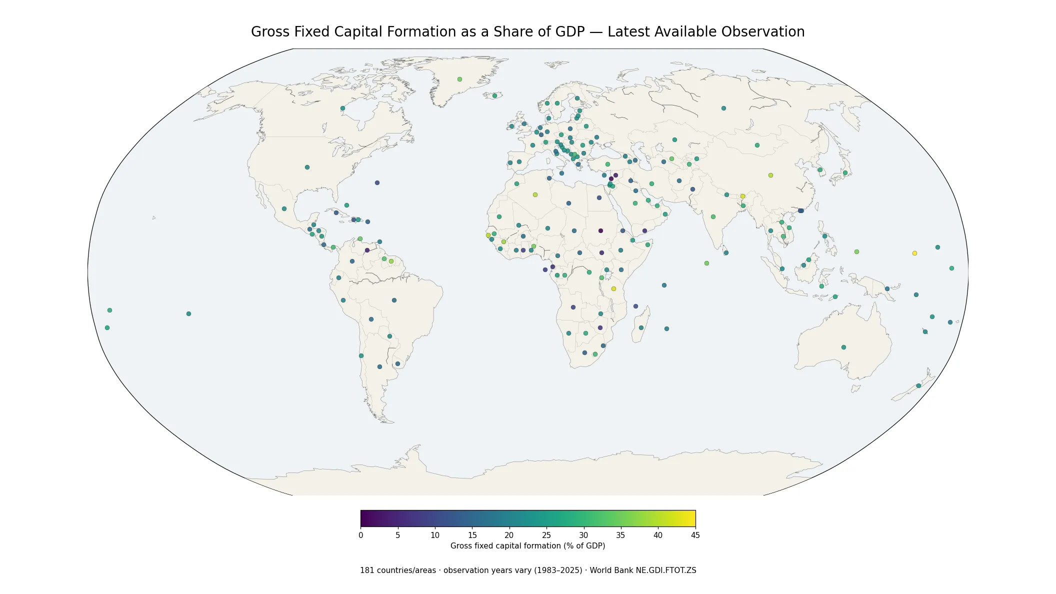
Table of Contents
What this indicator measures
Gross fixed capital formation is a flow concept from the national accounts. It captures additions to fixed assets used in production rather than the stock of assets already owned. A value of 25% therefore means that measured gross fixed capital formation in that observation year was roughly one quarter of GDP. It does not mean that one quarter of the country’s total wealth was newly created, and it is not a measure of the total market value of buildings, machinery, infrastructure, or other assets already in place.
This distinction also separates the indicator from gross capital formation, a broader concept that can include changes in inventories in addition to fixed capital formation. It also differs from the World Bank series for private-sector gross fixed capital formation, which narrows the scope to the private sector. The dataset in this article is the economy-wide gross fixed capital formation share of GDP, so it should not be substituted for either of those related measures.
The center of the latest-value distribution is around 22% of GDP
Across all 181 latest observations, the median is 22.24% and the mean is 22.46%. The 25th percentile is 17.92% and the 75th percentile is 26.91%, meaning half of the latest observations lie between those two points. The largest single band is 20.0–24.9%, which contains 65 countries and areas. Another 35 fall between 25.0% and 29.9%, while 32 are in the 15.0–19.9% range. The global pattern is therefore centered in the low twenties but has a wide spread on both sides.
Geographic proximity does not guarantee similar values. In South Asia in 2025, India recorded 31.68%, Bangladesh 28.54%, Nepal 23.57%, Sri Lanka 20.77%, and Pakistan 12.57%. In a tighter western European cluster, France was at 22.02%, Germany 20.31%, the Netherlands 19.80%, and Belgium 23.89%. These examples show why the map is most useful when it is read for both clusters and sharp neighboring differences rather than reduced to a simple continent-level story.
A same-year 2025 comparison of 126 countries and areas
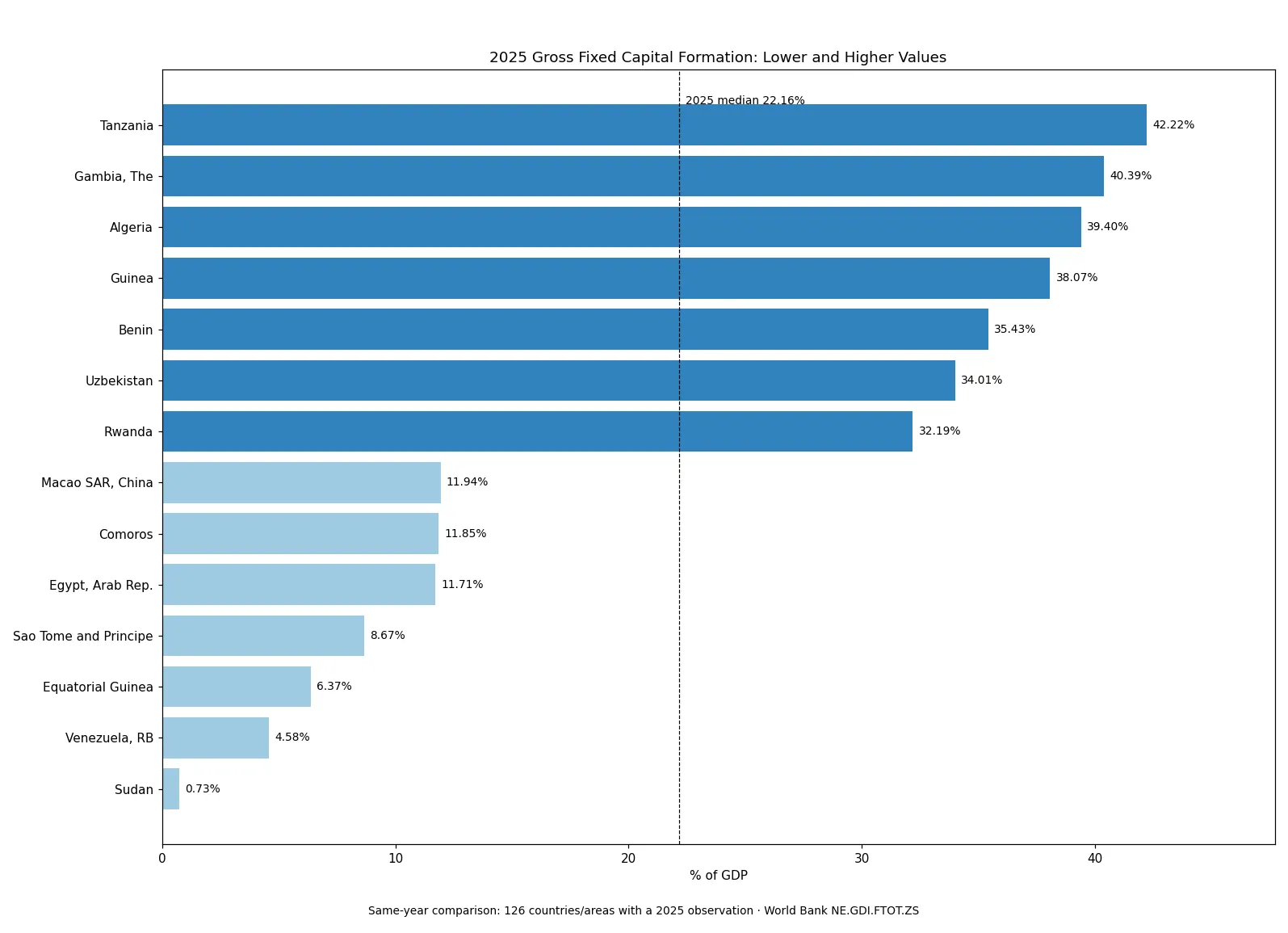
Limiting the comparison to the 126 observations dated 2025 removes the largest timing mismatch. The 2025 median is 22.16% and the mean is 22.35%. At the higher end, Tanzania recorded 42.22%, The Gambia 40.39%, Algeria 39.40%, Guinea 38.07%, and Benin 35.43%. At the lower end, Sudan recorded 0.73%, Venezuela 4.58%, Equatorial Guinea 6.37%, São Tomé and Príncipe 8.67%, and Egypt 11.71%. Because these values share the same reference year, they are more suitable for a direct cross-country snapshot than a ranking made from all 181 latest observations.
| Country or area | Year | Share of GDP |
|---|---|---|
| Tanzania | 2025 | 42.22% |
| Gambia, The | 2025 | 40.39% |
| Algeria | 2025 | 39.40% |
| Guinea | 2025 | 38.07% |
| Benin | 2025 | 35.43% |
| Sudan | 2025 | 0.73% |
| Venezuela, RB | 2025 | 4.58% |
| Equatorial Guinea | 2025 | 6.37% |
| Sao Tome and Principe | 2025 | 8.67% |
| Egypt, Arab Rep. | 2025 | 11.71% |
The extremes are descriptive, not a league table of economic quality. A high fixed-investment share can coincide with major infrastructure or capacity expansion, but the indicator does not reveal whether the projects are productive, how they are financed, which sectors receive the investment, or whether the level is sustainable. A low share likewise cannot be diagnosed as underinvestment from this number alone. Changes in GDP, project timing, economic disruption, national accounting revisions, and other conditions can all affect the ratio.
Regional patterns are mixed rather than uniform
Several African economies appear near the high end of the 2025 distribution, including Tanzania, The Gambia, Algeria, Guinea, Benin, and Rwanda. Yet the same broad region also contains some of the lowest 2025 values, such as Sudan and Equatorial Guinea. Central Asia also shows large gaps: Uzbekistan was at 34.01% in 2025, the Kyrgyz Republic at 25.76%, and Turkmenistan at 16.54%. The spatial signal is therefore not a single “high-investment region” or “low-investment region,” but a patchwork in which neighboring economies can differ substantially.
Some nearby countries do form tighter groups. Spain at 20.61%, Portugal at 20.70%, Italy at 21.83%, and France at 22.02% were all close to the low twenties in 2025. Canada at 22.90% and Mexico at 22.41% were also similar in 2025, while the United States’ latest value in this dataset is 21.35% for 2024. The U.S. value is useful as contextual information, but because its reference year differs, it should not be described as a strictly simultaneous 2025 comparison.
Why the observation year matters on a latest-value map
The latest-value approach increases geographic coverage, but it creates a freshness trade-off. Of the 181 observations, 165 come from 2024 or 2025, while 16 are from 2023 or earlier. A few last observations are much older. The Federated States of Micronesia has a 1983 value of 44.94%; Jordan’s latest supplied value is from 2007; the United Arab Emirates is from 2009; and Suriname is from 2010. Those points should not be interpreted as current 2025 conditions simply because they appear on the same map.
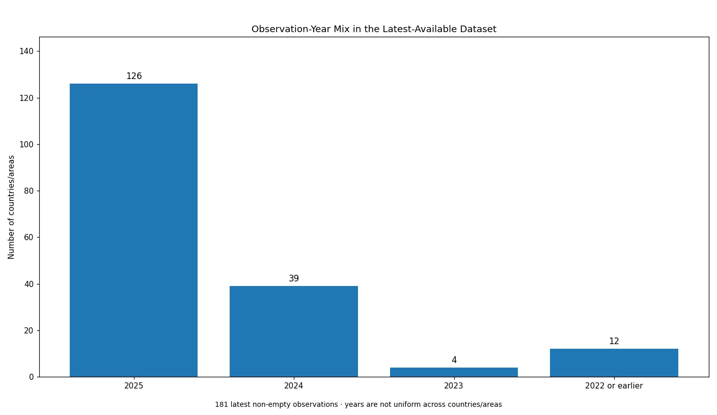
This timing issue changes how an overall ranking should be read. If all latest values are sorted mechanically, Micronesia’s 1983 value appears above Tanzania’s 2025 value, even though the observations are separated by more than four decades. That is why this analysis uses all 181 observations for coverage and distribution summaries, but switches to the 126-country 2025 subset for the detailed high-versus-low comparison. It preserves the map’s breadth without pretending that every point represents the same moment.
What the ratio can and cannot tell you
First, a share of GDP is not an absolute amount of investment. Two economies can both record 25% while their monetary investment totals differ enormously. Second, a high ratio is not the same thing as a high GDP growth rate. Fixed investment can expand productive capacity, but the growth effect depends on productivity, timing, demand, sector composition, and many other conditions. Third, this economy-wide indicator does not separate public and private investment. Analysts interested specifically in private investment need the private-sector gross fixed capital formation series.
Fourth, a single year cannot establish a long-run investment trend. Large infrastructure, housing, industrial, or energy projects can make the ratio jump in particular years, while pauses between projects can move it lower. Fifth, revisions to national accounts and different statistical publication calendars mean that “latest available” does not imply a common release date. A stronger country assessment would combine a multi-year time series with GDP growth, private investment, total capital formation, sector information, and financing indicators rather than treating this percentage as a stand-alone verdict.
Data source and method
The calculations use the World Bank World Development Indicators series NE.GDI.FTOT.ZS, reported as percent of GDP. The supplied dataset contains one most recent non-empty observation for each of 181 countries and areas, and missing values were not converted to zero. The map and overall distribution statistics use all 181 observations. The same-year comparison uses only the 126 observations dated 2025. The World Bank identifies national statistical authorities and central banks, national accounts files, OECD data, and World Bank staff estimates among the sources behind the indicator.
Frequently Asked Questions
Does a higher gross fixed capital formation share of GDP mean a stronger economy?
Not by itself. The ratio shows the size of fixed-asset formation relative to GDP, but it does not measure investment quality, productivity, financing conditions, or economic growth directly.
Are all 181 observations from 2025?
No. There are 126 observations from 2025 and 39 from 2024, while the remaining latest values are from earlier years.
Is gross fixed capital formation the same as gross capital formation?
No. Gross fixed capital formation focuses on fixed assets, while gross capital formation is broader and can also include changes in inventories.
Related Articles
Green Map creates custom-edited map images using open geographic data sources such as geoBoundaries, Natural Earth, OpenStreetMap, and government open data. These maps are edited visual materials, not raw data files, and are provided for education, documents, presentations, and graphic reference.