The share of women ages 50–54 differs markedly across the 217 countries and economies reporting a 2025 value in World Bank series SP.POP.5054.FE.5Y. Andorra records the highest share at 8.96%, while the Central African Republic is lowest at 2.16%. A five-year age band can therefore account for almost nine of every 100 females in one reporting economy but only a little more than two in another.
This is a composition measure, not a headcount. The denominator is the total female population of each reporting economy. A small territory can rank high even when its number of women ages 50–54 is modest, while a much larger country can have a lower percentage but a far larger number of women in the age group. The comparison below stays focused on the percentage and the age structure it describes.
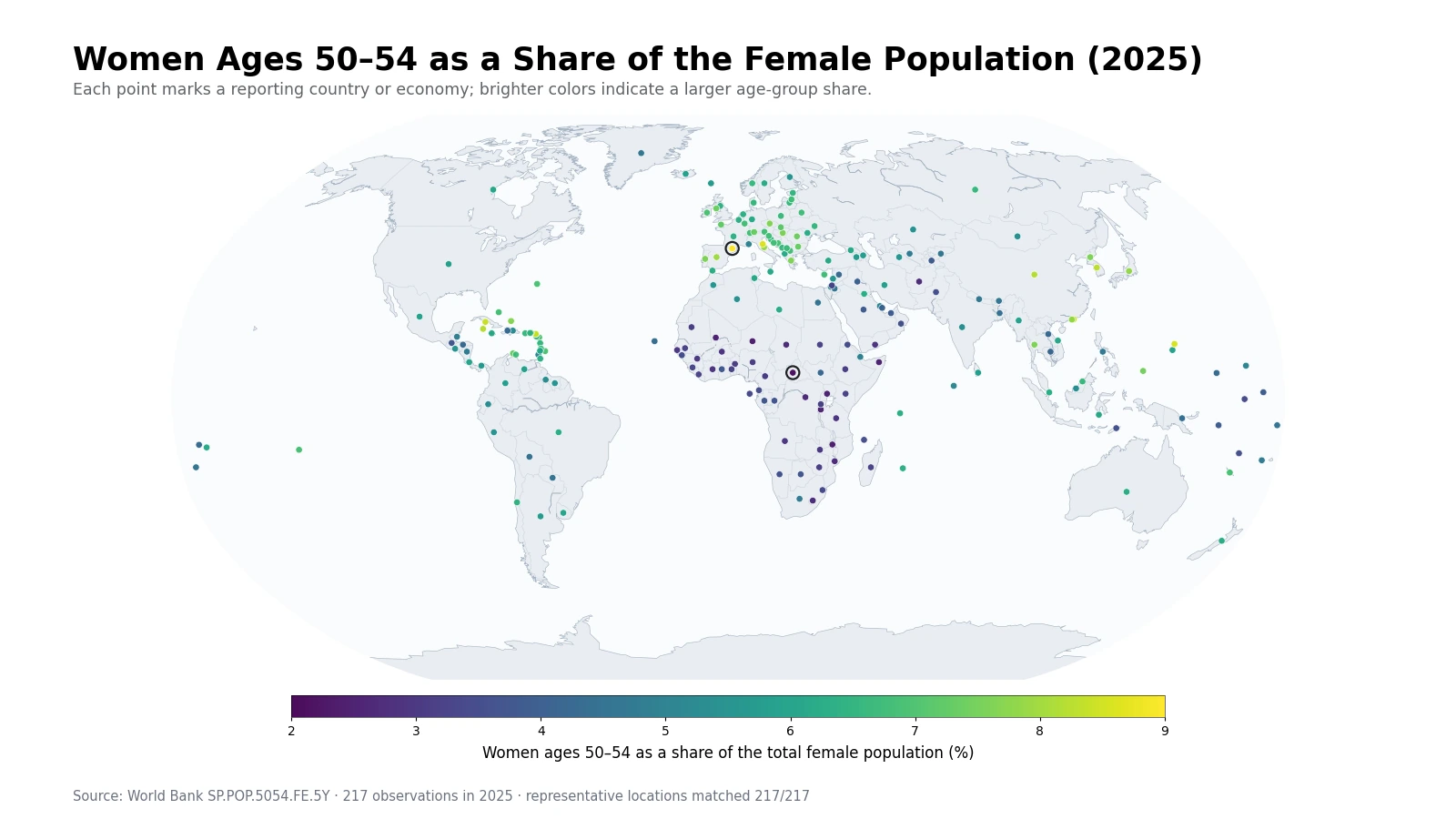
Table of Contents
The high end is geographically mixed rather than dominated by one region
Andorra leads at 8.96%, followed by San Marino at 8.66%. The Northern Mariana Islands are at 8.54%, Hong Kong SAR at 8.42%, Sint Maarten at 8.42%, and Cuba at 8.41%. The group combines European microstates, East Asian economies, and small Caribbean or Pacific territories. That mix is important: a high 50–54 share is not a pattern that belongs to a single continent or income group.
Several larger economies also sit near the upper end. China is at 8.20%, Spain at 7.94%, Italy at 7.87%, and Japan at 7.80%. These observations make parts of East Asia and Southern Europe visibly brighter on the map. However, the indicator does not identify why the cohort is large. A current age share can reflect cohort size at birth, subsequent survival, migration over decades, and the size of every other female age group that forms the denominator.
Small economies deserve particular care. A relatively modest migration flow can change the age composition of a small population more noticeably than it would in a very large country. For that reason, the upper tail should be treated as a description of present composition rather than direct evidence of one demographic cause or policy effect.
The low end forms a stronger cluster across youthful populations
The bottom of the distribution is more geographically concentrated. The Central African Republic is at 2.16%, Malawi at 2.45%, Niger at 2.46%, Uganda at 2.47%, and Somalia at 2.53%. Mali, Burundi, the Democratic Republic of the Congo, Chad, Mozambique, and several neighboring countries are also close to the low end. Many of these countries have age structures in which younger cohorts occupy a large part of the female population.
A low percentage does not by itself mean that the number of women ages 50–54 is unusually small. If younger age groups are large, one middle-age band can represent a smaller fraction of the whole female population even when its headcount is substantial. Likewise, a high 50–54 share does not prove that the entire population is old. The measure needs to be read with other age bands before drawing conclusions about the full population pyramid.
Afghanistan is at 2.73%, Yemen at 2.89%, Côte d’Ivoire at 2.93%, and Tanzania at 2.94%. When nearby countries repeatedly fall into similar ranges, the map provides useful evidence of a spatial cluster. What it cannot do is separate the contributions of historical fertility, mortality, and migration. Those mechanisms require additional data.
The gap between the highest and lowest observations is 6.80 percentage points
The 217 observations span 2.16% to 8.96%, a range of 6.80 percentage points. Andorra’s share is about 4.1 times the Central African Republic’s. For a single five-year band, that spread is large enough to show how different female age structures can be even before broader age groups are considered.
| High rank | Country or economy | Share | Low rank | Country or economy | Share |
|---|---|---|---|---|---|
| 1 | Andorra | 8.96% | 1 | Central African Republic | 2.16% |
| 2 | San Marino | 8.66% | 2 | Malawi | 2.45% |
| 3 | Northern Mariana Islands | 8.54% | 3 | Niger | 2.46% |
| 4 | Hong Kong SAR, China | 8.42% | 4 | Uganda | 2.47% |
| 5 | Sint Maarten (Dutch part) | 8.42% | 5 | Somalia, Fed. Rep. | 2.53% |
| 6 | Cuba | 8.41% | 6 | Mali | 2.53% |
| 7 | Korea, Rep. | 8.26% | 7 | Burundi | 2.56% |
| 8 | Cayman Islands | 8.21% | 8 | Congo, Dem. Rep. | 2.68% |
| 9 | China | 8.20% | 9 | Chad | 2.72% |
| 10 | Spain | 7.94% | 10 | Afghanistan | 2.73% |
The ranking also shows why percentage and population size should not be mixed. Several high-share observations are small territories, while many large countries fall closer to the middle. A 1 percentage point difference can mean very different numbers of people depending on the size of the female population.
The median is 5.69%, and half the observations lie between 3.89% and 6.60%
The unweighted mean is 5.38% and the median is 5.69%. The first quartile is 3.89% and the third quartile is 6.60%, so the middle half of reporting economies lies within a band of about 3.89% to 6.60%. The median being a little above the mean reflects the number of low observations that extend the lower tail of the distribution.
The 6% to under 7% band contains 65 economies, or 30.0% of the total. Another 40 are between 3% and under 4%, 35 are between 5% and under 6%, and 29 are between 4% and under 5%. Only nine observations reach 8% or more. The brightest markers are therefore visually prominent but statistically uncommon.
| Share band | Count | Share of observations |
|---|---|---|
| Below 3% | 18 | 8.3% |
| 3% to under 4% | 40 | 18.4% |
| 4% to under 5% | 29 | 13.4% |
| 5% to under 6% | 35 | 16.1% |
| 6% to under 7% | 65 | 30.0% |
| 7% to under 8% | 21 | 9.7% |
| 8% or more | 9 | 4.1% |
What the 50–54 cohort represents in 2025
People who are ages 50–54 in 2025 were born roughly in the early to mid-1970s. The exact birth-year boundaries depend on birthdays and the timing of population estimation, so it is more useful to think of this as a broad early-to-mid-1970s cohort rather than a perfectly fixed set of calendar years. The indicator asks how large that cohort is relative to all females alive in the reporting economy in 2025.
Its present size is the product of decades of demographic processes. Birth cohort size matters, but so do survival and international migration. The denominator matters just as much: a country with very large younger female cohorts can have a small 50–54 percentage even if the cohort itself has not shrunk. This is why a cohort share is informative but cannot be treated as a direct fertility or migration indicator.
The band is also distinct from measures of population aging such as the share age 65 and above. A thick 50–54 cohort may later contribute to older age groups, but the 2025 value is not a forecast. Future migration, survival, and changes in the rest of the population will continue to reshape the percentage.
Identical percentages can come from different population pyramids
Two economies can both record 6% while having very different distributions across all other ages. One may have a broad middle-age bulge and relatively few young adults; another may have nearly even shares across several adult bands. Because this indicator isolates one five-year interval, it does not uniquely describe the shape of the full population pyramid.
Adjacent age groups are especially useful for context. Comparing 45–49, 50–54, and 55–59 can show whether the 50–54 group is a local cohort bulge or simply part of a wider middle-age concentration. That comparison also reduces the risk of attaching a demographic story to one percentage without enough evidence.
The map is best for spatial structure; the tables are better for exact values
All 217 observations are plotted using representative geographic points. This keeps small islands and territories visible on a world map, where polygon maps can make them nearly disappear. In dense areas such as the Caribbean, Europe, and the western Pacific, markers can overlap at this scale, but the underlying observations remain distinct in the calculations.
Marker size is not population size. The markers are intentionally comparable in size so that color carries the percentage information. Use the map to identify broad clusters and contrasts, and the tables to read precise percentages and rankings. Geographic coordinates are used only for visualization and never enter the statistical calculations.
Data source and calculation
The analysis uses the 2025 values from the World Bank API series SP.POP.5054.FE.5Y. The World Bank indicator page provides the official definition and time series. The unit is women ages 50–54 as a percentage of the total female population.
All 217 rows contain a 2025 value, so no missing observation is replaced with zero and no earlier year is substituted. Minimum, maximum, mean, median, quartiles, range, rankings, and percentage-band counts are calculated directly from the same 217 values. Headcounts and trends are separate questions that require additional population totals or multiple years of data.
Frequently Asked Questions
What does a 6% value mean for women ages 50–54?
It means roughly 6 out of every 100 females in that reporting economy are ages 50–54. It does not mean 6% of the total population.
Does a higher share mean more women ages 50–54 in absolute numbers?
Not necessarily. This is a percentage of the female population, so a small economy can have a higher share but a smaller headcount than a large country.
Can a single 2025 observation show whether the 50–54 share is rising?
No. A trend requires multiple years of the same indicator. The 2025 value is a cross-sectional snapshot.
Related Maps
Green Map creates custom-edited map images using open geographic data sources such as geoBoundaries, Natural Earth, OpenStreetMap, and government open data.
These maps are edited visual materials, not raw data files, and are provided for education, documents, presentations, and graphic reference.