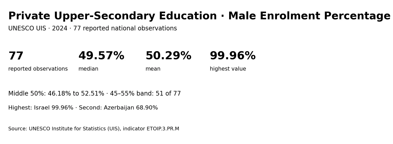
UNESCO Institute for Statistics (UIS) reports indicator ETOIP.3.PR.M, titled “Percentage of enrolment in upper secondary education in private institutions, male (%)”. The 2024 extract used here contains 77 national observations. The median is 49.57% and the arithmetic mean is 50.29%. Those two summary statistics sit near 50%, but the raw distribution is not completely symmetrical because one observation reaches almost 100%.
The values should be read as percentages under the UIS definition of this specific indicator, not as student counts. A value of 50 means 50 percent on the published measure; it does not mean 50 students. Coverage also matters. The dataset includes 77 reported national rows, not every country and territory in the UIS catalogue. Places that are absent are missing from this extract and must not be treated as zero.
Table of Contents
Most reported values cluster around the middle of the scale
The central half of the observations is relatively compact. The first quartile is 46.18% and the third quartile is 52.51%, so the interquartile range is only 6.32 percentage points. There are 51 observations between 45% and 55%, equal to about 66.2% of the 77 reported rows. This concentration is more informative than the full range by itself.
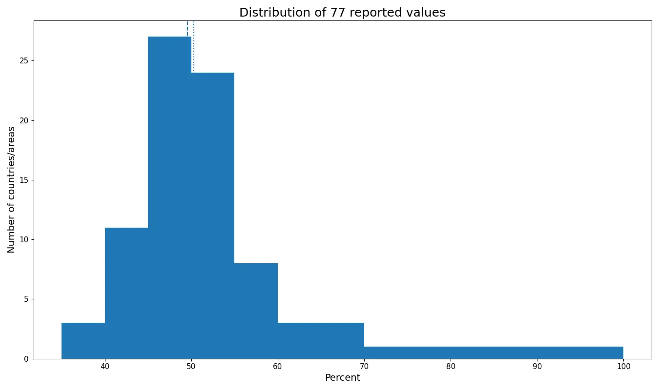
The median of 49.57% describes the middle ranked observation. The mean is slightly higher at 50.29%. If the highest observation is removed, the mean of the remaining 76 falls to 49.64%, which is much closer to the median. That change shows how a single extreme value can move the average even when most observations remain tightly grouped.
Only 3 reported values are below 40%, while 4 are at or above 60%. The 45–<50% band contains 27 observations and the 50–<55% band contains 24. A useful description of the dataset is therefore not simply “countries average around 50%,” but “most reported values are near 50%, with a small number of observations extending much farther upward or downward.”
The highest observation is separated sharply from the rest
Israel has the highest reported value at 99.96%. Azerbaijan is second at 68.90%, leaving a gap of 31.06 percentage points between first and second. Cook Islands follows at 61.90% and Egypt at 60.77%. Only 1 observation reaches 70% or more.
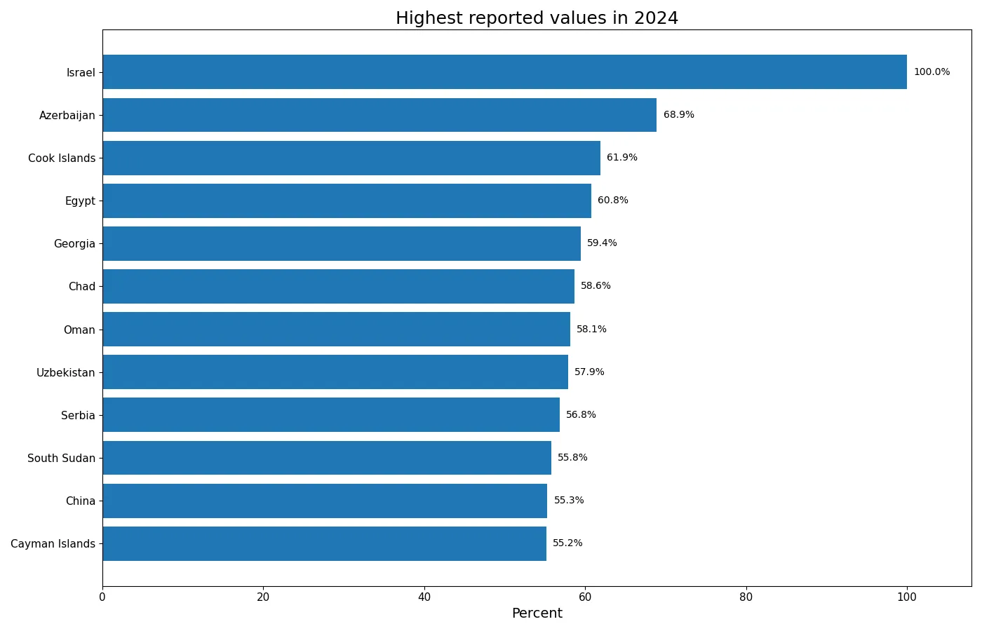
| Country or area | 2024 value |
|---|---|
| Israel | 99.96% |
| Azerbaijan | 68.90% |
| Cook Islands | 61.90% |
| Egypt | 60.77% |
| Georgia | 59.41% |
| Chad | 58.65% |
| Oman | 58.14% |
| Uzbekistan | 57.89% |
This is not a ranking of education quality. The indicator describes a percentage related to male enrolment and private upper-secondary institutions. A higher number does not, by itself, indicate better learning outcomes, broader access, greater equity, or a stronger school system. Those questions require different indicators. Institutional structure, the public-private split, enrolment totals, and the way education systems classify institutions may all matter when interpreting cross-country differences.
The lower end remains mostly in the upper 30s and 40s
The lowest reported value is Austria at 36.67%, followed by Gibraltar at 36.70% and Barbados at 37.67%. The total spread from minimum to maximum is 63.29 percentage points. Yet the range exaggerates how dispersed the typical observation is because most of the dataset sits far closer to the median than those endpoints suggest.
| Country or area | 2024 value |
|---|---|
| Austria | 36.67% |
| Gibraltar | 36.70% |
| Barbados | 37.67% |
| Belarus | 40.51% |
| Slovakia | 43.08% |
| Denmark | 43.28% |
| Latvia | 43.50% |
| Germany | 43.62% |
Low values should not be interpreted as evidence that boys have worse educational opportunities, just as high values should not be read as evidence of superior outcomes. The dataset does not include the corresponding female series or underlying enrolment counts in the same file. A direct gender composition analysis would need matched male and female indicators defined for the same education level, institution type, year, and geography.
A sorted profile makes the outlier structure easier to see
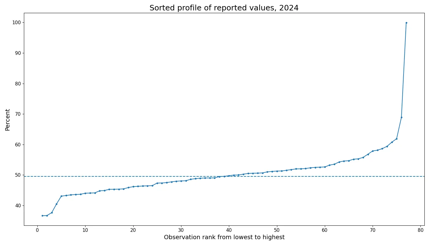
When the values are sorted from low to high, the majority form a gradual slope through the 40s and low 50s. The curve becomes steeper among the relatively few observations above 55%, then rises sharply at the final point. This shape is a clear visual reason to report more than one summary statistic. The median and interquartile range describe the dense central cluster, while the maximum and upper tail describe the exceptional cases.
The sorted chart also reinforces an important coverage rule: ranks apply only to the 77 observations reported in the data. UIS metadata identifies many catalogue units that are not reported in this extract. Their absence is not evidence of a zero value. Treating missing countries as zero would artificially create low observations, distort the mean, and produce a misleading ranking.
What the indicator can and cannot answer
The data can answer descriptive questions about the 2024 cross-section. It can show which reported observations are near the median, which are unusually high or low within the available set, and how concentrated the distribution is around 50%. It also supports calculations such as quartiles, ranges, rank positions, and counts within value bands because every row uses the same indicator, unit, and reference year.
The data cannot establish why one country has a higher percentage than another. It does not contain information about school financing rules, admissions, institutional ownership, cultural preferences, programme structure, or policy changes. Any causal explanation would require additional sources. The safest interpretation is descriptive: these are the percentages UIS reported for this indicator in 2024.
A single year also cannot establish a trend. To say that a country increased or decreased, the same ETOIP.3.PR.M series would have to be collected for earlier years using the same definitions. Comparing 2024 with a different education level, a different institutional category, or a differently defined gender measure would mix unlike observations.
How to extend the comparison responsibly
Three companion measures would add context. First, total upper-secondary enrolment would separate percentage composition from the scale of the student population. Second, the public-institution share would show how the institutional mix differs. Third, a corresponding female or gender-parity measure would allow the male percentage to be interpreted as part of a broader gender composition rather than in isolation.
It is also useful to keep the official series code in any reproducible analysis. The label is readable, but the code ETOIP.3.PR.M is the stable identifier that distinguishes this metric from similar UIS indicators. Matching on code, year, geography, and unit reduces the risk of accidentally combining adjacent education series that use similar wording.
Rounding should be separated from calculation. The tables and narrative display values to two decimal places for readability, but the rankings and summary statistics use the source values before display rounding. This matters especially when several observations are close together around the median.
Overall, the 2024 distribution has two features worth keeping in view at the same time: a dense center and a pronounced upper outlier. The middle half lies between 46.18% and 52.51%, while the maximum reaches 99.96%. Reading both parts of the distribution avoids two opposite mistakes—treating the countries as nearly identical because the average is near 50%, or treating the entire dataset as highly dispersed because the full range is wide.
Frequently Asked Questions
What is the unit of ETOIP.3.PR.M?
The UNESCO UIS series is reported in percent. The article compares the 2024 values directly without converting them to student counts.
Do countries missing from the 77 rows have a value of zero?
No. An unreported country is missing from this extract and must not be zero-filled.
Which reported observation is highest in 2024?
Israel is highest at 99.96% in the 2024 data.
Why show both the mean and the median?
The mean is 50.29% and the median is 49.57%. The highest observation pulls the mean upward, so the median and quartiles help describe the typical range.
Related Articles
Green Map creates custom-edited map images using open geographic data sources such as geoBoundaries, Natural Earth, OpenStreetMap, and government open data. These maps are edited visual materials, not raw data files, and are provided for education, documents, presentations, and graphic reference.