The World Bank reports a 2024 value for male primary gross enrollment in 134 countries and economies in this dataset. The observed range is unusually wide: 65.98% at the low end and 157.95% at the high end. The median is 98.95%, while the mean is 100.66%. Those numbers make sense only after distinguishing a gross enrollment ratio from a simple share of primary-age boys who are in school.
A gross enrollment ratio counts all male pupils enrolled in primary education, regardless of their age, and divides that total by the male population of the official primary-school age group. Because the numerator can include pupils who are older or younger than the official age range, the ratio can exceed 100%. A value of 120% therefore does not mean that 120% of eligible boys attend school, and a value below 100% does not translate directly into the percentage who are out of school.
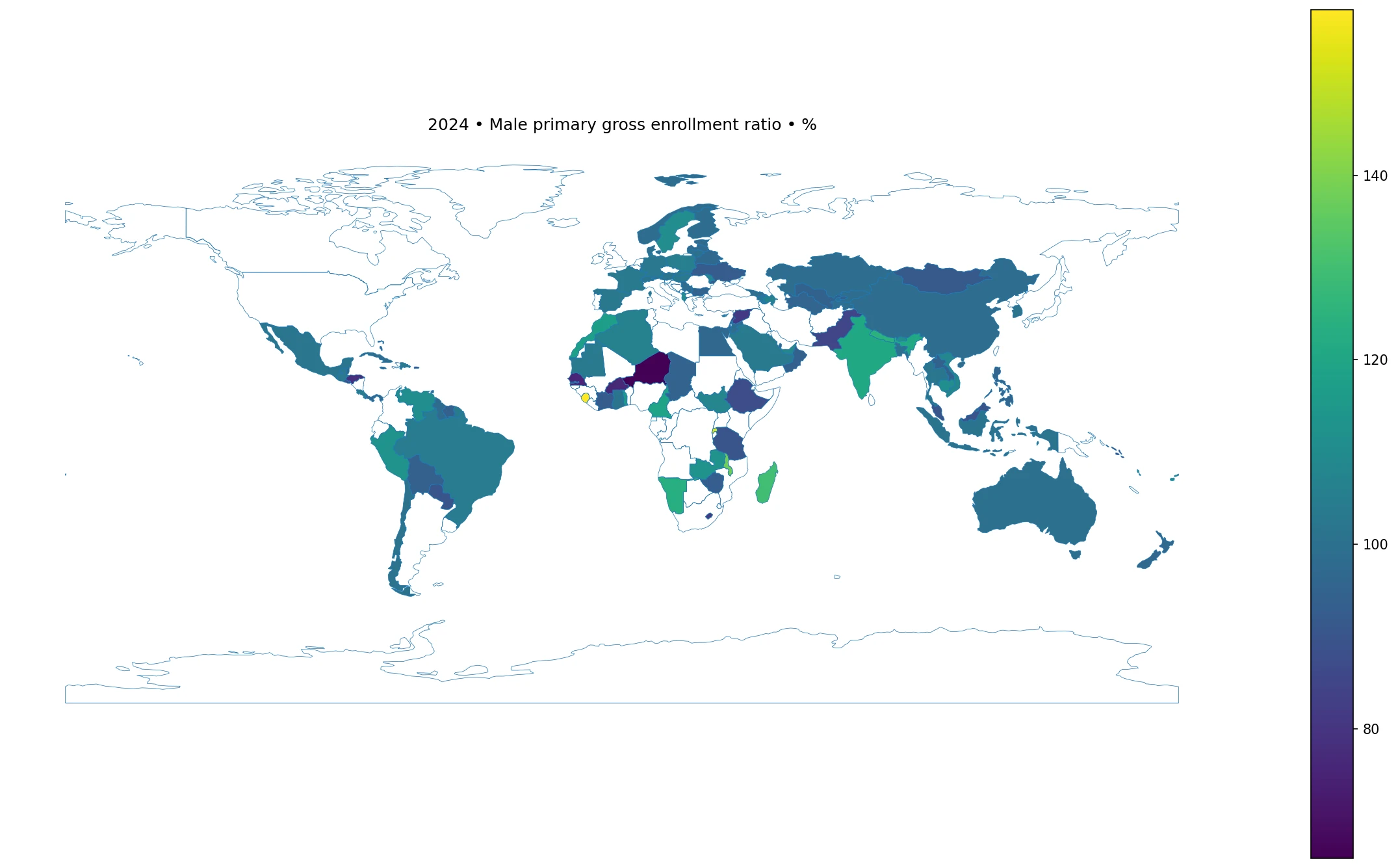
Table of Contents
Why the ratio can be above 100 percent
The denominator is tied to the population that is officially expected to be in primary school. The numerator is not restricted in the same way. A pupil who entered late, repeated a grade, entered early, or remained in primary school beyond the official age range can still be counted in enrollment. In systems where age-grade mismatch is common, total enrollment may therefore be considerably larger than the population of the official age group.
That property is useful rather than defective: it makes the gross ratio a broad measure of the scale of participation in a level of education. But it also limits what can be inferred from it. A high value can coexist with age distortion or repetition. A ratio near 100% can still hide differences in attendance, completion, learning, or access among subgroups. To measure participation of children who are actually in the official age range, a net enrollment indicator is the more direct companion measure.
The 2024 distribution illustrates the point. Sixty-two of the 134 reported values are above 100%, while 72 are below it. Twenty-three are at least 110% and nine reach 120% or more. At the other end, 17 are below 90% and six are below 80%. The 100% line divides the observations almost in half, but it is not a pass-fail threshold.
The middle of the distribution is much tighter than the extremes
The first quartile is 94.66% and the third quartile is 105.34%, so half of the reported economies fall within a band of roughly 94.66% to 105.34%. That central band is narrow compared with the full 91.97-percentage-point spread between the minimum and maximum. The mean of 100.66% sits above the median of 98.95% because a small group of very high observations pulls the average upward.
This is why the mean alone is not a good description of a “typical” country. A value close to 100% is common, yet the dataset also contains several economies far above 120% and a smaller cluster below 80%. Looking at the median, quartiles, and tails together gives a more faithful picture than reporting a global average without context.
Highest reported ratios in 2024
| Country or economy | Gross enrollment ratio (%) |
|---|---|
| Sierra Leone | 157.95 |
| Rwanda | 152.46 |
| Malawi | 137.34 |
| Madagascar | 129.92 |
| Turks and Caicos Islands | 126.12 |
| Nepal | 124.74 |
| Namibia | 123.56 |
| Monaco | 122.27 |
| India | 121.13 |
| Cameroon | 119.22 |
Sierra Leone has the highest reported value at 157.95%, followed by Rwanda at 152.46%. Malawi is at 137.34% and Madagascar at 129.92%. The Turks and Caicos Islands, Nepal, Namibia, Monaco, India, and Cameroon complete the top ten. These are not directly comparable to a completion rate or a learning score; they show the number of enrolled male primary pupils relative to the official-age male population.
The composition of the top group also shows that the indicator is not a simple proxy for income or development level. Large and small economies appear together, and values above 120% occur in different regions. Interpreting any one of them requires additional information about school-entry age, repetition, grade progression, demographic estimates, migration, and administrative coverage. The cross-country table can identify where the ratio is unusual, but it cannot identify the cause of the unusual value by itself.
Lowest reported ratios in 2024
| Country or economy | Gross enrollment ratio (%) |
|---|---|
| Niger | 65.98 |
| British Virgin Islands | 72.03 |
| Senegal | 75.52 |
| Burkina Faso | 76.06 |
| Curacao | 77.46 |
| Honduras | 78.48 |
| Syrian Arab Republic | 81.31 |
| Lesotho | 81.75 |
| Micronesia, Fed. Sts. | 81.78 |
| Lebanon | 82.12 |
Niger is the lowest reported observation at 65.98%. The British Virgin Islands, Senegal, Burkina Faso, Curaçao, and Honduras are also below 80%. The Syrian Arab Republic, Lesotho, the Federated States of Micronesia, and Lebanon are clustered around 81% to 82%. A lower gross ratio means total male primary enrollment is smaller relative to the official-age male population, but it does not by itself reveal how many primary-age boys are out of school.
Small territories deserve extra care because modest changes in enrollment or population estimates can move a percentage more visibly when the underlying population is small. Larger countries can also post low ratios, so population size is not a sufficient explanation. For policy or access questions, these figures should be paired with net enrollment, out-of-school rates, attendance measures, and age-specific population estimates.
Geographic patterns are mixed within regions
The map shows strong contrasts inside the same broad regions. In sub-Saharan Africa, Sierra Leone, Rwanda, Malawi, and Madagascar are at the upper end, while Niger, Senegal, and Burkina Faso are at the lower end. In South Asia, Nepal and India are above 120%, whereas Pakistan is 84.96%. These neighboring or regional contrasts make it risky to summarize an entire continent with a single value.
Other parts of the world show narrower but still meaningful variation. China is at 98.74%, Indonesia at 101.43%, Thailand at 101.93%, Viet Nam at 108.42%, and Malaysia at 90.33%. In Europe, Albania and Sweden are above 110%, while Ukraine is 92.56%; Germany, France, Spain, Finland, and Norway are closer to the 100% area. These patterns describe where values differ, not why they differ.
A single-year map cannot establish a trend. A country at 115% in 2024 might have been rising, falling, or stable in earlier years. The same applies to a country at 85%. A time series with the same indicator definition is required to distinguish a persistent structural pattern from a temporary change.
Reported data and map coverage are not the same thing
The source table contains 217 country and economy rows for 2024. Of those, 134 have a numeric observation and 83 are marked as source-missing. Missing values were left missing rather than converted to zero. That distinction matters: a blank area cannot be read as a 0% enrollment ratio.
The map uses a low-resolution world boundary layer. It can directly shade 105 of the 134 reporting observations after ISO3 matching, including France and Norway after their standard codes are restored in the boundary table. Several small islands and territories do not have separate polygons at this resolution. The ranking tables and summary statistics are therefore the authoritative way to include every reported observation, while the map is best used to see the broad spatial pattern.
What this indicator can and cannot answer
The ratio is useful for comparing the overall scale of male primary enrollment with the size of the official primary-age male population. It can flag unusually high or low observations, show whether values cluster around 100%, and provide a consistent basis for a same-year cross-country scan. With multiple years, it can also show whether the relationship between enrollment and the official-age population is changing.
It cannot measure learning quality, attendance, completion, grade progression, teacher availability, school resources, or household education costs. It also cannot separate on-age pupils from over-age and under-age pupils. A country with a high gross ratio can still face substantial educational challenges, while a value close to 100% is not proof that every eligible child is enrolled and attending.
For a fuller education profile, the next comparisons should include the female version of the same indicator, net primary enrollment, out-of-school rates, completion rates, and age-specific attendance or enrollment where available. The 2024 gross ratio is best treated as one piece of the participation picture rather than a standalone score of education system performance.
Frequently Asked Questions
Can a male primary gross enrollment ratio exceed 100%?
Yes. The numerator includes all male pupils enrolled in primary education regardless of age, while the denominator is the male population of the official primary-school age group. Over-age and under-age enrollment can therefore push the ratio above 100%.
Which observations are highest and lowest in 2024?
Among the 134 reported values, Sierra Leone is highest at 157.95% and Niger is lowest at 65.98%.
Does a ratio below 100% equal the share of boys who are out of school?
No. Gross enrollment is not restricted to pupils of official primary-school age, so the gap from 100% is not an out-of-school rate. Net enrollment or out-of-school indicators are needed for that question.
Related Articles
Green Map creates custom-edited map images using open geographic data sources such as geoBoundaries, Natural Earth, OpenStreetMap, and government open data. These maps are edited visual materials, not raw data files, and are provided for education, documents, presentations, and graphic reference.