The 2024 World Bank series reports antiretroviral therapy coverage for 126 countries and economies. Among observations with a value, the median is 70.5% and the mean is 67.96%. Ireland records the highest value at 98%, followed by Rwanda at 96% and Botswana, Namibia and Zimbabwe at 95%, 95% and 95%. At the lower end, Afghanistan is at 11%, Pakistan at 16% and Sudan at 20%. The range is wide enough that a single global average hides important differences.
The indicator measures the percentage of people living with HIV who are receiving antiretroviral therapy (ART). It is not HIV prevalence, the share of people who know their status, viral suppression, adherence, or a clinical treatment-success rate. A high value indicates broad treatment coverage relative to the estimated population living with HIV, but it does not by itself show whether every treated person has achieved viral suppression or whether access is equal across population groups.
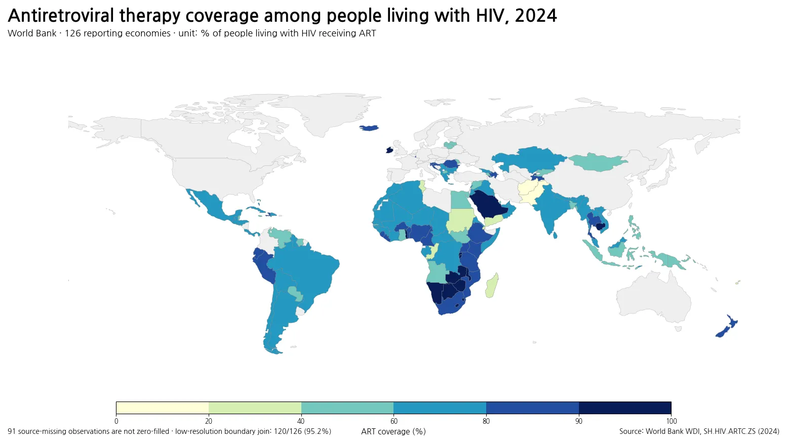
Table of Contents
The median is 70.5%, with the middle half between about 57% and 83%
The first quartile is 57.25%, the median is 70.5%, and the third quartile is 82.75%. In other words, the middle half of reported economies lies roughly between 57% and 83%. The 10th percentile is 42.5% and the 90th percentile is 89.5%. Those percentiles show that the global distribution is centered near 70%, but the lower and upper tails remain far apart.
By broad bands, 9 reported economies are below 40%, 25 are between 40% and 59%, 53 are between 60% and 79%, 26 are between 80% and 89%, and 13 reach at least 90%. The 60–79% band contains the largest number of observations, while a meaningful group has already reached very high coverage. Looking at the full distribution is more informative than treating the mean as a benchmark.
Several southern and eastern African countries appear among the highest reported values
The top ten include Ireland at 98%, Rwanda at 96%, Botswana at 95%, Namibia at 95%, Zimbabwe at 95%, Lesotho at 94%, Eswatini at 94%, Zambia at 94%, Burundi at 93% and Saudi Arabia at 93%. The presence of many African countries near or above 90% is an important feature of the 2024 data.
That pattern is a reminder that a high HIV burden does not automatically imply low treatment coverage. Some health systems and HIV programs report broad ART coverage even where treatment needs are substantial. The single-year indicator, however, cannot establish why one country performs differently from another. Diagnosed share, service delivery, medicine supply, retention in care, program design and estimation methods require separate evidence.
| Country or economy | ART coverage |
|---|---|
| Ireland | 98% |
| Rwanda | 96% |
| Botswana | 95% |
| Namibia | 95% |
| Zimbabwe | 95% |
| Lesotho | 94% |
| Eswatini | 94% |
| Zambia | 94% |
| Burundi | 93% |
| Saudi Arabia | 93% |
The lowest reported values span South Asia, North Africa, the Pacific and parts of Africa
At the lower end, Afghanistan reports 11%, Pakistan 16%, Sudan 20%, Fiji 24%, Djibouti 25%, Madagascar 29%, Tunisia 29% and Yemen 29%. The Republic of the Congo is at 34% and the Philippines at 40%. These observations sit well below the global median.
A low percentage should not be turned into a one-number verdict on an entire health system or national HIV response. ART coverage is a crucial access measure, but it does not reveal all barriers behind a low value. Undiagnosed infections, linkage to care, service availability, interruptions, population-group disparities and uncertainty in the estimated denominator can all matter. The indicator identifies a gap; it does not by itself diagnose its cause.
| Country or economy | ART coverage |
|---|---|
| Afghanistan | 11% |
| Pakistan | 16% |
| Sudan | 20% |
| Fiji | 24% |
| Djibouti | 25% |
| Madagascar | 29% |
| Tunisia | 29% |
| Yemen, Rep. | 29% |
| Congo, Rep. | 34% |
| Philippines | 40% |
Africa contains both some of the highest and some of the lowest observations
Rwanda is at 96%, Botswana 95%, Namibia 95%, Zimbabwe 95% and Zambia 94%. Ethiopia is at 88%, Kenya 87%, Uganda 85% and Tanzania 87%. South Africa reports 81%. These values place many countries in eastern and southern Africa well above the global median.
At the same time, Sudan is at 20%, Djibouti 25%, Madagascar 29%, Ghana 47% and Angola 48%. The continental range is therefore very broad. A regional average would obscure substantial country-level differences, which is why the map and country observations are more useful when interpreted together.
South and Southeast Asia show sharply different coverage levels
India reports 72%, while Pakistan is at 16% and Bangladesh at 41%. In Southeast Asia, Cambodia reaches 92% and Thailand 88%, with Viet Nam at 74%. Indonesia and the Philippines are lower at 41% and 40% respectively.
These gaps cannot be explained from this indicator by income level, epidemic size or geography alone. ART coverage represents the combined result of identifying people living with HIV, linking them to care, initiating therapy and maintaining service availability. To understand why countries differ, it is necessary to pair coverage with measures such as diagnosis coverage, retention, viral suppression, financing and access barriers.
Reported Latin American values mostly fall in the middle-to-high range
Argentina reports 79%, Brazil 73%, Peru 80%, Chile 71% and Mexico 65%. These figures are comparable as percentages for the same 2024 indicator, but they should not be interpreted as the number of people receiving treatment. Countries can have very different populations living with HIV even when their percentages are similar.
A coverage rate of 80% means that roughly four out of five people in the indicator denominator are represented in the ART numerator. It does not mean that 80% of the total national population receives treatment. Nor does it tell us the absolute number of people who need medicines, clinical monitoring or other services. Percentage and program scale answer different questions.
The Middle East and North Africa span values from below 30% to above 90%
Saudi Arabia is at 93%, the United Arab Emirates 77% and Morocco 76%. Qatar reports 46%, Egypt 45%, Tunisia 29% and Yemen 29%. The spread within the region is much wider than a single regional label would suggest.
Some countries may also have relatively small estimated populations living with HIV, making the percentage more sensitive to revisions in the numerator or denominator. The map therefore works best as a comparison of reported coverage, not as a causal explanation. Country-specific program reports are needed to interpret unusually high or low values.
The 91 missing observations are not 0% coverage
The source table contains 217 country and economy rows for the comparison year, but only 126 have a 2024 value. The remaining 91 rows are source-missing. A blank area on the map does not mean that nobody is receiving ART. It means this dataset does not provide a usable value for that economy in the selected comparison year.
Among the 126 reported observations, 120 join directly to the local simplified Natural Earth boundary, a match rate of 95.2%. Bahrain, Barbados, Comoros, Cabo Verde, Maldives and Malta do not have a directly joined polygon in this low-resolution boundary. Their values are still retained in the statistics and tables. Cartographic absence and data absence are therefore kept separate.
ART coverage is not the same as viral suppression
Receiving ART is one stage in the HIV care cascade. Viral suppression is a later outcome that depends on treatment effectiveness, adherence, continuity of care and other factors. A country can have high ART coverage while still needing to improve viral suppression or retention. This indicator does not measure those later outcomes, so the map should not be labeled as a treatment-success or viral-control map.
The reverse is also important: a low national coverage rate does not say that individuals who are receiving therapy have poor clinical outcomes. The numerator counts people on ART, while the denominator represents people living with HIV. It is an access and coverage ratio at population level rather than an individual clinical measure.
HIV prevalence and ART coverage answer different questions
HIV prevalence asks how common HIV is in a defined population. ART coverage asks what share of people living with HIV are receiving treatment. Because the denominators differ, the rankings do not have to move together. A country with a high HIV prevalence can also achieve very high ART coverage, while a country with lower prevalence can still have a large treatment-access gap.
A broader assessment of the HIV response therefore needs several indicators: incidence, prevalence, diagnosis coverage, ART coverage and viral suppression among them. The 2024 series used here is specifically about the treatment-coverage stage. It should not be converted into a composite score for prevention, diagnosis and outcomes.
Small percentage differences should not be overinterpreted as precise rankings
Most values in the source are reported as whole-number percentages. A difference between 71% and 72% should not automatically be treated as a meaningful performance gap. The number of people living with HIV and the number receiving ART can involve estimation, revision and reporting uncertainty. The indicator is better suited to identifying substantial gaps than to declaring a winner based on one percentage point.
For close comparisons, country program data, uncertainty ranges where available, and several years of the same indicator are more informative. Large differences such as 20% versus 90% are clearly visible in this dataset; very small differences deserve more cautious language.
A single 2024 snapshot cannot establish a trend
This comparison uses one year: 2024. It can show which reported economies have higher or lower ART coverage in that year, but it cannot establish whether coverage improved, stalled or declined. Trend statements require a consistent time series and attention to later revisions in the underlying estimates.
For the same reason, this map cannot attribute changes to a particular law, funding program, donor initiative or health-system reform. Those questions need a before-and-after timeline and evidence about implementation. The strength of this dataset is cross-country coverage comparison, not causal attribution.
Five rules make the map easier to read correctly
First, the percentage refers to people living with HIV, not the total population. Second, missing data are not zero. Third, ART coverage is not viral suppression or prevalence. Fourth, the same percentage can represent very different numbers of people across countries. Fifth, a single-year comparison does not explain causes or trends. Keeping these distinctions clear prevents most of the common interpretation errors.
Within the 126 reported observations, the median is 70.5%, 13 economies are at 90% or above, and 9 are below 40%. The 2024 distribution therefore shows both substantial treatment reach and persistent coverage gaps. Understanding the reasons behind either end of the distribution requires additional national and epidemiological evidence.
Frequently Asked Questions
What does antiretroviral therapy coverage measure?
It measures the percentage of people living with HIV who are receiving antiretroviral therapy. It is not the percentage of the total population and it is not a viral-suppression rate.
Do the 91 missing observations mean 0% treatment coverage?
No. They are source-missing values for the selected year and must be kept separate from an observed 0% value.
Does high ART coverage mean HIV prevalence is low?
No. HIV prevalence measures the share of a population living with HIV, while ART coverage measures treatment among people living with HIV.
Related Articles
Green Map creates custom-edited map images using open geographic data sources such as geoBoundaries, Natural Earth, OpenStreetMap, and government open data. These maps are edited visual materials, not raw data files, and are provided for education, documents, presentations, and graphic reference.