California led the 2025 state distribution of estimated total solar photovoltaic generation assigned to the U.S. commercial sector. Its EIA value was 7,728.146 thousand MWh, followed by New York at 2,859.106 and Massachusetts at 2,293.475 thousand MWh. The 51 observations—50 states plus the District of Columbia—sum to 25,503.223 thousand MWh, so California represents 30.30% of that same-series total. The exact identity is fueltypeid=TPV, sectorid=96, field=generation, annual frequency, and 2025. TPV is labeled estimated total solar photovoltaic, while sector 96 is All Commercial. Because those facets define the series more precisely than the broad route label, this article treats the values as estimated total commercial-sector solar PV generation rather than assuming that the observations cover utility-scale plants only.
The unit is thousand megawatthours, which measures electricity generated during the year rather than installed capacity. A high absolute value does not automatically mean that a state has the highest commercial-solar adoption rate. Total generation can be associated with the size of the commercial building and business base, cumulative installations, the timing of additions, solar resource, equipment performance, and operating conditions. Those explanatory variables are not included in this series. The observations also do not measure commercial electricity demand or electricity sales. For that reason, the ranking is best used to compare the absolute scale of commercial-sector solar generation across states, while adoption rates, market penetration, and demand shares require additional denominators.
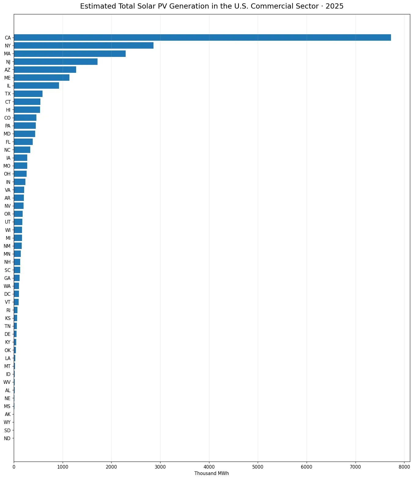
Table of Contents
California accounted for 30.30% of the 51-jurisdiction sum
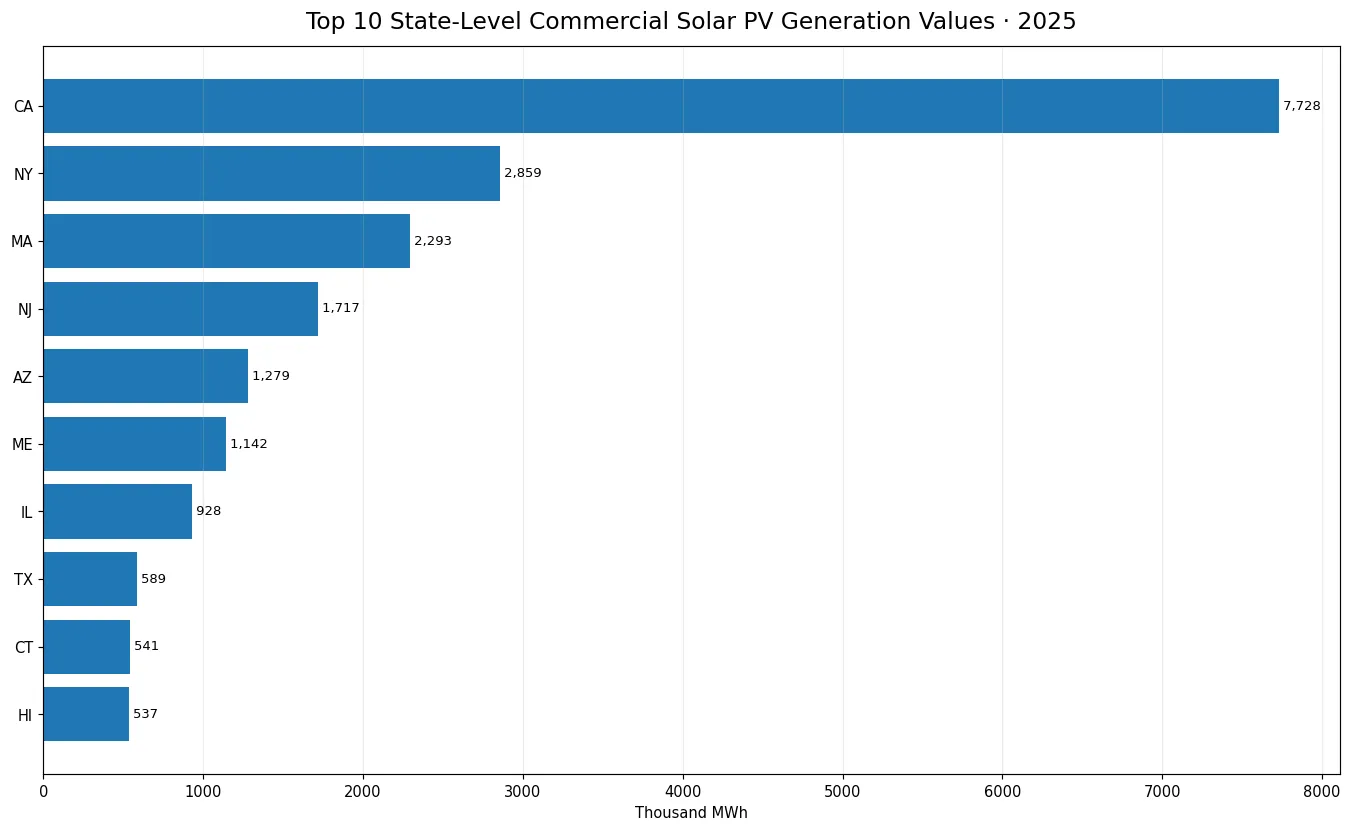
California alone accounts for 30.30% of the sum of the 51 state-level observations. New York contributes 11.21% and Massachusetts 8.99%. Together, the top three represent 50.51% of the total, while the top ten account for 76.91%. The gap between California and New York is 4,869.039 thousand MWh, which is larger than the entire annual value of every other state. New Jersey ranks fourth at 1,716.975 thousand MWh, followed by Arizona at 1,279.319 and Maine at 1,141.564. The concentration is substantial, even though the top group includes states from several different parts of the country.
The skew is also visible in the difference between the mean and the median. The mean is 500.063 thousand MWh, while the median is only 165.295. The first quartile is 50.225 and the third quartile is 411.686 thousand MWh. A small number of very large values therefore pull the average far above the middle observation. When a distribution has this shape, the average is not a good description of a typical state by itself. The full-state chart shows the long lower portion of the distribution, and the top-ten chart makes differences within the leading group easier to see.
New York, Massachusetts, and New Jersey all appear near the top
The second through fourth positions are held by New York, Massachusetts, and New Jersey. Their presence near the top is a useful reminder that a state ranking of commercial solar generation cannot be inferred from sunshine levels alone. Absolute annual output can reflect the amount of installed capacity, the scale and structure of the commercial sector, commissioning dates, equipment performance, local operating conditions, and many other factors. The EIA generation series establishes where output was high in 2025, but it does not identify which factor caused a state to reach its position. Any explanation of policy effectiveness or market behavior requires separate evidence.
Arizona ranks fifth, Maine sixth, Illinois seventh, Texas eighth, Connecticut ninth, and Hawaii tenth. The top ten therefore include the West, Northeast, Midwest, South, and an island state. This geographic mix makes it difficult to reduce the pattern to a single climate story. To test why states differ, an analyst could combine the generation observations with commercial PV capacity, installation dates, business counts, commercial floor area, electricity prices, incentives, or interconnection data. Those additions would create a different analysis. The current comparison deliberately keeps the result tied to one published EIA generation series.
| Jurisdiction | Generation (thousand MWh) | Share of 51-jurisdiction sum |
|---|---|---|
| California | 7,728.146 | 30.30% |
| New York | 2,859.106 | 11.21% |
| Massachusetts | 2,293.475 | 8.99% |
| New Jersey | 1,716.975 | 6.73% |
| Arizona | 1,279.319 | 5.02% |
| Maine | 1,141.564 | 4.48% |
| Illinois | 928.310 | 3.64% |
| Texas | 589.471 | 2.31% |
| Connecticut | 540.571 | 2.12% |
| Hawaii | 536.674 | 2.10% |
TPV and sector 96 are essential parts of the series identity
EIA operational data contain multiple solar and sector combinations. In this case fueltypeid=TPV is estimated total solar photovoltaic and sectorid=96 is All Commercial. A solar series using sector 8 Residential, sector 94 Independent Power Producer, or another solar fuel facet is not the same metric even if the year and unit look similar. The broad route wording can include the phrase Utility Scale, but the fixed TPV and All Commercial facets are more specific. For that reason, the public description avoids calling these values utility-scale commercial solar. The safer wording is estimated total solar PV generation attributed to the commercial sector.
The same rule applies to year-over-year analysis. A 2024-to-2025 change should keep TPV, sector 96, generation, annual frequency, and thousand MWh constant. Mixing a different solar facet or sector into the comparison can make an apparent growth rate partly reflect a definition change. This distinction is especially important in solar statistics because utility-scale, small-scale, and estimated-total concepts can coexist in the same broader data system. A consistent series identity is the foundation for a meaningful time comparison.
All 51 jurisdictions have positive reported generation
Every state and the District of Columbia has a positive 2025 value. There are no missing observations and no exact zeros. North Dakota is the minimum at 1.559 thousand MWh, followed by Alaska at 5.550 and South Dakota at 6.434 thousand MWh. These small numbers are published positive observations rather than missing values converted to zero. That distinction matters for maps and rankings, because treating missing data as zero can create a false geographic pattern. Here the complete 51-jurisdiction coverage allows a direct state-by-state comparison under the same series definition.
The distance between the minimum and maximum is enormous, but that gap should not be converted automatically into a judgment about solar competitiveness. Absolute generation is heavily influenced by total installed assets and the size of the activity being measured. A smaller state can have strong commercial-solar adoption on a per-business or per-building basis while still recording a lower total. Relative measures require an explicit denominator such as commercial customers, establishments, floor area, electricity consumption, or installed capacity. This article does not create those ratios because the required denominator is outside the generation series.
Generation, installed capacity, and electricity demand measure different things
Megawatthours measure energy produced over time, while megawatts measure the nameplate capacity available to generate at a moment. Two states with similar commercial PV capacity can produce different annual generation because of resource conditions, system orientation, downtime, installation timing, and other operational factors. Conversely, annual generation alone cannot reveal installed capacity precisely. A capacity-factor style comparison would need state-level commercial PV capacity measured on a consistent basis in addition to the 2025 generation values.
Commercial electricity demand is also separate from solar generation. A state may produce a large amount of commercial-sector solar and still have an even larger commercial load, so a high generation rank does not necessarily mean a high solar share of demand. Calculating that share requires a compatible commercial electricity consumption or sales denominator. On-site use, exports to the grid, ownership models, and accounting conventions can also matter depending on the question. The current figures should therefore remain a production-side measure rather than being presented as consumption, savings, or energy independence.
How to interpret the top-ten concentration
The top ten jurisdictions account for 76.91% of the sum of the 51 observations. That percentage is a descriptive concentration measure within this exact EIA series. It is not a national solar-market share that includes other sectors, and it is not a share of total U.S. electricity generation. It simply shows how much of the state-level commercial-sector TPV generation is located in the ten largest observations. Using the same denominator for every state makes the concentration easy to compare, but the meaning remains tied to the series boundary.
The tenth-ranked jurisdiction, Hawaii, records 536.674 thousand MWh, more than three times the median state value of 165.295 thousand MWh. Many jurisdictions in the lower half are below 100 thousand MWh. This uneven structure can be difficult to read on a single chart because California dominates the scale. The full-state figure is useful for coverage and the long lower tail, while the top-ten figure provides more resolution among the leaders. Both figures show absolute generation rather than normalized performance.
What the 2025 cross-section can and cannot establish
The 2025 observations directly establish the state ranking, the magnitude of each reported value, the degree of concentration, and the gap between the leading states and the rest. They do not by themselves establish long-term growth, policy effectiveness, investment returns, business adoption rates, or causal explanations. Those questions need additional years and variables. Keeping descriptive findings separate from causal claims prevents a map or ranking from implying more than the underlying observations support.
When later annual observations become available, the same TPV and sector 96 series can be used to calculate absolute changes, percentage changes, rank movement, and changes in concentration. EIA may also revise historical observations, so a clean time comparison should retrieve the same series definitions for all years at the time of analysis. The 2025 state distribution is therefore best viewed as a documented baseline for future comparisons rather than a complete account of the commercial solar market.
Source and calculation method
The source is the U.S. Energy Information Administration Electric Power Operational Data annual series. The 2025 observations are fixed to fueltypeid=TPV, sectorid=96 (All Commercial), field=generation, and the unit thousand megawatthours. The 51 observations sum to 25,503.223 thousand MWh; the mean is 500.063 and the median is 165.295. State shares use the sum of those same 51 observations as the denominator. No missing value was converted to zero, no observation was imputed, and no other year was mixed into the calculations. If EIA later revises the 2025 series, the figures can be updated using the same facets and field.
Frequently Asked Questions
Which state had the most estimated total commercial-sector solar PV generation in 2025?
California led with 7,728.146 thousand MWh, equal to 30.30% of the sum of the 51 state-level observations.
Do these values represent utility-scale solar only?
This article does not make that assumption. The fixed EIA facets are TPV (estimated total solar photovoltaic) and sector 96 (All Commercial), so the values are described as estimated total commercial-sector solar PV generation.
Is this a ranking of commercial solar adoption rates?
No. It is an absolute generation ranking. Adoption rates require a denominator such as businesses, buildings, installed capacity, or commercial electricity use.
Were missing states treated as zero?
No. All 50 states and the District of Columbia have positive reported observations, with no missing values and no exact zeros.
Related Articles
Green Map creates custom-edited map images using open geographic data sources such as geoBoundaries, Natural Earth, OpenStreetMap, and government open data. These maps are edited visual materials, not raw data files, and are provided for education, documents, presentations, and graphic reference.