The prevalence of undernourishment is not simply the share of people who missed a meal today. World Bank indicator SN.ITK.DEFC.ZS, sourced from the Food and Agriculture Organization of the United Nations (FAO), estimates the percentage of the population whose habitual food consumption is insufficient to provide the dietary energy required for a normal, active, healthy life. It is one of the main internationally comparable indicators used to monitor persistent food deprivation and hunger.
The supplied dataset contains the latest non-empty observation for 169 economies. Timing is unusually consistent: 165 observations are from 2023. The four exceptions are Cuba in 2006, the Democratic People’s Republic of Korea in 2018, Sudan in 2021, and Nicaragua in 2022. The main distribution and ranking discussion therefore focuses on the 2023 observations, while the four older latest values are treated separately.
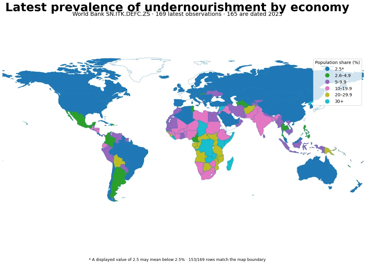
Table of Contents
What prevalence of undernourishment measures
FAO’s Prevalence of Undernourishment (PoU) is an estimate of the share of a population whose usual dietary energy consumption remains below the minimum level required for an active and healthy life. World Bank metadata describes the methodology as a measure of food deprivation informed by the average food available for human consumption, inequality in access to food, and minimum calorie requirements. FAO’s computational framework uses the average dietary energy consumption, the minimum dietary energy requirement, and the distribution of dietary energy consumption as core inputs.
PoU is a population-level modelled estimate, not an individual diagnosis. It cannot identify which specific person or household is undernourished, and it should not be confused with the broader concept of undernutrition. Undernutrition can reflect inadequate food quantity or quality as well as impaired nutrient absorption caused by illness. PoU is narrower: it is principally concerned with persistent insufficiency of dietary energy.
A displayed value of 2.5 may mean below 2.5%
The most important technical detail in this dataset is the value 2.5. World Bank metadata explicitly notes that a displayed value of 2.5 may signify prevalence below 2.5%. There are 63 such rows among the 169 latest observations and 62 among the 165 observations dated 2023. These economies should therefore not be ranked against one another as if every true value were exactly 2.500%.
The same censoring issue affects summary statistics. Using the displayed values literally produces an unweighted mean of about 10.04% across all 169 latest observations and a median of 5.3%. Because many 2.5 values may actually be lower, the true simple mean could be somewhat lower than that displayed-value calculation. The median is above the floor and is therefore less directly affected, but these remain unweighted country-level summaries rather than population-weighted global prevalence estimates.
The 2023 distribution across 165 observations
Restricting the data to 2023 improves temporal comparability. Across the 165 observations, the displayed-value median is 5.2% and the simple mean is 9.81%. The first quartile is at the 2.5 display floor and the third quartile is 13.5%. Sixty-two economies are shown as 2.5, 17 are above 2.5 but below 5%, and 31 are between 5% and 10%. Twenty-six economies are at or above 20%, including nine at or above 30%.
| 2023 displayed band | Economies | Share of 165 |
|---|---|---|
| 2.5* displayed | 62 | 37.6% |
| >2.5 to <5% | 17 | 10.3% |
| 5 to <10% | 31 | 18.8% |
| 10 to <20% | 29 | 17.6% |
| 20 to <30% | 17 | 10.3% |
| 30% or higher | 9 | 5.5% |
* A displayed 2.5 may represent prevalence below 2.5%. The first band is therefore a lower-bound reporting group rather than an exact 2.5% category. The map keeps it separate from the ordinary numeric ranges for the same reason.
The highest 2023 values exceed 50%
| Economy | 2023 prevalence of undernourishment |
|---|---|
| Haiti | 54.2% |
| Somalia | 53.2% |
| Madagascar | 39.5% |
| Syrian Arab Republic | 39.0% |
| Congo, Dem. Rep. | 38.5% |
| Zambia | 37.2% |
| Kenya | 36.8% |
| Liberia | 35.5% |
| Chad | 32.0% |
| Central African Republic | 29.8% |
Haiti records 54.2% and Somalia 53.2% in the 2023 data, putting both above one half of the population. Madagascar, the Syrian Arab Republic, the Democratic Republic of the Congo, Zambia, Kenya, and Liberia are all above 35%. Many of the highest values are in sub-Saharan Africa, but Haiti and Syria show that severe undernourishment is not confined to one geographic region.
The indicator does not establish why a particular country’s prevalence is high. Domestic food supply, household income, food prices, unequal access, conflict and displacement, climate shocks, distribution systems, and social protection can all matter, but causal claims require additional evidence aligned by place and time. The PoU map is best used to identify where persistent dietary-energy shortfalls are estimated to be widespread and where deeper analysis is warranted.
Sixty-three latest observations share the 2.5 display floor
Among all latest observations, 63 are displayed as 2.5. Their exact ordering cannot be recovered from this dataset. Two economies can both appear as 2.5 even if their underlying estimates differ within the below-2.5 range. Creating a bottom-ten league table from those rows would therefore imply precision that the reported data do not contain.
Among 2023 observations strictly above the floor, Mexico is at 2.7%, the Philippines and Tunisia at 3.0%, Hong Kong SAR and the Slovak Republic at 3.1%, and Argentina at 3.4%. These values can be distinguished from one another, but the exact gap between them and an economy displayed as 2.5 cannot be known from the rounded/censored display alone.
Four latest values are older than 2023
| Economy | Latest observation year | Displayed value |
|---|---|---|
| Cuba | 2006 | 2.5* |
| Democratic People’s Republic of Korea | 2018 | 47.0% |
| Sudan | 2021 | 11.0% |
| Nicaragua | 2022 | 17.3% |
The high concentration of 2023 data is a major strength of this extract, but the four older rows should not be treated as if they were measured in the same year. A 47.0% observation from 2018 or a 2.5 display from 2006 is a latest-available value, not a 2023 condition. For that reason, the same-year ranking and distribution sections exclude these four rows.
PoU and food insecurity are related but different
Prevalence of undernourishment and prevalence of moderate or severe food insecurity address different parts of the food-security problem. PoU is a modelled estimate of persistent dietary-energy inadequacy. The Food Insecurity Experience Scale (FIES), by contrast, uses people’s reported experiences of difficulty accessing food because of a lack of money or other resources. FIES questions span worsening diet quality, reducing quantities, skipping meals, and more severe restrictions.
A country can therefore have a substantially higher moderate-or-severe food-insecurity rate than its PoU estimate. People may be forced to compromise diet quality or reduce food choices without consistently falling below the minimum dietary-energy threshold used in PoU. Looking at the two indicators together helps separate broader problems of food access from the narrower condition of persistent energy insufficiency.
More food production does not automatically mean less undernourishment
The food production index answers another question again. It tracks how a country’s food production compares with its own reference-period level, not whether every household can acquire enough food. Agricultural-land share is a land-use measure and is even further removed from direct food access. Neither can substitute for the prevalence of undernourishment.
A country can produce substantial amounts of food while still experiencing undernourishment if income, prices, distribution, conflict, or inequality prevent some people from obtaining adequate food. Conversely, a country with limited agricultural land can rely on imports, purchasing power, storage, and social protection to maintain access. Food availability and food access interact, but they are not interchangeable.
Converting percentages into people requires population data
A prevalence of 40% does not by itself tell you how many people are undernourished. A small economy with 40% prevalence can have fewer affected people than a very populous economy with 10%. Estimating headcounts requires matching the prevalence rate to the appropriate population for the same reference period. The means and medians in this article give each economy one equal observation and therefore must not be described as the prevalence of undernourishment in the world’s population.
For a global prevalence rate or global number of undernourished people, official FAO regional and global aggregates are more appropriate than averaging country percentages. Those aggregates use population weighting and the agency’s formal estimation process, which answers a different statistical question from a simple country-level summary.
Blank map areas do not mean zero prevalence
The map joins the 169 statistical rows to a low-resolution world boundary. 153 rows match directly, equal to about 90.5% of the source rows. Some small island economies, territories, and separately reported areas do not have a distinct polygon in this simplified boundary or are too small to appear clearly. Their statistical values are not replaced with zero.
The choropleth is designed to reveal broad spatial patterns. It should not be used to infer tiny differences among low-prevalence economies, especially because the 2.5 display floor suppresses exact variation within the lowest group. The class breaks are visualization aids, not official World Bank or FAO severity categories.
What this indicator can and cannot tell you
PoU is useful for comparing the estimated prevalence of persistent dietary-energy insufficiency across countries, finding broad geographic clusters, and monitoring long-run patterns. It can also be combined with food-insecurity, food-price, production, trade, income, and social-protection indicators to guide deeper investigation.
It is not designed to identify individual undernourished people or to measure the short-term effect of a local program, a temporary price spike, or a single shock. FAO describes PoU as a tool for monitoring persistent food deprivation in relatively large population groups and long-run progress toward the hunger target under SDG 2.1.
The official definition and country time series are available from World Bank indicator SN.ITK.DEFC.ZS. FAO provides additional methodological context in its Prevalence of Undernourishment overview.
Summary
The latest-value dataset contains 169 economies, and 165 of those observations are from 2023, giving the cross-country comparison unusually strong timing consistency. Within the 2023 group, the displayed-value median is 5.2% and the simple mean is 9.81%, while Haiti and Somalia exceed 50%. The largest interpretation caution is at the bottom of the distribution: 62 of the 2023 observations are shown as 2.5, a value that may mean below 2.5%. PoU should therefore be read as an estimate of persistent dietary-energy insufficiency, not as an exact low-end ranking, a measure of short-term hunger episodes, or a substitute for food-insecurity and food-production indicators.
Frequently Asked Questions
Does a displayed value of 2.5 mean exactly 2.5% undernourishment?
Not necessarily. World Bank metadata says a displayed value of 2.5 may signify prevalence below 2.5%, so economies at the display floor cannot be precisely ranked against one another.
Is prevalence of undernourishment the same as moderate or severe food insecurity?
No. PoU estimates persistent dietary-energy inadequacy, while food-insecurity measures such as FIES use people's reported experiences of difficulty accessing adequate food because of resource constraints.
Are all 169 latest observations from 2023?
No, but almost all are. There are 165 observations from 2023 and four older latest values from 2006, 2018, 2021, and 2022.
Related Articles
Green Map creates custom-edited map images using open geographic data sources such as geoBoundaries, Natural Earth, OpenStreetMap, and government open data.
These maps are edited visual materials, not raw data files, and are provided for education, documents, presentations, and graphic reference.