World Bank data for 2025 show how much men ages 45–49 account for within the male population of 217 countries and economies. The median is 6.09% and the mean is 5.88%. The reported range runs from Central African Republic at 1.82% to Kuwait at 10.11%. This is a population-structure measure, not a count of men. A country with millions of men ages 45–49 can have a lower share than a much smaller economy if its total male population is distributed more heavily across other age groups.
The denominator is the total male population. That distinction matters because the indicator is not the share of the total population that consists of men ages 45–49. Women are not part of the denominator, and the value does not directly show how many people live in the age group. The measure is best read as the relative thickness of one five-year male age cohort within each country or economy’s male population.
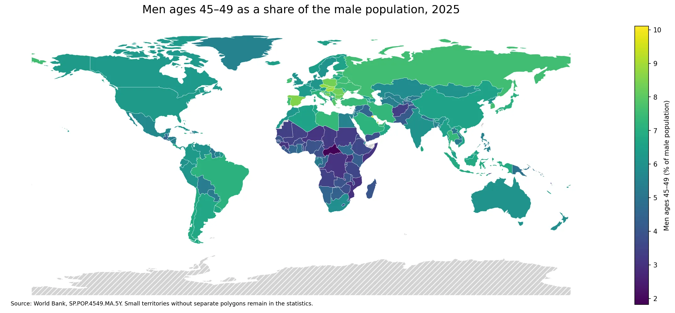
Table of Contents
The middle half of economies falls between about 4.67% and 6.85%
The 25th percentile is 4.67% and the 75th percentile is 6.85%, so half of the 217 economies are concentrated in a band of roughly 4.67% to 6.85%. The mean of 5.88% sits fairly close to the median of 6.09%, which indicates that the overall distribution is not dominated by a small number of extreme values. Even so, the full range is wide: the highest observation exceeds 10%, while the lowest is below 2%.
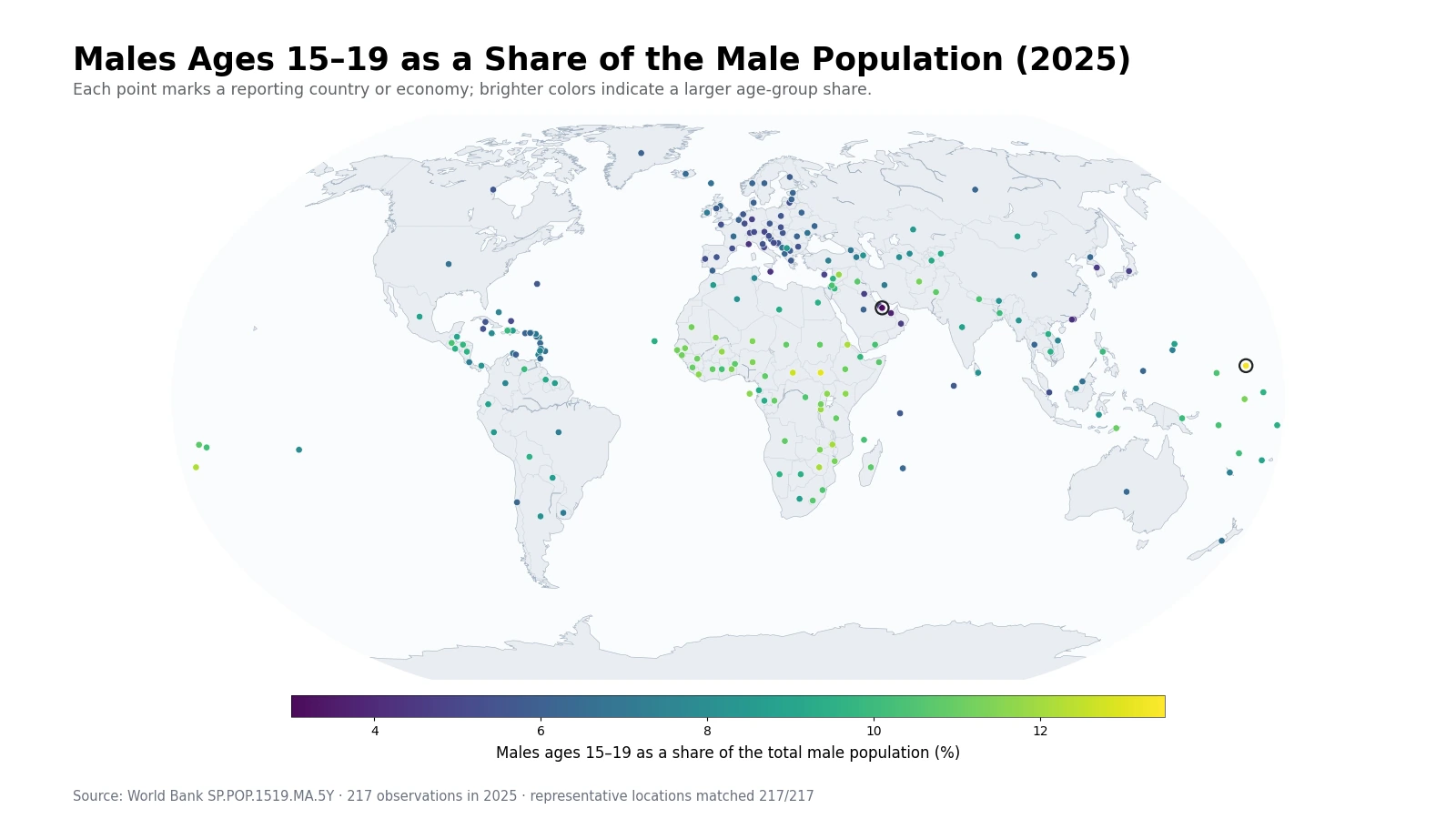
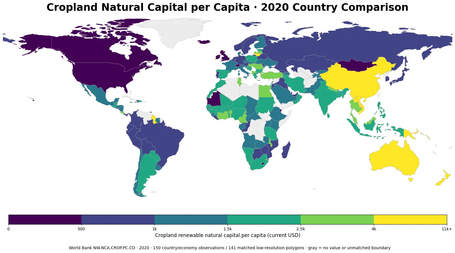
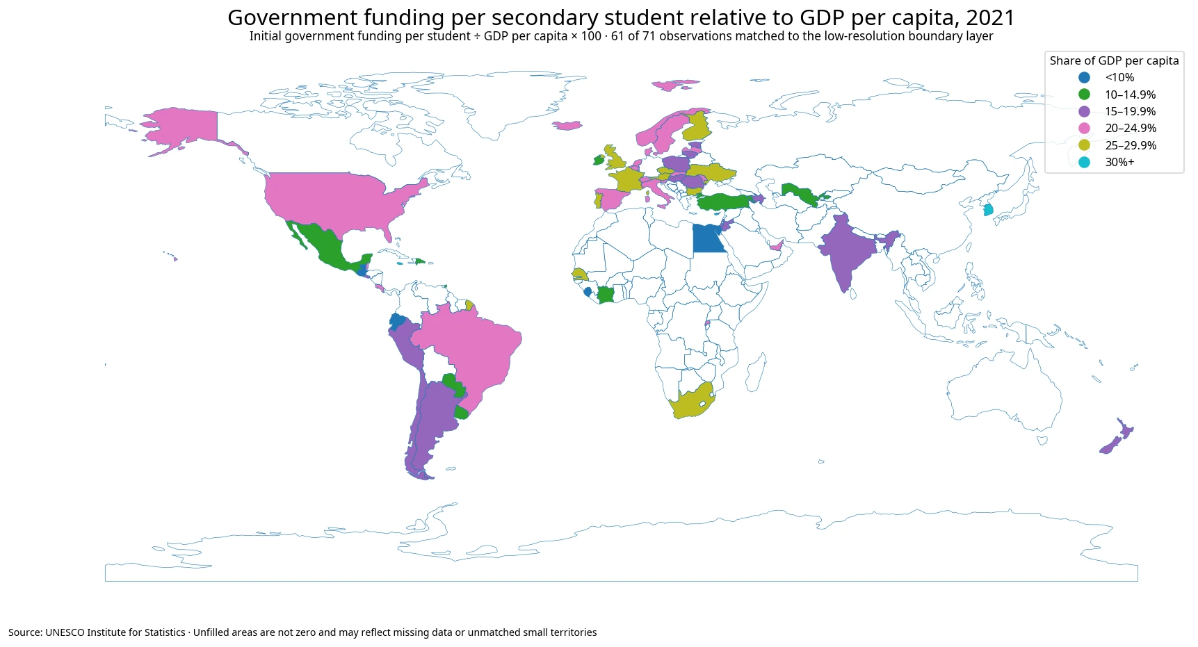
That spread is why the map is more informative than a single global average. Countries shaded similarly are not necessarily demographically identical, but they place a comparable share of their male population in the 45–49 age bracket. The map also separates the question of age structure from absolute population size. Large and small economies can appear in the same band because the measure is normalized by each economy’s male population.
The highest shares combine Gulf economies, European countries, and small territories
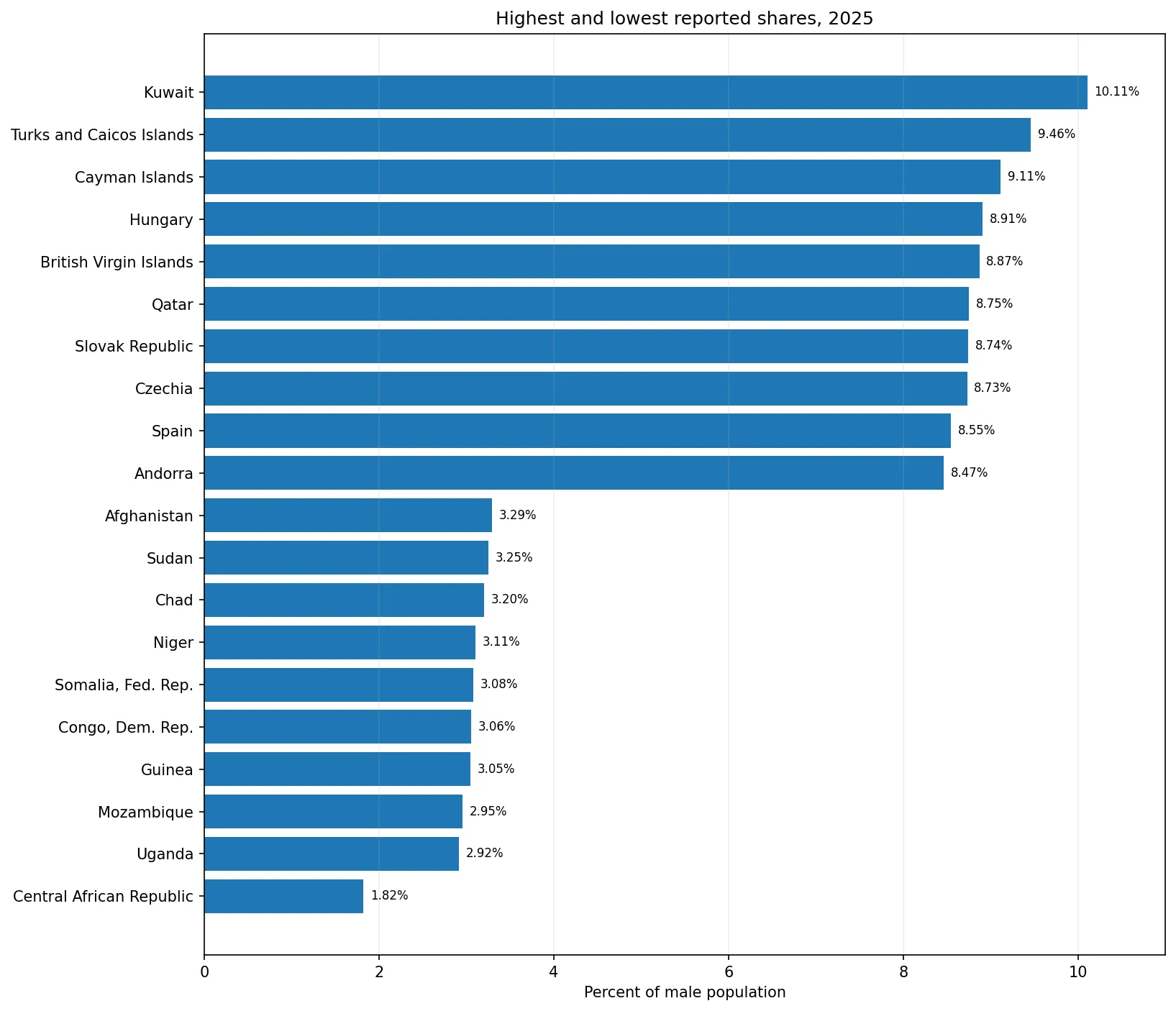
Kuwait records the highest value at 10.11%. Turks and Caicos Islands follow at 9.46%, Cayman Islands at 9.11%, Hungary at 8.91%, British Virgin Islands at 8.87%, Qatar at 8.75%, the Slovak Republic at 8.74%, Czechia at 8.73%, Spain at 8.55% and Andorra at 8.47%. The top ten therefore do not form one simple geographic bloc. They include countries in Europe and the Gulf as well as small island or territory economies.
Central and eastern Europe contain several values near or above 8%. Hungary is 8.91%, the Slovak Republic 8.74%, Czechia 8.73%, Poland 8.33%, Romania 8.30%, Bulgaria 8.25% and Bosnia and Herzegovina 8.26%. Western and northern Europe are more mixed: Germany is 6.13%, France 6.26%, the Netherlands 5.78%, the United Kingdom 6.09%, Sweden 6.09% and Norway 6.39%. The contrast shows that broad continental labels can hide meaningful differences in male age structure.
The Gulf also shows a wide spread within a compact region
Kuwait stands at 10.11% and Qatar at 8.75%, while Bahrain is 8.39%, the United Arab Emirates 7.44%, Saudi Arabia 7.16% and Oman 6.71%. That is a range of more than three percentage points among nearby economies. The indicator itself cannot identify the cause of the difference. It only establishes that the 45–49 cohort occupies a substantially different share of each male population.
Possible demographic mechanisms include differences in the size of birth cohorts, survival into midlife, and migration by age and sex, but those mechanisms require separate evidence. The map should therefore be used to identify where age structures differ, not to assign a cause from one percentage alone. This distinction is especially important for economies with unusual population compositions or substantial movements of working-age adults.
Many of the lowest shares are in Sub-Saharan Africa
Central African Republic has the lowest value at 1.82%. Uganda is 2.92%, Mozambique 2.95%, Guinea 3.05%, the Democratic Republic of the Congo 3.06%, Somalia 3.08%, Niger 3.11%, Chad 3.20% and Sudan 3.25%. Afghanistan, at 3.29%, is the only economy outside Africa in the bottom ten. These low percentages describe the relative share of the 45–49 cohort, not a shortage of people in absolute terms.
Even within Sub-Saharan Africa, values are not uniform. Ethiopia is 3.61%, Tanzania 3.58%, Burundi 3.60%, Senegal 3.93% and Nigeria 3.98%, while Ghana reaches 4.76% and South Africa 5.90%. The difference between neighboring or regionally close countries is another reason to rely on the country-level map rather than assume one continental pattern applies everywhere.
Asia and the Americas cluster closer to the middle but still vary
Across major Asian economies, Japan is 7.11%, China 6.53%, India 6.03%, Indonesia 6.81%, Thailand 7.35%, Viet Nam 6.67% and the Philippines 5.49%. Pakistan is lower at 4.13% and Nepal at 4.91%, while Sri Lanka is 6.70%. These economies occupy different parts of the same broad middle range rather than forming a single Asian level.
In North America, the United States is 6.29% and Canada 6.29%, almost identical, while Mexico is 5.73%. In South America, Brazil is 7.11%, Argentina 6.75%, Chile 6.85%, Uruguay 6.73%, Peru 6.14% and Colombia 6.32%. Most of these values are around or above the global median, but the country-level differences are still large enough to matter when comparing age structures.
Top 10 reported shares
| Country or economy | Men ages 45–49 (% of male population) |
|---|---|
| Kuwait | 10.11% |
| Turks and Caicos Islands | 9.46% |
| Cayman Islands | 9.11% |
| Hungary | 8.91% |
| British Virgin Islands | 8.87% |
| Qatar | 8.75% |
| Slovak Republic | 8.74% |
| Czechia | 8.73% |
| Spain | 8.55% |
| Andorra | 8.47% |
Bottom 10 reported shares
| Country or economy | Men ages 45–49 (% of male population) |
|---|---|
| Central African Republic | 1.82% |
| Uganda | 2.92% |
| Mozambique | 2.95% |
| Guinea | 3.05% |
| Congo, Dem. Rep. | 3.06% |
| Somalia, Fed. Rep. | 3.08% |
| Niger | 3.11% |
| Chad | 3.20% |
| Sudan | 3.25% |
| Afghanistan | 3.29% |
What a high or low share can tell you
A higher percentage means the 45–49 cohort occupies a larger slice of the male population at that point in time. A lower percentage means other male age groups collectively take a larger share. That makes the indicator useful for comparing the shape of male age structures, but it is not a score of demographic strength or weakness. It also does not show labor-force participation, employment, income, health, or household conditions for men in this age group.
The indicator becomes more informative when it is read alongside other five-year age bands. A country with a high 45–49 share but a small 0–4 or 15–19 share has a different age profile from a country where younger cohorts dominate. Likewise, pairing the male 45–49 series with the corresponding female series can show whether both sexes have similarly thick midlife cohorts. Those comparisons should use the same year and compatible definitions rather than mix periods.
Why rankings do not equal population counts
Percentages can make a small economy rank above a large one even when the large economy has far more men ages 45–49. That is not a data error; it follows directly from the denominator. For questions about market size, service demand, or the number of people in the age group, analysts would need age-specific population counts. For questions about population structure, however, the percentage is the more comparable measure because it controls for the total size of each male population.
Small territories deserve extra caution in interpretation. Turks and Caicos Islands, Cayman Islands and British Virgin Islands all appear in the top ten. Their percentages are valid observations in the source data, but they should not be treated as if they represented the same number of people as large countries. The ranking answers a structural question—how large is this cohort relative to all males—not a scale question.
How to read the map without over-interpreting it
- The unit is percent of the male population, not percent of the total population.
- The ranking is different from a ranking of the absolute number of men ages 45–49.
- All 217 country and economy rows in the supplied 2025 dataset have reported values, so no missing values were converted to zero.
- Some small islands and territories do not have separate polygons in the low-resolution world boundary file; they remain in the statistics and ranking tables.
- The indicator describes age structure. Explaining causes requires additional birth, mortality, and migration data.
Data and method
This analysis uses World Bank indicator SP.POP.4549.MA.5Y for 2025. All 217 country and economy rows contain numeric observations. The mean is 5.88%, the median 6.09%, the 25th percentile 4.67% and the 75th percentile 6.85%. Rankings and summary statistics use the same 2025 observations, without combining earlier years or filling missing values.
The map joins ISO3 economy codes to a standard low-resolution world boundary layer. 169 reported economy codes have a matching polygon in that layer. Several small islands, territories and special jurisdictions do not appear as separate polygons at this resolution, so their values are visible in the rankings and full statistics even when they cannot be shaded independently on the map. France and Norway were matched by name because the bundled boundary file uses nonstandard ISO placeholders for those polygons.
The source values were checked from the World Bank API snapshot collected on September 16, 2026, while the reference year for every observation used here is 2025. The map is intended to show spatial pattern, while the tables preserve exact high and low values. Because many economies sit close to the 6% range, small differences should be read from the numeric values rather than estimated from color alone.
Frequently Asked Questions
Is this the share of the total population that consists of men ages 45–49?
No. The denominator is the total male population, so the indicator measures how much the 45–49 male age group contributes to the male population only.
Which economies have the highest and lowest 2025 values?
Kuwait has the highest reported value at 10.11%, while the Central African Republic has the lowest at 1.82%.
Does a high percentage mean there are more men ages 45–49 in absolute terms?
Not necessarily. It is a relative share, so a small economy can have a high percentage even when a much larger country has more men ages 45–49 in absolute numbers.
Related Articles
Green Map creates custom-edited map images using open geographic data sources such as geoBoundaries, Natural Earth, OpenStreetMap, and government open data.
These maps are edited visual materials, not raw data files, and are provided for education, documents, presentations, and graphic reference.