Diabetes prevalence among adults ages 20–79 varies widely across the 2024 country and economy observations in World Bank indicator SH.STA.DIAB.ZS. The source table contains 217 rows: 209 have a numeric 2024 value and eight are source-missing. Pakistan has the highest reported estimate at 31.4%, while Zimbabwe has the lowest at 1.5%. Across the 209 reported observations, the median is 8.5% and the simple unweighted mean is 10.09%.
The percentages need a careful reading. This series is not a crude count of everyone living with diabetes in each country. It covers people ages 20–79 with type 1 or type 2 diabetes and is age-standardized to a common population structure. That adjustment is designed to make cross-country comparisons less dependent on whether one country has an older or younger adult population. It also means the mapped percentage should not be interpreted as the literal share of all residents who have diabetes.
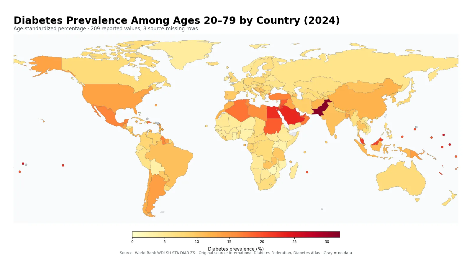
Table of Contents
The measure is age-standardized prevalence among ages 20–79
The World Bank metadata defines diabetes prevalence here as the percentage of people ages 20–79 who have type 1 or type 2 diabetes. The estimate is adjusted to a standard population age structure. The underlying source is the International Diabetes Federation’s Diabetes Atlas. Because diabetes prevalence changes substantially with age, standardization helps reduce the effect of countries having very different age profiles before their prevalence levels are compared.
Age-standardization does not turn every country into an identical population, and it does not remove every source of difference. It adjusts the age composition used for comparison, but differences in underlying disease patterns, diagnosis, health behavior, socioeconomic conditions, surveillance systems and other factors can remain. The indicator is therefore useful for describing international variation, not for assigning a single cause to a country’s position on the map.
It is also distinct from several related health measures. Prevalence describes the share of a population living with a condition, whereas incidence concerns newly occurring cases over a period. Mortality measures deaths, not the proportion living with diabetes. A country can therefore have a high prevalence without necessarily having the highest diabetes mortality, and a low prevalence estimate does not by itself show how effectively the health system detects or treats the disease.
The median is 8.5%, with the middle half between 6.5% and 12.2%
Giving each of the 209 reported country or area observations the same weight, the first quartile is 6.5%, the median is 8.5%, and the third quartile is 12.2%. The simple mean is 10.09%, which is above the median because a relatively small group of observations extends well into the 20% range and Pakistan reaches 31.4%. These summaries describe the distribution of country-level percentages; they are not a population-weighted estimate of diabetes prevalence across the world’s 20–79 population.
| 2024 age-standardized prevalence | Countries/areas | Share of 209 |
|---|---|---|
| Below 5% | 30 | 14.4% |
| 5% to under 7.5% | 46 | 22.0% |
| 7.5% to under 10% | 46 | 22.0% |
| 10% to under 15% | 53 | 25.4% |
| 15% to under 20% | 17 | 8.1% |
| 20% or more | 17 | 8.1% |
The largest band is 10% to under 15%, containing 53 observations or 25.4% of the reported set. The two bands from 5% to under 10% each contain 46 observations. Seventeen observations are at least 20%, while 30 are below 5%. In other words, the darkest map locations are important but they are not typical of most reporting economies. Roughly seven in ten reported observations are below 15%.
The overall range is 29.9 percentage points, from 1.5% to 31.4%. A range that wide makes a single average a poor description of the whole map. The median, quartiles and broad bands provide more context by showing where the center of the distribution lies and how long the upper tail is. They also reduce the temptation to treat small differences between neighboring estimates as meaningful league-table gaps.
High estimates cluster in parts of the Gulf and among several Pacific island economies
Pakistan is the highest 2024 observation at 31.4%. The Marshall Islands follows at 25.7%, Kuwait at 25.6%, Samoa at 25.4%, and both Kiribati and Qatar at 24.6%. Saudi Arabia is 23.1%, French Polynesia 22.8%, Egypt 22.4%, and Bahrain 22.1%. The top ten therefore spans South Asia, the Gulf and Middle East, and multiple Pacific island economies rather than one single contiguous region.
| High rank | Country/area | Prevalence | Low rank | Country/area | Prevalence |
|---|---|---|---|---|---|
| 1 | Pakistan | 31.4% | 1 | Zimbabwe | 1.5% |
| 2 | Marshall Islands | 25.7% | 2 | Rwanda | 2.1% |
| 3 | Kuwait | 25.6% | 3 | Uganda | 2.2% |
| 4 | Samoa | 25.4% | 4 | Ghana | 2.7% |
| 5 | Kiribati | 24.6% | 5 | Mozambique | 3.0% |
| 6 | Qatar | 24.6% | 6 | Nigeria | 3.0% |
| 7 | Saudi Arabia | 23.1% | 7 | Kenya | 3.1% |
| 8 | French Polynesia | 22.8% | 8 | Timor-Leste | 3.2% |
| 9 | Egypt, Arab Rep. | 22.4% | 9 | Bolivia | 3.4% |
| 10 | Bahrain | 22.1% | 10 | Viet Nam | 3.4% |
On the map, several Gulf economies occupy high color bands at the same time: Kuwait, Qatar, Saudi Arabia, Bahrain and the United Arab Emirates all stand out. The Pacific also contains a visible group of high-prevalence observations, including the Marshall Islands, Samoa, Kiribati, French Polynesia, Nauru, Tonga and Palau. That geographic clustering is descriptive. The single indicator cannot establish why those economies share high estimates or how much any one behavioral, economic, genetic or health-system factor contributes.
Population size is another reason not to equate a high percentage with a high number of people. A small island economy with prevalence above 20% may have far fewer adults living with diabetes than a large country whose standardized prevalence is below 10%. To estimate the number of people affected, the relevant age-group population and the underlying prevalence estimates need to be combined rather than inferred from the color alone.
Several Sub-Saharan African observations sit near the low end, but low does not mean no burden
Zimbabwe is the lowest reported estimate at 1.5%, followed by Rwanda at 2.1%, Uganda at 2.2%, Ghana at 2.7%, Mozambique and Nigeria at 3.0%, and Kenya at 3.1%. Timor-Leste is 3.2%, while Bolivia and Viet Nam are both 3.4%. Many of the lightest colors therefore appear in Sub-Saharan Africa, although there are exceptions within the region and low observations also appear elsewhere.
A low prevalence estimate should not be read as a complete health-system score. This series does not directly report the share of diabetes cases that are diagnosed, the proportion receiving treatment, glycemic control, complications, disability, or diabetes-related deaths. Nor does it measure access to screening. Those outcomes require separate data. The map answers a narrower question: how the age-standardized prevalence estimate for ages 20–79 differs across reporting economies in 2024.
The estimation context also matters when reading very small differences. International diabetes prevalence estimates draw on multiple data sources and use a standardized framework. That improves comparability, but it does not make a tenth of a percentage point a precise performance difference. Broad bands and repeated spatial patterns are more defensible than treating 8.4% and 8.5% as substantively different ranks.
Large-country comparisons show substantial variation even within broad regions
| Country | 2024 diabetes prevalence, ages 20–79 |
|---|---|
| Pakistan | 31.4% |
| Saudi Arabia | 23.1% |
| United Arab Emirates | 20.7% |
| Türkiye | 16.5% |
| Mexico | 16.4% |
| United States | 13.7% |
| Bangladesh | 13.2% |
| China | 11.9% |
| Indonesia | 11.3% |
| Brazil | 10.6% |
| India | 10.5% |
| Korea, Rep. | 9.6% |
| Japan | 8.1% |
| Germany | 7.8% |
| Canada | 7.7% |
| Australia | 7.4% |
| United Kingdom | 7.4% |
| South Africa | 7.2% |
| France | 6.5% |
| Russian Federation | 5.9% |
Among large economies, the United States is at 13.7%, China at 11.9%, India at 10.5%, Brazil at 10.6%, and Indonesia at 11.3%. France is 6.5%, Germany 7.8%, the United Kingdom 7.4%, and Japan 8.1%. Korea is 9.6% in the same table. These values underline that neither continent nor income level alone is enough to predict the country estimate. Neighboring and economically similar countries can still occupy different bands.
A useful feature of this comparison is that every numeric observation used in the rankings and summaries refers to 2024. A “latest available” table can mix years and create apparent country differences that partly reflect timing. Holding the reference year constant avoids that problem. It does not mean every country ran the same survey in the same month; the international series is a harmonized estimate designed for cross-country comparison.
Age-standardized prevalence and crude prevalence answer different questions
Crude prevalence applies the observed age distribution of a population. Age-standardized prevalence recalculates the comparison using a common age structure. The distinction matters because diabetes becomes more common at some adult ages than others. A country with many older adults can have a higher crude prevalence even if its age-specific prevalence pattern is similar to that of a younger country. Standardization reduces that compositional effect.
For comparative epidemiology, that is an advantage. For service planning, however, the actual population structure still matters. Clinics, medicines, monitoring and complication care depend on the number of people living with diabetes, not only on the standardized percentage. A country with hundreds of millions of adults and a moderate standardized prevalence can have a much larger diabetes population than a small economy with one of the darkest map colors.
The age range must also remain attached to the statistic. This indicator covers ages 20–79, not all ages and not every definition of “adult.” A measure for ages 18+, an all-age estimate, or a crude 20–79 prevalence can legitimately produce a different number. Comparisons should therefore match the age range, standardization method, year and source before values are treated as equivalent.
Eight source-missing rows remain no data rather than zero
The 217-row country and area master contains 209 reported 2024 values and eight source-missing rows. The missing locations are American Samoa, the Channel Islands, Gibraltar, the French part of St. Martin, the Northern Mariana Islands, Sint Maarten, the Turks and Caicos Islands, and the British Virgin Islands. None of those rows is converted to zero, and none is included in the rankings, mean, median, quartiles or distribution-band counts.
On the map, gray means “no 2024 value in the supplied source table,” not zero prevalence. Zero-filling would create false low observations and would pull the mean and lower-tail distribution downward. This distinction is particularly important for global datasets that include small territories and separately reported economies, where missingness may be more common than in large sovereign states.
For cartography, the data are joined to a low-resolution Natural Earth world layer using ISO-3 codes. Economies with visible polygons are colored directly, while small countries and areas that lack a distinct polygon at world-map scale are retained as representative point markers. All 217 source rows are assigned a map position; 209 reported values are colored and the eight missing rows are gray. Point size is only a visibility aid and does not encode prevalence or population.
Country prevalence is a population statistic, not an individual risk estimate
A national prevalence percentage cannot be applied directly to an individual. Personal diabetes risk can depend on age, family history, body composition, physical activity, pregnancy history, other medical conditions and additional factors that are not represented by the country color. The map is designed for population-level comparison, not diagnosis or personal risk assessment.
The same caution applies to judgments about health-system quality. Higher prevalence does not automatically mean poorer care, because prevalence can be influenced by the occurrence of disease, survival, detection and population characteristics. Evaluating care requires additional indicators such as treatment coverage, glycemic control, complications, premature mortality, access and financial protection. Conversely, a low prevalence estimate alone does not establish that diabetes is being prevented, detected or managed successfully.
The 2024 map is therefore best used to identify broad geographic contrasts and outliers, then paired with other evidence for any deeper explanation. It shows where standardized diabetes prevalence is relatively high or low after age adjustment. It does not tell us which policy caused a country’s value, how many people are untreated, or whether a particular health system should be judged successful.
Data source and calculation method
The statistical source is the World Bank World Development Indicators series SH.STA.DIAB.ZS, Diabetes prevalence (% of population ages 20 to 79). World Bank metadata describes the series as the percentage of people ages 20–79 with type 1 or type 2 diabetes, adjusted to a standard population age structure. The underlying source is the International Diabetes Federation’s Diabetes Atlas. The unit is percent.
The maximum, minimum, mean, median, quartiles, rank tables and prevalence-band counts are calculated directly from the 209 non-missing observations dated 2024. The eight missing rows are neither estimated nor replaced with values from other years. World Bank regional and income-group aggregates are not part of the country/economy table used for these summaries. As a result, the map, tables and descriptive statistics all refer to the same reference year and the same supplied observation set.
Frequently Asked Questions
Is this diabetes prevalence percentage based on the whole population?
No. It covers people ages 20–79 and is age-standardized to a common population structure, so it is not the crude share of all residents with diabetes.
Which 2024 observation is highest in the supplied data?
Pakistan is highest at 31.4% among the 209 reported 2024 observations, while Zimbabwe is lowest at 1.5%.
Were the eight missing 2024 rows treated as zero?
No. They remain source-missing and are excluded from rankings, the mean, median, quartiles and prevalence-band counts.
Related Articles
- Health Spending per Person by Country in 2023, Adjusted for Purchasing Power
- How much did governments spend on health per person from domestic sources? (2023)
- How Much Is Paid Out of Pocket for Health Care per Person? (2023)
Green Map creates custom-edited map images using open geographic data sources such as geoBoundaries, Natural Earth, OpenStreetMap, and government open data.
These maps are edited visual materials, not raw data files, and are provided for education, documents, presentations, and graphic reference.