A country can have millions of men in their early forties and still rank below a much smaller economy on this measure. That is because World Bank indicator SP.POP.4044.MA.5Y is a composition statistic: it asks what percentage of the entire male population is aged 40–44. This 2025 comparison uses 217 reported countries and economies. A value of 7% means roughly seven of every 100 males in that economy are between ages 40 and 44.
That makes the indicator useful for spotting unusually thick or thin age cohorts, but it also demands careful interpretation. Men aged 40–44 in 2025 were mostly born around 1981–1985. Their current share is therefore shaped by the size of those birth cohorts, survival to the early forties, migration over several decades, and the size of every other male age group that forms the denominator. It is not a headcount, employment rate, or direct measure of population ageing.
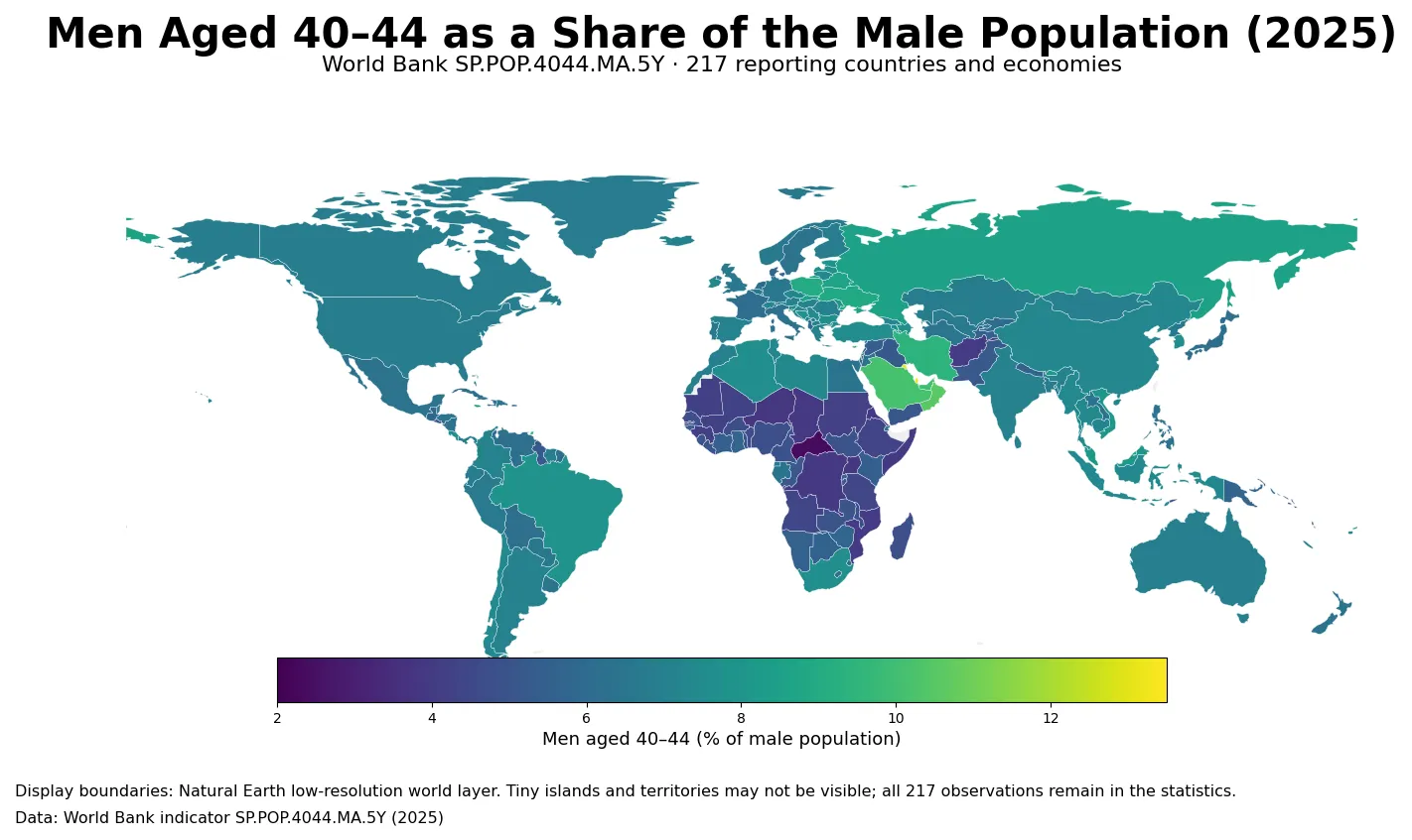
Table of Contents
The map’s strongest signal is a Gulf concentration
The most distinctive cluster is in the Gulf. Qatar and Kuwait are both above 13%, Bahrain is above 12%, and Oman, Saudi Arabia, and the United Arab Emirates are all above 10%. Those values are far beyond the global median and they occur in neighboring economies rather than as a single isolated outlier. The indicator does not decompose the reason for that pattern, but the result is consistent with an age structure in which working-age male cohorts carry unusual weight. Selective migration may be one contributor, alongside cohort size and denominator effects, but the percentage alone cannot assign a causal share to any of them.
At the opposite end, several countries in Sub-Saharan Africa occupy the lowest bands. The Central African Republic is the only observation below 3%, while Uganda, Niger, Chad, the Democratic Republic of the Congo, Eritrea, Somalia, and Mozambique remain below 4%. A large younger male population can mechanically reduce the percentage represented by men in their early forties, even when the number of 40–44-year-old men is substantial. The map therefore describes composition rather than population scale.
The ranking stretches from 2.35% to more than 13%
Across the 217 observations, the maximum is 13.22% in Qatar and the minimum is 2.35% in the Central African Republic. The span between them is about 10.87 percentage points. Seven of the ten highest observations exceed 10%, while most of the lowest ten fall between roughly 3.8% and 4.1%. This wide range shows how differently the same five-year male age band can sit within national population structures.
| Top rank | Country or economy | Share | Bottom rank | Country or economy | Share |
|---|---|---|---|---|---|
| 1 | Qatar | 13.22% | 1 | Central African Republic | 2.35% |
| 2 | Kuwait | 13.17% | 2 | Uganda | 3.80% |
| 3 | Bahrain | 12.06% | 3 | Niger | 3.82% |
| 4 | Maldives | 11.18% | 4 | Chad | 3.85% |
| 5 | Oman | 10.54% | 5 | Congo, Dem. Rep. | 3.88% |
| 6 | Saudi Arabia | 10.11% | 6 | Eritrea | 3.92% |
| 7 | United Arab Emirates | 10.02% | 7 | Somalia, Fed. Rep. | 3.93% |
| 8 | British Virgin Islands | 9.68% | 8 | Mozambique | 3.93% |
| 9 | Turks and Caicos Islands | 9.62% | 9 | Afghanistan | 4.00% |
| 10 | Cayman Islands | 9.47% | 10 | Guinea | 4.07% |
The table should not be interpreted as a ranking of absolute population. The British Virgin Islands, Turks and Caicos Islands, and Cayman Islands can appear near the top because the statistic is a percentage. A much larger country with a lower share can still have many more men aged 40–44. Percentages are best for comparing age structure; headcounts are needed for questions about the number of people, service demand, or labor-market scale.
Most economies are much closer to 6–8% than the extremes suggest
The middle of the distribution is compact. The median is 6.62% and the mean is 6.60%. The first quartile is 5.54% and the third quartile is 7.37%, meaning half of the observations fall within a band only about 1.83 percentage points wide. The similarity of the mean and median also shows that the very high Gulf values do not pull the center of the full dataset dramatically upward.
| Share band | Number of economies | Share of 217 observations |
|---|---|---|
| Below 3% | 1 | 0.5% |
| 3% to under 4% | 8 | 3.7% |
| 4% to under 5% | 25 | 11.5% |
| 5% to under 6% | 40 | 18.4% |
| 6% to under 7% | 62 | 28.6% |
| 7% to under 8% | 55 | 25.3% |
| 8% or more | 26 | 12.0% |
The largest band is 6% to under 7%, with 62 economies. Another 55 lie between 7% and 8%. Together those two bands contain 117 observations, or about 53.9% of the dataset. Only one observation is below 3%, while 26 are at 8% or above. That context is useful when reading the map: the brightest and darkest areas are visually memorable, but more than half of the reporting economies sit in a relatively narrow middle range.
A thick 40–44 cohort can emerge through several demographic routes
One route is cohort size. If births in the early 1980s were large relative to nearby years, that bulge can still be visible four decades later. A second route is migration. Age-selective inflows or outflows can alter the number of men in their early forties and also change the denominator of total male population. A third route is survival: the size of a birth cohort at age zero is not identical to its size at age 40 because mortality accumulates over time. The 2025 percentage captures the outcome of those processes, not their separate contributions.
The denominator can matter just as much as the numerator. Imagine that the number of 40–44-year-old men stays constant while the population of males in their twenties and thirties expands rapidly. The 40–44 share will fall even though the cohort itself did not shrink. The reverse can happen when younger cohorts become smaller. This is why a change in the percentage should not automatically be described as growth or decline in the number of men aged 40–44.
Why this is demographic context, not a labor-market statistic
Ages 40–44 overlap with prime working years in many economies, so the measure can provide useful demographic context for labor-market analysis. It does not, however, report whether anyone is employed, unemployed, looking for work, working full time, or outside the labor force. A country with a high 40–44 male share could still have very different employment outcomes from another country with the same share. Population composition and labor-market participation are separate dimensions.
For workforce planning, the percentage is more informative when paired with the absolute number of men in the age band and with participation or employment rates. For demographic analysis, adjacent five-year groups are especially useful. Looking at ages 35–39, 40–44, and 45–49 together can reveal whether the early-forties group is a sharp local peak, part of a broad middle-aged concentration, or simply one step in a smooth age profile.
Small territories can move more visibly in percentage terms
The 217 rows are not a list of 217 sovereign states. World Bank country series also contain separately reported economies and territories, while regional and income-group aggregates are removed. This is why several small Caribbean territories appear beside large countries in the ranking. Their observations are valid, but a relatively small number of migrants or a single unusually large cohort can change a small population’s percentage more noticeably than it would in a country of tens of millions.
The same distinction matters for the map. Natural Earth’s low-resolution world geometry can visibly represent 170 of the reported economies after ISO3 matching and a few standard code repairs. Tiny islands and territories may be absent or nearly invisible at this scale. They are not dropped from the statistical analysis: every ranking, quartile, range, and band count in this article uses all 217 World Bank observations.
A 2025 cross-section is a cohort snapshot, not a trend
This map freezes one point in time. It does not tell us whether a country’s 40–44 male share is rising, falling, or stable. Five years later, much of today’s 35–39 cohort will move into this age band, so the pattern can change even without a sudden demographic shock. Age-group indicators naturally shift as cohorts move through the life course. Tracking the same economy across several years is therefore the right method for identifying a trend.
It is also a mistake to read the map as a direct reflection of current fertility. The men in this group were born about four decades ago, and their present share has been reshaped by migration, survival, and the sizes of younger and older male cohorts. Current fertility is relevant to future age structures, but it cannot by itself explain the 2025 distribution of men aged 40–44.
Data source and calculation
The analysis uses 2025 observations from the World Bank API for indicator SP.POP.4044.MA.5Y. The World Bank indicator page provides the definition and country-level series. The working set contains 217 countries and economies with a 2025 value; aggregate regions and income groups are excluded. The unit is the percentage of the total male population that is aged 40–44.
No missing observation is converted to zero and no earlier year is substituted. The maximum, minimum, mean, median, quartiles, ranking, and distribution bands are calculated directly from the 217 reported percentages. The display map joins observations to low-resolution world boundaries using ISO3 codes, so cartographic coverage is smaller than statistical coverage for tiny territories.
Frequently Asked Questions
What does a 10% value mean in this indicator?
It means about 10 of every 100 males in that reporting economy are aged 40–44. It is not 10% of the total population or 10% of the labor force.
Does a high 40–44 male share mean a country has a larger workforce?
Not necessarily. The measure describes age composition only. Workforce size also depends on absolute population and labor-force participation.
Why are Gulf economies so prominent in the 2025 map?
Several Gulf economies have unusually high 40–44 male shares in the 2025 data. The indicator itself does not identify the cause; cohort size, selective migration, survival, and denominator effects can all contribute.
Related Maps
Green Map creates custom-edited map images using open geographic data sources such as geoBoundaries, Natural Earth, OpenStreetMap, and government open data.
These maps are edited visual materials, not raw data files, and are provided for education, documents, presentations, and graphic reference.