A five-year age band can reveal a surprisingly clear demographic fingerprint. This analysis compares the share of men aged 50–54 in the total male population for 217 reporting countries and economies in 2025, using World Bank indicator SP.POP.5054.MA.5Y. A value of 6% means that roughly six of every 100 males in that reporting economy are between 50 and 54 years old. It does not mean that 6% of the total population is male and aged 50–54, because the denominator contains males only.
The measure is best read as a cohort-structure indicator. Men who were 50–54 in 2025 were born roughly in the early to mid-1970s, so their current share reflects the size of those birth cohorts as well as survival, migration, and the size of younger and older male cohorts around them. That makes the indicator useful for comparing age profiles, but it should not be treated as a stand-alone measure of population ageing, retirement pressure, longevity, or current fertility.
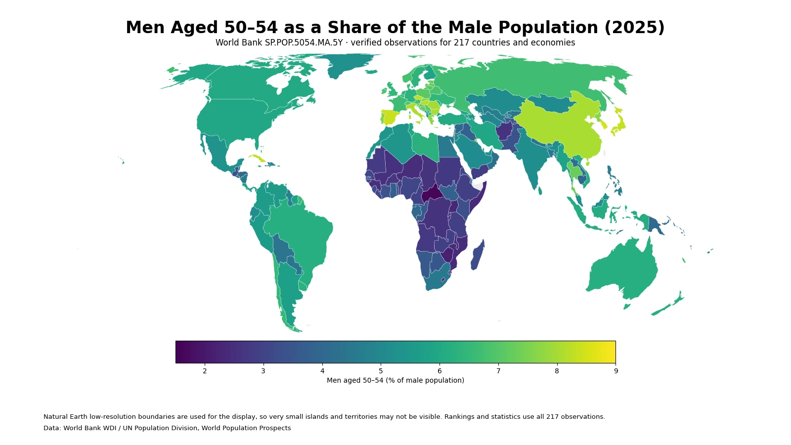
Table of Contents
What stands out on the 2025 map
The broadest contrast is geographic but not uniform. Many European countries occupy the upper part of the scale, and several East Asian economies also show relatively large 50–54 male cohorts. Much of Sub-Saharan Africa falls into lower bands. The Americas are more mixed, with many mainland countries near the middle while some Caribbean economies sit well above it. Asia contains both high and low values, showing why a continental label alone is too coarse to explain any individual country.
The map compares composition, not headcounts. A large country shaded around 6% can contain far more men aged 50–54 than a small territory shaded above 8%. The visual answer is therefore about how thick this five-year cohort is within each male population. For questions about service demand, labor-force size, or the number of people approaching a particular life stage, the percentage should be paired with absolute population counts.
The highest and lowest shares
The observed range is wide. Andorra has the highest 2025 value at 8.92%, while Central African Republic has the lowest at 1.62%. The gap between them is about 7.29 percentage points. The upper end includes microstates, island economies, and larger countries, whereas the lower end is dominated by African countries with much younger male age structures. This is a ranking of cohort shares, not a ranking of demographic performance.
| High rank | Country or economy | Share | Low rank | Country or economy | Share |
|---|---|---|---|---|---|
| 1 | Andorra | 8.92% | 1 | Central African Republic | 1.62% |
| 2 | Turks and Caicos Islands | 8.63% | 2 | Zimbabwe | 2.20% |
| 3 | San Marino | 8.56% | 3 | Uganda | 2.33% |
| 4 | Cayman Islands | 8.56% | 4 | Somalia, Fed. Rep. | 2.37% |
| 5 | Korea, Rep. | 8.49% | 5 | Mozambique | 2.44% |
| 6 | Spain | 8.41% | 6 | Burundi | 2.45% |
| 7 | Northern Mariana Islands | 8.37% | 7 | Niger | 2.46% |
| 8 | Japan | 8.33% | 8 | Guinea | 2.51% |
| 9 | Palau | 8.32% | 9 | Malawi | 2.51% |
| 10 | Cuba | 8.27% | 10 | Mali | 2.53% |
Small populations deserve special caution. In a territory with a limited population base, migration or an unusually large birth cohort can move a percentage more visibly than it would in a country with tens of millions of residents. That does not make the statistic invalid; it changes what the percentage can reasonably tell us. Comparing the share is appropriate, but translating it into infrastructure demand or labor-market scale requires an absolute headcount as well.
How unusual are the extremes?
The median across all 217 observations is 5.58%. The first quartile is 3.99% and the third quartile is 6.67%, so the middle half of reporting economies lies within a band of about 3.99% to 6.67%. This context matters because the maximum and minimum alone can make the distribution appear more polarized than it is. Most reporting economies are neither near 9% nor near 2%; they cluster in the broad middle.
| Share band | Number of economies | Share of 217 observations |
|---|---|---|
| Below 3% | 26 | 12.0% |
| 3% to under 4% | 30 | 13.8% |
| 4% to under 5% | 33 | 15.2% |
| 5% to under 6% | 37 | 17.1% |
| 6% to under 7% | 52 | 24.0% |
| 7% to under 8% | 23 | 10.6% |
| 8% or more | 16 | 7.4% |
The largest single band is 6% to under 7%, containing 52 reporting economies, or 24.0% of the dataset. Another 37 fall between 5% and 6%. At the tails, 26 observations are below 3%, while 16 are at 8% or more. In other words, extreme-looking places on the map are informative, but the typical 2025 observation is much closer to the 5–7% zone.
Why the 50–54 male share differs across countries
The first mechanism is cohort size. The men represented here were born approximately between 1971 and 1975. If births in those years were large relative to nearby cohorts, that bulge can remain visible half a century later. If those birth cohorts were small, or if later cohorts expanded rapidly, the 50–54 share can be lower. This time lag is why present-day birth rates cannot, by themselves, explain the 2025 pattern.
Migration is another important channel, particularly where working-age migration is strongly age- and sex-selective. Inflows or outflows can change both the numerator—the number of men aged 50–54—and the denominator—the total male population. Survival patterns also matter because a cohort must live to age 50 before it can appear in this band. The indicator, however, records the resulting age composition; it does not identify how much of a country’s value is attributable to fertility history, migration, mortality, or other demographic processes.
A denominator effect can be equally powerful. Two countries could have similar numbers of men aged 50–54, yet the country with a much larger population of younger males would show a lower percentage. Conversely, a shrinking or relatively small younger male population can push the 50–54 cohort’s share upward even if the number of 50–54-year-olds is not especially large. This is why percentages and absolute counts answer different questions.
What this indicator can—and cannot—tell you
The indicator is useful for comparing the internal age structure of male populations on a common scale. It can show where a specific midlife cohort is unusually thick or thin and can serve as one piece of a broader population profile. When neighboring five-year age groups are examined together, the sequence can reveal whether a country has a broad middle-aged bulge, a sharp cohort peak, or a smoother distribution across ages.
It cannot independently measure how old a society is. A country might have a high 50–54 share but a very different share at age 65 and above. It also excludes women, so it is not a full population-age indicator. A single 2025 cross-section cannot tell whether the cohort share is rising or falling; that requires comparable observations over time. Finally, the ordering should not be interpreted as better or worse. It describes demographic structure, not policy quality or social outcomes.
Reading microstates and territories in the same dataset
The 217 rows should not be read as a count of sovereign states. World Bank country series include separately reported economies and territories, while regional aggregates and income-group totals have been removed from this comparison. That is why places such as the Turks and Caicos Islands, the Cayman Islands, the Northern Mariana Islands, and Palau can appear alongside much larger countries. Their inclusion is useful for complete indicator coverage, but scale should remain part of the interpretation.
The display map uses low-resolution world boundaries, so some tiny islands and territories cannot be drawn clearly at a global scale even though their data are present. The ranking table, quartiles, range, and band counts are calculated from all 217 values. This distinction prevents a cartographic limitation from becoming a data omission: the map is the visual summary, while the tables preserve the full reporting set.
A useful way to interpret the 2025 snapshot
Start with the median of 5.58%, because it provides a reference point for every country without implying that the mean structure is desirable. Next, look at the map for broad clusters and neighboring contrasts. Then check the distribution table to see whether a value is genuinely unusual or merely a little above the middle. Finally, remember the cohort timing: this 2025 measure is partly a record of the population born in the early and mid-1970s, filtered through five decades of survival and migration.
The indicator becomes more informative when adjacent age bands are viewed together. Comparing ages 45–49, 50–54, and 55–59 can show whether the 50–54 group is a local peak or part of a wider middle-aged concentration. That approach is more robust than using one band to make claims about ageing or labor supply. The map here is therefore best understood as one carefully defined slice of the population structure rather than a complete demographic diagnosis.
Data source and calculation
The 2025 values come from the World Bank API for indicator SP.POP.5054.MA.5Y. The World Bank indicator page identifies the underlying source as World Population Prospects from the UN Population Division. This analysis uses 217 reporting countries and economies and excludes aggregate group rows.
No missing value is replaced with zero and no value is imputed from another year. The maximum, minimum, median, quartiles, range, and distribution bands are calculated directly from the 217 reported percentages. Country matching for the map uses ISO3 codes; very small geographic units that do not render clearly in the low-resolution boundary layer remain represented in the statistical calculations.
Frequently Asked Questions
What does a value of 8% mean in this indicator?
It means about eight of every 100 males in that reporting economy are aged 50–54. The denominator is the male population, not the total population.
Does a high 50–54 share mean a country is more aged overall?
Not necessarily. This is one five-year cohort. A broader ageing assessment needs older-age shares, neighboring cohorts, and other demographic indicators.
Why are some small islands and territories hard to see on the map?
The global display uses low-resolution boundaries, so tiny geographic units may not be visible. Their observations are still included in all rankings and summary statistics.
Related Maps
Green Map creates custom-edited map images using open geographic data sources such as geoBoundaries, Natural Earth, OpenStreetMap, and government open data.
These maps are edited visual materials, not raw data files, and are provided for education, documents, presentations, and graphic reference.