Energy expenditures took up very different shares of state economies in 2024. In the U.S. Energy Information Administration (EIA) State Energy Data System, Alaska recorded the highest energy-expenditure-to-current-dollar-GDP ratio at 11.65%. Wyoming followed at 10.75% and Louisiana at 10.21%. At the other end, the District of Columbia was 1.41%, New York 3.09%, and Washington 3.61%. The distance between the highest and lowest observations is 10.24 percentage points, large enough that a national average alone would conceal much of the geographic pattern.
The indicator is officially “Energy expenditures as percent of current-dollar GDP.” It is a ratio between energy spending recorded for a jurisdiction and the size of that jurisdiction’s economy in the same year. It is not an electricity-price index, a household energy-burden measure, or a ranking of energy efficiency. A high ratio can reflect the numerator, the GDP denominator, or both, so the safest first question is where energy spending is large relative to the local economy—not why it is large.
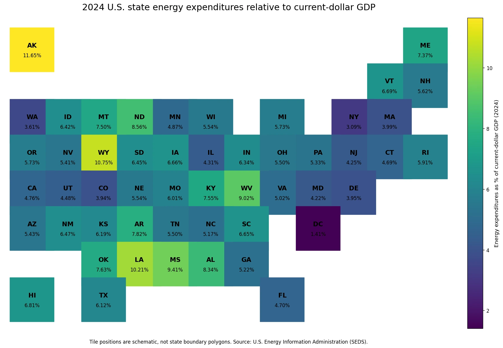
Table of Contents
Alaska, Wyoming, and Louisiana were the only jurisdictions above 10%
Only three of the 51 observations exceeded 10%: Alaska at 11.65%, Wyoming at 10.75%, and Louisiana at 10.21%. Mississippi was next at 9.41%, followed by West Virginia at 9.02%, North Dakota at 8.56%, and Alabama at 8.34%. The upper end is geographically mixed. It includes the noncontiguous North, the Mountain West, the Gulf Coast, Appalachia, and the northern Plains rather than one continuous high-value region.
That distribution should not be converted into a single causal story. The EIA series does not contain state industry mix, population, fuel prices, weather, household income, or sector-specific consumption. Those variables could help explain the ratio, but they are not evidence contained in this dataset. The defensible conclusion is narrower: energy spending represented a substantially larger fraction of current-dollar GDP in these jurisdictions in 2024 than in most of the country.
| Rank | State / jurisdiction | 2024 share |
|---|---|---|
| 1 | Alaska | 11.65% |
| 2 | Wyoming | 10.75% |
| 3 | Louisiana | 10.21% |
| 4 | Mississippi | 9.41% |
| 5 | West Virginia | 9.02% |
| 6 | North Dakota | 8.56% |
| 7 | Alabama | 8.34% |
| 8 | Arkansas | 7.82% |
| 9 | Oklahoma | 7.63% |
| 10 | Kentucky | 7.55% |
The lowest ratios were concentrated in D.C. and several Northeast and Western jurisdictions
The District of Columbia had the smallest observation at 1.41%. New York was 3.09%, Washington 3.61%, Colorado 3.94%, Delaware 3.95%, and Massachusetts 3.99%. Those are the six observations below 4%. New Jersey at 4.25%, Illinois at 4.31%, Utah at 4.48%, Connecticut at 4.69%, Florida at 4.70%, and California at 4.76% also sat below the 5.73% median.
A low ratio does not automatically mean cheap energy. A large GDP denominator can push the ratio down even when a jurisdiction spends a large absolute amount on energy. Conversely, a smaller economy can record a high percentage without having the country’s largest dollar expenditure. This is why the indicator is useful for comparing the economic weight of energy spending but cannot replace measures such as retail electricity prices, household bills, per-capita consumption, or total energy expenditures in dollars.
| Lowest rank | State / jurisdiction | 2024 share |
|---|---|---|
| 1 | District of Columbia | 1.41% |
| 2 | New York | 3.09% |
| 3 | Washington | 3.61% |
| 4 | Colorado | 3.94% |
| 5 | Delaware | 3.95% |
| 6 | Massachusetts | 3.99% |
| 7 | Maryland | 4.22% |
| 8 | New Jersey | 4.25% |
| 9 | Illinois | 4.31% |
| 10 | Utah | 4.48% |
Several neighboring jurisdictions show large percentage-point gaps
The schematic map also reveals abrupt differences across some neighboring states. Wyoming at 10.75% was 6.81 percentage points above Colorado at 3.94% and 6.27 points above Utah at 4.48%. Louisiana at 10.21% was 4.09 points above Texas at 6.12%. West Virginia at 9.02% was 4.00 points above Virginia at 5.02%, while North Dakota at 8.56% was 3.69 points above Minnesota at 4.87%. These are some of the most visually useful contrasts because national or regional averages would smooth them away.
The gaps do not prove that crossing a state line changes energy prices or efficiency by the same amount. The metric combines spending with current-dollar GDP, and state economies can differ sharply in their industrial structure and output even when they are adjacent. Neighbor comparisons are therefore a way to locate where the ratio changes; explaining the change would require additional variables measured on compatible geography and time periods.
The median was 5.73%, while the simple mean was about 6.07%
Across all 51 jurisdictions, the unweighted mean was approximately 6.07% and the median was 5.73%. The mean is modestly higher because the values near 9% to 12% lift the upper tail. Using linear-interpolated quartiles, the first quartile was about 4.82% and the third quartile 6.75%, so the middle half of observations fell within a fairly compact band even though the full range was much wider.
Twenty-three jurisdictions were at or above 6%, 12 were at or above 7%, seven were at or above 8%, and five were at or above 9%. Fourteen were below 5%. This distribution is not dominated by one extreme group; many states sit around the middle, while a smaller set stretches the upper end. That is why both the map and the distribution statistics are more informative than reporting a single U.S. state average.
How to interpret the ratio without overreading it
- A higher percentage is not the same as a higher energy price. Both total energy expenditures and GDP affect the result.
- The series is not a household affordability measure. It compares energy expenditures with the size of a jurisdiction’s economy.
- The percentage ranking can differ from a ranking of total energy expenditures in dollars.
- The dataset is a 2024 cross-section. It does not establish whether a state’s position has improved or worsened over time.
- This EIA series contains the ratio, not the causal variables needed to attribute differences to policy, climate, industry, or fuel mix.
The best use of the map is therefore to identify where energy spending carried a larger or smaller economic weight in 2024. A deeper explanation would require joining this series to compatible EIA price and consumption measures, BEA state GDP components, and population or household data. Those additions could separate scale, sector mix, and energy-use effects, but they should not be inferred from this one ratio alone.
Data source and calculation method
The statistical source is the U.S. Energy Information Administration State Energy Data System (SEDS) bulk dataset. The selected series is “Energy expenditures as percent of current-dollar GDP,” the year is fixed at 2024, and the published unit is Percent. The 2024 series contains one numeric observation for each of the 50 states plus the District of Columbia, for 51 observations in total. No observation is missing. Rankings, the mean, median, quartiles, band counts, and percentage-point gaps were calculated directly from those 51 values.
The representative map is a state-code tile grid rather than a boundary polygon map. Every code is matched once, and no missing value was converted to zero or replaced with another year. Tile positions are intentionally schematic, so their area and outline have no quantitative meaning. The color and printed percentages are used only to compare the supplied 2024 EIA observations consistently across jurisdictions.
Frequently Asked Questions
Which jurisdiction had the highest energy expenditures as a share of GDP in 2024?
Alaska ranked highest at 11.65%, followed by Wyoming at 10.75% and Louisiana at 10.21%.
Does a high ratio mean energy prices are high?
No. The ratio compares energy expenditures with current-dollar GDP, so spending levels and the size of the state economy both affect it.
What was the median across the 50 states and D.C. in 2024?
The median of the 51 observations was 5.73%, while the simple unweighted mean was about 6.07%.
Why is the District of Columbia included with the states?
The EIA SEDS series provides D.C. alongside the 50 states for the same 2024 metric, producing 51 comparable jurisdiction-level observations.
Related Articles
- Where Is U.S. Industrial and Commercial Electricity Generation Concentrated? (2024)
- Where U.S. Power-Sector SO₂ Emissions from EIA’s ‘Other’ Fuel Category Were Highest in 2024
- Where Petroleum-Related U.S. Power-Sector NOx Emissions Were Concentrated in 2024
Green Map creates custom-edited map images using open geographic data sources such as geoBoundaries, Natural Earth, OpenStreetMap, and government open data.
These maps are edited visual materials, not raw data files, and are provided for education, documents, presentations, and graphic reference.