A single “dependency ratio” can hide two very different demographic stories. World Bank indicator SP.POP.DPND, Age dependency ratio (% of working-age population), adds the population ages 0–14 and 65+ and compares that total with people ages 15–64. A value of 60 therefore means that there are 60 people in the two outer age groups combined for every 100 people ages 15–64. It is a demographic age-structure measure, not a count of people receiving financial support.
The validated dataset supplied for this article contains 217 countries and separately reported areas, all dated 2025. That common year matters because no older “latest observation” is being placed beside a newer one. The map, distribution counts, summary statistics, and rankings below all use the same 217-row 2025 table.
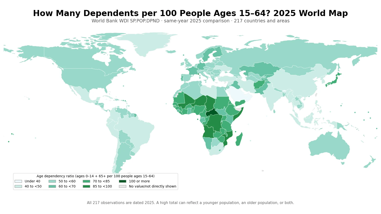
Table of Contents
What the 2025 distribution looks like
Treating every country or area row equally, the simple mean is 57.4 dependents per 100 people ages 15–64 and the median is 55.1. The first quartile is 48.1, the third quartile is 65.5, the minimum is 20.0, and the maximum is 103.6. These are summaries of the country-level ratios, not population-weighted estimates for the world as one combined population.
The median of about 55 is easiest to interpret as a split of the country rows: half of the observations are below roughly 55 people ages 0–14 and 65+ combined per 100 people ages 15–64, and half are above. A ratio of 100 would mean that the combined outer age groups equal the size of the 15–64 group. The denominator is not total population, so a ratio of 55 must not be restated as “55% of everyone in the country.”
| 2025 age dependency ratio band | Countries and areas |
|---|---|
| Under 40 | 17 |
| 40 to below 50 | 47 |
| 50 to below 60 | 80 |
| 60 to below 70 | 32 |
| 70 to below 85 | 31 |
| 85 to below 100 | 9 |
| 100 or more | 1 |
The largest band is 50 to below 60, with 80 observations. Another 47 fall between 40 and 50. There are 41 observations at 70 or higher and 17 below 40. The darker map classes show where the combined size of children and older people is larger relative to the 15–64 population, but the map does not reveal which of those two age groups is responsible.
The highest ratios do not form a simple aging ranking
The Central African Republic has the highest 2025 observation at 103.6, followed by Monaco at 99.1, Somalia at 96.7, the Democratic Republic of the Congo at 96.2, and Niger at 95.5. Those countries do not represent one common demographic type. Because SP.POP.DPND combines ages 0–14 with ages 65+, a high value can emerge from a relatively large child population, a relatively large older population, or a mixture of the two.
| Highest 2025 ratios | Per 100 people ages 15–64 |
|---|---|
| Central African Republic | 103.6 |
| Monaco | 99.1 |
| Somalia, Fed. Rep. | 96.7 |
| Congo, Dem. Rep. | 96.2 |
| Niger | 95.5 |
| Mali | 92.9 |
| Chad | 92.6 |
| Angola | 88.7 |
| Mozambique | 88.3 |
| Burundi | 87.0 |
At the low end, Qatar is 20.0, the United Arab Emirates 21.6, Kuwait 26.8, and Bahrain 28.9. These values mean that the 15–64 population is large relative to the combined outer age groups. They do not prove that households face little financial dependency, that social spending is low, or that labor markets are stronger. Those are separate questions requiring different data.
| Lowest 2025 ratios | Per 100 people ages 15–64 |
|---|---|
| Qatar | 20.0 |
| United Arab Emirates | 21.6 |
| Kuwait | 26.8 |
| Bahrain | 28.9 |
| Maldives | 31.6 |
| British Virgin Islands | 31.9 |
| Cayman Islands | 34.4 |
| Singapore | 35.0 |
| Saudi Arabia | 36.4 |
| Jamaica | 36.7 |
How Korea and other major countries compare
Korea is 44.0, below the 217-row median of 55.1. Japan is 70.2, the United States 55.0, Germany 60.2, and France 63.3. China is 43.5, India 46.1, Brazil 44.6, and Nigeria 77.3. The totals should not be used to infer that countries with similar ratios have similar age profiles. Korea and another country can have nearly the same total even if their shares of children and older people differ substantially.
| Country or area | 2025 age dependency ratio |
|---|---|
| Korea, Rep. | 44.0 |
| Japan | 70.2 |
| China | 43.5 |
| United States | 55.0 |
| Canada | 54.4 |
| Australia | 55.7 |
| Germany | 60.2 |
| France | 63.3 |
| United Kingdom | 57.9 |
| Italy | 58.1 |
| Spain | 52.1 |
| India | 46.1 |
| Indonesia | 46.6 |
| Brazil | 44.6 |
| Mexico | 48.4 |
| Nigeria | 77.3 |
| South Africa | 48.4 |
| Russian Federation | 53.4 |
| Singapore | 35.0 |
| United Arab Emirates | 21.6 |
| Qatar | 20.0 |
This is why a total dependency map can place a highly aged country and a very youthful country in the same broad color class. It captures the combined weight of the two outer age groups against ages 15–64; it is deliberately not a decomposition. For questions about aging specifically, the old-age dependency ratio is the more direct measure. For questions about the child population, the young-age component should be examined separately.
Total, old-age, and young-age dependency answer different questions
SP.POP.DPND is the total age dependency ratio. The World Bank also publishes an old-age dependency ratio that uses only the population age 65+ in the numerator, while the young-age component uses the population ages 0–14. Splitting the total matters because the policy implications are different. A larger child population may be more directly associated with schooling, childcare, and future labor-force entry; a larger older population raises different questions around retirement, health, and longevity.
The total ratio is therefore useful as a first map of age structure, but it should be followed by the two components whenever the goal is to explain why a country is high or low. The 2025 map can identify where the combined ratio is elevated; it cannot by itself identify fertility, mortality, migration, or longevity as the cause.
Why this is not an economic dependency ratio
The phrase “working-age population” is statistical shorthand for the 15–64 age interval in this indicator. It is not the employed population. Some people ages 15–64 are students, unemployed, or outside the labor force, and some people age 65+ continue to work. Likewise, children and older people are not assumed to receive all of their resources from a specific working-age person. The ratio therefore cannot be converted into “dependents per worker” or a tax burden without additional labor-market and fiscal information.
A fuller analysis of economic pressure would need employment, labor-force participation, household income, pension coverage and benefits, education and health spending, migration, and possibly population projections. SP.POP.DPND contributes one synchronized demographic input to that larger analysis. Its strength here is that the supplied 2025 observations are on a common definition and a common year.
Source and map construction
The statistical source is World Bank WDI SP.POP.DPND. World Bank documentation describes the numerator as people younger than 15 or older than 64 and the denominator as the population ages 15–64, with the result shown per 100 working-age people. The cleaned research file in this package was collected from the World Bank API and filtered to real country and area rows with non-empty observations; all 217 retained rows are dated 2025.
For the visualization, ISO3 codes were joined to a low-resolution Natural Earth boundary layer. Values were matched directly to 170 polygons, and 47 small or separately reported areas without a suitable standalone polygon were added as points, leaving no validated row unrepresented. All rankings and summary statistics are calculated from the 217-row cleaned CSV, not from only the polygons visible at this map scale.
Frequently Asked Questions
What does an age dependency ratio of 44 mean?
It means there are about 44 people ages 0–14 plus 65+ for every 100 people ages 15–64. It does not mean 44% of the total population.
What is Korea’s 2025 age dependency ratio?
The validated World Bank SP.POP.DPND value for Korea is 44.0, or about 44.0 people ages 0–14 plus 65+ per 100 people ages 15–64.
Does a high total dependency ratio always mean an older population?
No. The numerator combines children and older people, so a high value can be driven by a young age structure, an old age structure, or both. The old-age component must be checked separately for aging comparisons.
Are all 217 observations on this map from 2025?
Yes. Every retained country and area observation in the validated cleaned CSV is dated 2025.
Related Articles
- Global Population Growth Map – 2025 Country Comparison
- Global Urban Population Growth Map – 2025 Country Comparison
- Global Rural Population Growth Map – 2025 Country Comparison
Green Map creates custom-edited map images using open geographic data sources such as geoBoundaries, Natural Earth, OpenStreetMap, and government open data.
These maps are edited visual materials, not raw data files, and are provided for education, documents, presentations, and graphic reference.