A global map of national employment-to-population ratios looks simple until the date column is examined. World Bank indicator SL.EMP.TOTL.SP.NE.ZS reports national estimates of employed persons as a share of the population ages 15 and older, sourced from the ILO Labour Force Statistics database. The supplied table contains a latest non-null observation for 209 economies, but those observations span 1983 through 2025. Only 70 rows—33.5% of the total—are dated 2025. This is therefore a latest-national-estimate map, not a synchronized 2025 ranking.
That distinction is the reason this national-estimate series deserves a separate article from the modeled ILO series. National observations are useful when the question is what a country’s official labor-statistics system most recently reported. They can also preserve country-specific survey practices that matter domestically. The trade-off is weaker comparability across countries and much more uneven reference-year coverage. The World Bank metadata explicitly notes that definitions, age coverage, treatment of worker groups, armed-forces coverage, and survey frequency can all affect cross-country comparisons.
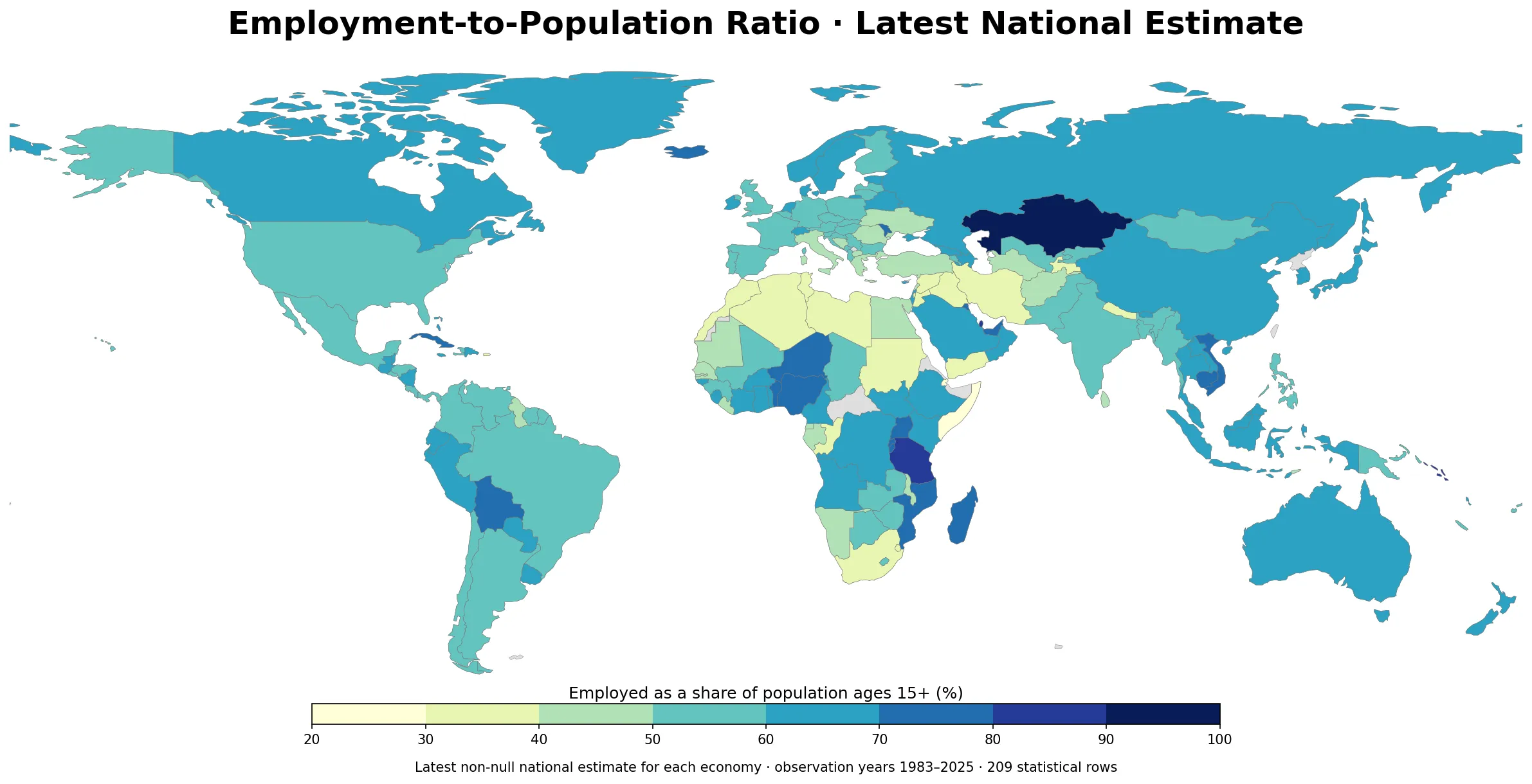
Table of Contents
A value map without the reference year can be misleading
Several economies with high latest values are based on recent observations: Qatar is 87.9% in 2024, Tanzania 83.2% in 2024, the United Arab Emirates 79.8% in 2024, and Nigeria 78.7% in 2024. South Korea is 63.1% in 2025, the United States 59.7% in 2025, Japan 62.2% in 2025, and Germany 59.3% in 2025. But China’s latest national-estimate row in this dataset is 67.4% from 2019, while Indonesia’s is 65.7% from 2023. Placing those numbers in one ranked list would disguise a large timing difference.
Some older or unusually high observations make the problem even clearer. Kazakhstan has a 95.1% national-estimate value dated 2022. Equatorial Guinea’s latest row is from 1983. Gibraltar and the British Virgin Islands are dated 1991, and Turkmenistan 1999. A latest-value map can still be informative because it shows the geographic coverage of reported national data, but an extreme color should trigger a metadata check rather than a conclusion about labor-market performance.
| Economy | Latest year | Employment-to-population ratio, ages 15+ |
|---|---|---|
| Qatar | 2024 | 87.9% |
| United Arab Emirates | 2024 | 79.8% |
| Tanzania | 2024 | 83.2% |
| Nigeria | 2024 | 78.7% |
| Kazakhstan | 2022 | 95.1% |
| China | 2019 | 67.3% |
| Indonesia | 2023 | 65.7% |
| South Africa | 2024 | 37.6% |
| Korea, Rep. | 2025 | 63.1% |
| United States | 2025 | 59.7% |
| Japan | 2025 | 62.2% |
| Germany | 2025 | 59.3% |
| France | 2025 | 52.7% |
| India | 2025 | 52.8% |
| Italy | 2025 | 46.8% |
| Djibouti | 2025 | 27.9% |
The reference-year map shows where “latest” is actually recent
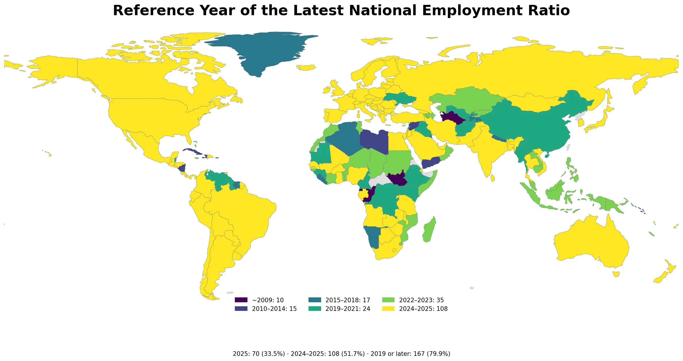
Only 108 of the 209 latest observations are from 2024 or 2025, equal to 51.7%. Expanding the window to 2019 or later raises coverage to 167 economies (79.9%). That still leaves 42 latest rows dated 2018 or earlier. For a subject as cyclical and policy-sensitive as employment, these timing gaps are large enough to change the meaning of a cross-country comparison.
Reference-year variation is not merely a freshness label. Labor-force surveys can be redesigned, statistical standards can change, and the mix of monthly, quarterly, or less frequent collections can alter an annual average. The World Bank notes that seasonality alone can create differences when one country has a full year of observations and another relies on a smaller set of survey periods. The reference-year map is therefore part of the substantive answer, not a technical footnote.
A same-year 2025 subset exists, but it covers only 70 economies
Filtering to 2025 produces a cleaner time comparison but sharply reduces coverage. The 2025 subset contains 70 economies, with a median of 59.3% and a simple unweighted mean of 58.5%. The mean gives each economy one equal observation; it is not a population-weighted global employment ratio. More importantly, 70 economies represent only about one third of the latest-value table, so a “global 2025 national-estimate ranking” would have substantial geographic gaps.
Within that 2025 subset, Rwanda is 72.7%, Iceland 72.3%, and Moldova 71.4%. South Korea is 63.1%, Canada 60.8%, the United States 59.7%, Germany 59.3%, Brazil 59.5%, Mexico 58.8%, India 52.8%, France 52.7%, Spain 52.1%, and Italy 46.8%. Djibouti is 27.9% and West Bank and Gaza 32.5%. Keeping one reference year removes the time mismatch, but it does not eliminate national differences in concepts and data collection.
| Economy | Year | Employment-to-population ratio |
|---|---|---|
| Rwanda | 2025 | 72.7% |
| Iceland | 2025 | 72.3% |
| Moldova | 2025 | 71.4% |
| Australia | 2025 | 64.1% |
| Korea, Rep. | 2025 | 63.1% |
| Canada | 2025 | 60.8% |
| United States | 2025 | 59.7% |
| Germany | 2025 | 59.3% |
| Mexico | 2025 | 58.8% |
| Brazil | 2025 | 59.5% |
| India | 2025 | 52.8% |
| France | 2025 | 52.7% |
| Spain | 2025 | 52.1% |
| Italy | 2025 | 46.8% |
| Djibouti | 2025 | 27.9% |
| West Bank and Gaza | 2025 | 32.5% |
National estimates and modeled ILO estimates answer different data needs
World Development Indicators publishes two closely named series. The one used here, SL.EMP.TOTL.SP.NE.ZS, is the national estimate sourced from the ILO Labour Force Statistics database. The related SL.EMP.TOTL.SP.ZS series is the modeled ILO estimate. The modeled database combines nationally reported information with imputation and harmonization intended to support broad regional and global comparisons with more consistent country coverage.
Neither series should be treated as a corrected version of the other. National estimates are closer to the country-reported statistical record, which can be important for domestic policy context. Modeled estimates aim for broader comparability and coverage, which can make them more suitable for a same-year world map. The World Bank metadata specifically cautions users when comparing national and ILO estimates. Subtracting one from the other without a country-by-country investigation of methods, source periods, and revisions would create a number with no clear statistical meaning.
A practical rule is to choose the series that matches the question. Use the national estimate when you need the latest value reported through national labor-statistics systems and are prepared to read the reference year and metadata. Use the modeled series when you need a harmonized international comparison with broader same-year coverage. In both cases, the indicator name, source type, and year belong in the title, table, or caption.
Employment-to-population ratio is not a renamed unemployment rate
The employment-to-population ratio divides the number of employed persons by the working-age population. In this WDI series the unit is percent of the population ages 15 and older. The unemployment rate uses the labor force as its denominator, while the labor-force participation rate divides the labor force—employed plus unemployed—by the working-age population. These measures are related, but they answer different questions.
An economy can have relatively low unemployment and still have a modest employment-to-population ratio if a large share of adults are outside the labor force. Likewise, a high employment ratio does not guarantee high wages, adequate hours, job security, formal employment, strong social protection, or high productivity. ILO guidance treats the ratio as an important headline labor-market measure that must be complemented by other indicators when assessing decent work.
Why national ratios are not perfectly comparable across borders
The first issue is age coverage. Ages 15 and older are generally used as the working-age population for international presentation, but national systems can apply different lower or upper bounds. The second issue is the definition and coverage of employment. International standards include people who worked for pay or profit during a short reference period and people temporarily absent from a job, but national treatment of contributing family workers, own-account workers, military personnel, and other groups can differ.
The third issue is collection frequency. A ratio based on twelve monthly observations can differ from an annual figure constructed from four quarters or a shorter survey period, even when the underlying labor market is similar, because seasonality is real. The fourth issue is statistical revision. Countries may adopt updated ILO standards or redesign household surveys, which can create breaks in a time series. These are reasons to compare broad patterns cautiously rather than interpret one- or two-percentage-point differences as precise rankings.
What this map is good for
The strongest use is a two-step lookup. First, identify an economy’s latest national estimate on the value map. Second, check the reference-year map before comparing it with another country. If the years are far apart, the correct next step is not to calculate a ranking gap but to retrieve a closer common year or inspect the country’s underlying labor-force survey.
The map is also useful for identifying data-quality questions. A very old latest year, an extreme ratio, or a sharp difference from neighboring economies can be a reason to inspect ILOSTAT metadata or a national statistical office release. Those patterns can guide research, but the map itself cannot establish why employment is high or low. Demographics, education, migration, informality, sector structure, economic conditions, and policy can all matter, and none is isolated by this single ratio.
Finally, the ratio works best alongside genuinely different labor-market measures. A global unemployment map answers how much of the labor force is without work under its indicator framework. A county employment-growth map answers how covered employment changed over time in local areas. An employment-to-population map answers how much of the adult population is employed. Treating these as separate questions produces a clearer labor-market picture than forcing them into one “jobs score.”
Data source and mapping method
The statistical source is the World Bank World Development Indicators series Employment to population ratio, 15+, total (%) (national estimate), code SL.EMP.TOTL.SP.NE.ZS. The World Bank identifies the International Labour Organization Labour Force Statistics database as the source. The unit is percent of the population ages 15+ and the periodicity is annual.
Definitions and limitations were checked against the ILOSTAT Labour Force Statistics methodology and the World Bank metadata. The value map uses the latest non-null row for each of the 209 statistical economies in the supplied table. Country codes are joined to a low-resolution world boundary layer. Some small islands and special statistical areas may have a valid statistical row but no matching polygon at this scale, so an unmapped area is not automatically evidence of missing data.
The 2025 mean and median are computed only from the 70 rows dated 2025 and are unweighted across economies. The overall latest-value mean and median are deliberately not presented as a current world statistic because their reference years differ. The modeled comparison series is documented separately by the World Bank as SL.EMP.TOTL.SP.ZS; no national-estimate values were replaced, harmonized, or imputed in this article.
Frequently Asked Questions
Is this a 2025 global ranking of employment-to-population ratios?
No. It maps the latest national estimate for 209 economies, and the reference years range from 1983 to 2025. Only 70 observations are dated 2025.
How is the national estimate different from the modeled ILO estimate?
The national-estimate series is sourced from ILO Labour Force Statistics and reflects nationally reported statistics. The modeled ILO series uses a separate modeled database designed for broader and more consistent international coverage, including imputation where needed.
Does a higher employment-to-population ratio mean a better labor market?
Not by itself. The ratio measures the share of the population ages 15+ that is employed. It does not directly measure wages, hours, job security, informality, social protection, or other dimensions of job quality.
What is the safest way to compare countries on this map?
Check the reference year first and prefer comparisons among economies with the same or similar periods and compatible statistical definitions. Broad differences are more defensible than precise rankings based on small gaps.
Related Articles
These Green Map pages cover closely related labor-market and official-statistics questions. They are useful for separating employment share, unemployment, employment growth, and the selection of local indicators rather than treating them as interchangeable measures.
- Global Unemployment Rate Map – Country Patterns in 2025
- U.S. County Employment Growth Map – 2025 QCEW
- ONS Explore Local Indicators Guide – UK Local Statistics
Green Map creates custom-edited map images using open geographic data sources such as geoBoundaries, Natural Earth, OpenStreetMap, and government open data.
These maps are edited visual materials, not raw data files, and are provided for education, documents, presentations, and graphic reference.