County commute times vary enough across the United States that a single national number hides much of the local picture. Using the U.S. Census Bureau 2024 American Community Survey (ACS) 5-year Subject Table S0801, the median of the 3,136 county and county-equivalent estimates eligible for ranking is 24.1 minutes. The metric is the mean travel time to work for workers age 16 and over who did not work from home; it is not a round-trip commute and it does not assign remote workers a commute of zero.
That definition matters. A county with a large work-from-home share can have a very different “mean among people who traveled to work” from an all-worker average. The map and tables use the official average commute-time estimate and retain the published 90% margin of error so that small-area estimates are not treated as equally precise.
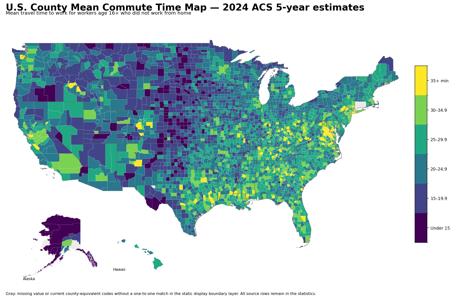
Table of Contents
The middle county-level estimate is 24.1 minutes
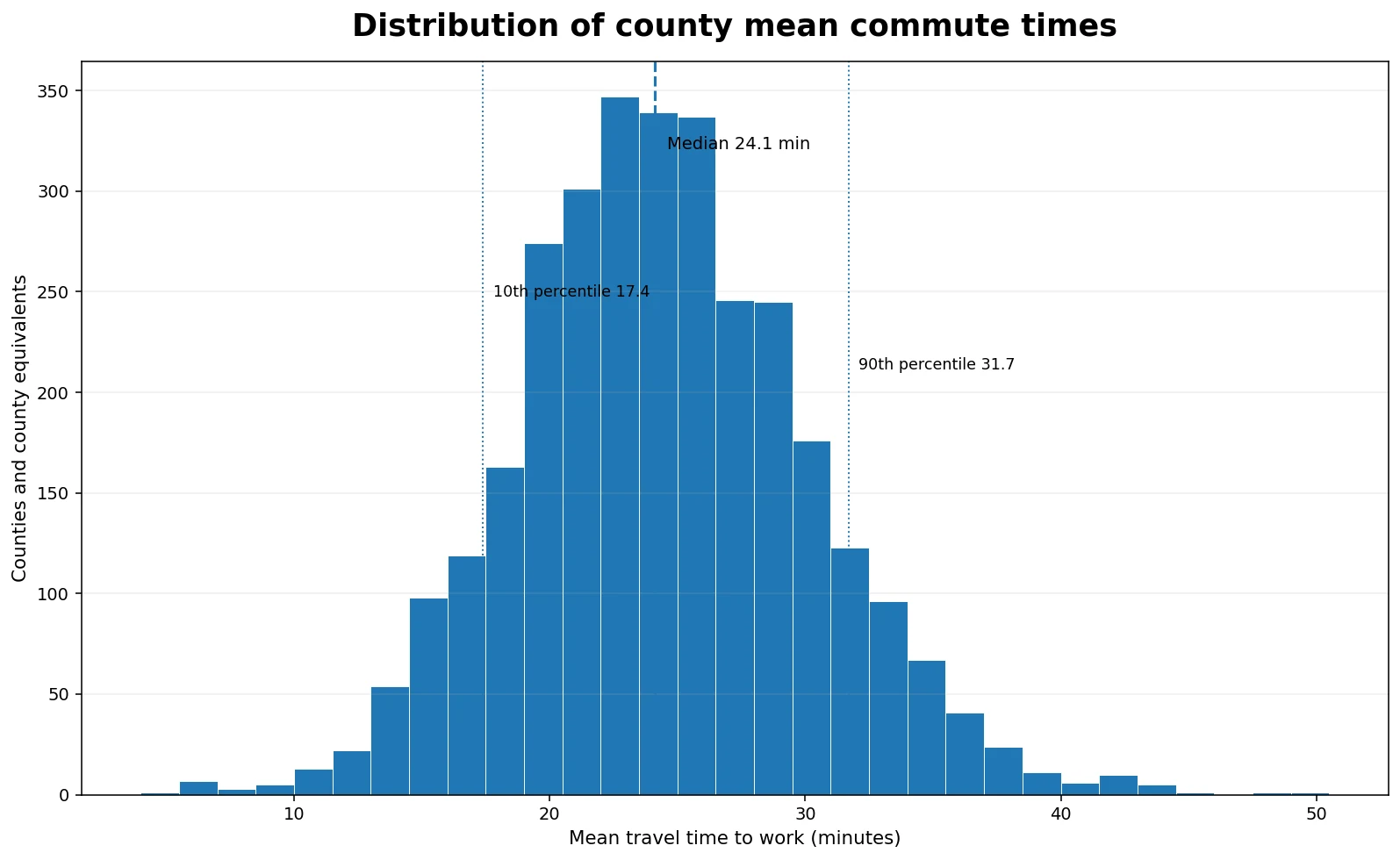
Giving every ranking-eligible county or county equivalent one equal observation, the 10th percentile is 17.4 minutes, the 25th percentile 20.6, the median 24.1, the 75th percentile 28.1, and the 90th percentile 31.7 minutes. In other words, the middle half of county estimates sits roughly between 20.6 and 28.1 minutes. These are percentiles of county estimates, not population-weighted commute-time percentiles for U.S. workers.
| County distribution point | Mean travel time |
|---|---|
| 10th percentile | 17.4 min |
| 25th percentile | 20.6 min |
| Median | 24.1 min |
| 75th percentile | 28.1 min |
| 90th percentile | 31.7 min |
A total of 500 county-level areas have estimates of at least 30 minutes, about 15.9% of the ranking-eligible file. 116 areas (3.7%) are at or above 35 minutes, while 665 (21.2%) are below 20 minutes. Those counts describe the geography of counties. A county with millions of residents and a small rural county each count once.
Long mean commutes appear in very different kinds of counties
The highest point estimate is Glascock County, Georgia at 49.6 minutes. Calhoun County, Illinois is 47.7, Clay County, West Virginia 45.4, and Lee County, Kentucky 43.4. At the same time, several New York City borough counties are also near the top: Bronx County is 43.3 minutes, Richmond County 43.1, Queens County 42.9, and Kings County 41.7. The top of the distribution therefore cannot be summarized as exclusively urban or exclusively rural. Similar mean times can emerge in places with very different commuting systems, and the S0801 mean alone does not identify the cause.
| Long mean commute area | Mean time | MOE |
|---|---|---|
| Glascock County, Georgia | 49.6 min | ±11.1 min |
| Calhoun County, Illinois | 47.7 min | ±5.8 min |
| Clay County, West Virginia | 45.4 min | ±5.9 min |
| Lee County, Kentucky | 43.4 min | ±9.3 min |
| Greene County, Mississippi | 43.4 min | ±5.0 min |
| Bronx County, New York | 43.3 min | ±0.4 min |
| Richmond County, New York | 43.1 min | ±0.6 min |
| Buckingham County, Virginia | 43.0 min | ±3.6 min |
The uncertainty column also changes how the top table should be read. Glascock County’s 49.6-minute estimate has a margin of error of ±11.1 minutes, while Bronx County’s 43.3-minute estimate has an MOE of only ±0.4 minute. Both meet the ranking reliability rule used in this package, but they are not equally precise. The top few small-area values are better read as belonging to a very-long-commute group than as an exact national order.
Very short mean commute times are common among Alaska county equivalents
The lowest reliable estimates are dominated by Alaska county equivalents. Skagway Municipality is 4.9 minutes, Yakutat City and Borough 5.5, Aleutians East Borough 5.6, and Northwest Arctic Borough 5.9. The median county-level estimate within Alaska is 10.55 minutes, the lowest state-level county median in the file. Wyoming is next at 17.2 minutes, followed by South Dakota at 17.45, Kansas at 17.9, and North Dakota at 18.8.
| Short mean commute area | Mean time | MOE |
|---|---|---|
| Skagway Municipality, Alaska | 4.9 min | ±0.8 min |
| Yakutat City and Borough, Alaska | 5.5 min | ±1.1 min |
| Aleutians East Borough, Alaska | 5.6 min | ±0.7 min |
| Northwest Arctic Borough, Alaska | 5.9 min | ±0.5 min |
| Kusilvak Census Area, Alaska | 6.3 min | ±0.7 min |
| Nome Census Area, Alaska | 6.3 min | ±0.5 min |
| Aleutians West Census Area, Alaska | 6.4 min | ±0.8 min |
| Petersburg Borough, Alaska | 6.8 min | ±1.0 min |
A short mean should not be translated into a broad judgment about transportation quality. Travel distance, mode, congestion, job location, settlement pattern, and other factors may all matter, but this dataset measures time rather than those causes. The defensible statement is that the measured average among people who traveled to work is short in these places, not that one transportation system is inherently better than another.
State medians summarize the map but are not official state commute averages
If the county estimates are grouped by state and each county receives equal weight, New Jersey and the District of Columbia are both at 30.0 minutes at the high end. West Virginia is 29.4, Florida 28.9, Maryland 28.85, Tennessee 27.9, Virginia 27.4, and Louisiana 27.35. At the low end are Alaska at 10.55, Wyoming 17.2, South Dakota 17.45, Kansas 17.9, North Dakota 18.8, Nebraska 19.0, and Montana 19.15 minutes.
These numbers are medians of county estimates within each state, not the Census state-level mean commute time. A small county and a major metropolitan county receive equal weight in this calculation. The state medians are used only as a compact geographic summary of the county map. A question about the typical worker in a state should use an appropriate state-level estimate instead.
Workers who worked from home are excluded from this mean
The official measure used here is “Mean travel time to work in minutes for workers 16 years and over who did not work from home.” Remote workers are excluded from the mean; they are not included as zero-minute commuters. This distinction matters whenever the map is compared with work-from-home rates, labor-force data, or broader measures of time use.
The statistic is also a mean rather than a median. A group of very long commutes can pull the average upward even if many commuters travel for less time. Questions about the share commuting 60 minutes or longer, time bands, or median commute time require different variables. The analysis here stays with the same clearly defined average commute-time measure throughout, so visitors can compare places without mixing different definitions.
Margins of error matter most for small-area extremes
The file contains 3,144 target county and county-equivalent rows. A commute-time value is present for 3,143 of them; Loving County, Texas is preserved as missing. Under the reliability rule used here, 3,136 estimates are eligible for ranking, six are marked caution, and Kalawao County, Hawaii is classified very low reliability. Kalawao’s point estimate is 16.8 minutes, but its MOE is ±25.2 minutes, larger than the estimate itself.
- Read the broad spatial pattern before focusing on exact ranks.
- When two county estimates are close, compare the margins of error and 90% confidence intervals.
- Do not place caution or very-low-reliability estimates into top or bottom ranking tables.
- Do not infer congestion, transit quality, housing costs, or job decentralization from commute time alone.
The same map color can therefore represent estimates with very different statistical precision. Large county-equivalent areas such as Bronx, Queens, and Kings have very small MOEs in this table, while some sparsely populated places have much wider intervals. The map is strong for seeing large geographic differences, but fine-grained rank claims need the uncertainty information beside them.
Current county codes and static display boundaries do not always match one-to-one
The statistics use 2024 ACS county and county-equivalent identifiers. The static display boundary layer does not have a one-to-one current polygon for 12 rows: Chugach Census Area, Copper River Census Area, and Kusilvak Census Area in Alaska, plus the nine current Connecticut planning regions. Those values remain in every statistical calculation but are left gray rather than being forced onto outdated polygons. Oglala Lakota County, South Dakota is displayed on the legacy Shannon County polygon because it is the same renamed county boundary.
This display issue is separate from missing data. Loving County, Texas is the one target row with no source value. The unmatched Alaska and Connecticut rows have data; they are simply not assigned an approximate color to an incompatible static boundary.
Data source and calculation notes
The primary source is the U.S. Census Bureau 2024 ACS 5-year Subject Table S0801. The mapped measure is the average travel time to work, measured in minutes, and the published 90% margin of error is used to show uncertainty. The 2024 ACS 5-year release is a multi-year period estimate, so it should not be interpreted as a single-year traffic snapshot.
The 10th, 25th, 50th, 75th, and 90th percentiles are calculated across the 3,136 ranking-eligible county estimates with equal county weights. Counts above 30 and 35 minutes and below 20 minutes use the same set. State summaries are unweighted medians of county estimates. For the visual map, values are grouped into under 15, 15–19.9, 20–24.9, 25–29.9, 30–34.9, and 35+ minute classes.
Frequently Asked Questions
Does the ACS county commute-time mean include people who worked from home?
No. This measure covers workers age 16 and over who did not work from home. Remote workers are excluded from the mean rather than counted as zero-minute commuters.
Is 24.1 minutes the average commute for all U.S. workers?
No. It is the median across 3,136 ranking-eligible county and county-equivalent estimates with each county weighted equally. It is not a population-weighted national worker average.
Does a longer county commute time prove that congestion is worse?
No. The mean travel time can reflect many factors, including distance, mode, job location, and local settlement patterns. The commute-time measure alone does not identify the cause.
Related Articles
- U.S. County Household Income Map: 2024 ACS Patterns Across America
- U.S. County Employment Growth Map: 2025 QCEW Annual Average Change
- U.S. County Wage Level Map – 2025 BLS QCEW Average Weekly Wages
Green Map creates custom-edited map images using open geographic data sources such as geoBoundaries, Natural Earth, OpenStreetMap, and government open data.
These maps are edited visual materials, not raw data files, and are provided for education, documents, presentations, and graphic reference.