Hamilton County is a useful place to see two very different Indiana landscapes inside one county boundary. The 2025 land-cover summary gives agriculture the largest share at 49.10%, yet developed land is close behind at 41.80%. That balance is not evenly mixed on the map. Large farm blocks dominate the north, while an extensive developed area spreads across the southern half around Carmel, Fishers, Noblesville, and Westfield. Morse Reservoir, the White River corridor, and the water near Geist break up those broad yellow and red areas with distinct blue, green, and wetland features.
This page includes four views of the same county: current land cover, forest and farmland, impervious surface/developed land, and a 1985–2025 class-difference map. The web images are optimized for reading on the page, while the four original JPG maps are available together in one ZIP download. Use the current map for the overall county pattern, the forest/farmland version for agricultural and wooded contrasts, the impervious map for hard-surface intensity, and the change map to locate cells whose broad classification differs between the two endpoint years.
Table of Contents
A 15.98% mean impervious surface shows where the urban fabric is actually hard-surfaced
Impervious surface measures pavement, rooftops, parking lots, and other surfaces that resist infiltration. Hamilton County’s mean impervious value is 15.98%, while 13.28% of the county is mapped above 50% impervious. Those figures should not be confused with the 41.80% developed-land share. A developed neighborhood can contain substantial lawn and tree cover, so it may be classified as developed without being mostly pavement. At the same time, roads and buildings in rural areas contribute some impervious surface even when surrounding cells are agricultural.
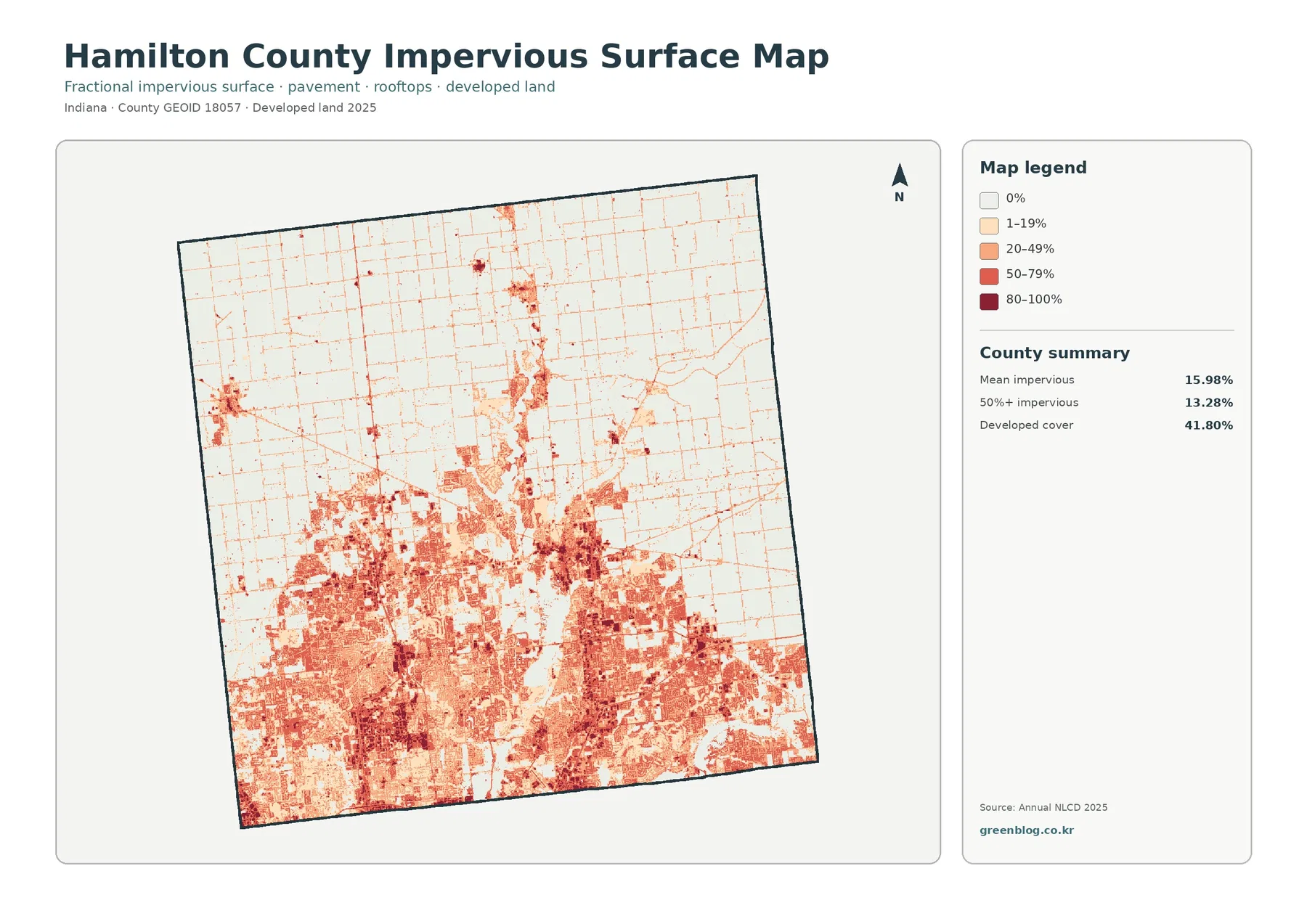
The impervious map produces the sharpest north-south contrast of the four products. Much of the southern half is filled with orange and red cells, and the strongest clusters occur around the major cities and commercial or transportation areas. Carmel and Fishers are embedded in a broad hard-surface network, while Noblesville and Westfield form additional large clusters to the north. Connecting roads appear as narrow linear features, which makes the urban network look more continuous than it does on the forest-and-farmland map.
North of that urban belt, the background becomes pale. Towns such as Cicero, Arcadia, Atlanta, and Sheridan still appear as compact concentrations, and roads create a fine web across farmland, but the surrounding field blocks have very low impervious values. Morse Reservoir again acts as a useful visual divider: development and roads are visible around parts of the shoreline, while much of the landscape farther north remains lightly mapped. The Geist area in the southeast is different because high impervious values extend much more broadly around the reservoir-side developed landscape.
Imperviousness is useful for comparing surface intensity, but it is not a flood-risk map. A high percentage indicates more hard surface in a cell, not whether a specific parcel will flood. Drainage capacity, terrain, soil, rainfall, river stage, stormwater infrastructure, and many other factors determine actual runoff and inundation. The right use is to identify where hard surfaces are concentrated and then combine that information with hydrology or drainage data if a more detailed environmental or planning question follows.
The 1985–2025 map records a 33.37% class difference, led by 22.79% to developed
Hamilton County’s change map is unusually striking because the colored differences cover a large part of the southern and central county. The summary reports a 33.37% overall class difference between 1985 and 2025. Cells summarized as changing to developed account for 22.79%. Agricultural loss is listed at 1.07%, forest loss at 0.13%, and other class difference at 9.31%; wetland difference is also a legend category even though the preview does not give it a separate percentage. These categories show that the 33.37% total cannot be described as one single kind of change.
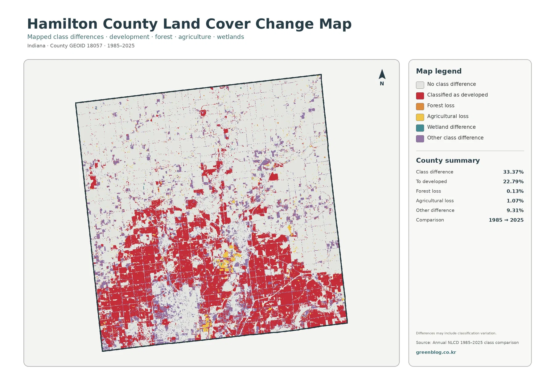
The spatial pattern is consistent with the current developed landscape. Large red areas cover much of the south around Carmel and Fishers and continue through Westfield and Noblesville. Moving north, the red class becomes more fragmented and is increasingly associated with towns or road corridors rather than one continuous urban field. Broad pale areas remain across much of the far-northern agricultural landscape. Hamilton County’s parks history describes a long shift from an agricultural county toward suburban development, which provides useful background for the map, but the raster itself should remain the evidence for where the endpoint classifications differ.
A cell marked “to developed” should not automatically be tied to a particular subdivision, road project, or annexation. The change map compares classification results, not permits or construction dates. Some boundary cells can change class because a 30-meter pixel contains a different mix of vegetation, pavement, water, or buildings at the two endpoints. Around reservoir shores, river edges, and mixed urban-green areas, those classification effects deserve extra caution. The map is excellent for locating clusters that warrant closer historical study, but not for assigning a cause by itself.
The endpoint nature of the comparison also matters. A cell shown as unchanged in 1985 and 2025 could have experienced an intermediate change that returned to the same broad class by the final year. Conversely, a colored cell may represent a subtle shift between broad classes rather than a dramatic land-use event. Anyone studying the chronology of Hamilton County’s urban growth would need intermediate Annual NLCD years, aerial imagery, parcel records, or planning documents in addition to this two-date comparison.
A county split between a 49.10% agricultural north and a heavily developed south
The county summary makes the basic structure clear. Agriculture accounts for 49.10% of Hamilton County and developed land for 41.80%. Forest is much smaller at 5.71%, followed by water at 1.47% and wetlands at 1.36%. Because the two largest classes together cover more than nine tenths of the county, the current map is visually dominated by agricultural yellow and developed red. The smaller categories still matter because they are concentrated along reservoirs, river corridors, parks, and drainage features where they form recognizable breaks in the larger pattern.
The strongest difference is directional. North of the largest urbanized belt, broad rectangular fields remain the main cover. Thin developed lines follow roads, and smaller settlement clusters appear around places such as Arcadia, Atlanta, Cicero, and Sheridan. Moving south toward Noblesville and Westfield, developed land becomes more continuous. Farther south, Carmel and Fishers sit within a wide developed landscape where farm fields remain as scattered pieces rather than the dominant background. Hamilton County’s official list of cities and towns confirms these communities, but the land-cover colors should not be mistaken for municipal boundaries.
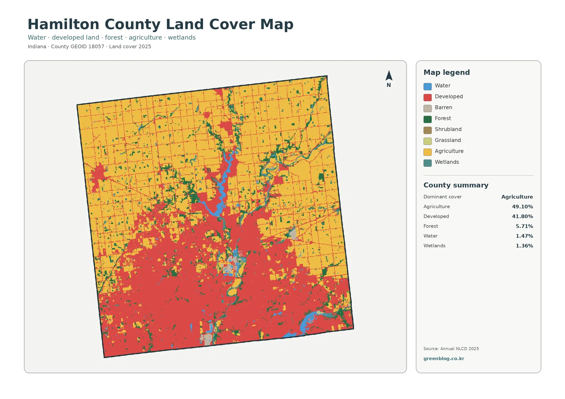
The developed class is broader than pavement alone. Annual NLCD can classify low-, medium-, and high-intensity developed settings that include buildings and roads as well as lawns, trees, and other vegetation within developed environments. That distinction is important in Hamilton County because the southern half contains many neighborhoods, commercial areas, transportation corridors, parks, and streams within the same general urban region. A red area therefore means developed land cover, not a legal city limit and not necessarily a completely sealed surface.
Agricultural cover is also more varied than the countywide percentage suggests. In the far north it forms large connected blocks, while around the central and southern cities it appears as isolated or transitional pieces between developed areas. Roads create a fine grid through northern farm country, and wooded or wet corridors interrupt some field blocks. Near Morse Reservoir, water and associated drainage features cut through the agricultural pattern. Reading the percentage together with the map prevents a misleading conclusion that farm cover is spread evenly from one end of the county to the other.
Morse Reservoir and the White River provide a water framework through the center
Water makes up only 1.47% of the county, but it has much more visual influence than that percentage might imply. Morse Reservoir is the most obvious blue feature near the center-north portion of the map. Hamilton County Parks identifies Morse Reservoir as a roughly 1,500-acre reservoir constructed in 1956 and locates Morse Park and Beach along its shore. On the land-cover map, the reservoir is a clear reference point between the farm-dominated north and the more developed central part of the county.
The White River adds a different type of water pattern. Instead of one broad reservoir shape, the river corridor bends through the county and is accompanied in places by forest and wetland cover. Hamilton County’s parks master plan describes the White River as an important natural and landscape feature and notes natural areas along its banks. The map does not label every waterway, so the safest interpretation is to follow the visible blue corridor and its green or teal edges rather than assign names to every narrow branch.
The southeastern water feature connects with the Geist Reservoir area, which sits beside a far more intensely developed landscape than the northern side of Morse Reservoir. Hamilton County’s health department identifies both Morse and Geist as reservoirs created for drinking-water supply and now also used for recreation. This official context helps explain why the two blue features are useful comparison points: Morse meets substantial agricultural land on its northern side, while Geist is closely bordered by developed cover associated with the Fishers area.
Land-cover water and wetland classes are not regulatory boundaries. A blue cell shows mapped water surface, while teal wetland cover represents a land-cover classification. Neither one determines floodplain limits, wetland jurisdiction, ownership, or public access. Site-level questions along the White River, Morse Reservoir, or Geist Reservoir require more detailed county, state, FEMA, utility, or field data. The county map is best used to establish where water sits within the broader agricultural and developed landscape before moving to those specialized sources.
Frequently Asked Questions
How can agriculture still be 49.10% when the southern half looks so urban?
The agricultural share is concentrated strongly in the northern part of the county. Large farm blocks dominate much of that area, while Carmel, Fishers, Noblesville, and Westfield create a broad developed landscape in the south and center. A countywide percentage combines those very different regions into one number, whereas the map shows where each class is actually concentrated.
Do Morse Reservoir and Geist Reservoir appear the same way on the land-cover map?
Both are mapped as water, but their surroundings are different. Morse Reservoir borders substantial agricultural land to the north and developed land toward Noblesville, while Geist lies next to a much broader developed area associated with Fishers and the southeastern county. The water class does not provide depth, water quality, ownership, or recreation rules.
Does a 33.37% class difference mean one third of Hamilton County became developed?
No. The 33.37% total includes several kinds of classification difference. The map summary lists 22.79% as to developed, 1.07% agricultural loss, 0.13% forest loss, and 9.31% other class difference, with wetland difference shown as another legend category. It is a two-date land-cover comparison, not a single development-rate statistic.
The forest and farmland view reveals what remains between roads, towns, and reservoirs
The forest-and-farmland map simplifies much of the developed area, making the contrast between cropland and wooded cover easier to trace. Agriculture remains the dominant visible class across the north, while developed/other cover occupies a large portion of the south. Forest totals only 5.71%, but the green patches are not random. They often follow river and stream corridors, cluster near reservoir edges, or survive as irregular pieces within and around the urbanized portion of the county.
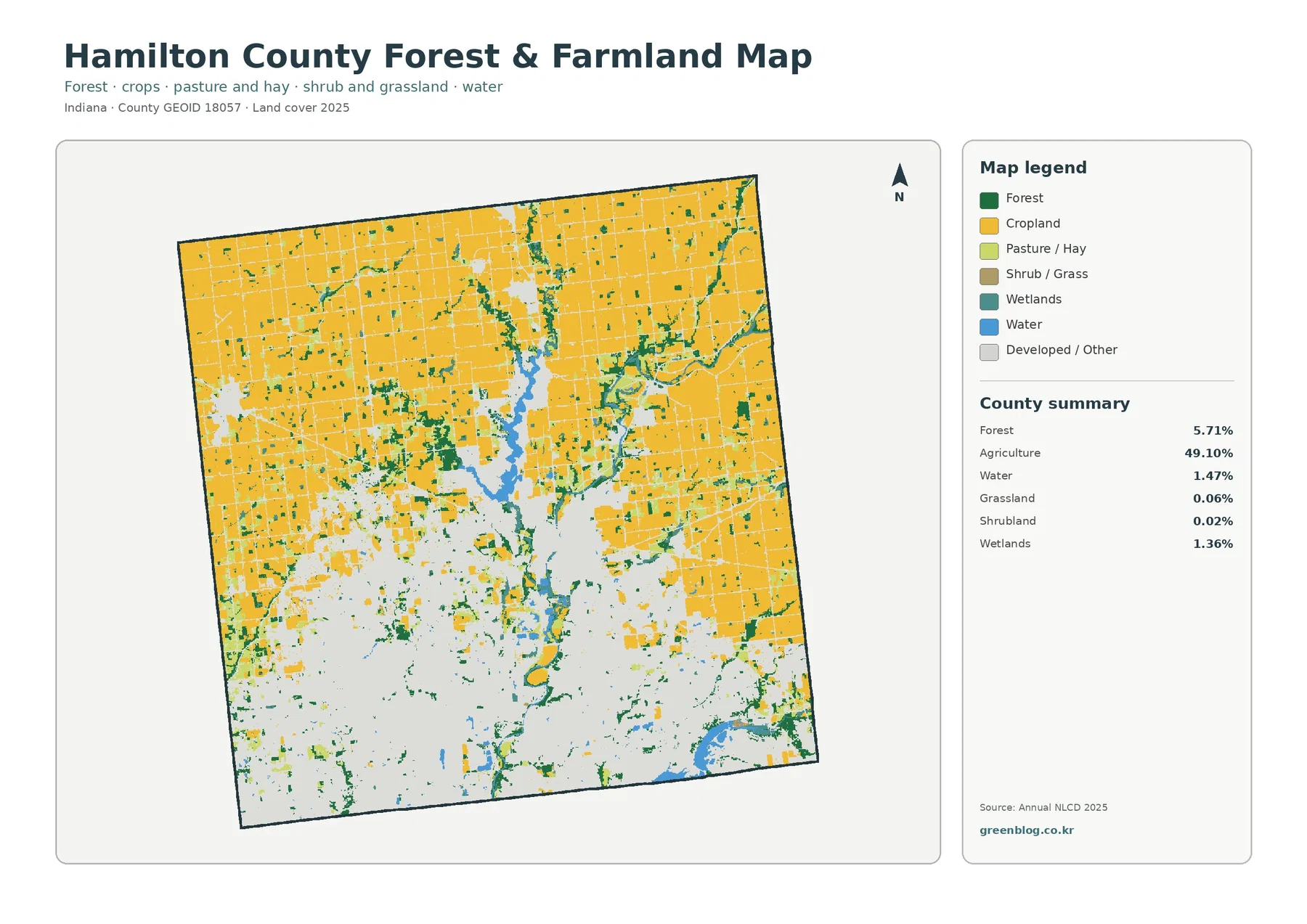
The north illustrates what a countywide agricultural percentage looks like when it is spatially concentrated. Large cropland blocks continue toward the county line, broken by a road grid and smaller developed nodes. The transition around Cicero and Morse Reservoir is more complex because water and settlement interrupt the field pattern. Farther south, agricultural cover no longer forms one background surface; it becomes a set of smaller pieces surrounded by developed/other land. That shift is one reason the same 49.10% total can coexist with a southern half that appears strongly urban.
Forest is easier to appreciate on this simplified map than on the full land-cover version. Narrow wooded strips can be followed along watercourses, and larger patches stand out where they would otherwise compete visually with developed colors. Hamilton County Parks manages several properties connected with the White River and other natural areas, providing local context for some of the county’s green corridors. Still, a forest-colored cell does not establish that land as a park, preserve, or public property. The map is showing vegetation cover, not ownership.
This view is especially useful for explaining transition zones. North of the urban belt, farmland is broad and connected. Near Noblesville and Westfield, fields and developed land interlock. In the far south, remaining agricultural pieces are comparatively fragmented. Along the river and reservoirs, forest and wetland cover add another layer that cuts across the simple north-versus-south split. A classroom or report can use those differences to discuss how countywide percentages hide very different local arrangements.
Classification and scale limits matter most along Hamilton County’s mixed edges
Annual NLCD uses a raster classification so that land cover can be compared consistently over large regions. At the commonly used 30-meter cell size, a single cell may include part of a road, a lawn, several trees, and a building. The system assigns a mapped class to that mixed area rather than surveying every boundary on the ground. In Hamilton County, the most complicated places are the edges where neighborhoods meet fields, streams pass through developed areas, or reservoir shorelines combine water, trees, lawns, and roads within short distances.
The 2025 maps also have a clear date limit. Development completed after that year is not represented. The 1985–2025 map has a different limitation because it compares two endpoint classifications rather than narrating every year in between. A county experiencing substantial development can change in stages, and those stages need intermediate-year products or dated aerial imagery. The map supplied here should therefore be described as a class comparison between 1985 and 2025, not a complete development history.
Finally, physical land cover must be kept separate from legal land use. Agricultural cover does not prove agricultural zoning. Developed cover does not define a municipal boundary. Forest does not indicate public ownership, and wetland cover is not a regulatory delineation. These maps answer a simpler and very useful question: what broad type of surface is mapped at each location, how is it arranged across Hamilton County, and where do the 1985 and 2025 classifications differ?
Which JPG to use for a report, class, presentation, or planning reference
The general land-cover map is the best one-page overview because it keeps all major classes visible. It is the clearest way to show how northern farm country, southern development, reservoirs, river corridors, forest, and wetlands fit together. For a focused discussion of agriculture or vegetation, the forest-and-farmland map removes much of the developed-class detail and makes remaining fields and wooded strips easier to compare. For urban form, pavement, rooftops, and transportation corridors, the impervious product is more informative than the general developed class.
The change map should normally be paired with a current map. On its own, a large red area can be misunderstood as current development rather than a classification difference between 1985 and 2025. Side-by-side use lets a reader see both the present surface and the historical comparison. This is especially important in Hamilton County because the class-difference total is 33.37% and the to-developed category is 22.79%, values large enough to dominate the visual impression.
The download ZIP contains four original JPG files at 2480 by 1754 pixels each. They are suitable for slides, classroom worksheets, reports, and printed county-reference pages where the web-optimized image is not ideal. Keep each map’s year and legend visible when combining images. The current land-cover, forest/farmland, and impervious products describe 2025 conditions, while the change product compares 1985 with 2025.
These files are county-scale reference maps rather than parcel or engineering products. They cannot establish property lines, zoning, wetland jurisdiction, ownership, flood elevations, utility service, or construction suitability. A useful workflow is to identify a broad location or contrast here—such as the White River corridor, the Morse shoreline, the southern urban belt, or northern farmland—and then open the appropriate county GIS, municipal planning document, state resource map, or field-based dataset for a site-specific decision.
Map File Information
The ZIP contains four original JPG maps for Hamilton County: current land cover, forest and farmland, impervious surface/developed land, and the 1985–2025 land-cover change comparison.
- Printable Size: 2480 × 1754 px each
- File Type: ZIP containing 4 JPG files
- Intended Use: printing, classroom work, reports, presentations, and county land-cover reference
Related Maps
- Adams County Indiana Land Cover Map
- Allen County Indiana Land Cover Map
- Bartholomew County Indiana Land Cover Map
Sources and references
- MRLC Annual NLCD Data – official Annual NLCD data access
- USGS Annual NLCD Land Cover Classification – land-cover class definitions and dataset guidance
- U.S. Census Bureau TIGER/Line Shapefiles – official county boundary source
- Hamilton County Cities and Towns – official community list for Carmel, Fishers, Noblesville, Westfield, and other towns
- Hamilton County Parks and Recreation Master Plan – White River and county natural-landscape context
- Hamilton County – Morse Park & Beach History – official Morse Reservoir background
- Hamilton County Recreation Water Sampling Program – official context for Morse and Geist reservoirs
Green Map creates custom-edited map images using open geographic data sources such as geoBoundaries, Natural Earth, OpenStreetMap, and government open data.
These maps are edited visual materials, not raw data files, and are provided for education, documents, presentations, and graphic reference.