Gibson County in southwestern Indiana is mostly farm country in the 2025 land-cover summary, but the map is not a uniform field of agricultural color. Agriculture accounts for 70.35% of the county, while a large lake and river wetlands break up the western and northern margins, woodland appears in irregular bands and patches, and the largest developed concentration sits around Princeton near the center. The four maps on this page separate those patterns so that current cover, farm-and-forest distribution, impervious surfaces, and long-term class differences can be read without treating them as the same thing.
The WebP images below are quick on-page previews. The four original JPG maps are available together in one download for printing, classroom use, reports, presentations, or closer comparison. A reader who needs a broad county picture can start with the 2025 land-cover map, then use the other three views to isolate natural cover, built surfaces, or places where the 1985 and 2025 classifications differ.
Table of Contents
A farm-dominated interior framed by rivers, wetlands, and a large western lake
The 2025 county summary gives agriculture a 70.35% share. Developed land is the next largest category at 10.75%, followed by forest at 9.08%, wetlands at 6.46%, and water at 2.89%. Grassland is only 0.06% and shrubland 0.02%, so neither category controls the appearance of the county at this scale. The dominant visual impression is a wide agricultural interior interrupted by built-up centers, wooded fragments, wet lowlands, and open water.
The western county edge is strongly curved rather than geometric. Indiana’s official roster of navigable waterways lists the Wabash River in Gibson County, along with the White River and the Patoka River. That river setting helps explain why water and wetland colors become much more visible along the outer parts of the county than they are across the farmed interior. The map does not label river names, so the land-cover image should be read with the official waterway information rather than used as a substitute for a hydrography map.
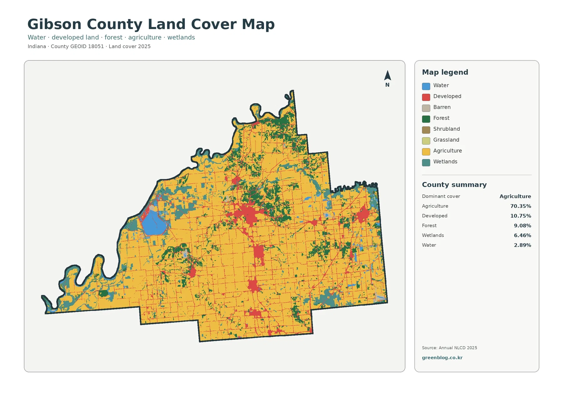
A broad developed cluster near the center corresponds to Princeton when the land-cover pattern is compared with official county location maps. Smaller clusters occur toward the east, south, and west near other communities such as Oakland City, Fort Branch, Haubstadt, and Owensville. Thin developed lines also cross the agricultural background along roads. These shapes show where built cover is concentrated, but they do not trace municipal boundaries, parcel lines, or zoning districts.
Why Gibson Lake and the river lowlands stand out even at small percentages
Water makes up 2.89% of the county, a modest share compared with agriculture, yet it is visually important because it is concentrated in recognizable features. The large blue waterbody west of Princeton corresponds to Gibson Lake. County and state wildlife information also describes wetland habitat around the lake area, which matches the broader mix of water, wetlands, and other natural cover visible along the western side of the map. That concentration makes the lake useful as a reference point when comparing different map layers.
Wetlands account for 6.46%, more than twice the water share. Teal wetland colors occur beside open water, along winding drainage areas, and in irregular patches where farm fields become less continuous. The U.S. Fish and Wildlife Service describes the Patoka River National Wildlife Refuge and Management Area as spanning parts of Gibson and Pike counties along the lower Patoka River, protecting wetlands and floodplain forest. That outside source gives useful context for the complex natural-cover pattern in the eastern and northeastern river corridor without implying that every mapped wetland belongs to the refuge.
The western and northern edges are therefore more informative than their percentages alone suggest. A reader looking only at the county summary might think that 70.35% agriculture leaves little room for major aquatic features. On the map, however, the large lake, the meandering western river boundary, and wetland belts create a strong visual counterpoint to the rectilinear field pattern. This is a good example of why location and shape matter alongside area totals.
Forest is a minority cover, but it repeatedly interrupts the agricultural grid
The forest-and-farmland view removes much of the visual competition from developed classes and makes the relationship between cropland and natural cover easier to follow. Cropland dominates broad parts of the center and south. Forest, by contrast, appears as irregular green blocks, narrow bands, and scattered fragments. The 9.08% forest share is much smaller than the 70.35% agricultural share, yet woodland is distributed widely enough that it remains a recurring feature rather than one isolated forest tract.
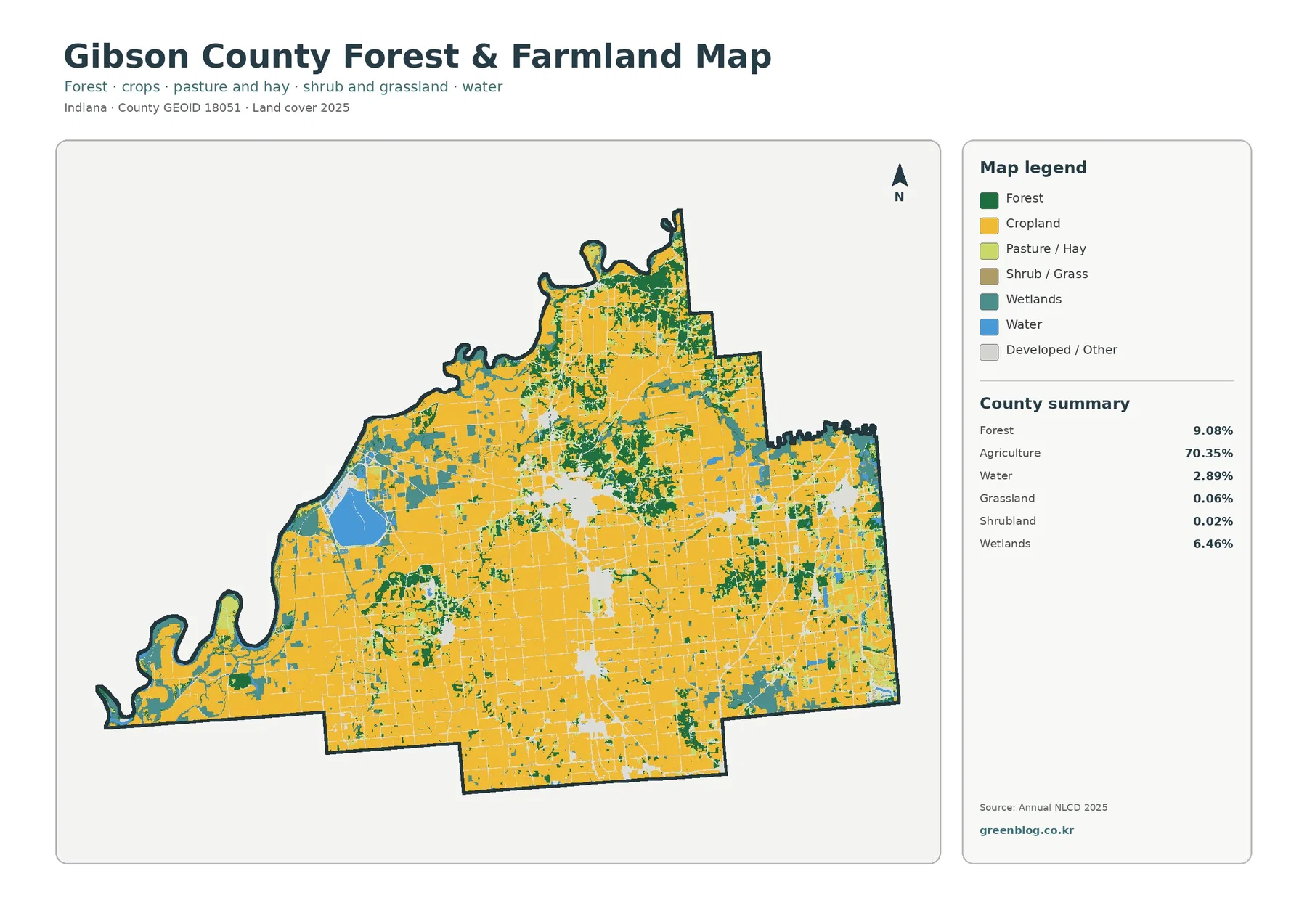
The contrast is especially clear near water. Woodland and wetlands often sit next to blue water or follow uneven edges, while cropland tends to occupy broader blocks with straighter field boundaries. Moving away from those river and lake settings, the map becomes more consistently agricultural. This does not mean every green patch is protected forest or every yellow patch is an active commercial field on the date a visitor reads the page. It means the Annual NLCD classification assigned those surface-cover classes for the mapped year.
The map legend separates cropland, pasture or hay, shrub or grass, wetlands, water, forest, and developed or other cover. The county summary groups agricultural cover more broadly at 70.35%, so the summary and the detailed legend should not be treated as identical classification levels. Grassland at 0.06% and shrubland at 0.02% are tiny shares; they are still useful for reading isolated pixels correctly, but they do not change the overall conclusion that agriculture is the dominant land cover.
Land cover also should not be confused with legal land use. A cell classified as cropland does not prove that a parcel is zoned for agriculture, and a forest cell does not establish public ownership or conservation status. The map describes the physical cover detected and classified at the surface. Questions about property ownership, development rights, easements, zoning, or permit requirements belong with current county and state records.
Princeton becomes much more distinct on the impervious-surface map
Impervious surface means pavement, rooftops, parking areas, and other surfaces that do not readily absorb water. Gibson County has a mean impervious value of 2.93%, while 1.58% of the county falls in the 50%-or-greater impervious category. The developed land-cover share is 10.75%, which is substantially larger. That difference is expected because a developed land-cover class can include lawns, trees, bare soil, and other permeable surfaces alongside roads and buildings.
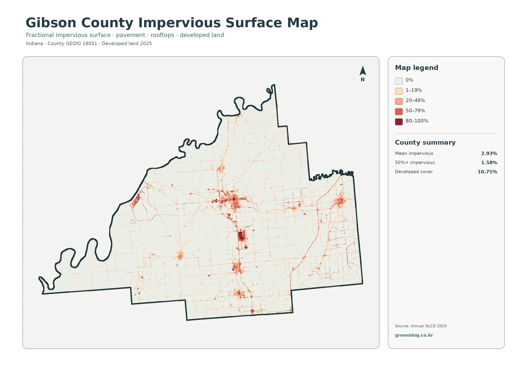
The central Princeton area is the clearest high-value cluster on this map. A darker north-south pattern continues through the central and southern part of the county, and smaller concentrations appear near other communities. In the countryside, many roads show up only as thin lines crossing a pale background. The result is a very different view from the general land-cover map: instead of asking whether a cell is classified as developed, this map emphasizes how much hard surface is present within developed and rural settings.
This makes the impervious layer useful for comparing settlement intensity, but it is not a flood-risk map. High impervious cover can matter for runoff, yet actual flooding depends on rainfall, drainage systems, terrain, soils, river levels, and many other conditions. A planning or hazard analysis should therefore combine this layer with dedicated hydrology and flood information rather than treating the red and dark-red areas as direct evidence of flood exposure.
It is also important not to infer exact street layouts from the image. At county scale, narrow road corridors are generalized by the raster grid and may look thicker or more continuous than they do on the ground. The map works best for recognizing relative concentration: Princeton has the largest contiguous built core, smaller towns create separate clusters, and the large agricultural spaces between them remain mostly low in impervious cover.
A 10.63% class difference does not mean 10.63% of the county was newly developed
The change map compares mapped classes from 1985 and 2025. Its county summary reports a total class difference of 10.63%. Within that total, 2.59% is classified as change to developed, 1.27% as forest loss, 1.54% as agricultural loss, and 4.94% as other class difference. Wetland difference is also represented in the legend, although the preview summary does not print a separate percentage for it. These categories show that the overall difference is a mixture of several land-cover transitions rather than a single development measure.
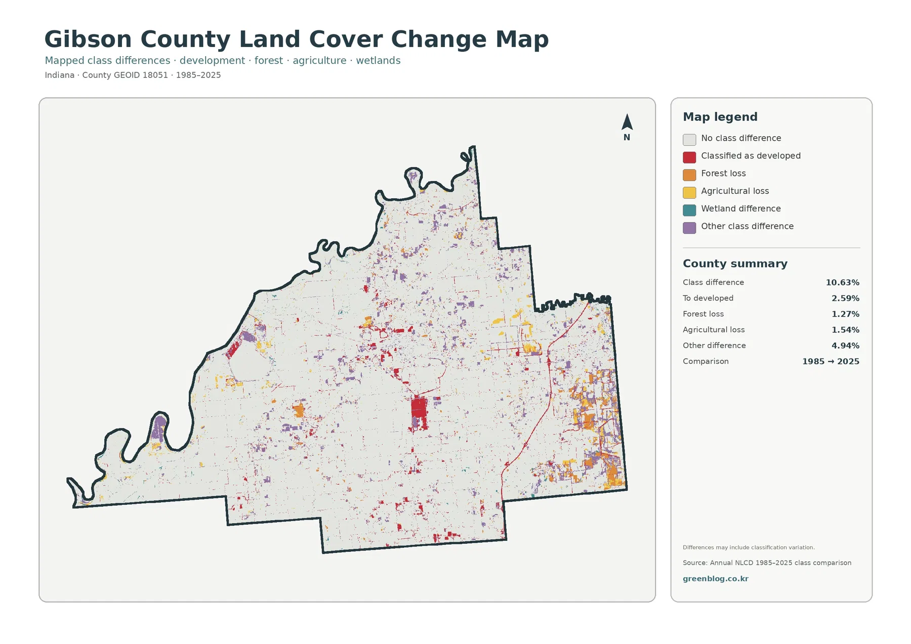
Red change-to-developed areas are most noticeable around the central built area and several smaller settlement clusters. Orange and purple differences are more common in some eastern and northeastern sections and along boundaries where agriculture, forest, and wetlands intermix. Large white areas indicate no difference in the broad class assigned at the two comparison dates. The white background is therefore just as informative as the colored changes: most of the county remained in the same mapped class between the two endpoints.
The map itself warns that some differences may include classification variation. A small forest edge, wetland boundary, farm-field margin, or road corridor can be assigned differently when imagery, seasonal conditions, or pixel mixtures change. For that reason, a colored cell should not automatically be described as a documented clearing, construction project, drainage alteration, or farm conversion. Those claims require site-specific records or imagery beyond this countywide comparison.
A practical way to read the change layer is to use the 2025 maps first. Find Princeton, Gibson Lake, the broad farm blocks, and the river wetland areas on the current maps. Then return to the change view and ask where colored differences overlap those familiar settings. This sequence reduces the temptation to read every small colored patch as equally significant and makes the long-term comparison easier to connect with the current landscape.
Which map works best for agriculture, water, development, or long-term comparison?
For a general county profile, the 2025 land-cover map is the best starting point because it keeps agriculture, developed land, forest, wetlands, water, and minor classes in one view. A classroom discussion can use the 70.35% agricultural share as the headline, then point to Gibson Lake and river wetlands to show why a dominant percentage does not erase smaller but geographically important features. The map also makes Princeton’s developed core visible without turning the page into a road or city-boundary map.
The forest-and-farmland map is better when the main question concerns the arrangement of farm fields and natural cover. By simplifying built land, it becomes easier to see where woodland and wetlands break the field pattern. The impervious map is the opposite: it suppresses most land-cover color so that hard-surface concentration stands out. It is therefore more useful for comparing Princeton with smaller communities than for describing forest or wetland extent.
The 1985–2025 change map should be reserved for questions about difference through time. It can show that developed-class changes are not evenly distributed and that other class differences account for a large part of the total. It cannot identify the exact year a change occurred, and it does not prove why a pixel changed. If a report needs a dated development history for one parcel or project, aerial photographs, permits, assessor records, and local planning documents are more appropriate sources.
Using the four maps together also prevents category confusion. A location may be developed in the land-cover map, moderately impervious rather than highly impervious, and unchanged between 1985 and 2025. Another location may remain agricultural today but show a class difference in the change layer because the earlier classification was different. Keeping those questions separate produces a much more accurate interpretation than treating all red or non-agricultural colors as one kind of urban growth.
What the countywide colors can show—and what they cannot
Annual NLCD uses 30-meter raster cells for consistent regional land-cover mapping, not for legal parcel decisions. A raster cell is one square unit in the gridded dataset, so boundaries between forest, wetland, cropland, roads, and small developed sites may appear stepped or simplified. Narrow features can occupy only part of a cell, and mixed surfaces may be assigned to the class that best represents that grid unit. These limitations matter most when a reader zooms in and tries to interpret very small patches.
The 2025 values are a snapshot of the mapped year. Construction, crop changes, clearing, restoration, or water-level changes after that period are not represented. The map also does not show zoning, ownership, conservation easements, municipal limits, wetland jurisdiction, or regulatory flood zones. Official county GIS, state agencies, the U.S. Fish and Wildlife Service, and other current records should be used when those boundaries or legal questions matter.
Within those limits, the set is useful because Gibson County contains several contrasting landscape elements in a relatively compact area. A large farm-dominated interior, a major western river boundary, Gibson Lake, wetland corridors, forest fragments, Princeton’s built core, and smaller towns can all be compared with the same county outline. The four views make it possible to move from a broad present-day picture to more focused questions without pretending that one map can answer everything.
Frequently Asked Questions
What is the dominant land cover in Gibson County in 2025?
Agriculture is the dominant cover at 70.35%. Developed land accounts for 10.75%, forest 9.08%, wetlands 6.46%, and water 2.89%. The map reflects those numbers: farm cover fills most of the interior, while rivers, the large western lake, wetland areas, woodland, and built centers create smaller but clearly visible patterns.
Why is the impervious value only 2.93% when developed land is 10.75%?
The two statistics measure different things. Developed land is a land-cover class, while the 2.93% mean impervious value summarizes the share of hard surfaces such as pavement and rooftops across the county. Developed areas can contain lawns, trees, soil, and other permeable surfaces, so their land-cover area can be much larger than the average impervious share.
Does the 10.63% change value mean that much land was converted to development?
No. The 10.63% figure is the total mapped class difference between 1985 and 2025. Change to developed accounts for 2.59%, while forest loss, agricultural loss, wetland differences, and other class differences make up the rest. The map also notes that classification variation can contribute to some differences, so it should not be used as a parcel-by-parcel development history.
Map File Information
The four original JPG maps for Gibson County are included in one ZIP file: general land cover, forest and farmland, impervious surface and developed land, and 1985–2025 land-cover change.
- Printable Size: 2480 × 1754 px each
- File Type: ZIP containing 4 JPG images
- Intended Use: classes, reports, presentations, regional comparison, and agriculture or environment reference
Related Maps
- Adams County Indiana Land Cover Map
- Allen County Indiana Land Cover Map
- Bartholomew County Indiana Land Cover Map
Sources and References
- MRLC Annual NLCD Data – access to Annual NLCD datasets including 2025
- USGS Annual NLCD Land Cover Classification – land-cover classes and interpretation guidance
- U.S. Census Bureau TIGER/Line Shapefiles – official county boundary data
- Purdue Extension – Gibson County Ag & Natural Resources – local agriculture and natural-resources information
- Indiana Natural Resources Commission – Navigable Waterways by County – official Gibson County listing for the Wabash, White, and Patoka rivers
- U.S. Fish & Wildlife Service – Patoka River National Wildlife Refuge – wetland and floodplain habitat context for the Patoka River in Gibson and Pike counties
Green Map creates custom-edited map images using open geographic data sources such as geoBoundaries, Natural Earth, OpenStreetMap, and government open data.
These maps are edited visual materials, not raw data files, and are provided for education, documents, presentations, and graphic reference.