Bartholomew County is not a uniform farm landscape. Agriculture covers 55.86% in the supplied 2025 summary, but a broad forested west and a concentrated developed area around the county’s center create two strong counterweights. This Bartholomew County Indiana Land Cover Map makes those contrasts visible while also showing smaller wetland and water corridors.
The page includes four views: current land cover, forest and farmland, impervious surface and developed land, and a 1985–2025 endpoint comparison. Their WebP previews can be read beside the text, and the four original 2480 × 1754 JPG maps are available together in one ZIP. The set works best when present-day cover and mapped class difference are kept clearly separate.
Table of Contents
A wooded west, a farm-heavy east, and a developed center define the first view
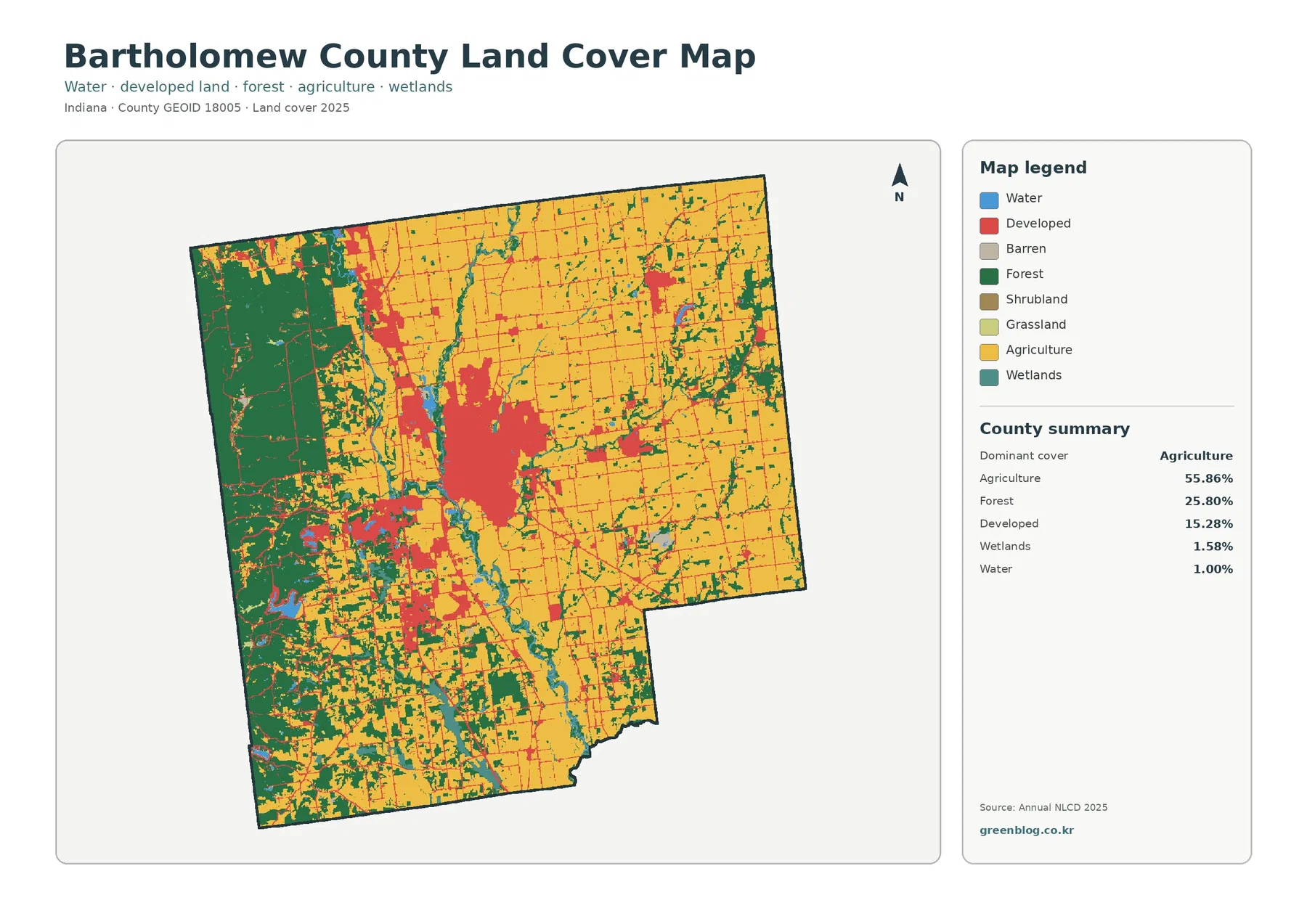
Yellow agricultural cover dominates the eastern half and extends across much of the north. Large blocks are broken by narrow green strips, scattered teal wetland cells, and blue water features, but agriculture remains the main background color through those areas. The western side changes abruptly. Dark green forest occupies large continuous sections near the west boundary and spreads through the southwest in a much more mixed pattern.
Forest represents 25.80% of the county. That share is large enough to be obvious without relying on the printed summary. The western block is especially substantial, while smaller wooded corridors extend into the south and toward waterways closer to the center. In several places, forest and agriculture meet along irregular edges rather than clean straight lines, giving the western and southwestern parts of the county a more fragmented appearance than the broad farm areas farther east.
Developed cover accounts for 15.28% and forms one large red concentration near the center, with smaller patches to the north and west. Because the current map does not draw municipal limits, the outer edge of red cover should not be treated as the legal boundary of Columbus or any other community. A developed class identifies surface cover associated with built environments; it does not mark zoning districts, parcels, ownership, or incorporation lines.
Wetlands cover 1.58% and open water 1.00%. Those percentages are modest, yet the blue and teal features are easy to notice because many of them form narrow corridors through agricultural and forested areas. Open water and wetlands should not be merged into one category. Blue generally represents exposed water surfaces, while wetland classes can include vegetation and seasonally wet ground that may not look like a lake or river on the ground.
Local geography helps place the Columbus area without turning the map into a city map
Bartholomew County’s official website identifies Columbus as the county seat and describes the county as lying largely in level areas around the East Fork of the White River and its tributaries. It also notes that Interstate 65 and U.S. Highway 31 cross the county. That information provides useful orientation for a land-cover image that intentionally omits place labels, road names, and municipal boundaries.
The broad central developed concentration corresponds generally to the part of the county where Columbus is located, but the raster colors are not a city-boundary layer. Red pixels can extend beyond incorporated limits or include developed surfaces in nearby unincorporated areas. For the same reason, a thin linear developed or impervious trace should not be labeled I-65 or US 31 solely from its shape. A current transportation map is needed for route identification.
Water-related cover is also easier to understand with the county’s official description in mind. Blue and teal corridors pass through and beside the developed center and continue toward the south, while green forest often appears close to those features. The map supports a statement that water, wetlands, and forest occur near one another in several corridors. It does not by itself prove that one land-cover class caused another or identify floodplain, wetland jurisdiction, stream order, or water quality.
Impervious cover isolates the hard surfaces inside the developed footprint
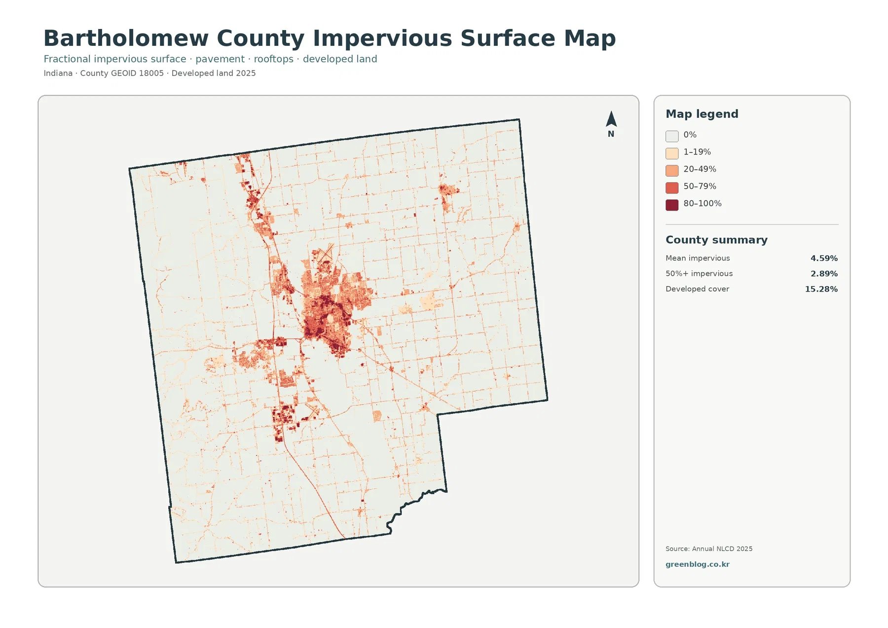
Mean impervious cover is 4.59%, and 2.89% of the county is mapped at 50% impervious surface or greater. Both figures are lower than the 15.28% developed-cover share because developed land can contain lawns, trees, bare soil, and other permeable surfaces around buildings and roads. The impervious layer narrows the question to hard materials such as pavement and rooftops instead of treating every developed cell as completely sealed.
The darkest tones are concentrated in the large central developed area. Medium and light values spread outward from that core, while smaller dark clusters appear north and west of it. Much of the eastern agricultural area remains white or very pale. This distribution is a good example of why a countywide average can hide strong local differences: 4.59% is modest as one number, but some parts of the central area contain much higher hard-surface intensity.
Thin impervious lines form a grid across farm country and extend between the larger clusters. Roads are a likely source of many of those linear hard surfaces, yet this map does not provide route names, lanes, traffic volumes, or road classifications. The official county page confirms major transportation routes exist, but the impervious image should still be used only to show the presence and relative intensity of hard surface. Route-specific analysis needs a transportation layer.
High impervious cover is not the same thing as mapped flood risk. Pavement and rooftops can affect how quickly rainfall reaches drainage systems, but actual flood conditions depend on rainfall, elevation, streams, wetlands, drainage infrastructure, soils, and many other factors. This layer is useful for comparing surface intensity; it is not a substitute for FEMA flood maps, engineering studies, or local stormwater data.
The vegetation view shows how sharply western forest differs from eastern cropland
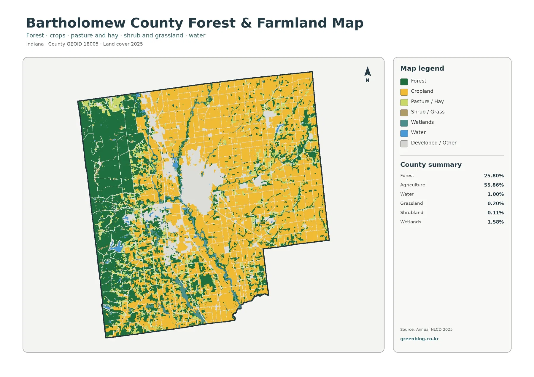
Removing much of the visual weight of developed land makes the county’s east-west contrast stronger. Cropland spreads across broad, relatively simple blocks in the east and northeast. Forest fills a much larger share of the west and southwest, where agricultural openings are more broken and irregular. The central developed area becomes pale gray, allowing the surrounding vegetation pattern to stand out instead of competing with a large red urban footprint.
The 55.86% agricultural share is therefore best understood as a countywide total rather than a description of every part of Bartholomew County. Agriculture is extensive enough in the east, north, and several southern areas to remain the dominant class overall. Forest, however, is concentrated strongly enough in the west that a viewer focusing only on that side could reasonably perceive a primarily wooded landscape. Both statements can be true at the same time because location matters as much as the total percentage.
The southwestern portion is particularly mixed. Forest and agricultural colors alternate repeatedly, with wetland and water features appearing in smaller strips and patches. That arrangement produces more edges between land-cover types than the broad farm blocks in the east. The map can show those edges clearly, but it cannot identify tree species, crop type, field ownership, habitat quality, or whether a specific wet area meets a regulatory wetland definition.
Grassland is listed at 0.20% and shrubland at 0.11%. These are real mapped categories, but they occupy such small shares that they should not be promoted as defining countywide characteristics. They are most useful as reminder classes when a small nonfarm, nonforest patch appears between larger categories. The main story remains the balance among agriculture, forest, developed cover, and water-related surfaces.
The 1985–2025 map records 11.36% endpoint class difference, not 11.36% damage
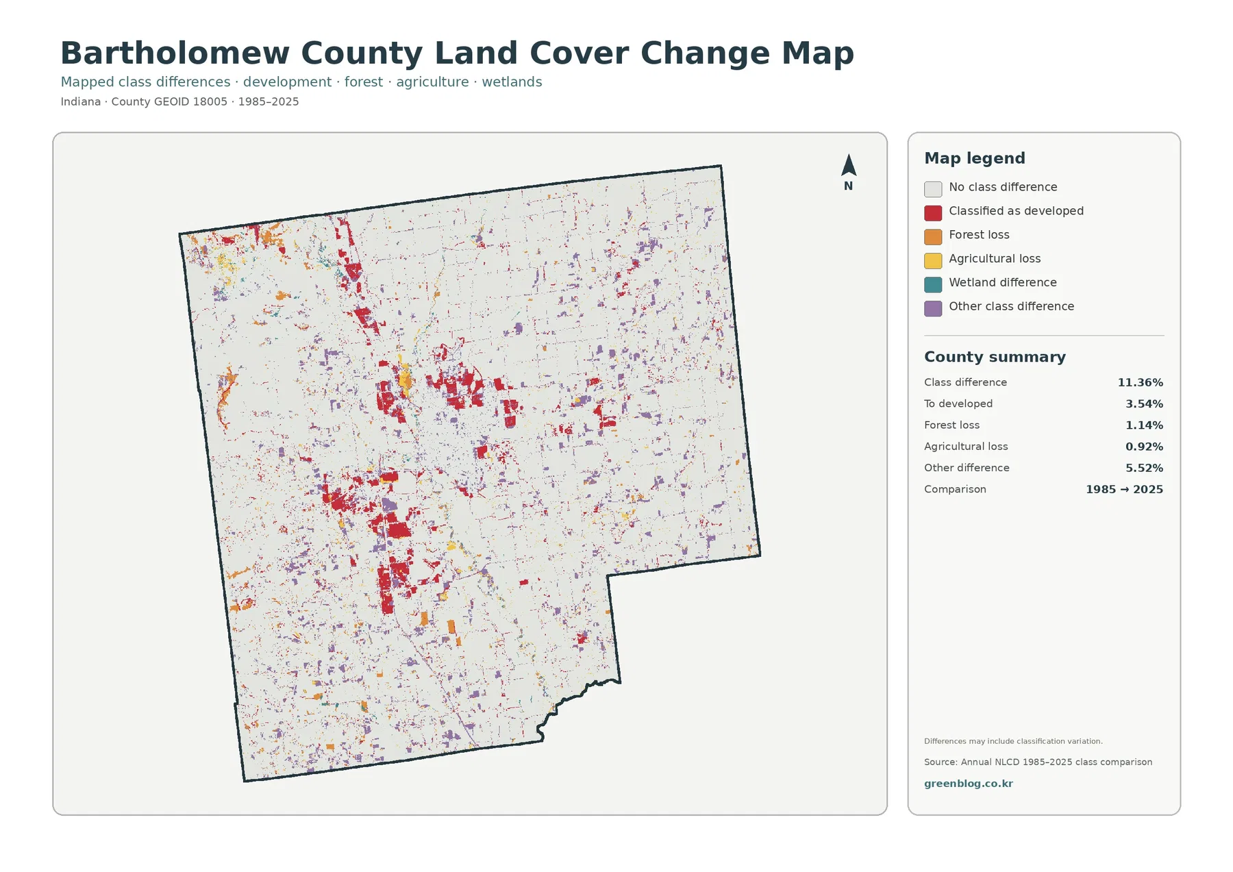
The change summary reports a total class difference of 11.36% between 1985 and 2025. That value is the share of cells whose endpoint classifications differ. It does not mean 11.36% of the county was damaged, permanently converted, or degraded. The map itself notes that classification variation may be included, so interpretation must allow for image timing, seasonal conditions, mixed pixels, and classification behavior as well as genuine surface change.
Cells classified as developed account for 3.54% of the county in the change summary. Red change cells are concentrated around the present-day central developed area and continue northward in several noticeable groups. Additional red patches appear elsewhere. Their distribution makes development-related class difference one of the clearest visual features, but the map cannot establish the exact year, project, road improvement, or demographic change associated with any particular pixel.
Forest loss is listed at 1.14% and agricultural loss at 0.92%. Orange forest-loss cells appear along parts of the western forest edge and in scattered locations, while yellow agricultural-loss cells are distributed through farm areas. The words “loss” describe a change away from the earlier endpoint class. They do not prove logging, construction, abandonment, storm damage, flooding, or any other cause. Intermediate imagery and local records are needed before a cause can be assigned.
Other class difference is 5.52%, the largest separately printed component in the summary, and purple cells are scattered across much of the county. Wetland difference appears in the legend but is not given a separate percentage. Subtracting the printed components from 11.36% and labeling the remainder as an official wetland rate would ignore rounding and processing details. Only the values printed in the package should be reported as exact percentages.
The change image is most useful as a screening layer. It tells a reader where endpoint classifications differ enough to justify a closer look. A strong red, orange, yellow, teal, or purple cluster can then be compared with intermediate-year NLCD products, aerial photography, county records, or site-specific data. That sequence is much more defensible than using one color to declare what happened and why.
Each map measures a different part of the same landscape
The current land-cover map should usually come first because it answers the broadest question: what classes were mapped across Bartholomew County in 2025? The forest and farmland view then reduces the visual weight of developed areas so the western forest block and eastern agricultural fields are easier to compare. The impervious layer asks a narrower question about hard surfaces. The change map leaves current cover behind and compares two endpoints.
This distinction matters most around the central developed concentration. A red cell on the 2025 land-cover map means developed cover. A dark cell on the impervious map means a high proportion of pavement, rooftops, or similar hard surface. A red cell on the change map indicates a developed-related endpoint difference. The three may occur in similar places, but they are not interchangeable measurements and should not be described with the same wording.
For a county profile, start with the current map and describe the 55.86% agricultural majority alongside the 25.80% forested west and 15.28% developed share. Add the vegetation map when the subject is farm-versus-forest distribution. Add the impervious map when the question concerns built-surface intensity. Place the 1985–2025 comparison after present-day conditions so the audience does not mistake a change color for a current land-cover class.
Thirty-meter cells and the observation year set clear limits on detail
Annual NLCD is a raster dataset built from 30-meter square cells. A raster divides the landscape into a grid and assigns a representative value to each cell. If trees, grass, pavement, a building, and water all share one cell, the resulting classification simplifies that mixture. Narrow streams, small ponds, roadside forest strips, and building edges can therefore appear wider, narrower, more fragmented, or more continuous than they are on the ground.
Mixed pixels are especially important when reading the change map. A small shift in the dominant surface inside a 30-meter cell can change the endpoint label even when the physical landscape changed only slightly. That does not make the dataset useless; it means small isolated change cells deserve more caution than broad, consistent clusters. Enlarging the JPG makes the pixels easier to see but cannot create parcel-level detail that was not present in the original data.
The current land-cover and impervious maps use the supplied 2025 observation year. Construction, demolition, crop conditions, vegetation growth, standing water, or restoration after that observation may not appear. The 1985–2025 comparison also uses two endpoints rather than a continuous history. A place could change more than once during four decades and still look simple when only the beginning and end are compared.
Each downloadable JPG measures 2480 × 1754 pixels and keeps the proportions of the supplied originals. Those dimensions are suitable for screens, documents, lessons, and many ordinary print layouts, but the asset manifest does not identify the files as meeting an A3 high-resolution reference. A proof is wise before making a large poster. Parcel, survey, zoning, permit, flood, wetland-jurisdiction, or engineering decisions require current authoritative records.
Useful ways to present the Bartholomew County map set
A local geography presentation can use the 2025 overview to show how a farm-majority county still contains a very large western forest block and a concentrated Columbus-area developed footprint. The official county description of the East Fork White River and its tributaries can then provide geographic orientation without pretending the land-cover map itself labels every stream. This keeps the map focused on surface cover while trusted local information supplies place context.
An environmental lesson can compare the 55.86% agricultural share with 25.80% forest, then ask why the western side looks so different from the east even though agriculture is the countywide majority. The same lesson can use the 1.58% wetland and 1.00% water shares to discuss why narrow water-related corridors can be visually important despite small total percentages. This is more informative than presenting the summary values as an isolated list.
An urban-surface lesson can compare 15.28% developed cover with 4.59% mean impervious cover and 2.89% of the county at 50% impervious or greater. That comparison demonstrates why a developed classification includes more than roofs and pavement. A change-focused lesson can then use the 11.36% endpoint difference to discuss why class change is not the same as damage and why intermediate evidence matters before a cause is assigned.
The map set is also useful when a report needs one consistent county boundary across several themes. Because all four views use the same county outline and image dimensions, a reader can move from current cover to vegetation, hard surfaces, and endpoint difference without relearning the geography. The safest approach is to keep the legend visible, state the observation years, and avoid using the maps for legal or parcel-level claims they were not designed to answer.
Frequently Asked Questions
If agriculture covers 55.86%, why does western Bartholomew County look mostly forested?
The 55.86% figure is a countywide total. Agriculture is extensive across the east, north, and several southern areas, while a large share of the county’s 25.80% forest is concentrated in the west. Looking only at the western portion therefore gives a very different visual impression from looking at the county as a whole. The printed percentages and the geographic distribution need to be read together.
Why is mean impervious cover only 4.59% when developed cover is 15.28%?
Developed land can include lawns, trees, bare soil, drainage areas, and other permeable surfaces around buildings and roads. The impervious layer measures the harder parts such as pavement and rooftops. A cell can therefore be classified as developed without being mostly impervious, which is why the countywide mean is lower than the developed-cover share.
Does the 11.36% 1985–2025 class difference mean that much land was damaged?
No. It is the share of cells with different endpoint classifications, and the map notes that classification variation may be included. The printed components include 3.54% classified as developed, 1.14% forest loss, 0.92% agricultural loss, and 5.52% other difference. Timing and cause require intermediate imagery, local records, or other site-specific evidence.
Sources and Reference Data
- MRLC Annual NLCD Data – official access point for annual land-cover and comparison products
- USGS Annual NLCD Land Cover Classification – official descriptions of forest, developed, agriculture, wetlands, and related classes
- U.S. Census Bureau TIGER/Line Shapefiles – official county-boundary reference used to identify Bartholomew County
- Bartholomew County, Indiana – official county context for Columbus, the East Fork of the White River and tributaries, and major transportation routes
Map File Information
The ZIP contains four original JPG maps for comparing Bartholomew County's 2025 land cover, western forest and eastern agriculture, impervious surfaces around the developed center, and 1985–2025 class differences.
- Included Files: Use only the versions confirmed in the article and supplied images
- File Type: Use the confirmed download contents
- Intended Use: Printing, education, presentations, and map-based projects
Related Maps
- Adams County Indiana Land Cover Map
- Allen County Indiana Land Cover Map
- Indiana Population Density: Indianapolis Core and Fast-Growing Suburban Counties
Green Map creates custom-edited map images using open geographic data sources such as geoBoundaries, Natural Earth, OpenStreetMap, and government open data.
These maps are edited visual materials, not raw data files, and are provided for education, documents, presentations, and graphic reference.