Agriculture covers 56.54% of Allen County in the supplied 2025 summary, but the county does not look like a uniformly rural landscape. Developed cover accounts for 31.83% and forms a large, continuous concentration across the middle and western side. This Allen County Indiana Land Cover Map makes that contrast visible while also showing the smaller forest, wetland, and water areas around it.
The page includes four matching views: current land cover, forest and farmland, impervious surface and developed land, and 1985–2025 class differences. Each 2480 × 1754 original JPG is included in one ZIP below, while the article uses WebP previews for on-page comparison. The set works best when current cover is read first and the more specialized maps are used to answer narrower questions.
Table of Contents
The countywide view is split between a large built center and broad agricultural edges
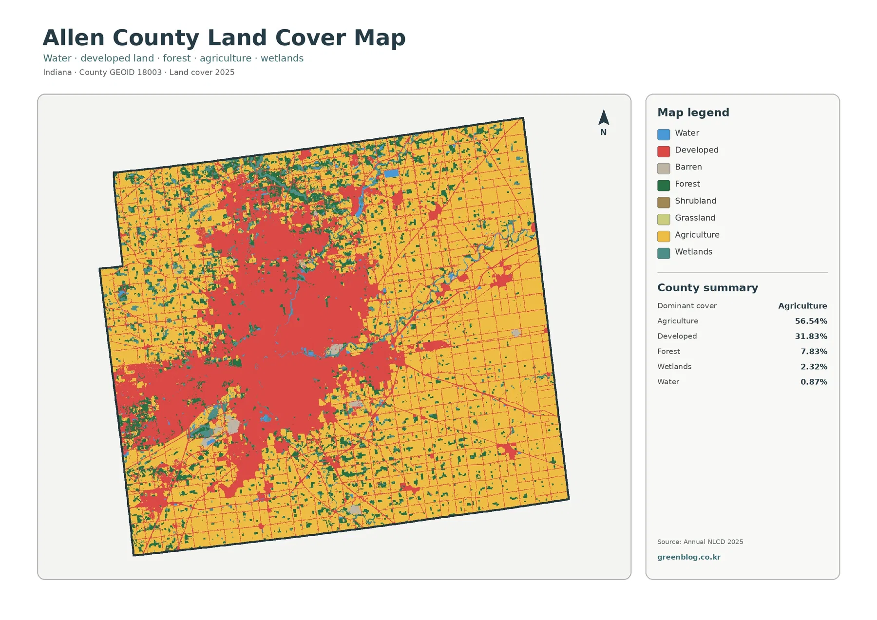
Yellow agricultural cover dominates the eastern half and remains extensive along the northern and southern edges. Red developed cover is concentrated very differently. It spreads through a broad central area, extends toward the western side, and breaks into smaller clusters farther north and east. The pattern is not a clean urban-versus-rural line; agricultural blocks wrap around the built concentration on several sides and continue between some of the smaller developed patches.
The 31.83% developed share is large enough that the central red area occupies a substantial part of the county image. It is surrounded by thinner red lines and detached patches that reach into the agricultural surroundings. Because the supplied maps do not label municipalities or draw city limits, those red edges should be described as developed land cover rather than as a legal urban boundary. A municipal boundary could include lawns, fields, woods, or other surfaces that receive different land-cover classes.
Forest contributes 7.83%. Green cells form scattered blocks and narrow bands rather than one continuous forest occupying a single corner. Some of the more noticeable green areas sit north and northwest of the largest developed concentration, while additional patches follow curved wet-looking corridors toward the center and east. Wetlands make up 2.32% and open water 0.87%, so both are smaller classes, yet their blue and teal colors help trace where natural cover interrupts the agricultural and built surfaces.
Land cover describes the surface category assigned from remotely sensed data. It does not identify zoning, ownership, parcel boundaries, building rights, or the legal use of a property. A developed cell can include trees and grass around buildings, while an agricultural cell does not identify a specific crop or farm. The map is therefore appropriate for county-scale comparison, not for deciding what can be built or regulated on an individual parcel.
Impervious cover reveals the intensity inside the developed area
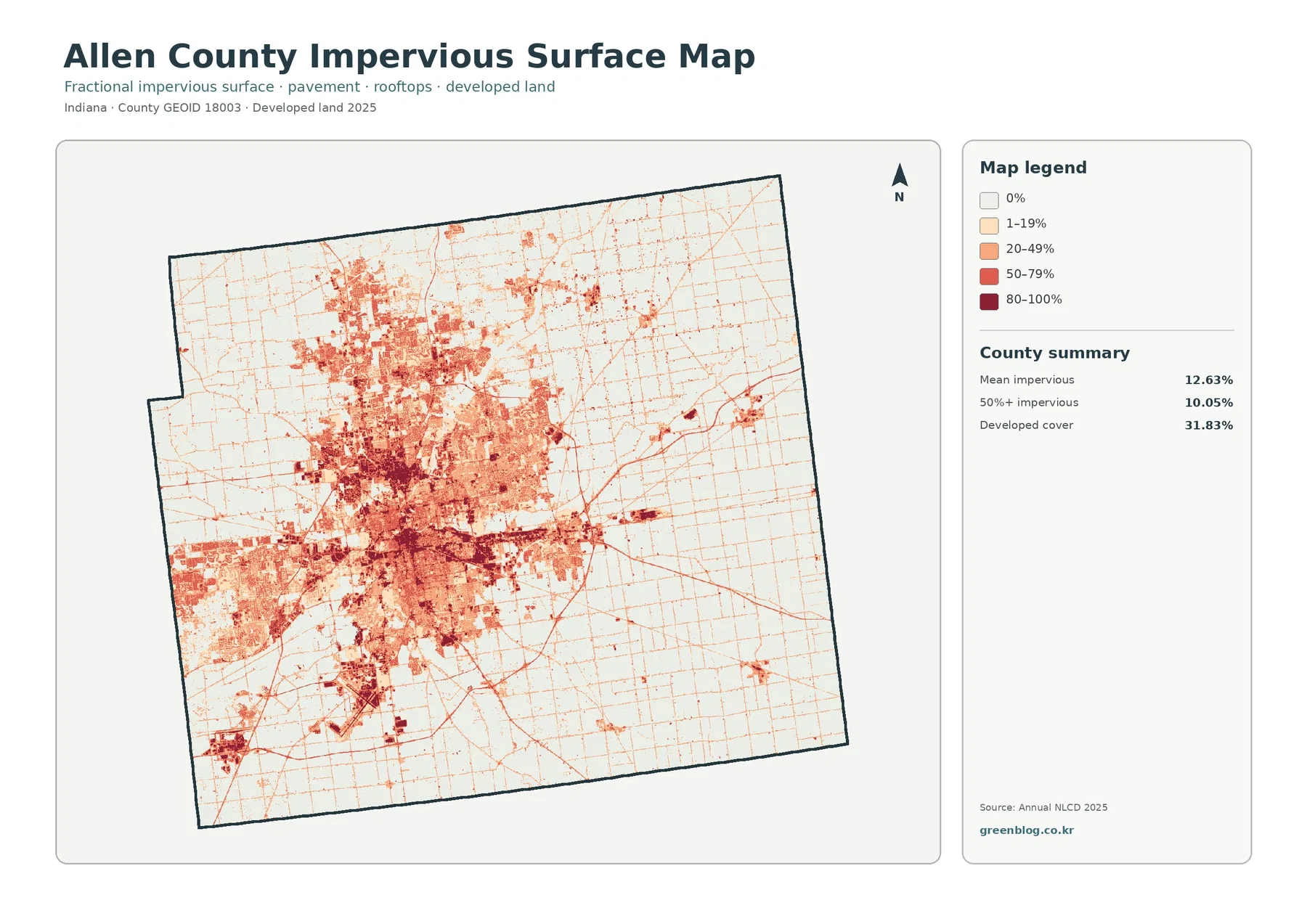
Mean impervious cover is 12.63%, and 10.05% of the county is mapped at 50% impervious surface or greater. Both numbers are well below the 31.83% developed-cover share because developed classes can contain permeable surfaces such as lawns, trees, bare soil, and landscaped open space. The impervious map isolates the harder surfaces, making it a better choice when the question concerns pavement and rooftops rather than the full extent of developed land.
The darkest shades cluster inside the same broad central-west area that appears red on the current land-cover map. A dense core of 50–100% impervious cells is surrounded by lighter zones, so the developed area contains a clear range of surface intensity rather than one uniform value. Separate dark patches also appear north and east of the main concentration. By contrast, much of the eastern and southeastern farm country remains white or very lightly shaded.
Thin lines extend far beyond the dense built center and create a fine network across agricultural areas. Those lines are consistent with narrow hard surfaces such as paved transportation corridors, but the image provides no road names, route numbers, traffic volumes, or street classifications. A long diagonal line may be useful as a visual reference, yet it should not be named as a specific highway without another transportation source.
Impervious cover can help identify places where hard surfaces are concentrated, but it is not a flood-risk map. Runoff also depends on rainfall, drainage systems, topography, soil, streams, wetlands, and local engineering. The map is useful for screening and teaching because it shows where hard surfaces are dense and where they thin out, but hazard or drainage decisions require current official data designed for those purposes.
Farm country becomes easier to see when the developed area is muted
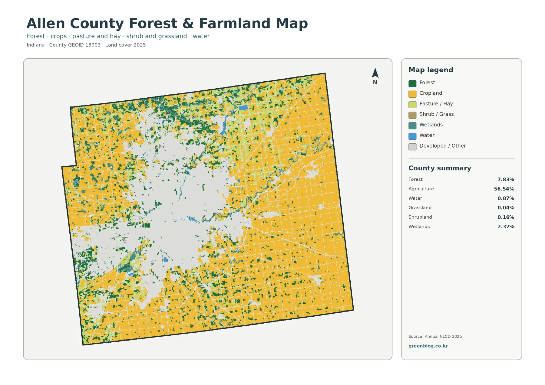
With developed and other surfaces shown in pale gray, the 56.54% agricultural share becomes easier to trace around the county. Large yellow blocks fill much of the east and southeast and continue along the north and south. Near the central developed area, agricultural patches become smaller and more interrupted. Farther outward, they form broader, simpler fields, creating a strong contrast between the fragmented edge of development and the more continuous agricultural exterior.
Forest covers 7.83% and appears in a different pattern from agriculture. Green patches are irregular, often narrower, and frequently occur beside wetlands or water. The northwestern and north-central parts contain several noticeable wooded groups, while additional green bands appear east of the main developed concentration. These locations make forest useful as a visual connector between the farm matrix and the blue-teal water-related classes, even though forest remains a much smaller share than agriculture.
Wetlands account for 2.32% and open water for 0.87%. The distinction matters because teal wetland cells can include vegetation or saturated ground, while blue water represents exposed water surfaces. A teal corridor should not automatically be labeled as a river, and a small open-water percentage does not mean that water-related landscapes are absent. The two classes describe different surface conditions and should be read separately.
Grassland is listed at 0.04% and shrubland at 0.16% in the supplied summary. Their shares are too small to define the countywide pattern, but they help prevent every nonfarm, nonforest patch from being treated as developed cover. They are best used as secondary categories when examining transitions along field edges, wooded margins, and the outskirts of the large developed area.
The 1985–2025 comparison is concentrated around the developed side of the county
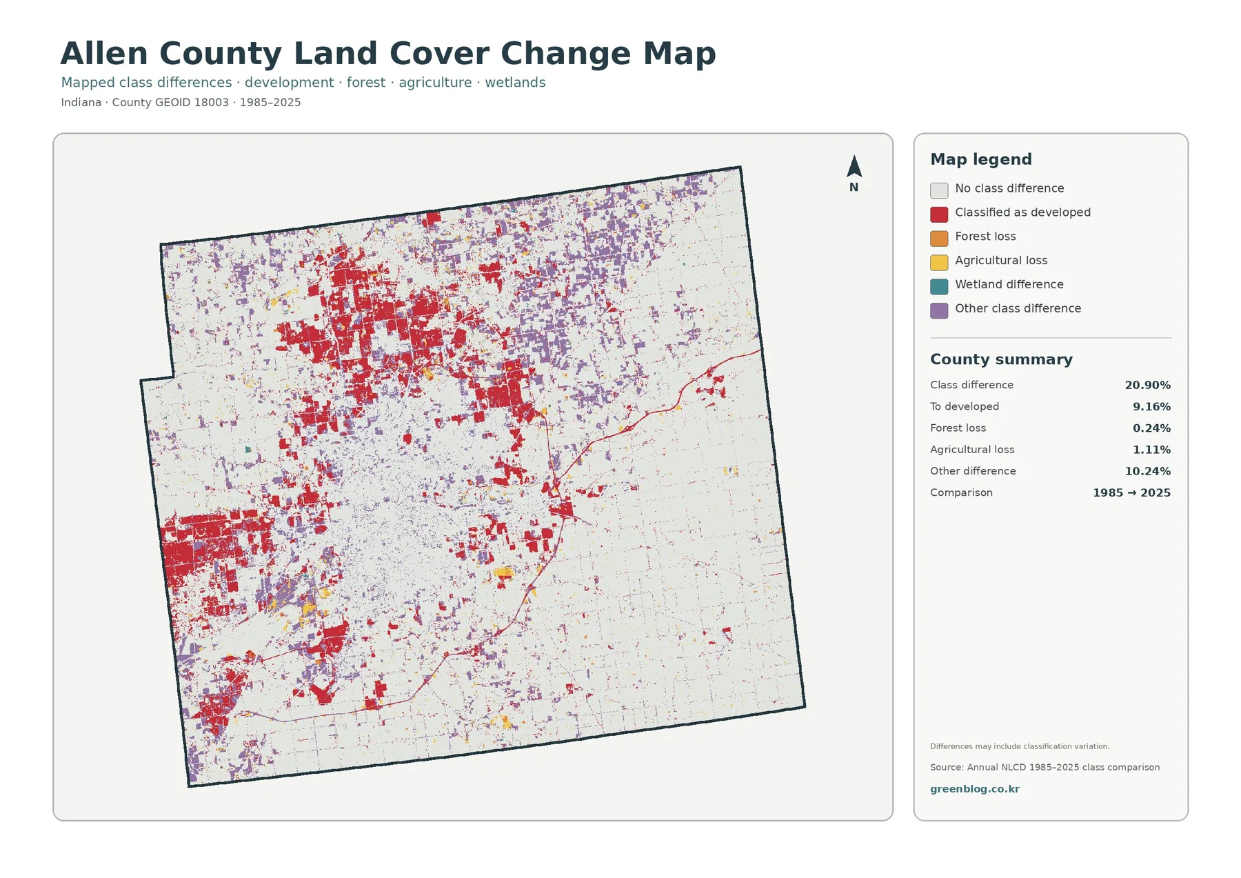
The map reports a total class difference of 20.90% between 1985 and 2025. That number is the share of cells with different endpoint classifications, not the percentage of Allen County that was damaged or permanently transformed. The map itself warns that classification variation may be included. Image timing, seasonal conditions, mixed pixels, and classification methods can contribute to differences alongside real surface change.
Cells classified as developed account for 9.16% in the change summary. Red change cells are especially prominent around the northern and western portions of the present-day developed concentration and appear in additional outlying patches. Their broad distribution makes development-related class difference one of the clearest visual features of the comparison. It still does not establish when a specific change happened or what project, demographic trend, or local decision caused it.
Other class difference is listed at 10.24% and appears as widespread purple patches, particularly across the northern and central parts of the county. Agricultural loss is 1.11%, while forest loss is 0.24%. Wetland difference is included in the legend but has no separate percentage printed in the summary. Calculating a remainder and presenting it as an official wetland rate would ignore rounding and the way the classes were processed, so the safest approach is to report only the values printed on the map.
Terms such as “forest loss” and “agricultural loss” describe a change in endpoint labels. They do not prove logging, construction, abandonment, flood effects, restoration, or any other cause. A cell that changed from forest in 1985 to another class in 2025 needs intermediate imagery or local records before its timing and explanation can be established. Use the change map to locate areas worth investigating rather than to assign causes by color alone.
Why the four maps should not be read as interchangeable layers
The current land-cover map answers the broadest question: what surface classes were mapped across Allen County in 2025? The forest and farmland view then removes much of the visual weight of developed land so vegetation and water-related classes are easier to follow. The impervious layer narrows the focus again by measuring hard surfaces inside and outside developed areas. Finally, the change map leaves current classification behind and shows endpoint differences instead.
This distinction is especially important in the central developed area. A red current-land-cover cell means developed cover in 2025, while a dark impervious cell means a high percentage of hard surface. A red change cell means the 1985 and 2025 comparison placed that cell in the developed-change category. Those colors may overlap in the same part of the county, but they do not represent the same measurement.
For a presentation, start with the current map so the audience sees agriculture, developed land, forest, wetlands, and water together. Add the vegetation map when discussing the agricultural exterior, or the impervious map when discussing surface intensity. Place the 1985–2025 image after the present-day view and explain that it compares two endpoints. This sequence reduces the risk that a change color will be mistaken for a current land-cover class.
Scale, cell size, and observation year limit what the maps can answer
Annual NLCD uses a 30-meter raster grid. Each square cell receives a predominant classification even when several surfaces occupy that space. A narrow stream, roadside tree strip, small pond, parking lot edge, or mixed residential parcel can therefore look wider, narrower, more fragmented, or more continuous than it does on the ground. Enlarging the JPG improves viewing size but cannot create parcel detail that was not present in the original cells.
The current maps use the supplied 2025 observation year. Construction, demolition, crop conditions, vegetation recovery, or water changes after that observation may not appear. The 1985–2025 comparison also uses two endpoints, so it does not show the full sequence of changes between them. A location could change more than once during forty years and still look simple in an endpoint comparison.
Each downloadable JPG is 2480 × 1754 pixels and preserves the original proportions supplied in the package. The files are practical for screens, documents, lessons, and many ordinary print layouts, but the asset manifest does not mark them as meeting an A3 high-resolution reference. Test a proof before making a large poster, and use current parcel, zoning, survey, wetland, flood, or engineering records for decisions that require legal or site-level precision.
Practical ways to use the Allen County map set
A county profile can use the 2025 overview to explain how a broad developed center sits within a county that is still 56.54% agricultural. An environmental lesson can compare the smaller 7.83% forest and 2.32% wetland shares with the much larger agricultural and developed classes, then use the vegetation map to locate where those natural surfaces remain visible. The maps support comparison without requiring the reader to infer legal land use from the colors.
For an urban-surface lesson, the difference between 31.83% developed cover and 12.63% mean impervious cover is particularly useful. It shows why a developed classification is broader than pavement and rooftops. For a change lesson, the 20.90% class-difference value provides an opportunity to discuss why endpoint change is not the same as damage and why intermediate evidence is needed before assigning a cause.
Frequently Asked Questions
Why does developed land look so prominent if agriculture is the largest class?
Agriculture covers 56.54%, but developed land still represents 31.83% and is concentrated in one broad central-west area. Concentrated red cover can look visually stronger than agricultural cover spread around the outer parts of the county. Reading the printed percentages together with the map prevents the size of one dense cluster from being mistaken for a countywide majority.
Why is mean impervious cover 12.63% when developed cover is 31.83%?
Developed classes can include lawns, trees, bare soil, and other permeable surfaces around buildings and roads. The impervious layer measures the harder surfaces such as pavement and rooftops. A developed cell therefore does not need to be completely impervious, which is why the countywide mean impervious percentage is lower than the developed-cover share.
Does the 20.90% 1985–2025 class difference represent land damage?
No. It is the share of cells with different endpoint classifications, and the map notes that classification variation may be included. The listed components include 9.16% classified as developed, 1.11% agricultural loss, 0.24% forest loss, and 10.24% other difference. Timing and cause require intermediate imagery and other local evidence.
Sources and Reference Data
- MRLC Annual NLCD Data – official access point for annual land-cover and comparison products
- USGS Annual NLCD Land Cover Classification – official descriptions of forest, developed, agriculture, wetlands, and related land-cover classes
- U.S. Census Bureau TIGER/Line Shapefiles – official county-boundary reference used to identify Allen County
Map File Information
The ZIP contains four original JPG maps for comparing Allen County's 2025 land cover, agricultural and forest pattern, impervious surfaces, and 1985–2025 class differences.
- Included Files: Use only the versions confirmed in the article and supplied images
- File Type: Use the confirmed download contents
- Intended Use: Printing, education, presentations, and map-based projects
Related Maps
- Adams County Indiana Land Cover Map
- Indiana Population Density: Indianapolis Core and Fast-Growing Suburban Counties
- Why 92 Counties Fit a Tall Indiana State Map
Green Map creates custom-edited map images using open geographic data sources such as geoBoundaries, Natural Earth, OpenStreetMap, and government open data.
These maps are edited visual materials, not raw data files, and are provided for education, documents, presentations, and graphic reference.