Agriculture covers 84.87% of Clinton County in the supplied 2025 dataset, making farmed land the unmistakable background of the county. Frankfort forms the largest developed concentration near the middle, while forest and wetland cells appear in much smaller ribbons and patches between fields. This Clinton County Indiana Land Cover Map is designed to show those contrasts without treating the county as one uniform agricultural surface.
The page includes a 2025 land-cover overview, a forest-and-farmland view, an impervious-surface map, and a 1985–2025 class-difference comparison. The WebP images are presented for quick reading on the page. Four original 2480 × 1754-pixel JPG maps are also available together in one ZIP for county profiles, classroom work, presentations, and first-pass landscape comparisons.
Table of Contents
A countywide farm pattern interrupted by one large central developed cluster
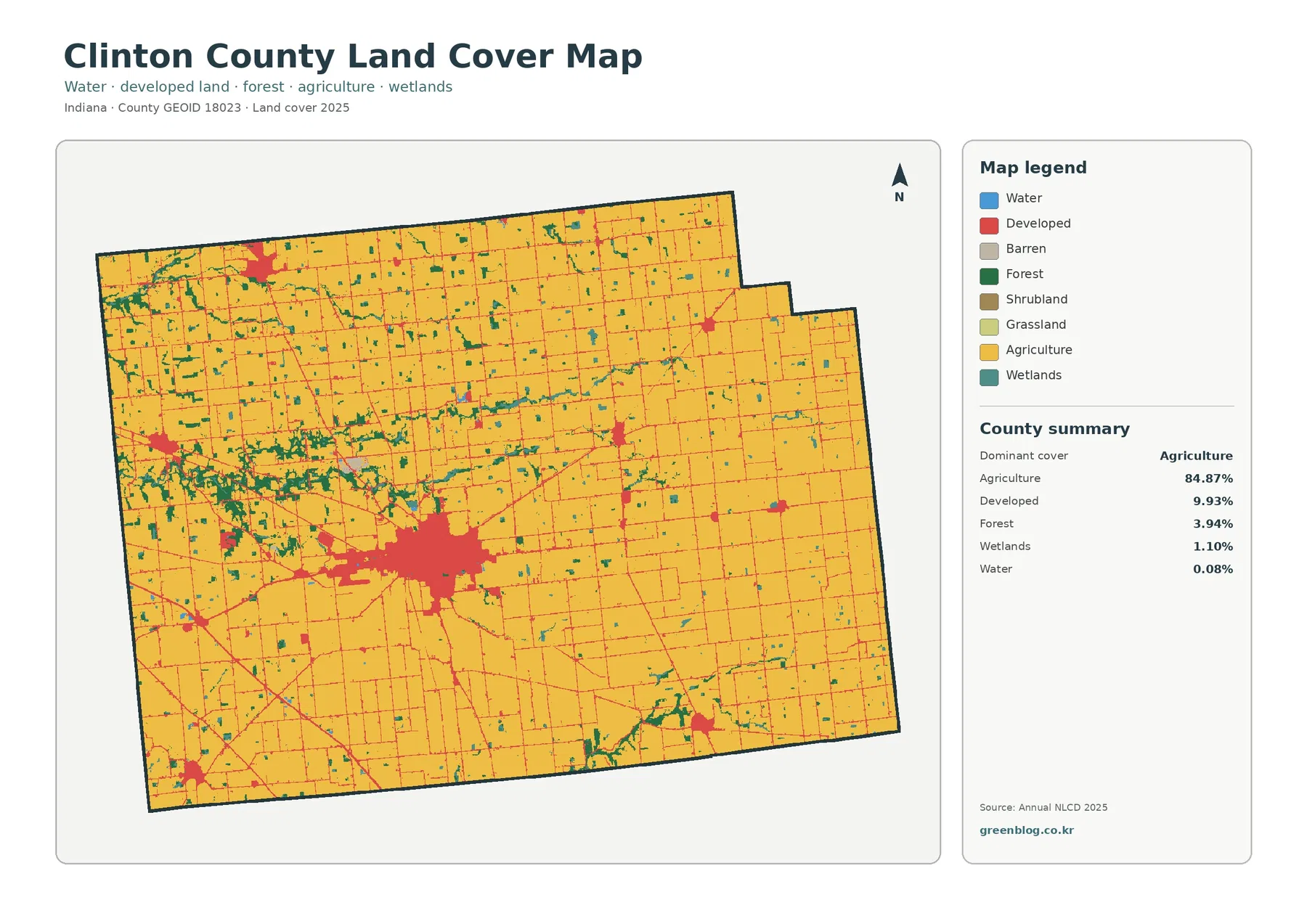
Yellow agricultural cells fill nearly every part of the county. The broad blocks continue north, east, and south of Frankfort and remain dominant even where small towns or linear developed traces appear. The 84.87% share therefore describes more than a statistical majority. It matches a map in which most nonagricultural cover occurs as compact settlements, thin lines, or small natural patches embedded within a much larger field pattern.
Developed land accounts for 9.93%. The largest red area corresponds to Frankfort and is far larger than the smaller clusters elsewhere in the county. Thin red lines extend away from the center and form a loose network through the agricultural background. Several separate built concentrations appear toward the county edges, but the land-cover image does not label municipal boundaries. Naming every small cluster from this image alone would therefore go beyond what the map supports.
Forest is only 3.94% of the county, yet its location is visually useful. Green patches gather more often west and northwest of the main developed center, with additional narrow groups farther north and toward the southeast. Much of this forest is broken into small pieces rather than one continuous block. That makes the forest percentage easy to overlook in a table even though the green patches visibly divide some field areas.
Wetlands make up 1.10%, while open water is 0.08%. The two classes should not be combined. Blue cells represent exposed water, whereas wetland classes can include vegetation and ground influenced by water. A county can therefore have very little mapped open water and still show more wetland cover. The preview has no stream labels, so narrow teal or blue traces should not be assigned a river or ditch name without a hydrography layer.
Land cover describes the surface classified from imagery and related data. It is not a zoning map, ownership map, parcel survey, farm boundary, or statement about development rights. A developed cell may contain lawn and trees in addition to roofs and pavement, and an agricultural cell does not identify an owner or crop. Keeping those limits in mind is especially important in a county where field-shaped blocks can look similar to legal property lines.
The 4.46% endpoint difference is smaller than the current developed share
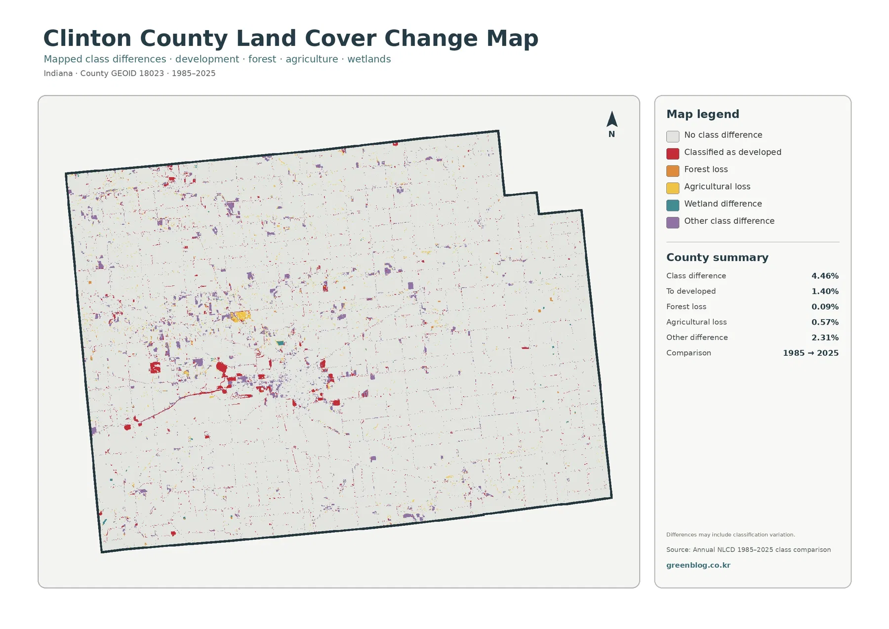
The mapped class difference between 1985 and 2025 is 4.46%. The supplied summary lists 1.40% as classified to developed, 0.09% as forest loss, 0.57% as agricultural loss, and 2.31% as other difference. Wetland difference appears in the legend but has no separate percentage in the summary. A residual calculation or visual estimate should not be presented as an official wetland-change value.
Red developed-conversion cells are most noticeable around Frankfort, where they occur beside areas that are already developed in the current map. Smaller red groups and traces appear elsewhere. Purple other-difference cells are more widely scattered and represent the largest listed component at 2.31%. Yellow agricultural-loss cells are visible in small patches, while the orange forest-loss category is sparse, which is consistent with its very small 0.09% summary value.
The 4.46% total is not a countywide development rate. Only 1.40% is specifically listed as cells classified to developed at the 2025 endpoint after receiving another class in 1985. The remaining total includes multiple transitions. Calling every colored cell urban growth would erase the distinction between agricultural, forest, wetland, and other classification changes.
Likewise, “forest loss” and “agricultural loss” are classification descriptions, not explanations of cause. A cell that changed class could reflect an actual surface change, but the map does not identify construction, harvest, abandonment, drainage work, flooding, restoration, or classification variation as the reason. Intermediate-year imagery and local records are needed to determine when a change happened and what produced it.
Frankfort stands out more strongly when hard surfaces are separated from developed cover
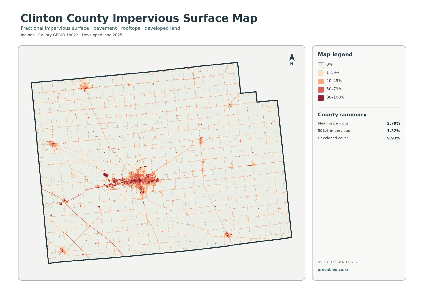
Mean impervious cover is 2.79%, and 1.32% of the county is mapped at 50% impervious or greater. Both values are well below the 9.93% developed-land share. That difference is expected because developed land can include lawns, planted trees, exposed soil, and other permeable surfaces around buildings. The impervious layer narrows the question to roofs, pavement, parking areas, and similar hard materials.
The darkest tones cluster in Frankfort. Within the larger built area, the map separates a denser central group from lighter developed surroundings. Thin lines extend into the farm landscape, while smaller dark or medium clusters appear at other settlements. This pattern makes the impervious view more useful than the general land-cover map when the question is where built surfaces are most concentrated rather than how much land receives a developed class.
Clinton County’s official website notes access by State Road 28, U.S. 52, and I-65. The impervious map contains many long linear traces, but none of those routes is labeled in the image. A line that resembles a highway should therefore be matched to an official transportation map before it is named. The same caution applies to thin developed traces around smaller towns and rural intersections.
A countywide mean of 2.79% combines the dense center with very large rural areas close to zero. It cannot describe a city block, industrial site, or individual drainage area. Impervious cover can be useful for framing runoff questions, but rainfall, soil, topography, drainage infrastructure, streams, and wetlands also matter. This image is a surface-intensity reference, not a flood or engineering map.
Fields dominate even more clearly after developed and miscellaneous surfaces are faded
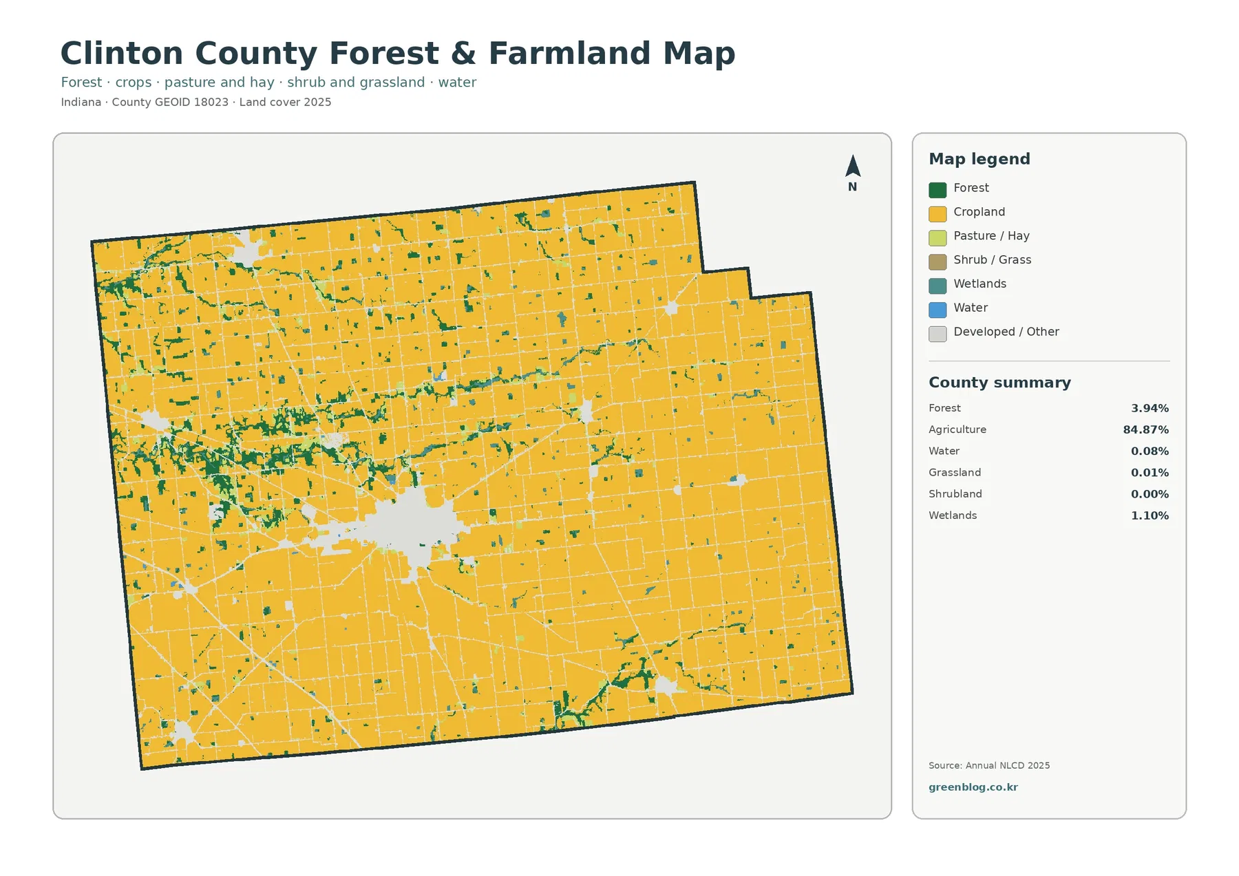
Removing the strong red developed color makes the 84.87% agricultural share almost continuous across the page. Frankfort becomes a pale opening inside the field pattern rather than the visual center. Large yellow blocks extend around that opening in every direction. The result is useful for explaining how a sizable county seat can exist within a county whose overall surface is still overwhelmingly agricultural.
The green forest cells become easier to follow in this version. They are more frequent west and northwest of Frankfort and appear in several narrow connections across the northern half. Another curved group is visible toward the southeast. Because forest is only 3.94%, these local concentrations matter more than the countywide percentage when the goal is to show where natural cover interrupts the field grid.
The focused summary also reports wetland at 1.10%, water at 0.08%, grassland at 0.01%, and shrubland at 0.00%. Grassland and shrubland are too small to justify broad claims about the county. Wetlands, however, appear often enough to create small teal pieces along some forest and field edges. Open water remains limited, reinforcing the need to distinguish exposed water from wetter vegetated surfaces.
Straight agricultural edges may resemble parcel boundaries, but Annual NLCD is a raster classification using 30-meter cells. Tree rows, drainage ditches, farm lanes, small buildings, and mixed surfaces can be absorbed into the dominant class. The map is therefore useful for county-scale field distribution, not for determining property lines, planted acreage on one farm, or a specific crop.
Small natural patches deserve attention in a county with such a high agricultural share
An 84.87% agriculture statistic can make the remaining categories sound unimportant, but their locations add useful detail. Forest and wetlands appear together in some areas and separately in others. They break the large field pattern into smaller units and provide a visual reminder that the county is not a single uninterrupted crop surface. For classroom or county-profile use, showing those interruptions is more informative than repeating the agriculture percentage alone.
Purdue Extension Clinton County describes its Agriculture and Natural Resources program as serving traditional agriculture audiences as well as woodland owners, gardeners, and homeowners. That local resource is useful for questions beyond the map, especially crop, farm-management, woodland, or water-quality topics. It should not be treated as the source of the 84.87% land-cover statistic, which comes from the mapped Annual NLCD dataset.
Agricultural land cover also does not tell the reader what is planted, how productive the land is, or how it is managed. Those questions require crop records, agricultural statistics, soils, drainage information, and field-scale data. The map answers a simpler spatial question: where does agricultural surface dominate, and where do developed or natural classes interrupt it?
Municipal planning boundaries answer a different question than the red land-cover cells
The Clinton County Area Plan Commission states that it serves Mulberry, Rossville, Kirklin, Colfax, and the county’s unincorporated areas, providing planning, zoning, permit, addressing, and inspection services. Those administrative responsibilities are separate from Annual NLCD classification. The land-cover map can show a small developed cluster, but it does not show where a town boundary begins or whether a parcel falls within a zoning district.
This distinction is especially useful when reading the smaller red patches outside Frankfort. A municipality can contain farmland, grass, trees, and water, while developed cells can also occur beyond municipal limits. A red pixel is therefore neither a city-limit marker nor a building-permit approval. For land-use regulation, parcel questions, or annexation, the reader should move from the land-cover image to official local planning and boundary records.
Using the two sources together can make a clearer presentation. Start with land cover to establish the countywide surface pattern, then add official boundaries only when the discussion shifts to jurisdiction. That keeps the map from carrying more meaning than it was designed to provide and prevents a visual land-cover class from being mistaken for a legal designation.
Current cover and endpoint change tell different stories about the same central area
Frankfort is the largest current developed cluster on the 2025 map, while the change map also shows a concentration of cells classified to developed around the same general area. Those observations are related but not interchangeable. Current developed cover is 9.93%; the 1985–2025 “to developed” component is 1.40%. One describes the 2025 surface, and the other describes a subset of cells whose endpoint classification differs.
The same distinction applies to agriculture. Agriculture occupies 84.87% in the current map, while agricultural loss is listed as 0.57% in the endpoint comparison. The 0.57% value is not the county’s net decline in agricultural area. Calculating net change would require comparable full class totals for both years and careful treatment of all transitions in both directions.
For a report or lesson, the safest sequence is to show the 2025 overview first, then place the change map beside it. That order lets the reader see what exists now before interpreting which cells received different classes at the two endpoints. It also reduces the chance that red change cells will be mistaken for all current development or that unchanged developed areas will be ignored.
What the 30-meter cells and 2480 × 1754 JPGs can and cannot support
Annual NLCD uses 30-meter square cells, which are well suited to broad county comparisons. Small ponds, narrow ditches, single tree rows, minor roads, and isolated buildings may be generalized into neighboring classes. Enlarging the image makes the cells larger on screen but does not recover parcel-level detail that was never present in the source classification.
The current layer represents the supplied 2025 observation year. Construction, crop changes, vegetation recovery, clearing, or water conditions after that observation may not appear. The 1985–2025 comparison is also an endpoint comparison rather than a continuous record of every intermediate year. Current permitting or site decisions should rely on newer local records and more detailed imagery.
Each original JPG measures 2480 × 1754 pixels. That size is convenient for documents, slides, ordinary printing, and map comparison. The package does not state that the files meet an A3 high-resolution reference, so a large poster should be test-printed before final use. These graphics are references, not survey, parcel, wetland-jurisdiction, flood-insurance, or engineering products.
Four original JPG maps for a step-by-step Clinton County comparison
The ZIP contains one JPG for 2025 land cover, forest and farmland, impervious surface and developed land, and 1985–2025 land-cover change. Begin with the countywide overview when the audience needs the 84.87% agricultural context. Add the forest-and-farmland view when the smaller natural interruptions matter, or the impervious map when the focus is Frankfort’s hard-surface concentration.
Use the change map only after the current classes are established. That sequence keeps 9.93% current developed land, 2.79% mean impervious cover, 1.40% classified to developed, and 4.46% total endpoint difference in their proper roles. A pair of carefully chosen maps usually explains the question better than displaying all four without a reading order.
Frequently Asked Questions
Is Clinton County almost entirely agricultural?
Agriculture is the dominant class at 84.87%, but the county is not one continuous agricultural surface. Developed land accounts for 9.93%, led by the Frankfort cluster, while forest is 3.94% and wetlands are 1.10%. Their smaller percentages still produce visible interruptions and local contrasts within the farm pattern.
Why is developed cover 9.93% while mean impervious cover is only 2.79%?
Developed classes can include lawns, trees, bare ground, and other permeable surfaces around buildings and roads. Impervious cover focuses on roofs, pavement, parking areas, and similar hard surfaces. As a result, the countywide impervious mean is lower and the highest values are concentrated in Frankfort rather than spread evenly across every developed cell.
Does the 4.46% class difference mean Clinton County grew by 4.46%?
No. The 4.46% figure combines several kinds of endpoint classification difference. The supplied summary lists 1.40% classified to developed, 0.09% forest loss, 0.57% agricultural loss, and 2.31% other difference, with wetland difference also represented in the legend. It should not be converted into a population-growth, urban-growth, or damage rate.
Sources and Reference Data
- MRLC Annual NLCD Data – official access point for current land-cover and comparison products
- USGS Annual NLCD Land Cover Classification – definitions and guidance for agriculture, forest, developed land, wetlands, water, and related classes
- U.S. Census Bureau TIGER/Line Shapefiles – official county and administrative boundary reference
- Clinton County, Indiana – official county information, including local access routes and government resources
- Clinton County Area Plan Commission – local planning, zoning, permit, and jurisdiction information for participating towns and unincorporated areas
- Purdue Extension Clinton County Agriculture and Natural Resources – county-specific agriculture, woodland, gardening, and natural-resource information
Map File Information
The ZIP contains four original JPG maps for comparing Clinton County’s broad agricultural cover, Frankfort-area development, forest and wetland patches, impervious surfaces, and 1985–2025 class differences.
- Included Files: 4 original JPG land cover map files shown in this article
- File Type: JPG files in a ZIP archive
- Intended Use: Printing, education, presentations, and map-based projects
Related Maps
- Adams County Indiana Land Cover Map
- Allen County Indiana Land Cover Map
- Bartholomew County Indiana Land Cover Map
Green Map creates custom-edited map images using open geographic data sources such as geoBoundaries, Natural Earth, OpenStreetMap, and government open data. These maps are edited visual materials, not raw data files, and are provided for education, documents, presentations, and graphic reference.