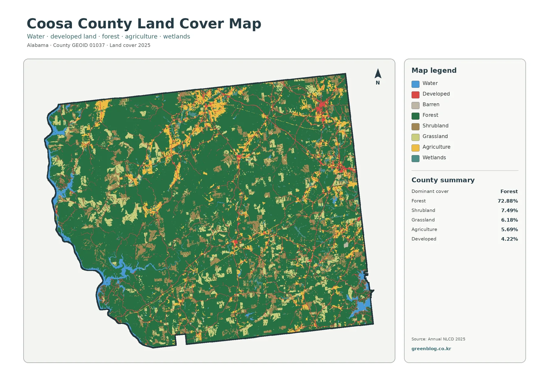
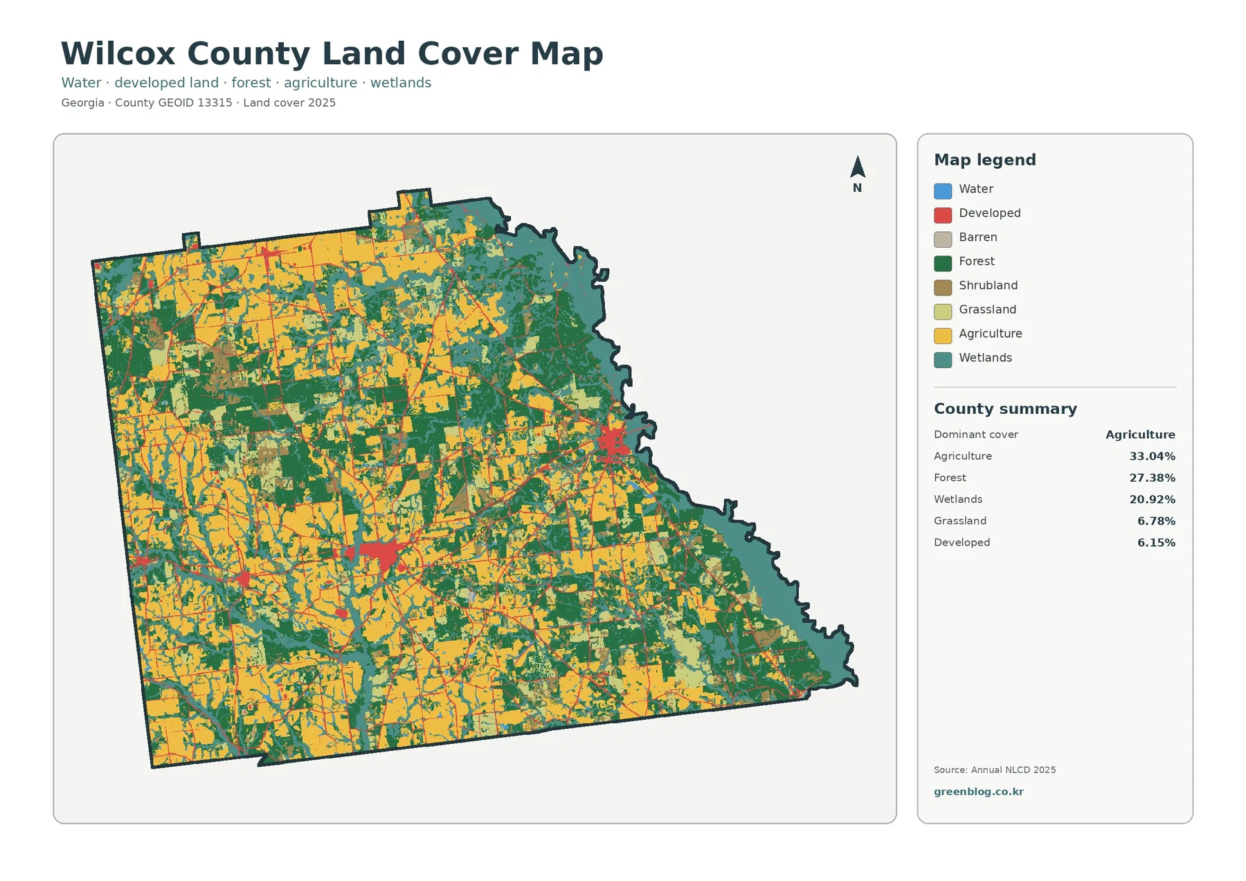
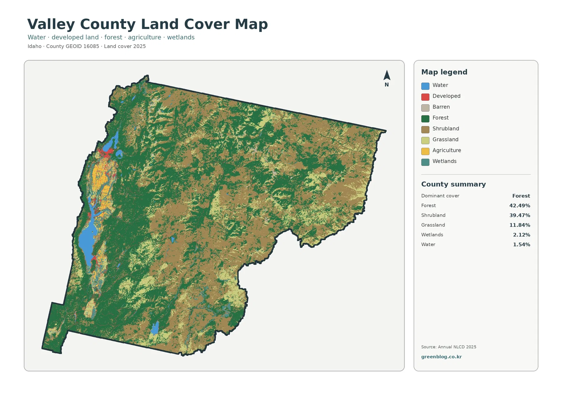
Agriculture covers 75.91% of Wabash County in the supplied 2025 land-cover summary, yet the county map is not a uniform field pattern. A concentrated developed area stands out along the east-central side, while forest, wetlands, and water become much more noticeable near the eastern edge and at the narrow southern end. The four maps on this page separate those features so that broad land cover, farm-and-forest patterns, impervious surfaces, and 1985–2025 classification differences can be compared at the same county boundary.
The browser view uses WebP images, and the original four JPG maps are available together in one ZIP farther down the page. They are useful for different questions: one shows the full mix of surface classes, another simplifies the county to emphasize agriculture and forest, the impervious map isolates pavement and rooftops, and the change map marks cells whose classifications differ between 1985 and 2025. Land cover describes what is physically covering the ground in the satellite-based classification. It does not establish zoning, ownership, parcel boundaries, building rights, or any other legal land-use status.
Table of Contents
The east-central developed cluster is the clearest break in a mostly agricultural county
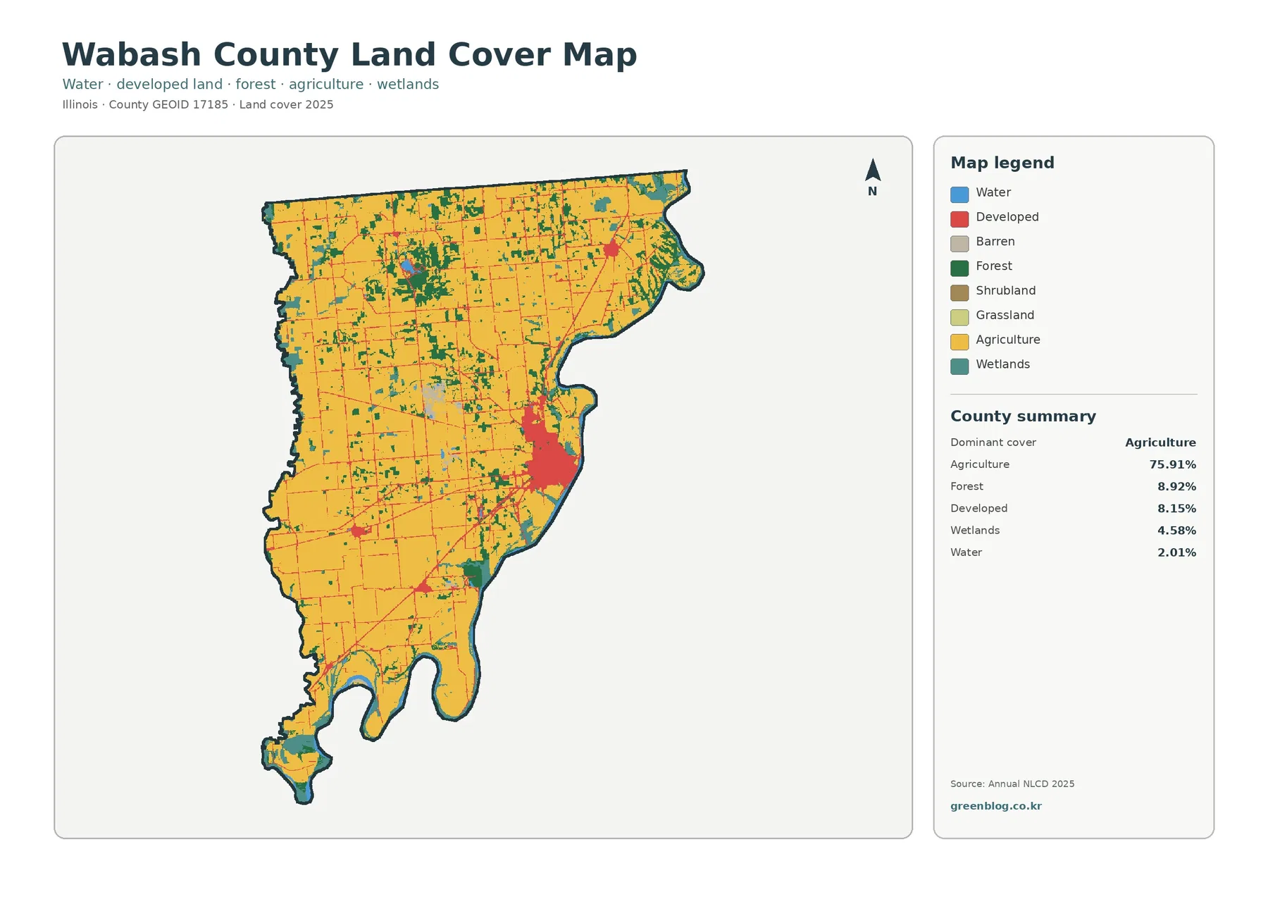
On the 2025 land-cover map, the largest developed concentration appears on the east-central side of Wabash County. It is much larger and denser than the smaller built patches scattered elsewhere. Thin developed lines extend away from that concentration through surrounding agricultural land, while isolated spots appear toward the north, center, and south. The pattern matters because the countywide developed share is 8.15%. That percentage does not mean development is evenly spread across 8.15% of every part of the county; most of it is visibly concentrated in a few locations.
Agriculture surrounds this built concentration on several sides and continues across most of the interior. Forest and wetlands become more frequent toward the eastern boundary, producing a less regular mix of colors than the broad farm areas farther west. The southern tip is also distinctive. There, agriculture remains important, but small areas of forest, wetland, and water repeatedly interrupt the farm cover. These contrasts make the general land-cover map the best starting point when the goal is to understand how all major surface classes fit together.
Countywide percentages make more sense when they are paired with the map pattern
The summary lists agriculture at 75.91%, forest at 8.92%, developed land at 8.15%, wetlands at 4.58%, and water at 2.01%. Grassland is only 0.03% and shrubland 0.01% in the supplied farm-and-forest summary. Those figures quickly establish the overall balance, but they do not explain where each class is located. Agriculture is both the largest percentage and the broadest continuous cover. Forest is far smaller in area but forms irregular strips and patches that are visually easy to follow. Wetlands occupy an even smaller share, yet their concentration near the east and south gives them more local importance than the countywide number alone suggests.
This distinction between share and location is useful whenever a map is used in a report or lesson. A class can be small countywide and still dominate the appearance of one specific edge or corridor. Conversely, agriculture can cover three quarters of the county without being the most interesting feature at an east-side developed center or a wet southern boundary. Reading both the legend and the map prevents the summary table from becoming a substitute for the actual geography shown in the image.
Forest is scattered through the interior but becomes more persistent near the eastern edge
The forest-and-farmland map removes much of the complexity of the developed classes, making the green forest pattern easier to trace. Broad yellow cropland dominates the west, center, and much of the south. Forest appears as irregular blocks and narrow strips through parts of the interior, with more persistent green areas toward the eastern side. Several bends along the eastern county edge contain forest next to wetland colors, and the southern end also contains a tighter mix of forest, wetland, water, and agricultural cover.
The 8.92% forest share should therefore be understood as a countywide total rather than a description of a single large wooded district. Much of the visible forest is fragmented or elongated. The map can show that forest and wetter classes occur close together, but it cannot by itself establish why the forest remains there. Terrain, drainage, ownership, conservation, and land-management history would require additional sources. The safest interpretation is simply that these surface classes are spatially associated in several parts of the supplied map.
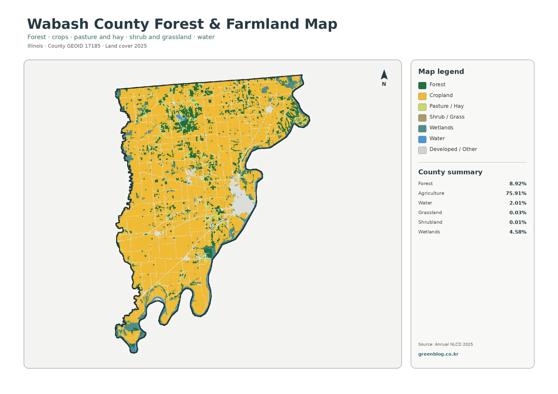
For a simple comparison of cultivated land and woodland, this version is often easier to use than the full land-cover map. The broad farm surface is immediately visible, and small green segments do not have to compete with the stronger developed-land colors. It also makes the southern end easier to inspect because forest and wet classes remain visible against the agricultural background. The tradeoff is that developed areas are generalized, so the map should be paired with the full land-cover or impervious map when settlement surfaces matter.
Wetlands and water occupy modest shares but form a distinct eastern and southern pattern
Wetlands account for 4.58% of the 2025 summary and water for 2.01%. Together they are much smaller than agriculture, yet their location makes them conspicuous. Teal wetland cells appear repeatedly near the eastern boundary, in the southern portion, and in smaller interior pockets. Blue water cells are less extensive but occur close to some of the same green and teal areas. The result is a more varied surface pattern along the east and south than across the farm-dominated interior.
These mapped classes should not be treated as exact regulatory boundaries. Annual NLCD is raster data, meaning the landscape is divided into cells and each cell receives a representative classification. A narrow water feature, wooded bank, wet soil, crop edge, or small developed surface may share one cell. At those transitions, the classification can simplify a much more complicated ground condition. Anyone needing a legal wetland boundary, flood determination, or detailed hydrographic line should use the appropriate official dataset for that purpose rather than relying on this county overview.
Mean impervious cover of 1.95% is far lower than the 8.15% developed-land share
Impervious surface means pavement, rooftops, parking areas, and other surfaces that water cannot easily soak through. Wabash County has mean impervious cover of 1.95%, and 0.77% of the county is mapped with impervious values of 50% or higher. Those figures are much lower than the 8.15% developed-land share because a developed class can include lawns, trees, bare soil, and other permeable surfaces around buildings and roads. The two measures answer related but different questions.
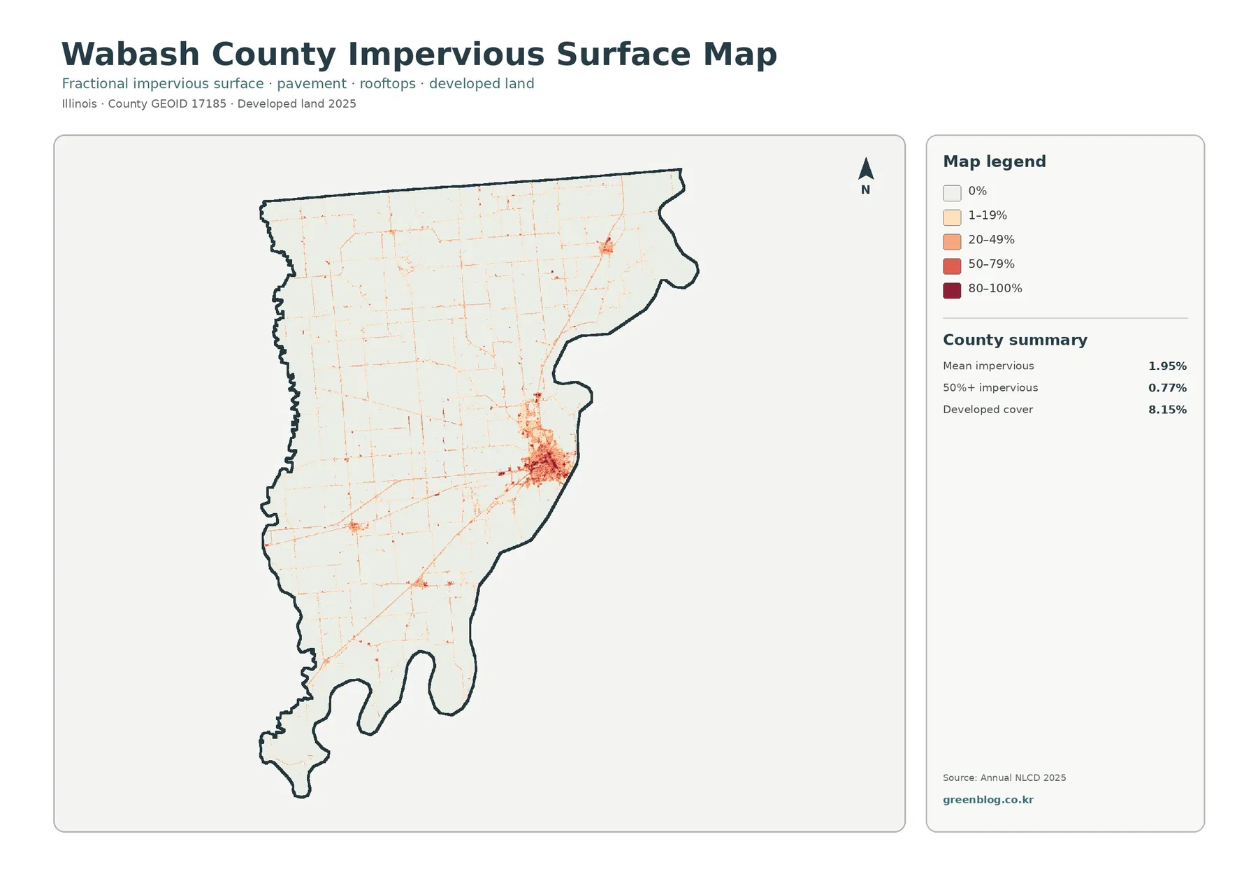
The impervious map is pale across most of the agricultural interior. Stronger orange and red values are concentrated in the east-central built area, with smaller spots and narrow lines elsewhere. This is a useful visual contrast: the general land-cover map identifies a larger developed footprint, while the impervious map narrows attention to the parts with more pavement and built surface. A rural road may be visible as a thin line even where the surrounding fields remain nearly zero impervious, and a developed neighborhood can contain both high and low values depending on the mix of buildings, pavement, yards, and vegetation.
The map is appropriate for a county-scale view of where hard surfaces are concentrated, but it is not a stormwater model. It does not show pipe capacity, drainage structures, soil infiltration, rainfall, or measured runoff. Those factors would be necessary for a site-specific drainage conclusion. Here, the value of the impervious layer is comparative: it reveals how strongly the main built cluster differs from the agricultural and natural portions of the county.
The 1985–2025 map marks classification differences across 6.13% of the county
The change map compares land-cover classes from 1985 with those from 2025. The supplied county summary reports a total class difference of 6.13%. Within that summary, 0.98% is classified as change to developed, 0.69% as forest loss, 1.26% as agricultural loss, and 3.08% as other class difference. Most of the map remains in the light “no class difference” background. Colored cells are scattered rather than forming one countywide band of change.
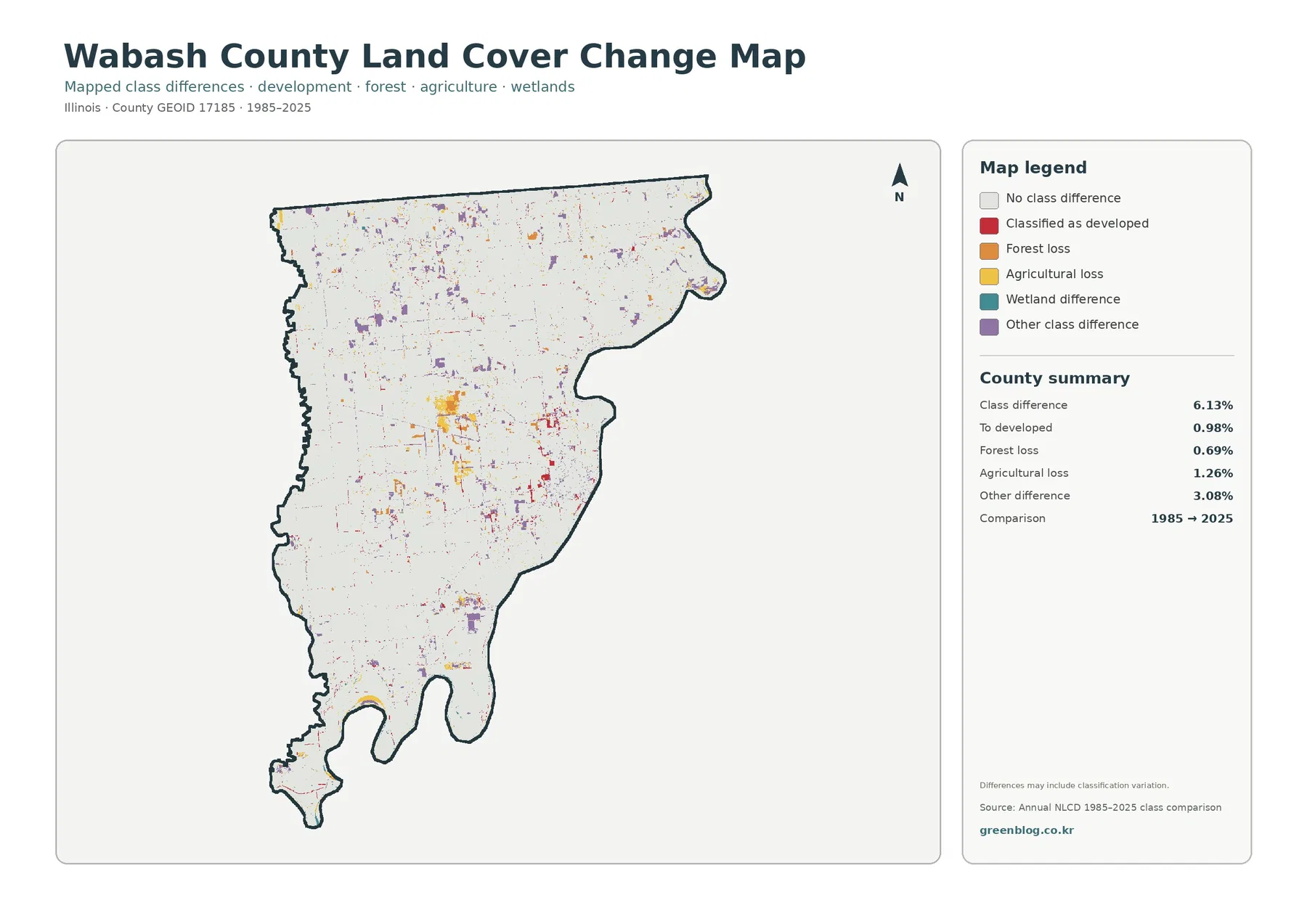
More colored cells are easy to notice around the east-central developed area, but differences also appear in farm areas and near forest or wetland edges. Some are compact patches; others are thin lines or isolated pixels. The “other difference” category is the largest single summarized component at 3.08%, which is one reason the overall 6.13% should not be described as a simple development rate. Different image dates, classification methods, mixed pixels, and changing surface conditions can all contribute to a cell receiving a different class.
For a real-world change investigation, this map works best as a locator. A user can identify a colored patch, then compare multiple Annual NLCD years, aerial photography, or local records to determine whether the difference represents a documented land conversion. The map itself does not provide the cause, date, permit history, or ownership associated with a changed cell. That limitation is especially important along edges where agriculture, forest, wetlands, and development meet within short distances.
Comparing the same location across all four maps prevents several common misreadings
Consider the east-central built concentration. In the general map it forms the strongest developed cluster in the county. In the impervious map, only portions of that cluster reach the darker values, showing that developed land is not equivalent to 100% pavement. The change map adds another layer by marking selected cells whose 1985 and 2025 classes differ. Looking at all three together separates current developed classification, present-day impervious intensity, and long-term class difference instead of treating them as the same measure.
The southern end offers a different comparison. The general land-cover image contains a close mixture of agriculture, forest, wetlands, and water, while the farm-and-forest version makes the green and yellow relationship easier to follow. Impervious values are mostly low there, so the surface pattern contrasts sharply with the east-central built cluster. The change map contains scattered differences rather than one large continuous developed conversion. This side-by-side reading shows why the four maps are more informative as a set than as isolated images.
A 30-meter raster is well suited to county patterns, not parcel-level decisions
Annual NLCD is a raster product with cells that represent the dominant or assigned land-cover condition at a fixed spatial scale. A single cell can contain a crop edge, trees, a narrow road, a ditch, a small building, or water along one side. When several surfaces fall inside the same cell, the mapped boundary necessarily simplifies the ground. That effect is easiest to notice where narrow forest strips cross farm areas or where wetland, water, and forest classes meet near the county edge.
Because of that scale, these maps work well for comparing broad agricultural dominance, locating forest concentrations, identifying the county’s main impervious cluster, and screening for areas with class differences between two years. They should not be used to decide which side of a parcel boundary contains a wetland, whether a property is zoned for a use, how much impervious surface exists on a single lot, or whether a particular field legally qualifies as agricultural land. Those questions require parcel, zoning, survey, wetland, or site-specific datasets.
Choose the map according to the question rather than treating one image as a complete answer
The full land-cover map is the strongest overview because it preserves the relationship among agriculture, forest, development, wetlands, and water. For a farm-versus-forest comparison, the simplified forest-and-farmland image reduces visual clutter. The impervious map is the best choice when the question concerns pavement and rooftops rather than the broader developed class. The 1985–2025 map is useful when the goal is to locate areas worth checking for long-term change, provided the classification caveat remains visible.
In a classroom, report, or local reference project, the maps can be paired to create concrete questions. Why does the east-central developed area have a larger footprint on the land-cover map than on the high-impervious map? Where does forest remain most visible inside a county that is 75.91% agricultural? Why do wetlands matter locally even though they account for 4.58% of the county? Which colored change cells overlap the current developed footprint, and which occur far from it? Those questions encourage map reading without turning a classification product into evidence it was not designed to provide.
Download the four original JPG maps in one ZIP
The download contains four JPG files for Wabash County: the general land-cover map, forest-and-farmland map, impervious/developed-land map, and 1985–2025 land-cover change map. All four use the same County GEOID 17185 boundary, so the broad agricultural interior, the east-central built concentration, and the more varied eastern and southern natural cover can be matched from one image to another. The WebP versions in the article are intended for quick browser viewing; the JPG files are more convenient for saving locally, placing in documents, or examining the same location across multiple map types.
Frequently Asked Questions
Does 75.91% agriculture mean that exactly 75.91% of Wabash County is legally designated farmland?
No. The 75.91% figure is the share classified as agriculture in the supplied 2025 land-cover map. It describes mapped surface cover, not tax status, ownership, agricultural zoning, conservation designation, or parcel-level land use. Legal or administrative farmland questions require the appropriate county or state records.
Why is developed land 8.15% while mean impervious cover is only 1.95%?
The two measures describe different things. A developed land-cover class can contain buildings and roads along with lawns, trees, soil, and other permeable surfaces. Impervious cover focuses on hard surfaces such as pavement and rooftops. That is why the east-central developed cluster appears broader on the land-cover map than the darkest area on the impervious map.
Can the 6.13% class difference from 1985 to 2025 be used as a direct land-use change rate?
It should not be used that way by itself. The 6.13% total includes several mapped categories, including 0.98% change to developed, 0.69% forest loss, 1.26% agricultural loss, and 3.08% other class difference. Classification methods, image conditions, and mixed pixels can also contribute to differences. A specific real-world change should be checked against multiple NLCD years, aerial imagery, or local records.
Map File Information
Download four original JPG maps for Wabash County showing land cover, forest and farmland, impervious/developed surfaces, and the 1985–2025 classification comparison.
- Included Files: Land cover map, forest & farmland map, impervious/developed land map, land cover change map
- File Type: Four JPG maps in one ZIP
- Intended Use: Comparing agriculture and forest, locating eastern wetlands and development, reviewing impervious cover, and screening 1985–2025 class differences
Related Maps
- Adams County Illinois Land Cover Map
- Alexander County Illinois Land Cover Map
- Bond County Illinois Land Cover Map
Sources and References
- MRLC Annual NLCD Data – official source for annual land-cover and impervious datasets used for comparison
- USGS Annual NLCD Land Cover Classification – description of the land-cover classes and classification framework
- U.S. Census Bureau TIGER/Line Shapefiles – standard geographic boundary source for counties including Wabash County
Green Map creates custom-edited map images using open geographic data sources such as geoBoundaries, Natural Earth, OpenStreetMap, and government open data.
These maps are edited visual materials, not raw data files, and are provided for education, documents, presentations, and graphic reference.