A 2025 global GDP per capita map reveals an unusually wide gap between countries and economies even when every observation is aligned to the same year. This article uses World Bank World Development Indicators series NY.GDP.PCAP.CD, GDP per capita in current U.S. dollars. World Bank regional and income-group aggregates are excluded. The master country/economy table contains 217 rows, and 186 of them have a numeric 2025 observation used in the ranking and comparison.
Across those 186 observations, the median is about $7,882 per person, while the simple unweighted mean is about $19,523. The mean is much higher than the median because a relatively small set of very high-value economies pulls the upper end of the distribution upward. Three economies are above $100,000, 22 are at or above $50,000, while 103 are below $10,000. A map is therefore more informative than a single world average because it shows both the size of the gap and where high and low values cluster.
GDP per capita in current dollars is not the same thing as average salary, household disposable income, or purchasing power. It divides an economy’s GDP by its population and expresses the result in current U.S. dollars. That means the number can reflect differences in production, population, prices, and exchange rates. The map is best read as a same-year comparison of nominal economic output per person, not as a direct ranking of how much money an average resident takes home or how far that income goes locally.
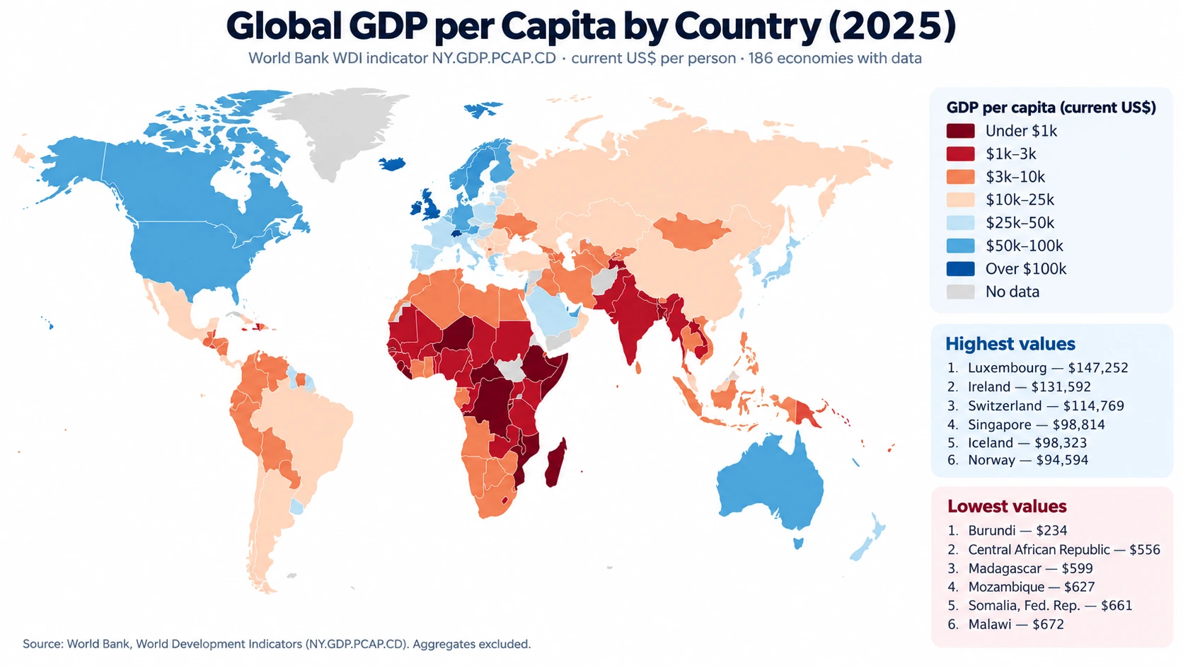
Table of Contents
What stands out on the 2025 GDP per capita map
The highest values form a strong cluster across parts of Western and Northern Europe, with additional high-value economies in North America, East Asia, and the Gulf. Luxembourg is the highest 2025 observation at about $147,252 per person. Ireland follows at about $131,592 and Switzerland at about $114,769. Singapore and Iceland are both near $98,000, Norway is about $94,594, and the United States is about $90,027. Denmark, the Netherlands, Macao SAR, and Qatar also sit above roughly $70,000.
Geography makes the contrasts easier to see than a ranked list alone. Luxembourg is surrounded by countries that are themselves high-income, yet its value is still more than twice Belgium’s roughly $60,750 and Germany’s roughly $60,496. Ireland is another strong European outlier at about $131,592 compared with the United Kingdom at about $57,602. A choropleth therefore shows not only broad regional prosperity but also sharp differences between neighbors.
Asia is even more mixed. Singapore is near $98,814, while Malaysia is about $13,125, Indonesia about $5,060, and India about $2,702. China is around $13,862. South Korea and Japan are much higher at about $36,227 and $35,951. These countries are often grouped together in broad regional discussions, but the per-person current-dollar output levels in the 2025 data occupy very different map classes.
Top 10 GDP per capita observations in 2025
| Country or economy | 2025 GDP per capita (current US$) |
|---|---|
| Luxembourg | $147,252 |
| Ireland | $131,592 |
| Switzerland | $114,769 |
| Singapore | $98,814 |
| Iceland | $98,323 |
| Norway | $94,594 |
| United States | $90,027 |
| Denmark | $76,970 |
| Macao SAR, China | $75,902 |
| Netherlands | $73,684 |
The top ten combine small European economies, major financial and trade centers, the United States, and Qatar. The ranking should not be treated as a table of household wealth. GDP records production within an economy, and dividing that total by population does not show how income is distributed. In economies with unusually large multinational, financial, resource, or cross-border activity, the gap between measured GDP per person and the economic experience of a typical household can be substantial.
Where the lowest 2025 observations are concentrated
| Country or economy | 2025 GDP per capita (current US$) |
|---|---|
| Burundi | $234 |
| Central African Republic | $556 |
| Madagascar | $599 |
| Mozambique | $627 |
| Somalia, Fed. Rep. | $661 |
| Malawi | $672 |
| Niger | $775 |
| Congo, Dem. Rep. | $807 |
| Sierra Leone | $846 |
| Liberia | $915 |
The lower end is concentrated heavily in Sub-Saharan Africa. Burundi is the lowest numeric observation at about $234 per person, followed by the Central African Republic at about $556, Madagascar at about $599, Mozambique at about $627, Somalia at about $661, and Malawi at about $672. Niger, the Democratic Republic of the Congo, Sierra Leone, and Liberia are also below $1,000. Of the 186 economies with a value, 67 are below $5,000 and 33 are below $2,000.
That geographic concentration is visible, but it should not be turned into a blanket statement about an entire continent. African economies span a wide range, and the dataset by itself does not identify the cause of any country’s position. Industry mix, productivity, population, natural resources, institutions, domestic prices, and exchange rates can all matter. The verified data support statements about 2025 levels and spatial patterns; causal explanations require separate country-specific evidence.
How several major economies compare
| Country or economy | 2025 GDP per capita (current US$) |
|---|---|
| Singapore | $98,814 |
| United States | $90,027 |
| Australia | $65,130 |
| Germany | $60,496 |
| United Kingdom | $57,602 |
| Canada | $55,698 |
| France | $48,986 |
| Italy | $43,309 |
| Korea, Rep. | $36,227 |
| Japan | $35,951 |
| Saudi Arabia | $34,537 |
| Mexico | $13,889 |
| China | $13,862 |
| Malaysia | $13,125 |
| Brazil | $10,713 |
| South Africa | $6,598 |
| Indonesia | $5,060 |
| India | $2,702 |
Among several large economies, the United States is near $90,000 per person, followed by Australia at about $65,130, Germany at about $60,496, the United Kingdom at about $57,602, and Canada at about $55,698. France is around $48,986 and Italy $43,309. South Korea and Japan are both close to $36,000. China and Mexico are near $13,900, Brazil is about $10,713, Indonesia about $5,060, and India about $2,702.
This is why GDP size and GDP per capita need to be kept separate. China and India are among the world’s largest economies in total output, but their populations are also very large, so their per-person values are much lower than those of the United States or many European economies. Luxembourg has a far smaller total economy, yet a very high level of GDP relative to its population. A total-GDP map answers “where is the most output produced?” while this map asks “how much output corresponds to each resident on average?”
Why “current U.S. dollars” changes how the map should be read
World Bank series NY.GDP.PCAP.CD is expressed in current prices and U.S. dollars. “Current prices” means the calculation uses prices prevailing in the measured period rather than holding prices fixed to remove inflation. Converting values into U.S. dollars also introduces exchange-rate effects. A country’s dollar-denominated GDP per capita can therefore change because of domestic economic activity, price changes, currency movements, population changes, or a combination of those factors.
For that reason, this indicator is useful for a nominal cross-country snapshot, but it is not the best standalone measure for long-run real growth or for comparing local purchasing power. Constant-price GDP indicators are designed for real change over time, while PPP-adjusted GDP per capita addresses a different question by accounting more directly for cross-country price-level differences. This article deliberately avoids mixing those concepts: every value in the map and tables uses the same current-dollar indicator.
Why 31 economies are left without a 2025 value
The master table contains 217 country and economy rows, but only 186 have a numeric 2025 value. The other 31 are preserved as missing rather than filled with an older observation or an estimate. Examples include Afghanistan, the United Arab Emirates, the Bahamas, Bermuda, Cuba, Lebanon, Monaco, North Korea, South Sudan, Syria, Yemen, and several territories or island economies. A gray or missing area on the map therefore should not be interpreted as a low GDP per capita value; it means the economy is outside this same-year numeric comparison.
Keeping missing observations visible protects comparability. Pulling a 2024 or earlier value into a map labeled 2025 would create a mixed-year ranking even if the older figure were valid for that economy. The World Bank country table also includes separately reported economies and territories, not only sovereign states, so the count of 186 should not be read as a sovereign-country count. “Countries and economies” is the more accurate description of the statistical scope.
What the map can—and cannot—tell you
The map can reliably show the spatial distribution of 2025 GDP per capita in current U.S. dollars. High-value areas are prominent across much of Western and Northern Europe, the United States, and several Asian and Gulf economies. Low-value observations are concentrated in parts of Sub-Saharan Africa. It also reveals local discontinuities: Luxembourg differs sharply from Belgium and Germany, while Singapore differs strongly from nearby Malaysia and Indonesia.
The map cannot by itself tell you the poverty rate, median income, wage level, wealth distribution, housing affordability, living costs, or household purchasing power. GDP is a macroeconomic production measure. Dividing it by population creates a useful scale-adjusted average, but it does not describe distribution. Because the indicator is in current U.S. dollars, a higher or lower ranking can also reflect exchange-rate and price movements. It would be a mistake to say that residents became proportionally richer simply because the current-dollar GDP per capita number rose.
Source, coverage, and calculation method
The statistical source is the World Bank World Development Indicators GDP per capita (current US$) series, indicator code NY.GDP.PCAP.CD. The World Bank defines the measure as GDP divided by population and reports this series in current U.S. dollars. The package uses one comparison year, 2025, country/economy geography, ISO3 identifiers, and excludes World Bank regional and income-group aggregates.
The data were collected from the World Bank API and checked on September 5, 2026. The cleaned dataset retains all 217 master country/economy rows: 186 numeric observations and 31 missing values. Missing rows are not imputed. Rankings, the mean and median, and the threshold counts in this article were calculated directly from that cleaned table, so the narrative, tables, and map-data file share the same factual base.
Frequently Asked Questions
Does GDP per capita show the average salary or household income?
No. GDP per capita divides an economy’s GDP by its population. It is a macroeconomic output measure and is different from average wages, median income, disposable income, or household wealth.
Why does this map use current U.S. dollars instead of PPP?
The verified source series is World Bank indicator NY.GDP.PCAP.CD. Current-dollar GDP per capita is useful for a nominal same-year comparison, but it is affected by prices and exchange rates. PPP-adjusted GDP per capita answers a different purchasing-power question.
Do gray or missing countries have low GDP per capita?
Not necessarily. Of 217 country/economy master rows, 186 have a numeric 2025 value and 31 are missing. Those missing rows were not filled with older observations, so a blank area means no retained 2025 value for this comparison.
Does Luxembourg or Ireland’s high GDP per capita mean the typical resident earns that amount?
No. GDP per capita is an average production measure, not a distributional income statistic. Household income, prices, purchasing power, and inequality need separate indicators.
Related Articles
For another view of the 2025 economy, compare this level measure with real GDP growth and unemployment. The Ireland and Guyana map pages provide geographic context for two countries that stand out in related economic comparisons.
- Global GDP Growth Map – Country Patterns in 2025
- Global Unemployment Rate Map – Country Patterns in 2025
- Ireland Map Set with Color, Basic and Outline Versions
- Printable Guyana Map for Classrooms and Presentations
Green Map creates custom-edited map images using open geographic data sources such as geoBoundaries, Natural Earth, OpenStreetMap, and government open data.
These maps are edited visual materials, not raw data files, and are provided for education, documents, presentations, and graphic reference.