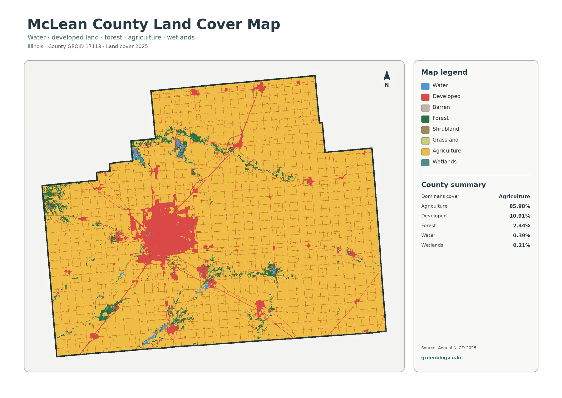
Across McLean County, agriculture dominates the landscape, but the map is not visually uniform. The 2025 summary assigns 85.98% of the county to agriculture and 10.91% to developed cover, with forest at 2.44%, water at 0.39%, and wetlands at 0.21%. Most of the county therefore appears as a broad farm landscape, while the Bloomington–Normal urban area forms a large, concentrated developed block just west of the county’s center. Narrow wooded corridors, small water features, and road-linked settlements break up the surrounding field pattern.
This page compares four related views of that landscape: current land cover, forest and farmland, impervious surface and developed land, and the 1985–2025 class-difference map. The map images can be viewed on the page, and the four original JPG files are available together in one ZIP download. Looking across the complete set helps separate questions about present cover, hard urban surfaces, agricultural continuity, and long-term classification differences.
Table of Contents
A large Bloomington–Normal footprint sits inside an 85.98% agricultural county
The general land-cover map is overwhelmingly agricultural in the north, east, south, and much of the west. The field pattern is crossed by a fine rectilinear road network, so the yellow agricultural background is divided into many regular blocks without losing its overall continuity. Against that background, the Bloomington–Normal area stands out as the largest developed concentration by a wide margin. Its red footprint is broad enough to be visible immediately even though developed cover represents only 10.91% of the county as a whole.
Smaller developed patches occur around other communities and along transportation corridors, but they remain isolated compared with the main urban core. Several road-like red lines radiate from Bloomington–Normal and connect to smaller centers across the county. This creates a useful contrast between area and concentration: agriculture wins overwhelmingly in countywide percentage, while development is visually powerful because much of it is clustered in one metropolitan center rather than spread evenly across every township.
Forest is only 2.44%, yet its branching corridors are easy to follow
Rather than forming one large forest mass, most tree cover appears in narrow, irregular corridors. Instead, most green cover appears as narrow, irregular bands that cut across the agricultural background. A prominent wooded corridor runs through the northern half of the county, while other green bands extend south and east of Bloomington–Normal. In the southwest, a few broader patches appear among the fields. These shapes are important because they give the forest class a stronger visual presence than its 2.44% countywide share might suggest.
Water and wetlands occupy still smaller shares, 0.39% and 0.21% respectively, but they tend to cluster with the same irregular corridors. Blue water patches and teal wetland cells are most noticeable around stream valleys and reservoir-like features rather than scattered evenly through the farm grid. Their boundaries are much less geometric than the surrounding fields, so even small areas interrupt the regular agricultural pattern. These classes describe surface cover, not legal wetland boundaries, floodplain regulation, property ownership, or development rights.
Muting developed land reveals how continuous the farm landscape really is
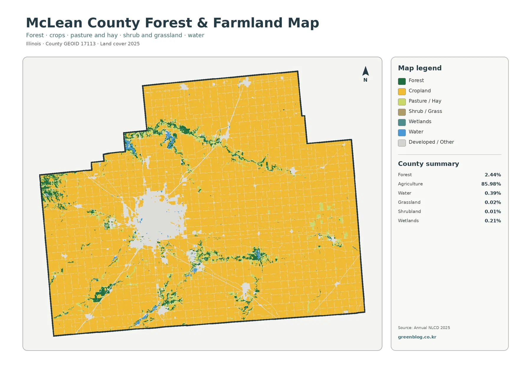
With developed and other cover shown in light gray, the forest-and-farmland view lets the agricultural surface carry most of the visual weight. Once Bloomington–Normal is muted, the county reads as an almost continuous farm matrix from the northern boundary to the southern edge. Large agricultural blocks remain connected around smaller communities, and the road grid becomes a pale network laid across the fields rather than a competing land-cover class.
The most useful contrast in this view is between that broad cropland matrix and the thin wooded strips that follow irregular paths through it. Forest remains 2.44%, while grassland is only 0.02% and shrubland 0.01% in the supplied summary. Those tiny categories are not strong countywide features. The map is therefore more informative as a guide to the continuity of agriculture and the location of wooded or wet corridors than as a way to emphasize rare grass or shrub classes.
Impervious surface is concentrated in the urban core and along radial road corridors
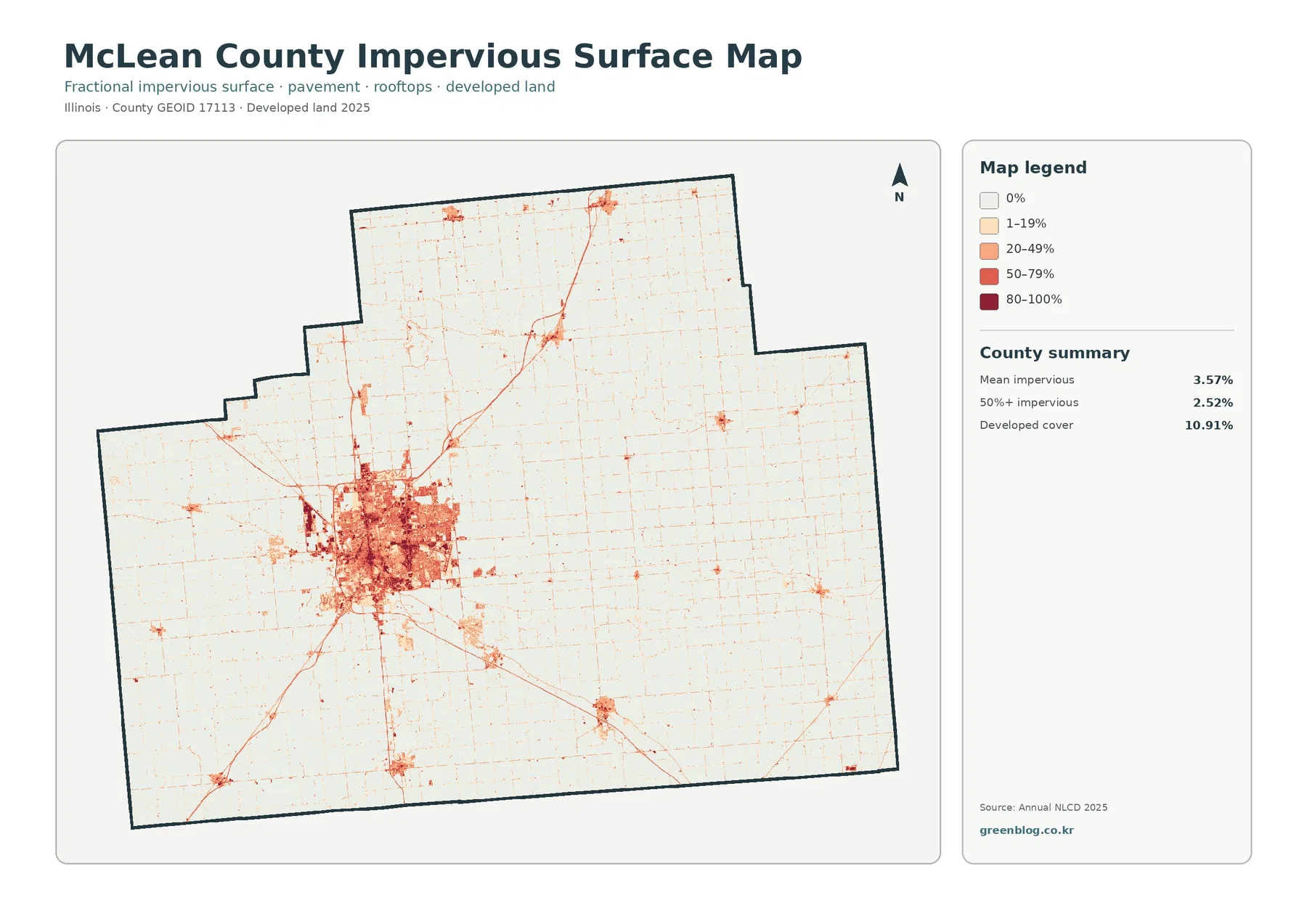
Impervious surface means rooftops, pavement, parking areas, and other hard surfaces that resist water infiltration. Countywide, mean impervious cover is 3.57%, while 2.52% of the county is mapped above the 50% impervious threshold. Those values are much lower than the 10.91% developed land-cover share because a developed cell can still contain lawns, trees, bare soil, and other permeable surfaces. The two measures should not be treated as interchangeable.
On the impervious view, Bloomington–Normal has a much sharper internal structure than on the general land-cover map. Darker reds cluster in the urban center, surrounded by lighter bands where the built landscape contains more permeable cover. Major roads extend outward as thin red lines, producing a radial pattern that is easy to see against the mostly white rural background. Smaller towns appear as compact dots or short clusters, but none approaches the scale or density of the main Bloomington–Normal concentration.
The 1985–2025 class-difference map reports 5.87% change, not 5.87% new development
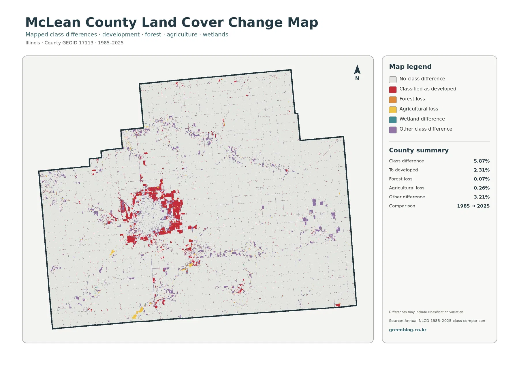
The change map compares the representative land-cover class assigned to each raster cell in 1985 with the class assigned in 2025. The supplied county summary reports 5.87% total class difference. Change to developed accounts for 2.31%, forest loss 0.07%, agricultural loss 0.26%, and other class difference 3.21%. The legend also includes wetland difference, and the map notes that differences may include classification variation. For that reason, the total should not be described as a simple measure of physical land conversion.
Red change-to-developed cells are most extensive around the Bloomington–Normal fringe and along several outward corridors. They are not spread uniformly through the current urban footprint because the map shows only cells whose endpoint classes differ. Rural areas contain far fewer red cells, although small clusters appear near minor communities and road junctions. Purple other-difference cells occur in irregular bands and patches, including places near wooded and drainage corridors, showing that the endpoint differences involve more than one class transition.
The same place answers four different questions across the map set
Take the Bloomington–Normal area as an example. The general map shows how the present developed footprint sits within surrounding agriculture and how small natural-cover patches interrupt its edge. Once most urban color is muted, the farm boundary and nearby wooded corridors are easier to follow. Looking at hard surfaces inside the developed area reveals a denser center and less-impervious outer neighborhoods. The change map then removes the stable background and keeps only cells whose endpoint classes differ.
This distinction matters when the maps are used in reports or classroom material. A 10.91% developed share should not be quoted as a 10.91% impervious share, and the 5.87% class difference should not be labeled as 5.87% urban growth. Each map has its own measurement and legend. Keeping the map title and year visible alongside the image prevents those categories from being mixed together.
Official county GIS and zoning maps answer questions that land cover cannot
For parcel and regulatory questions, the county’s official GIS page points users to mapping applications and to the McLean County GIS Consortium, which includes the county, the City of Bloomington, and the Town of Normal. The county also publishes zoning maps for unincorporated areas. Those resources serve a different purpose from the Annual NLCD maps on this page. Zoning describes legally designated land-use districts, while land cover classifies what the surface looks like from remotely sensed data.
A field can therefore appear as agriculture on the land-cover map without telling you what development is legally permitted on that parcel. Likewise, a developed land-cover cell does not identify whether the site is residential, commercial, industrial, or institutional. Use the NLCD maps for broad surface-pattern comparison, then turn to county GIS, zoning, parcel, or planning records when the question concerns a specific property or regulation.
Raster cells simplify narrow features, and endpoint comparison cannot date a change
Annual NLCD is raster data, meaning the county is represented as a grid of cells rather than as surveyed parcel polygons. A single cell can include part of a crop field, a road, trees, a ditch, and a building. The classification assigns a representative cover to that cell, so narrow forest strips can look broken, small water features can disappear, and edges can be slightly simplified compared with high-resolution aerial photography. This is normal for a county-scale thematic map.
The 1985–2025 comparison has an additional limitation: it does not tell you when a cell changed between those dates. A red cell may have become developed at any point in the forty-year interval, and it may have passed through more than one intermediate condition. Classification differences can also contribute to the result. Historical aerial imagery, building permits, subdivision records, and local planning documents are better sources for a dated site history.
Map File Information
The ZIP contains four original JPG maps for McLean County, Illinois: general land cover, forest and farmland, impervious surface and developed land, and the 1985–2025 land-cover class comparison.
- Included Versions: Land cover / forest and farmland / impervious and developed land / land-cover change
- File Type: ZIP containing four JPG maps
Related Maps
Frequently Asked Questions
Why does Bloomington–Normal look so large when agriculture is 85.98% of McLean County?
Agriculture dominates the total area because it covers most of the rural county. Developed land is only 10.91% countywide, but much of that development is concentrated in one large urban core. A compact red area therefore attracts more attention on the map than the same amount of development would if it were scattered thinly through the farm landscape.
Why is developed cover 10.91% while mean impervious surface is 3.57%?
The two layers measure different things. Developed land cover can include pavement and buildings together with lawns, trees, bare soil, and other permeable surfaces inside a built setting. Impervious percentage estimates only the hard portion that resists infiltration, so its countywide mean can be much lower than the share classified broadly as developed.
Can the 1985–2025 map tell me the exact year when a field or neighborhood changed?
No. It compares the representative class at the two endpoint years and does not record the exact date or cause of a change. A cell could have changed at any time between 1985 and 2025, and classification variation can also contribute to the mapped difference. Use historical imagery and local records for a dated parcel-level history.
Sources and Reference Data
The 2025 cover percentages, impervious summary, and 1985–2025 class-difference values in this article come from the supplied McLean County maps and legends. The official links below provide background on Annual NLCD classification and on McLean County GIS and zoning. Their statistics are not merged into the supplied map totals.
- MRLC Annual NLCD Data – official Annual NLCD data access and product information
- USGS Annual NLCD Land Cover Classification – definitions and guidance for land-cover classes
- McLean County GIS and Maps – official county GIS and mapping resources
- McLean County Zoning Maps – official zoning maps for unincorporated McLean County
Related Maps
- Adams County Illinois Land Cover Map
- Alexander County Illinois Land Cover Map
- Bond County Illinois Land Cover Map
Green Map creates custom-edited map images using open geographic data sources such as geoBoundaries, Natural Earth, OpenStreetMap, and government open data.
These maps are edited visual materials, not raw data files, and are provided for education, documents, presentations, and graphic reference.