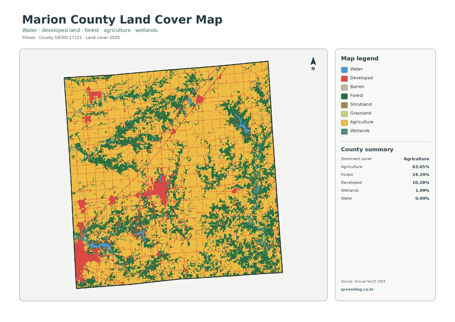
Marion County, Illinois is dominated by farmland, but the 2025 maps do not show a simple uninterrupted agricultural surface. Agriculture accounts for 63.65% of the county, while forest covers 24.24%. Those wooded areas spread through the north, center, east, and southeast in broad branching patches that break up the larger farm blocks. Developed land makes up 10.28% and is most conspicuous in a large southwestern edge cluster, a separate south-central concentration, and several smaller settlements farther north.
This page brings together four views of the same county: general land cover, forest and farmland, impervious surface and developed land, and mapped class differences between 1985 and 2025. The four original JPG maps are available in one ZIP, so they can be kept together for printing, classroom comparison, presentations, or reference work. Land cover describes what is physically covering the ground in the classification; it does not identify zoning, ownership, parcel boundaries, or whether a particular property can be developed.
Table of Contents
Agriculture leads the county total, but forest shapes much of the map
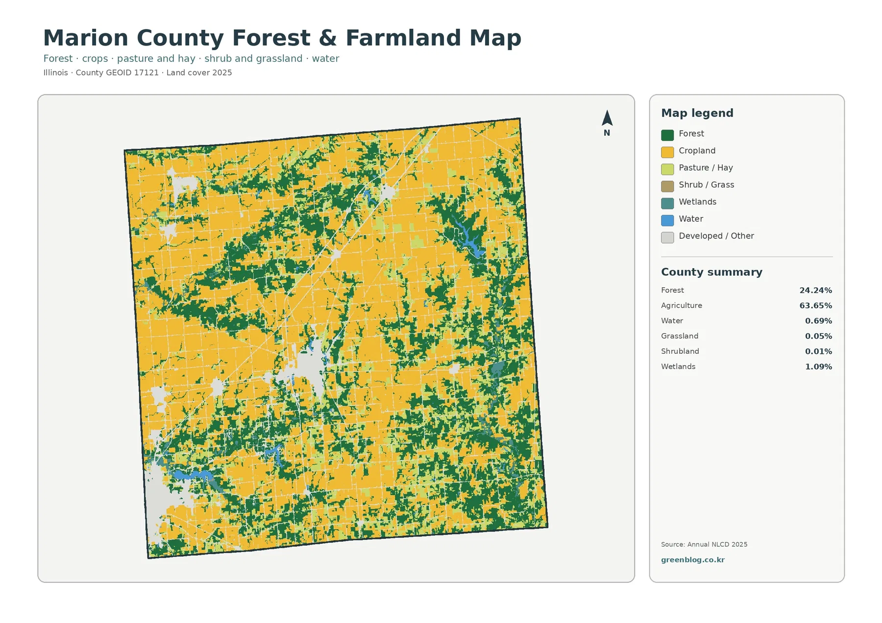
The broad yellow agricultural areas are easiest to see in the western interior, northeast, and several central openings. They are repeatedly interrupted by dark green forest rather than meeting a single forested edge. Wooded cover enters the farm landscape from several directions, widens into larger patches in parts of the center and east, and appears again across the southern half. That distribution matters because the county summary is not merely a 63.65% agriculture statistic; nearly one quarter of the mapped area is forest.
Developed land, at 10.28%, has a very different shape. The largest red area presses against the southwest edge of the county, while a separate developed concentration sits farther inland in the south-central portion. Smaller red clusters can be seen in the northwest and north-central area, with thin developed lines connecting or extending away from some of them. Because these areas are clustered, they can look visually prominent even though their countywide share is far below agriculture and forest.
Wetlands account for 1.09% and water for 0.69%. Neither category occupies a large share, yet blue water and teal wetland pixels provide useful landmarks inside the larger agricultural and forest pattern. A more noticeable water feature appears within the eastern to northeastern interior, surrounded by or close to forest, while smaller water areas occur toward the southwest and south. The map therefore works best when the percentages and the shapes are read together rather than treating the largest color as the only important feature.
The 1985–2025 comparison is mostly scattered class difference, not one single conversion
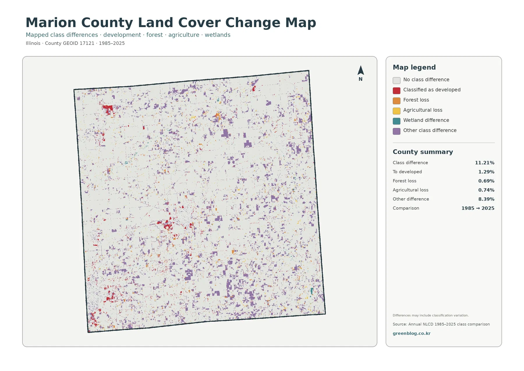
The change map should be read differently from the current land-cover map. Its pale background represents cells whose main class does not differ between the two comparison years, while colored cells mark a difference between the 1985 and 2025 classifications. Across Marion County, the total class difference is 11.21%. The largest component is the broad ‘other class difference’ category at 8.39%, which appears as many small purple patches scattered across the county.
Cells classified as developed in the later map account for 1.29% of the comparison. Red change patches are visible around the southwestern developed edge and the south-central concentration, with additional smaller pockets elsewhere. Forest loss is 0.69% and agricultural loss is 0.74%, both shown as much smaller portions of the county total. Those values make it especially important not to describe the full 11.21% as urban growth or farmland loss.
The map itself also warns that class differences may include classification variation. A 30-meter raster cell can contain more than one surface, such as a road edge, trees, grass, and cropland. If the dominant class assigned to that cell changes between the two mapped years, the cell can appear as a difference. The real-world change may still be more complicated than a complete conversion from one cover type to another. For a site-specific history, the map is best used to identify places that deserve a closer look with historical imagery or local records.
Impervious surfaces isolate the strongest built-up footprints
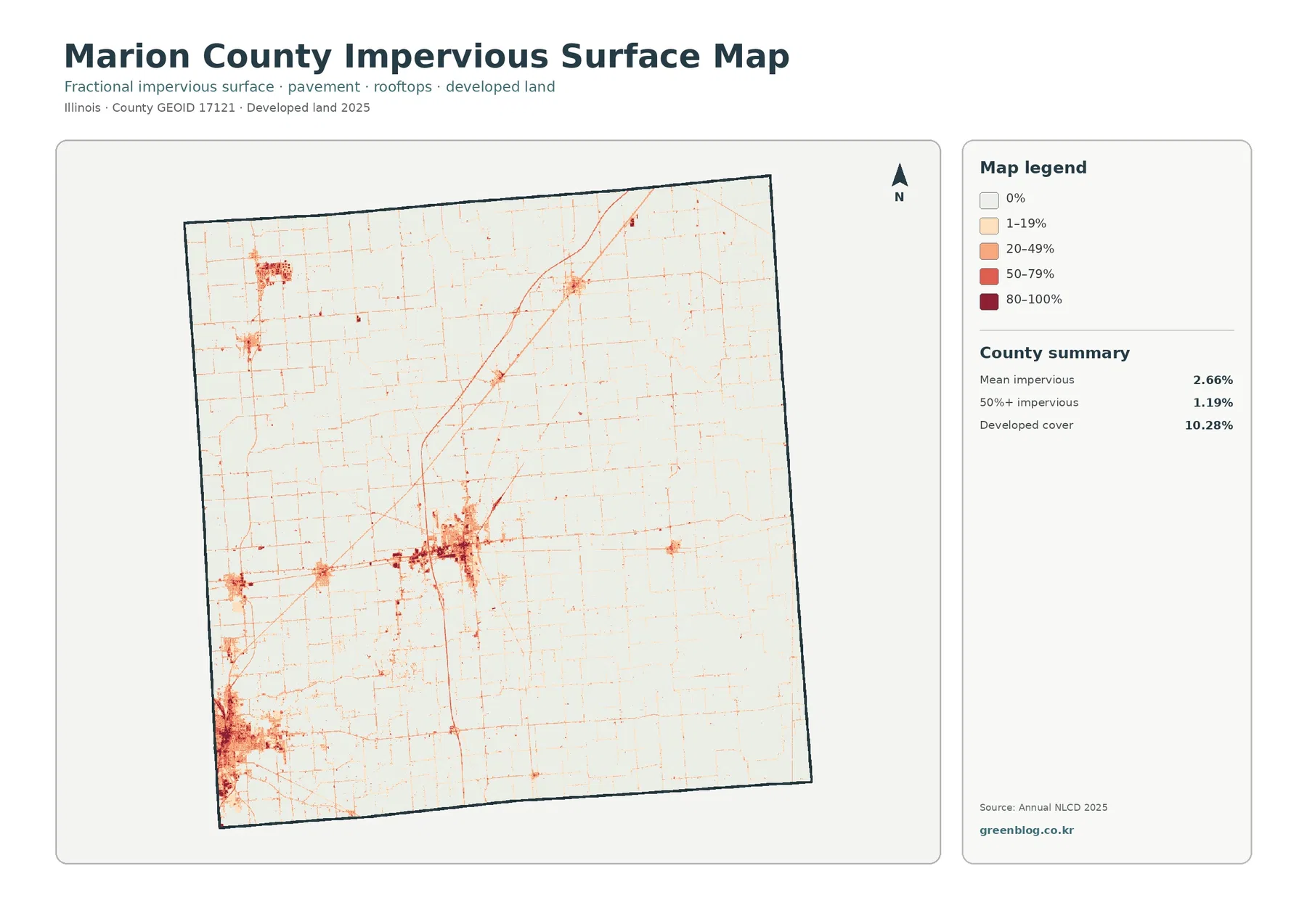
The impervious-surface map strips away most of the farm and forest colors and focuses on the share of each cell covered by surfaces such as pavement and rooftops. This makes the developed pattern much easier to separate into high- and low-intensity areas. The darkest concentrations occur at the southwestern edge and in the south-central developed cluster. Smaller dark areas appear in the northwest and north-central part of the county, while much of the agricultural east remains very light.
Marion County’s mean impervious value is 2.66%, and cells with more than 50% impervious surface account for 1.19%. These numbers are substantially lower than the 10.28% developed-cover share because the two measures are not interchangeable. A cell classified as developed can still contain lawns, trees, bare soil, or other surfaces that allow water to infiltrate. The impervious map estimates the built, water-resistant portion inside those areas rather than simply repeating the developed-land category.
Thin lines across the map also reveal roads and other narrow built features that are less obvious on the general land-cover map. A diagonal corridor can be followed from the south-central area toward the north, and a grid of lighter lines crosses much of the county. These patterns are useful for broad runoff or development-context comparisons, but the map does not name the roads or identify individual facilities. Engineering, drainage, or regulatory decisions would require finer local data.
A simplified forest-and-farmland view reveals how the two dominant covers interlock
When developed and miscellaneous classes are muted, the relationship between cropland and forest becomes easier to follow. Large yellow farm areas occupy much of the county, but green forest is threaded through them in irregular bands and larger patches. The north contains several wooded branches, the center includes wider connected forest areas, and the east and southeast show additional green cover among the farm blocks. The result is not a clean east-west or north-south division; the two dominant covers repeatedly meet across the county.
The summary on this map reports 24.24% forest and 63.65% agriculture. Grassland is only 0.05% and shrubland 0.01%, while wetlands remain 1.09% and water 0.69%. Those small categories should not be ignored, but they do explain why the simplified image is overwhelmingly yellow and green. Using this version is helpful when the question is where forest interrupts agricultural land, rather than where every developed or miscellaneous surface occurs.
The agricultural label should not be treated as a parcel-level statement about a crop or farm operation, and the forest label does not identify public versus private woodland. These are land-cover classes derived from the mapped dataset. Their value is in showing county-scale distribution with one consistent classification system. If ownership, field boundaries, a particular crop, or management status matters, those questions need a different source.
Four maps answer different questions about the same southwest and central clusters
The large southwestern developed area is a good example of why the four images should not be collapsed into one interpretation. On the general map it is simply a broad developed class surrounded by agriculture, forest, and smaller water features. On the impervious map, that same area contains a mixture of darker and lighter intensities, showing that the entire developed classification is not uniformly paved or roofed. The change map then highlights only the cells whose 1985 and 2025 classes differ, not the whole present-day developed footprint.
The same comparison works in the center and east, where agriculture and forest dominate. The general map is best for seeing all major classes at once. The forest-and-farmland version reduces visual clutter and makes wooded branches easier to trace through the farm landscape. The impervious map leaves most of these areas pale except for roads and compact built clusters, while the change map selects scattered differences rather than painting every farm or forest cell.
For a presentation about current county composition, the general 2025 land-cover map usually makes the strongest starting image because the legend includes agriculture, forest, developed land, wetlands, and water. A forest or habitat comparison can then use the simplified forest-and-farmland map. If the topic is built surface or runoff context, the impervious map is more specific. Historical comparison should use the change map with its 1985–2025 label and the caution that classification variation may be included.
The maps are county-scale references, not parcel surveys
Annual NLCD is raster data, meaning the landscape is represented as a grid of cells rather than surveyed parcel polygons. Under the supplied interpretation rules, the land-cover grid is generalized at 30 meters. A single cell can therefore contain several real surfaces, especially along the edge of a road, field, wooded strip, wetland, or developed lot. Narrow features may look thicker, thinner, interrupted, or shifted when reduced to the dominant class of a grid cell.
That limitation is especially relevant in Marion County because forest and agriculture meet along many irregular boundaries. A green edge on the map should not be read as a legal forest boundary, and a yellow agricultural edge is not a cadastral field line. Likewise, small wetlands and water features can be sensitive to cell size and classification. The maps are well suited to comparing broad patterns across the county, but not to measuring a property line or determining a regulatory status.
The dates also set a clear boundary on what the maps can say. The current land-cover, forest-and-farmland, and impervious views summarize 2025 conditions in this package. The change map compares 1985 with 2025 and does not describe every intermediate year. Development, tree clearing, agricultural changes, or water-edge changes after 2025 are outside the mapped period. If a current decision depends on recent conditions, newer aerial imagery or local records should be checked.
Finally, land cover is not the same as land use. A developed class does not tell whether a site is residential, commercial, industrial, or institutional. Agriculture does not identify the crop or operator, and forest does not establish ownership or conservation status. The consistent classification is valuable for comparison precisely because it keeps these questions separate. Legal, ownership, zoning, tax, and permit questions need their own official records.
Choose the JPG that matches the question before printing or comparing
The general land-cover JPG is the most complete choice when one image must summarize Marion County. It includes the 63.65% agricultural majority, 24.24% forest share, 10.28% developed share, and the smaller wetland and water classes in one legend. For a cleaner comparison of the two dominant covers, the forest-and-farmland JPG removes much of the developed detail and makes the wooded pattern easier to see.
The impervious-surface JPG is the better option when the goal is to compare the strength of built surfaces inside developed areas. It separates low percentages from cells above 50% impervious instead of treating all developed land equally. The change JPG should be kept as a historical comparison layer: it shows class difference between 1985 and 2025 and should not replace the current land-cover map.
Each original JPG in the supplied asset information is 2480×1754 pixels. The package does not mark these source files as meeting the A3 high-resolution reference, so large-format printing should be tested before relying on a final enlarged copy. For on-screen comparison, standard print reference, lessons, or presentation graphics, keeping all four images together makes it easy to switch between current cover, dominant natural and agricultural classes, built surface, and long-term class difference.
Frequently Asked Questions
Why does forest look so prominent when agriculture covers 63.65% of Marion County?
Forest still covers 24.24% of the county, and its shape makes it visually noticeable. Instead of forming one isolated block, wooded cover appears in branching patches through the north, center, east, and southeast, repeatedly cutting into or bordering larger agricultural areas. Agriculture remains the dominant class by area, but the dispersed forest pattern creates many visible edges. Reading the summary percentages beside the map is the best way to separate visual prominence from actual countywide share.
Why is developed land 10.28% while mean impervious surface is only 2.66%?
Developed land and impervious surface measure different things. The developed class can include lawns, trees, soil, and other permeable surfaces within a developed setting, while impervious percentage focuses on surfaces such as pavement and rooftops that resist infiltration. That is why an area can be classified as developed without being mostly impervious. In this package, only 1.19% of the county is mapped above 50% impervious surface.
Does the 11.21% class difference mean 11.21% of the county was physically converted?
No. The 11.21% figure is the share of cells whose representative class differs between the 1985 and 2025 comparison maps. The largest portion, 8.39%, is grouped as other class difference. Only 1.29% is summarized as change to developed, with 0.69% forest loss and 0.74% agricultural loss. The map notes that classification variation may be included, so site-level conversion, timing, and cause need to be checked with additional historical or local evidence.
Sources and Reference Data
The percentages and change values discussed above come from the supplied Marion County map summaries based on Annual NLCD. The official links below provide the underlying land-cover data context, classification documentation, and county boundary reference used for this type of mapping. They do not replace parcel, zoning, ownership, or permit records when a property-specific question is involved.
- MRLC Annual NLCD Data – official access and information for Annual NLCD products
- USGS Annual NLCD Land Cover Classification – classification categories and interpretation guidance
- U.S. Census Bureau TIGER/Line Shapefiles – county boundary and geographic reference data
Map File Information
The ZIP contains four original JPG maps for Marion County, Illinois: general land cover, forest and farmland, impervious surface and developed land, and the 1985–2025 land-cover class comparison.
- File Type: ZIP containing four JPG maps
Related Maps
- Adams County Illinois Land Cover Map
- Alexander County Illinois Land Cover Map
- Bond County Illinois Land Cover Map
Green Map creates custom-edited map images using open geographic data sources such as geoBoundaries, Natural Earth, OpenStreetMap, and government open data.
These maps are edited visual materials, not raw data files, and are provided for education, documents, presentations, and graphic reference.